Your living room walls are more than just boundaries—they’re blank canvases waiting to tell your story and set the entire mood of your home’s most social space. The right wall art transforms empty expanses into captivating focal points that draw the eye, spark conversation, and reflect your unique personality. Whether you’re drawn to minimalist sophistication, bohemian warmth, or bold colorful statements, thoughtfully chosen wall décor bridges the gap between a house and a home. From curated gallery walls that evolve with your tastes to single dramatic pieces that command instant attention, these fifteen designer-approved ideas will help you discover the perfect approach for elevating your living room walls with confidence and style.
1. Layered Gallery Wall With Mixed Frames
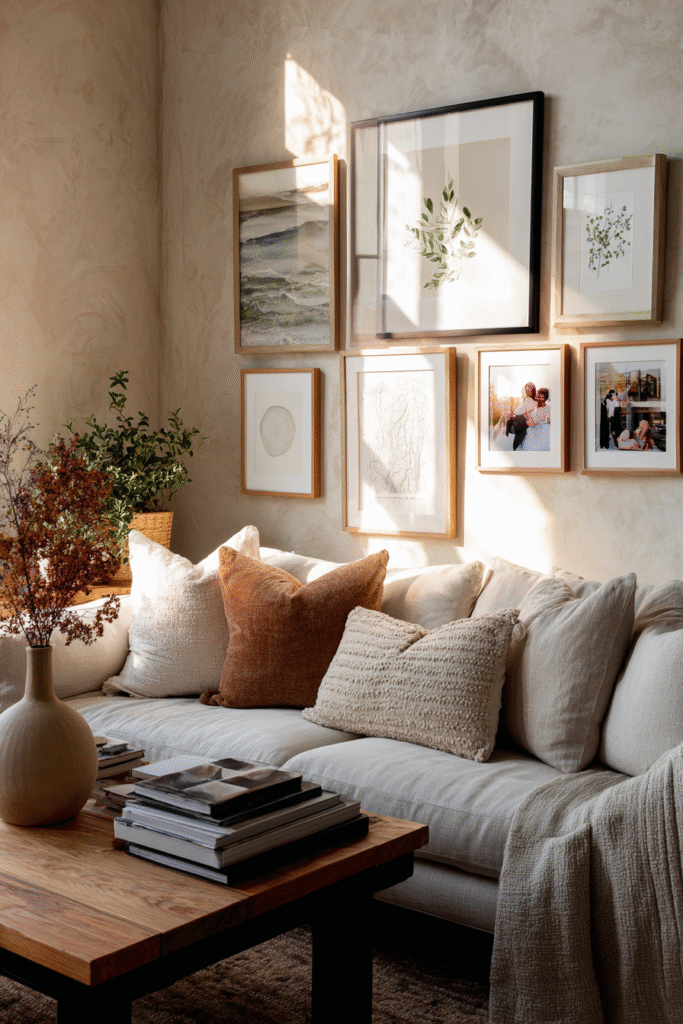
Picture a curated collection where black, white, and natural wood frames overlap in perfect harmony, each piece telling its own story while contributing to a unified whole. The layered effect creates depth and movement, drawing the eye across varied sizes and subjects—abstract prints beside vintage botanicals, personal photographs nestled between art prints. This arrangement feels intentionally imperfect, lived-in yet polished, with each frame positioned to create visual rhythm rather than rigid symmetry.
Gallery walls like this work because they allow personality to shine through curation rather than perfection. The mixed frame approach prevents the display from feeling too matchy or sterile, giving you flexibility to add pieces over time without disrupting the overall aesthetic. This style particularly excels above sofas or along staircase walls where you have generous horizontal space to play with composition and create an engaging focal point that invites closer inspection.
Design Breakdown:
- Anchor the arrangement with one or two larger pieces positioned off-center to establish visual weight
- Mix frame finishes—matte black, warm oak, brushed gold, or white—keeping to three materials maximum for cohesion
- Vary the artwork styles between photography, illustrations, line art, and abstract pieces to maintain interest
- Leave intentional breathing room between frames, approximately two to three inches, to prevent visual clutter
- Include at least one unexpected element like a small mirror, floating shelf, or dimensional object
- Balance heavier visual pieces with lighter, more minimal works to create natural flow
- Consider the negative space around your gallery as part of the design, not just empty wall
- Start your layout on the floor first, arranging until the composition feels balanced before committing to wall placement
Best For: Eclectic interiors, personalized spaces, or anyone who loves collecting art and memories over time.
2. Oversized Abstract Canvas as a Focal Point
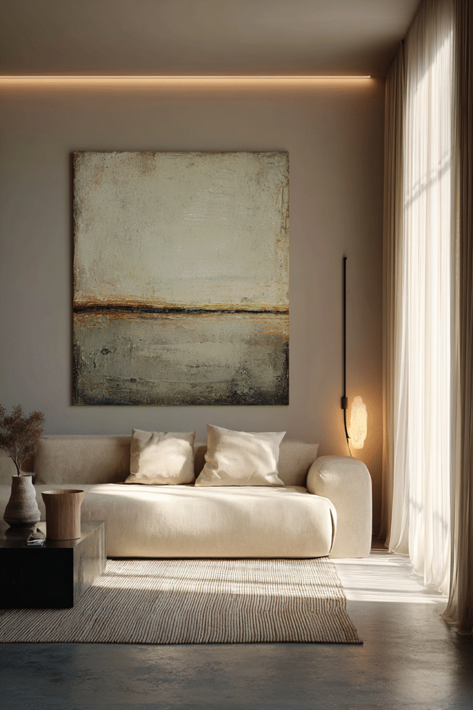
A single large-scale abstract piece commands attention the moment you enter the room, its bold brushstrokes or geometric forms creating an instant mood. Whether it’s soft watercolor washes in dusty rose and sage or dramatic charcoal and ochre sweeps, the oversized format transforms your wall into a statement of confidence and sophistication. The scale alone eliminates the need for additional décor, letting the artwork breathe and dominate the visual landscape with unapologetic presence.
This approach works beautifully in modern and contemporary settings where less-is-more philosophy reigns. The simplicity of one powerful piece creates calm rather than visual noise, making rooms feel larger and more intentional. Choose abstracts that echo your existing color scheme for seamless integration, or go bold with contrasting hues to inject energy and personality. The key is proportion—your canvas should fill approximately two-thirds to three-quarters of the wall space above your furniture for maximum impact.
Design Breakdown:
- Select a canvas measuring at least 40×60 inches for standard living rooms, larger for expansive walls
- Position the piece so its center sits at eye level, typically 57-60 inches from the floor
- Choose artwork with colors that either harmonize with your palette or provide intentional contrast
- Consider texture within the abstract—heavy impasto, layered glazes, or mixed media adds dimensional interest
- Frame or leave unframed depending on your aesthetic; gallery-wrapped edges suit modern spaces
- Flank the canvas with minimalist sconces or picture lights to enhance evening drama
- Keep surrounding furniture simple and low-profile to let the artwork remain the hero
- Use the canvas colors as inspiration for throw pillows, blankets, or accent pieces throughout the room
Best For: Minimalist homes, modern interiors, or anyone seeking instant sophistication with effortless style.
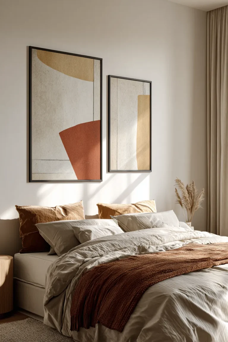
3. Symmetrical Diptych or Triptych Arrangement
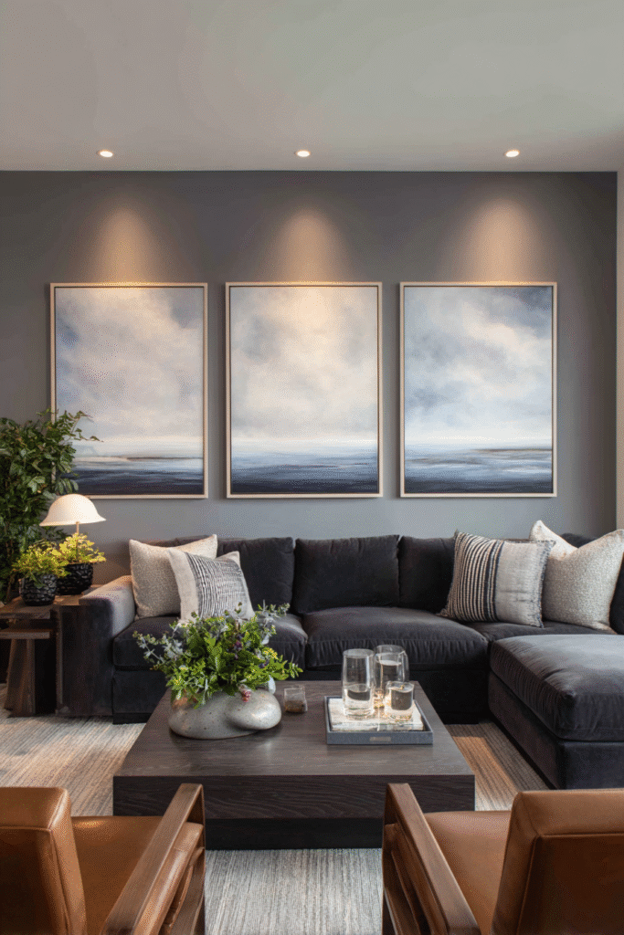
Two or three coordinating canvases aligned in perfect symmetry create architectural elegance that feels both classic and contemporary. The panels might continue a single image across their surfaces—a panoramic landscape, an abstract color study, or a large-scale photograph—or they might present complementary scenes that dialogue with each other. The clean lines and balanced spacing bring order and refinement, particularly effective in formal living rooms or spaces with strong architectural elements like fireplaces or built-ins.
Symmetrical multi-panel arrangements work because they satisfy our innate attraction to balance while adding visual interest through segmentation. The breaks between panels create natural rhythm, and the horizontal spread draws the eye across the wall, making the space feel wider. This style particularly suits rooms with high ceilings or long walls above sectional sofas where a single piece might feel lost. The formal structure also complements traditional and transitional interiors beautifully, bridging classic sensibilities with contemporary art.
Design Breakdown:
- Ensure each panel measures identically for true symmetry, with spacing between pieces matching their frame width
- Hang the panels with consistent gaps of two to four inches, maintaining perfect alignment at top edges
- Choose artwork where the composition naturally extends across panels or where each section stands alone but relates
- Consider vertical triptychs for narrow walls or above consoles, horizontal arrangements for sofa walls
- Match frame styles exactly—same color, material, and profile—to reinforce the cohesive look
- Center the entire arrangement on your wall or furniture piece rather than centering individual panels
- Coordinate the artwork’s dominant colors with one or two accent colors already present in textiles or accessories
- Add matching lighting above each panel for gallery-level presentation and evening ambiance
Best For: Traditional homes, formal living spaces, or design lovers who appreciate classical balance with modern execution.
4. Floating Picture Ledge Display
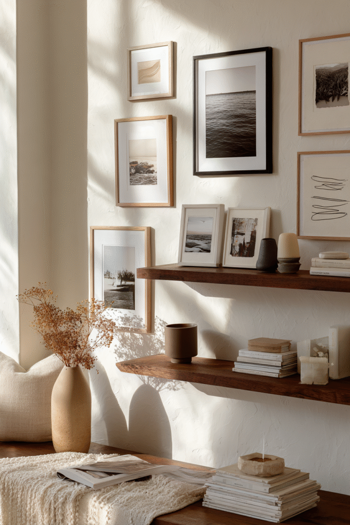
Slim wooden or metal ledges mounted horizontally transform your wall into a flexible gallery that evolves with your mood and seasons. Artwork leans casually rather than hangs, overlapping in layers that create depth and an effortlessly curated feel. You might display five frames on a single ledge, varying heights and sizes, with smaller pieces layered in front of larger ones, perhaps a small plant or decorative object nestled between for organic variation. The beauty lies in the changeable nature—swap pieces weekly if inspiration strikes, without a single new nail hole.
This styling approach excels in spaces where commitment feels daunting or where you love refreshing your look regularly. The ledge system feels approachable and contemporary, less precious than traditional hanging while still delivering sophisticated visual impact. It works particularly well in apartments or rentals where wall damage is a concern, and the layered aesthetic suits both minimalist and maximalist sensibilities. The key is balancing the composition so it feels intentional rather than haphazard, with careful attention to how pieces overlap and relate.
Design Breakdown:
- Install ledges at eye level or slightly above furniture, ensuring they’re perfectly level for a polished look
- Start with larger frames in the back, layering progressively smaller pieces forward to create dimensional interest
- Mix orientations—portrait and landscape—to break up visual monotony and add dynamic energy
- Include three-dimensional objects like small sculptures, ceramic pieces, or botanical elements for textural variety
- Keep a cohesive color story across frames and artwork to prevent the display from feeling chaotic
- Leave intentional gaps and negative space; overcrowding diminishes the sophisticated, curated effect
- Consider installing two ledges at different heights for even more flexibility and visual intrigue
- Lean artwork at slight angles rather than perfectly vertical to enhance the casual, collected aesthetic
Best For: Renters, frequent redecorators, or anyone who loves flexibility and low-commitment styling options.
5. Boho-Chic Wall Tapestry Corner
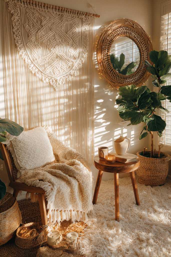
Layered with woven textures and warm neutrals, this boho corner transforms empty walls into a cozy art statement where fabric becomes the medium. A large macramé hanging anchors the space, its cotton fringe cascading like gentle waterfalls, perhaps joined by a smaller woven wall basket or circular rattan piece offset to one side. The tactile quality brings immediate warmth, softening hard surfaces with organic fibers that catch and filter light throughout the day, creating subtle shadow play that adds living dimension to your walls.
This aesthetic thrives in spaces craving warmth and soul, where hard-edged minimalism feels too stark. The bohemian approach to wall art emphasizes natural materials, handcrafted elements, and global-inspired patterns that feel collected rather than bought in a single shopping trip. Tapestries work particularly well in rooms with abundant natural light, which illuminates the texture and brings out the subtle variations in weave and color. They also provide acoustic softening—a practical benefit in lofty spaces with hard floors where sound can echo.
Design Breakdown:
- Anchor with a substantial tapestry or macramé piece measuring at least 36 inches wide for proper presence
- Layer smaller woven pieces asymmetrically around the main piece, creating visual triangles rather than straight lines
- Incorporate natural wood elements like floating shelves, driftwood pieces, or bamboo frames to enhance earthiness
- Add dimensional interest with hanging planters, trailing pothos, or mounted staghorn ferns
- Choose a warm, neutral palette—cream, terracotta, rust, sand, caramel—with perhaps one muted accent color
- Include soft ambient lighting such as warm LED strips behind the tapestry or string lights woven through
- Mix weaving techniques—chunky knots, fine weaves, fringe details—to create textural conversation
- Consider adding small mirrors with rattan or macramé frames to reflect light and expand the bohemian narrative
Best For: Bohemian lovers, relaxed interiors, reading corners, or spaces that need instant warmth and texture.
6. Black and White Photography Collection
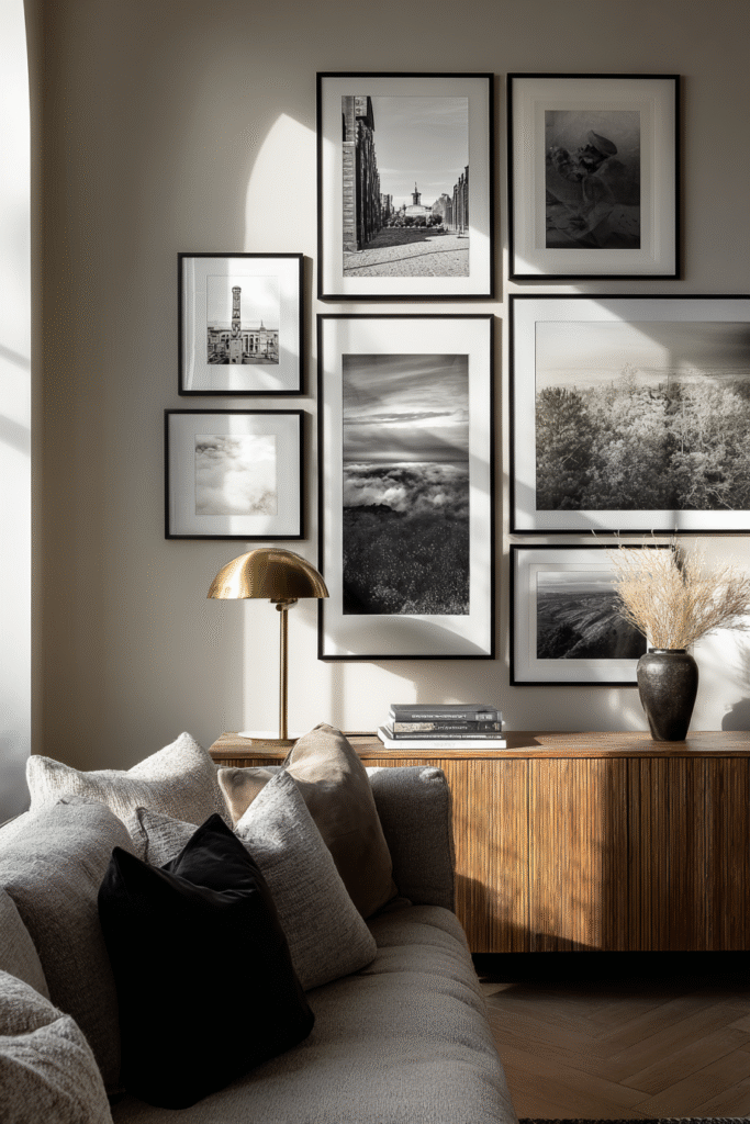
A carefully curated series of monochromatic photographs creates timeless elegance that transcends trends and styles. Whether capturing stark architectural details, intimate portraits, sweeping landscapes, or abstract studies of light and shadow, black and white imagery brings sophistication and cohesion even when the subjects vary widely. The absence of color unifies disparate scenes, letting composition, form, and emotion take center stage while creating a gallery-like atmosphere that feels both intellectual and deeply personal.
This approach works because monochrome photography inherently feels more artistic and intentional than color snapshots, even when displaying personal memories. The format particularly suits modern, Scandinavian, and minimalist interiors where restrained palettes dominate, though it also provides striking contrast in warm, colorful spaces. The beauty lies in versatility—you can mix professional art photography with personal travel shots or family moments, and the consistent black and white treatment makes everything feel cohesive and curated rather than random.
Design Breakdown:
- Select uniform frames in matte black, white, or natural wood to let the photography command attention
- Create visual rhythm by alternating between close-up details and wider environmental shots
- Consider both high-contrast dramatic images and soft, ethereal grays to add tonal variety
- Arrange in clean grids for modern spaces or organic salon-style groupings for eclectic rooms
- Include varied subject matter while maintaining consistent mood—all moody and dramatic or all light and airy
- Use generous white or cream matting to give each photograph breathing room and gallery sophistication
- Ensure consistent print quality and paper finish across all pieces for professional cohesion
- Hang at consistent heights with equal spacing for orderly arrangements, or vary deliberately for casual sophistication
Best For: Modern minimalists, photography enthusiasts, or anyone seeking classic elegance that never goes out of style.
7. Textured Woven Wall Hanging
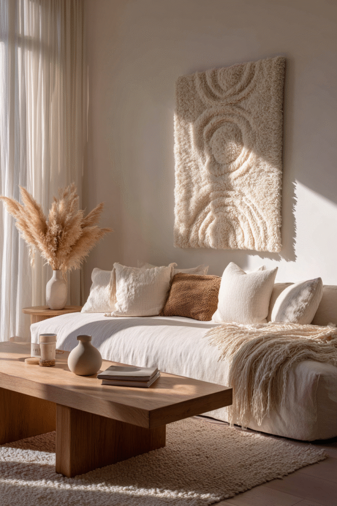
A single substantial woven piece in natural fibers becomes sculptural art that engages multiple senses beyond sight. Thick wool roving in cream and oatmeal might cascade in organic loops, or tightly woven jute could form geometric patterns with dimensional relief, catching light at different angles throughout the day. The handcrafted quality is evident and intentional—slight irregularities and visible weaving techniques remind us that human hands created this piece, bringing authentic warmth that mass-produced art simply cannot replicate.
Textured wall hangings excel at softening contemporary interiors that might otherwise feel cold or overly polished. They introduce organic elements without requiring the maintenance of living plants, and they work beautifully in spaces with neutral palettes where texture does the heavy lifting of creating interest. The dimensional quality means the piece changes subtly as light shifts from morning to evening, essentially giving you evolving art throughout the day. This style particularly suits bedrooms, reading nooks, or intimate conversation areas where you want to create sanctuary-like calm.
Design Breakdown:
- Choose substantial pieces measuring 30 inches wide minimum to create proper visual weight and presence
- Opt for natural, undyed fibers like cotton, wool, jute, or linen for authentic bohemian warmth
- Consider the weaving technique—chunky loops create casual coziness, tight geometric weaves feel more refined
- Hang using a wooden dowel or brass rod that complements the organic aesthetic rather than competing
- Position at eye level or slightly above furniture, ensuring the texture is close enough to appreciate
- Complement with simple, low-profile furniture that doesn’t compete for attention with the dimensional textile
- Add subtle uplighting or picture lights to emphasize texture and create dramatic evening shadow play
- Incorporate coordinating textiles in the room—chunky knit throws, linen cushions, woven baskets—for cohesive layering
Best For: Cozy spaces, bedrooms, or anyone drawn to tactile, handcrafted elements and natural materials.
8. Mirror Cluster for Light and Dimension
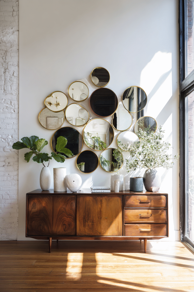
Multiple mirrors grouped together as intentional art create luminous impact while serving the practical purpose of expanding light and space. Imagine five or seven round mirrors in varying sizes—some with slim brass frames, others in dark walnut, perhaps one or two frameless with beveled edges—arranged in an organic cluster that feels like bubbles or celestial bodies in conversation. The reflective surfaces catch and multiply natural light, making rooms feel airier and more spacious while adding sophisticated visual interest that changes constantly with movement and shifting daylight.
This approach transforms a functional item into decorative statement, blending practicality with beauty in ways pure artwork cannot. Mirror clusters work exceptionally well in smaller living rooms or spaces with limited natural light, where the reflective surfaces genuinely improve the room’s brightness and perceived size. The arrangement also adds architectural interest to blank walls without requiring commitment to specific colors or subjects, making it ideal for indecisive decorators or those who prefer neutral, timeless approaches. The key is treating mirrors as sculptural elements rather than merely functional objects.
Design Breakdown:
- Combine five to nine mirrors in varied sizes, with the largest measuring 18-24 inches diameter for proper impact
- Mix finishes thoughtfully—perhaps gold and black, or brass and natural wood—staying within two to three material families
- Arrange in asymmetrical organic groupings rather than rigid patterns, creating visual movement and intrigue
- Include different mirror shapes if desired—round, hexagonal, sunburst—while maintaining cohesive style language
- Position the cluster to reflect something beautiful—windows, greenery, interesting architecture—rather than random walls
- Ensure secure hanging, as mirror clusters carry significant weight; use appropriate anchors and hardware
- Consider the room’s existing metal finishes when selecting mirror frames for harmonious integration
- Leave breathing room between mirrors to prevent visual clutter, treating negative space as part of the composition
Best For: Small spaces, light-starved rooms, or design lovers who want functional art that expands and brightens.
9. Statement Metal Wall Sculpture
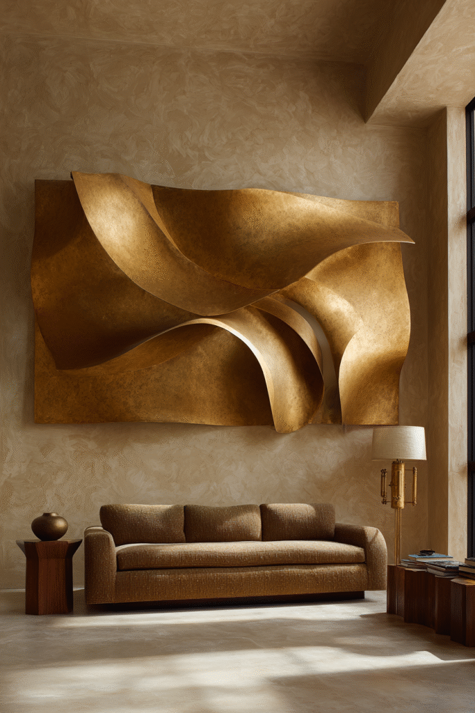
A three-dimensional metal sculpture brings contemporary edge and architectural presence that flat art simply cannot achieve. Picture an abstract design in brushed brass—organic curves suggesting movement, or geometric forms creating rhythmic patterns—that extends from the wall with dimensional confidence. The metal might be aged copper with verdigris patina, sleek matte black steel, or warm gold-tone alloy, each catching and reflecting light differently throughout the day. These pieces feel gallery-worthy and sophisticated, transforming your living room into a space that takes design seriously.
Metal sculptures work because they add physical dimension that creates constantly changing shadow play and visual interest from multiple angles. They suit contemporary, industrial, and modern interiors particularly well, though the right piece can also warm transitional spaces seeking sculptural elements. The substantial presence means you need nothing else on that wall—the sculpture carries the visual weight solo, making styling decisions refreshingly simple. Consider scale carefully; metal pieces need room to breathe and should be proportional to both wall size and surrounding furniture.
Design Breakdown:
- Select sculptures measuring at least 30-36 inches in one dimension to create proper statement-making presence
- Choose finishes that complement your existing metals—if you have brass fixtures, consider brass or gold-tone sculptures
- Consider the sculpture’s profile depth; pieces extending 4-8 inches create excellent shadow and dimension
- Position to catch natural light from windows, which enhances the three-dimensional quality and creates drama
- Mount securely using proper anchors rated for the sculpture’s weight, consulting installation instructions carefully
- Keep surrounding décor minimal to let the sculptural piece remain the undisputed focal point
- Consider how the piece looks from different angles and seating positions throughout the room
- Add picture lights or wall washers to illuminate the sculpture beautifully during evening hours
Best For: Modern interiors, art collectors, or anyone wanting bold, gallery-level sophistication with dimensional impact.
10. Botanical Prints in Natural Wood Frames
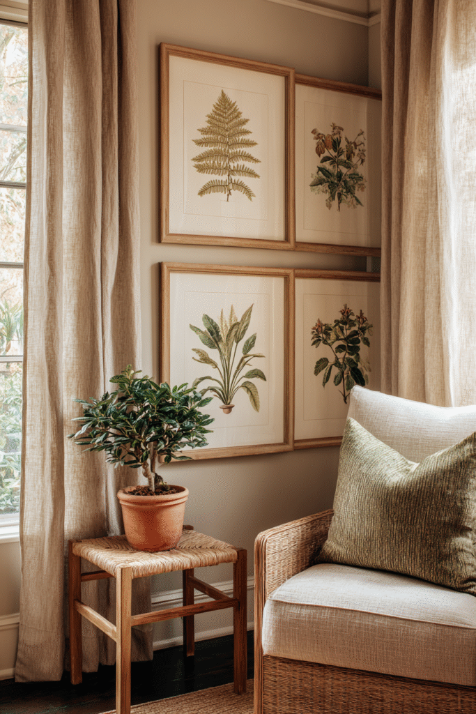
Vintage-inspired botanical illustrations in warm wood frames bring organic elegance that feels both collected and refined. Picture detailed renderings of ferns, palms, or flowering branches—perhaps watercolor studies or classic Linnaean-style engravings—each matted generously in cream and housed in light oak or walnut frames. The natural subject matter brings the outside in without requiring living plant maintenance, while the scientific illustration quality adds intellectual sophistication. Arranged in symmetrical pairs or organic groupings, these prints create calm, nature-inspired focal points that suit virtually any decorating style.
Botanical art has endured centuries for good reason—it bridges traditional and contemporary aesthetics while bringing undeniable life and freshness to interiors. The combination of organic subject matter with refined presentation creates accessible elegance that feels neither stuffy nor overly casual. These prints work particularly well in homes with abundant natural elements like wood furniture, linen textiles, and earthy color palettes, though they also provide welcome natural contrast in urban, modern spaces. The key is selecting prints with similar illustration styles and coloring for cohesion.
Design Breakdown:
- Choose illustrations with consistent style—all watercolor, all line drawings, or all vintage engravings—for unified impact
- Frame in natural wood tones that complement your existing furniture, keeping frame styles identical or very similar
- Use generous cream or white matting to give each botanical study breathing room and museum-quality presentation
- Arrange in symmetrical pairs flanking windows or fireplaces, or create larger groupings of four to six
- Consider the botanical subjects’ colors and ensure they harmonize with your existing palette
- Mix leaf studies, flowering plants, and seed pods for variety while maintaining the nature theme
- Hang lower than you might think—center of each print at 57 inches creates intimate, approachable placement
- Incorporate living plants nearby to reinforce the organic theme and create dialogue between real and illustrated botanicals
Best For: Nature lovers, traditional homes, transitional spaces, or anyone seeking timeless, organic elegance.
11. Salon-Style Asymmetrical Wall
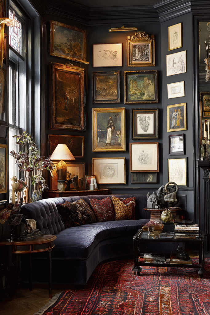
An eclectic floor-to-ceiling arrangement where every inch of wall space comes alive with art creates maximalist magic that feels both curated and spontaneous. Frames of all sizes and shapes overlap and nestle together—large oils beside small sketches, ornate gilt frames next to sleek black ones, landscapes sharing space with abstracts and portraits. The asymmetrical placement looks organic rather than planned, as if collected over decades, with varied mat widths, frame depths, and hanging heights creating wonderful dimensional chaos that somehow resolves into cohesive beauty when viewed as a whole.
This European-inspired salon hanging works beautifully for true art lovers who refuse to choose favorites or limit their collections. The dense, layered approach creates visual richness and storytelling opportunity, with each piece revealing itself gradually rather than competing for attention simultaneously. It requires confidence and an understanding that more-is-more can be just as sophisticated as minimalism when executed with intention. The style particularly suits homes with strong personalities, vintage collectors, or anyone who finds joy in abundance and eclecticism rather than restraint.
Design Breakdown:
- Start with your largest piece positioned off-center at eye level as an anchor point, building around it organically
- Mix frame styles generously—gilded antiques, modern black, natural wood, painted vintage—embracing variety
- Include different art types and eras—oil paintings, watercolors, prints, drawings, small objects—for textural interest
- Vary mat widths dramatically, from no mat on some pieces to generous borders on others
- Fill the wall densely, leaving just two to three inches between frames for the classic salon effect
- Create visual triangles with similar colors or subjects scattered throughout to guide the eye naturally
- Include at least one or two dimensional objects—small shelves, sconces, or sculptural pieces—for depth
- Step back frequently during arrangement to ensure balance of visual weight, even if placement is asymmetrical
Best For: Maximalists, art collectors, vintage enthusiasts, or anyone with confidence to embrace abundant, layered beauty.
Tips for Balancing Different Sizes
When working with varied frame dimensions, establish visual equilibrium by distributing weight evenly—place larger pieces throughout rather than clustering them in one area. Create imaginary sight lines connecting similar colors or subjects across the arrangement to unify the collection. Use smaller pieces to fill gaps and create rhythm rather than treating them as afterthoughts. Step back six feet regularly to assess overall balance, ensuring no single quadrant feels heavier or emptier than others.
12. Large-Scale Landscape or Seascape
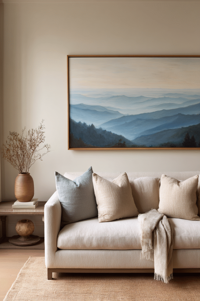
A panoramic natural scene stretching across substantial canvas brings serene escapism and visual breathing room to busy living spaces. Imagine misty mountains fading into layered ridges of blue-gray, or a calm coastal scene where sand meets gentle waves under soft morning light. The expansive horizontal format mimics windows, creating the psychological effect of opening your wall to beautiful vistas beyond. The peaceful subject matter—whether dramatic wilderness or tranquil water—provides visual rest and contemplative calm that counterbalances our overstimulated modern lives.
Large landscapes work because they tap into our innate connection to nature while requiring zero maintenance or watering schedules. The scale makes them appropriate for primary walls above sofas or in spacious entry areas where you want immediate impact without overwhelming detail. Choose scenes that align with your color palette for seamless integration—coastal blues and sand tones for nautical schemes, forest greens and earth tones for organic interiors, or desert palettes for southwestern aesthetics. The photograph or painting style matters less than the emotion it evokes; whether realistic or impressionistic, the landscape should feel like somewhere you’d want to spend time.
Design Breakdown:
- Select pieces measuring at least 48 inches wide to truly capture the panoramic effect and command the space
- Position horizontally above sofas or consoles, with the bottom edge 8-10 inches above furniture tops
- Choose scenes with depth—foreground, middle ground, background—to create dimension and visual journey
- Consider your room’s natural light; north-facing rooms benefit from warmer landscape tones like golden hour scenes
- Frame minimally or use gallery-wrapped edges to avoid competing with the landscape’s natural beauty
- Coordinate the dominant landscape colors with one or two existing room colors for cohesive flow
- Include subtle gradations and soft transitions rather than high-contrast busy scenes for true relaxation
- Consider seasonal rotation if you love variety—coastal summers, autumn forests, winter mountains
Best For: Nature enthusiasts, peaceful spaces, or anyone seeking transportive art that creates calm and visual escape.
13. Minimalist Line Drawings in a Grid
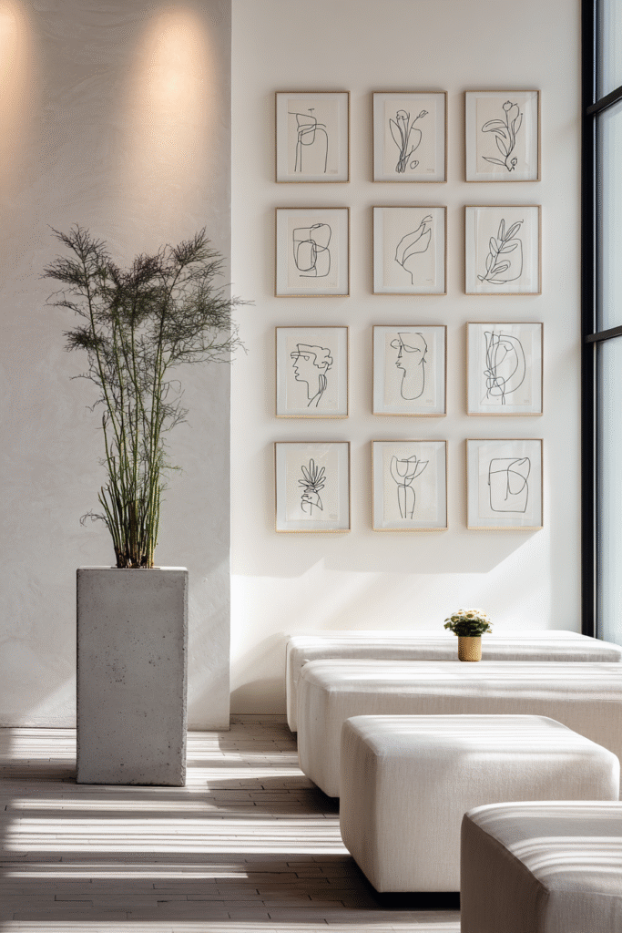
Simple continuous line sketches arranged in perfect grid formation create sophisticated restraint that feels both modern and timeless. Each drawing might capture a face in profile, a nude form, botanical stems, or architectural details using nothing but single, unbroken pen lines—no shading, no color, just essential forms distilled to their purest expression. The white backgrounds and black ink create high contrast while the grid arrangement brings order and calm. This approach delivers maximum impact through minimum means, proving that subtlety and simplicity can be just as arresting as bold color or complex composition.
Grid arrangements of minimalist art work because they satisfy our attraction to pattern and order while the line drawings themselves provide organic, human elements that prevent coldness. This style particularly suits Scandinavian, modern, and minimalist interiors where every element must earn its place through beauty or function—preferably both. The repetition of similar frame sizes and consistent subject treatment creates rhythm, while slight variations in the drawings themselves prevent monotony. It’s an accessible entry into art collecting that feels sophisticated and curated without requiring large budgets or extensive knowledge.
Design Breakdown:
- Select four to nine prints of identical dimensions, typically 8×10 or 11×14 inches for cohesive grid impact
- Frame identically in thin black, white, or natural wood profiles with consistent mat borders
- Hang in perfect grid with equal spacing between frames—usually 2-3 inches works beautifully
- Choose line drawings with related subjects—all figures, all faces, all botanicals—for thematic consistency
- Ensure all backgrounds are identical (usually white or cream) to maintain the clean, minimal aesthetic
- Position the grid centered on your wall or furniture piece with geometric precision
- Keep the color palette strictly monochrome—black ink on white paper—to preserve the minimalist ethos
- Mount on white or light neutral walls where the contrast creates maximum clarity and breathing room
Best For: Minimalists, modern interiors, small spaces, or design lovers who appreciate quiet sophistication over bold statements.
14. Monochromatic Color Story Gallery
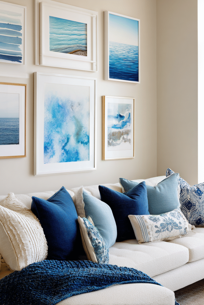
A curated collection united by single-color family creates harmonious impact that feels both intentional and soothing. Imagine seven frames showcasing blues—from pale sky and powder through cobalt to deep navy—in varied subjects like abstracts, photography, and illustrations. Or perhaps warm terracotta and rust tones flowing through desert landscapes, botanical studies of autumn leaves, and abstract clay-colored compositions. The monochromatic approach ties disparate subjects and styles together through color alone, creating sophisticated cohesion that feels thoughtfully collected rather than randomly assembled.
This color-focused curation works beautifully because it provides structure without rigidity, allowing you to include varied art styles and subjects while maintaining clear visual unity. It’s particularly effective in rooms with strong color schemes where you want wall art to reinforce rather than compete with existing palettes. The approach also simplifies shopping and collecting—once you’ve chosen your color family, decisions about what works together become clearer. The key is including enough tonal variation within your chosen hue to create depth and interest without straying into unrelated color territories.
Design Breakdown:
- Choose a color family with clear boundaries—all greens, all blues, all earth tones—and commit fully
- Include at least five tonal variations from lightest to darkest within your chosen hue for dimensional interest
- Mix art types freely—photography, paintings, prints, illustrations—united by color rather than style
- Frame consistently in neutral tones—black, white, natural wood—that don’t introduce competing color stories
- Arrange with your darkest or most saturated pieces providing anchor points, lighter tones filling between
- Consider the psychological impact of your chosen color family—blues calm, reds energize, greens ground
- Incorporate varied textures and finishes—matte, glossy, watercolor, oil—while maintaining color consistency
- Add one or two dimensional objects in your color family—ceramic pieces, books, textiles—to extend the story
Best For: Color-focused decorators, cohesive interiors, or anyone who finds decision-making easier with clear parameters.
How to Choose a Cohesive Palette
Select colors that already appear prominently in your space through furniture, textiles, or architectural elements. Pull from existing throw pillows, rugs, or statement furniture pieces to ensure your wall art gallery feels integrated rather than added as afterthought. Test your color selections by placing paint swatches or fabric samples together—if they look harmonious side-by-side, they’ll work on your wall. Aim for variations within two steps on either side of your base hue to maintain cohesion while avoiding monotony.
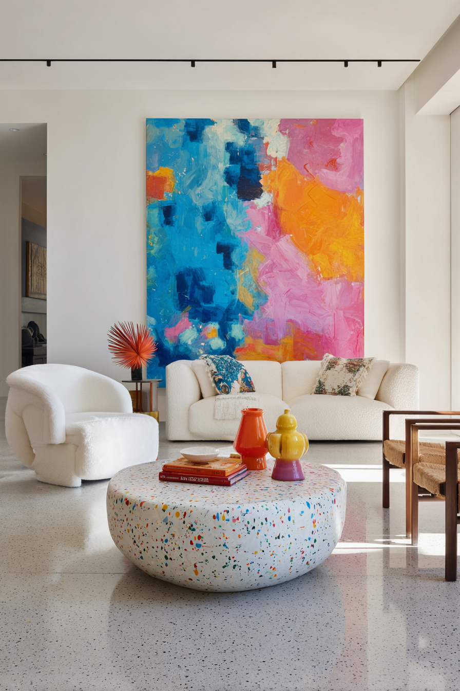
15. Statement Wall With Bold Colorful Art

An audacious explosion of color commands attention and energizes the entire room with unapologetic vibrancy. Picture a massive canvas alive with fuchsia, electric blue, sunshine yellow, and tangerine—perhaps abstract expressionist brushwork or modern pop art celebrating pure chromatic joy. This approach embraces maximalism and personality, declaring that your living room is a space for living boldly rather than playing it safe with neutrals. The intense color creates instant focal point and conversation starter, making the art impossible to ignore and infusing the space with dynamic energy.
Bold colorful art works for spaces and personalities that crave excitement over calm, preferring stimulation to serenity. It’s particularly effective in neutral or monochrome rooms where a color explosion provides much-needed vitality and prevents the space from feeling sterile or forgettable. The key is committing fully—timid half-measures fall flat when working with vibrant palettes. Choose artwork with colors you genuinely love rather than what seems safe or trendy, because you’ll live with this bold choice daily. Consider pulling one or two accent colors from the piece into your textiles and accessories to create cohesive dialogue between art and décor.
Design Breakdown:
- Select art with at least three to five distinct, saturated colors for proper vibrancy and visual punch
- Size matters critically—go as large as your wall and budget allow, minimum 40×50 inches for real impact
- Position on your most prominent wall where the piece gets maximum visibility from main seating areas
- Keep surrounding walls relatively neutral to let the colorful art shine without overwhelming the space
- Choose modern or contemporary frames, or gallery-wrapped canvas edges to maintain fresh, current aesthetic
- Pull two or three colors from the artwork into throw pillows, blankets, or decorative objects for integration
- Ensure excellent lighting—natural during day, spotlights at night—to make colors truly sing
- Balance the color intensity with calming neutral furniture so the room doesn’t feel visually exhausting
Best For: Bold personalities, creative spaces, neutral rooms needing energy, or anyone tired of playing it safe.
Conclusion
Your living room walls hold limitless potential for self-expression and style elevation. Whether you’re drawn to minimalist line drawings, layered bohemian textiles, or bold colorful statements, the right wall art transforms blank surfaces into captivating focal points that reflect who you are. These fifteen approaches offer flexibility for every aesthetic, budget, and confidence level—from simple single pieces to complex salon-style arrangements. The beauty lies not in following rigid rules but in trusting your instincts, experimenting with what speaks to you, and remembering that your walls are canvases for your personal story. Start with one idea that resonates, commit to it fully, and watch how thoughtfully chosen wall art changes not just how your living room looks, but how it feels to inhabit the space daily.
FAQs
What size wall art is best for a living room?
Scale matters tremendously for proper visual impact. For walls above sofas, aim for artwork spanning two-thirds to three-quarters of the furniture width—typically 48-72 inches for standard sofas. Single statement pieces should measure at least 40×50 inches minimum to command attention without feeling lost. Smaller pieces work beautifully in groupings of four to nine arranged with intentional spacing.
How do I arrange a gallery wall without damaging my walls?
Create your arrangement on the floor first, photographing the final layout for reference. Use painter’s tape on walls to map positions before committing. Consider picture ledges or adhesive strips rated for your frame weights as damage-free alternatives. For traditional hanging, use proper anchors rated for combined weight, and remember that thoughtfully placed holes from quality arrangements add character rather than damage—walls are meant to be lived on.
Should I match wall art to my furniture or create contrast?
Both approaches work depending on your goals. Matching creates harmonious flow and makes spaces feel cohesive and restful—ideal for calming bedrooms or formal rooms. Contrast generates energy and visual interest, preventing spaces from feeling too coordinated or bland. Most successful rooms incorporate both strategies, pulling one or two colors from artwork into accessories while allowing the art to introduce fresh hues not present elsewhere.
What are the best colors for living room wall art?
Choose based on the mood you want to create rather than strict rules. Warm earth tones—terracotta, rust, ochre, sage—bring cozy grounding. Cool blues and greens create calm and spaciousness. Bold jewel tones add luxury and drama. Monochrome black and white offers timeless sophistication. The “best” colors are those you genuinely love living with daily that complement your existing palette without matching it exactly.
How high should I hang artwork above my sofa?
Position artwork so the center sits at eye level—approximately 57-60 inches from the floor—or slightly higher when hanging above furniture. For sofa walls specifically, leave 6-10 inches between the sofa back and the bottom edge of your art. The piece should feel connected to the furniture below rather than floating disconnected near the ceiling. For very large pieces, hanging slightly higher prevents the room from feeling bottom-heavy.