Designing a small living room isn’t about shrinking your lifestyle; it’s about mastering the art of visual ergonomics. In 2025, the focus has shifted from merely “saving space” to “curating volume.” A compact footprint offers a unique opportunity to create a jewel-box environment where every texture, shadow, and silhouette is intentional. By manipulating scale, light, and layout, you can trick the eye into perceiving grandeur where the blueprints see limits.
The following 13 décor layouts utilize professional styling principles—from the “leggy” silhouettes of Mid-Century design to the immersive psychology of color drenching—to transform your small living room into a sophisticated sanctuary.
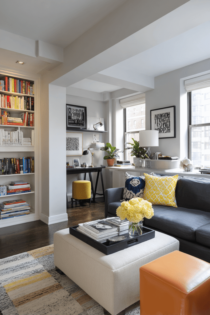
1. The “Floating” Island Layout
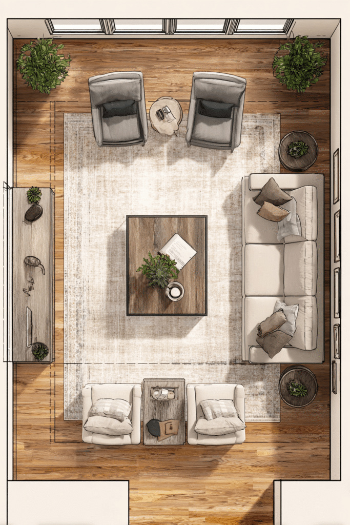
Most homeowners instinctively push every piece of furniture against the walls to create a “dance floor” of empty carpet in the middle. Ironically, this emphasizes the room’s limited boundaries and creates a disconnected, “waiting room” atmosphere. Instead, the Floating Island layout pulls the sofa and armchairs toward the center, creating an intimate conversation circle that exists independently of the walls.
By leaving even just a few inches of breathing room behind the sofa, you create shadows that imply depth, making the walls appear to recede rather than encroach. This layout creates a dedicated zone for living that feels intentional and cozy, rather than dictated by the architecture. It allows traffic to flow around the social zone rather than through it, preserving the energy of the space.1
Design Breakdown:
- Anchor with a Rug: Use a rug large enough that all front legs of the “floating” furniture sit on it, defining the island.
- Rear Console: Place a slim console table behind the floating sofa to act as a visual barrier and a surface for lamps or decor.1
- Traffic Lanes: Ensure there is a 30–36 inch walkway around the perimeter of the furniture grouping.3
- Rounded Edges: Choose a round or oval coffee table to soften the flow of movement around the tight center.4
- Focus Inward: Angle armchairs slightly inward to encourage eye contact and intimacy.
- Low Profiles: Keep furniture backs low to allow line-of-sight across the room, maintaining openness.
Best For: Open-concept apartments or square rooms where you need to define a lounge area distinct from a dining or entry zone.
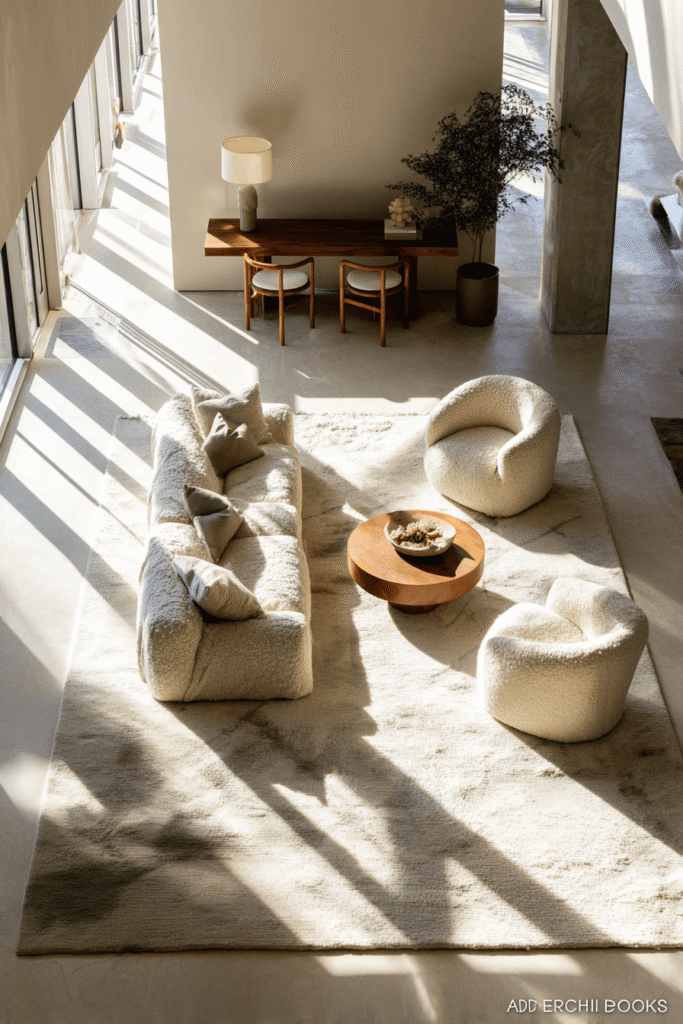
2. Japandi Zen: Low-Profile Serenity
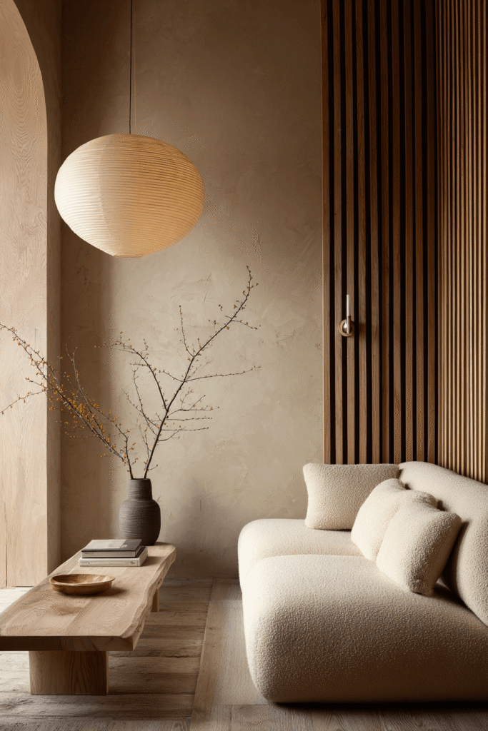
Trending heavily for 2025, Japandi (a hybrid of Japanese rustic minimalism and Scandinavian functionality) is the ultimate antidote to small-space claustrophobia. This aesthetic relies on low-profile furniture that sits closer to the ground. By lowering the center of gravity in the room, you maximize the vertical “white space” between the furniture and the ceiling, making standard height ceilings feel soaring and lofty.5
The visual language here is hushed and tactile. It avoids the starkness of clinical minimalism by introducing warm, natural textures like unfinished wood, bamboo, and linen. The absence of visual noise—clutter, bright patterns, sharp contrasts—allows the eye to glide effortlessly across the room, creating a psychological sense of expansion and calm.7
Design Breakdown:
- Ground-Hugging Sofa: Select a sofa with a low back and deep seat, ideally in a light, neutral boucle or linen.7
- Natural Palette: Stick to earth tones—oatmeal, cream, stone, and pale oak—to reflect light.8
- Slatted Wood: Incorporate vertical wood slats (on a media unit or wall panel) to add texture and verticality.8
- Paper Lighting: Use Noguchi-style paper lanterns that emit a soft, diffused glow without casting harsh shadows.9
- Intentional Empty Space: Leave negative space on shelves; styling should be sparse and sculptural.
- Biophilic Accents: Add a single, sculptural branch in a ceramic vase or a tall potted plant to connect with nature.10
Best For: High-stress urban dwellers seeking a calming retreat or rooms with lower ceilings.
3. The Color Drenched Cocoon

Conventional wisdom suggests painting small rooms white to make them look bigger, but 2025 sees a pivot toward “Color Drenching.” This technique involves painting the walls, trim, baseboards, and even the ceiling in the same rich, saturated hue. This monochromatic approach blurs the architectural lines that define the room’s corners and edges. Without these visual “stops,” the brain cannot easily register the room’s dimensions, creating an infinite, enveloping effect.11
This style turns a small, potentially dark room into a deliberate, moody “snug.” Rather than fighting the lack of light, it embraces it, creating a cozy, jewel-box atmosphere that feels luxurious and bespoke. Deep greens, navies, or terracottas recede visually, often making walls feel further away than they actually are, much like looking into the night sky.3
Design Breakdown:
- Unified Sheen: Use matte or eggshell for walls and ceiling, and a satin or semi-gloss in the exact same color for trim and doors.12
- Tonal Furniture: Choose larger furniture pieces (like the sofa) in a velvet or fabric that matches the wall color to make them disappear into the layout.11
- Metallic Pops: Use brass or copper accents (lighting, handles) to reflect light and break up the monochrome block.14
- Warm Lighting: Essential to prevent the room from feeling cave-like; use warm-temperature bulbs (2700K).
- Reflective Decor: Incorporate a mirror or glass surfaces to bounce light around the dark palette.15
- Rich Textures: Layer velvet, wool, and leather to add depth since you aren’t using color contrast.5
Best For: Media rooms, north-facing rooms with little natural light, or anyone who loves a moody, boutique-hotel aesthetic.
4. Vertical Impact with “High and Wide” Curtains

In a small living room, the window is your connection to the outside world and a critical tool for optical illusion. The “High and Wide” hanging method is a non-negotiable designer trick. By mounting the curtain rod 6–12 inches above the window frame (or directly below the ceiling molding) and extending it 10–12 inches past the frame on either side, you fundamentally alter the room’s perceived proportions.16
This layout creates two powerful effects: verticality and luminosity. The vertical lines of the drapery draw the eye upward, lifting the ceiling. Simultaneously, because the curtains stack against the wall rather than over the glass, you maximize the influx of natural light, which is the most potent space-expander available. The window appears larger and grander, lending the room a sense of stateliness.18
Design Breakdown:
- Floor-to-Ceiling Fabric: Curtains should “kiss” the floor; floating curtains shorten the visual height.19
- Vertical Patterns: Consider subtle vertical stripes or ribbing in the fabric to further enhance the height illusion.17
- Lightweight Fabric: Opt for linen or sheers that allow light to filter through, avoiding heavy, opaque brocades.20
- Tone-on-Tone: Match the curtain color to the wall color to create a seamless, uninterrupted peripheral view.20
- Invisible Hardware: Use sleek, minimal rods or ceiling-mounted tracks to keep the look clean.21
- Layering: Pair sheers with heavier side panels for functionality without sacrificing the daytime “open” look.19
Best For: Rooms with standard 8-foot ceilings or small windows that need to feel grander.
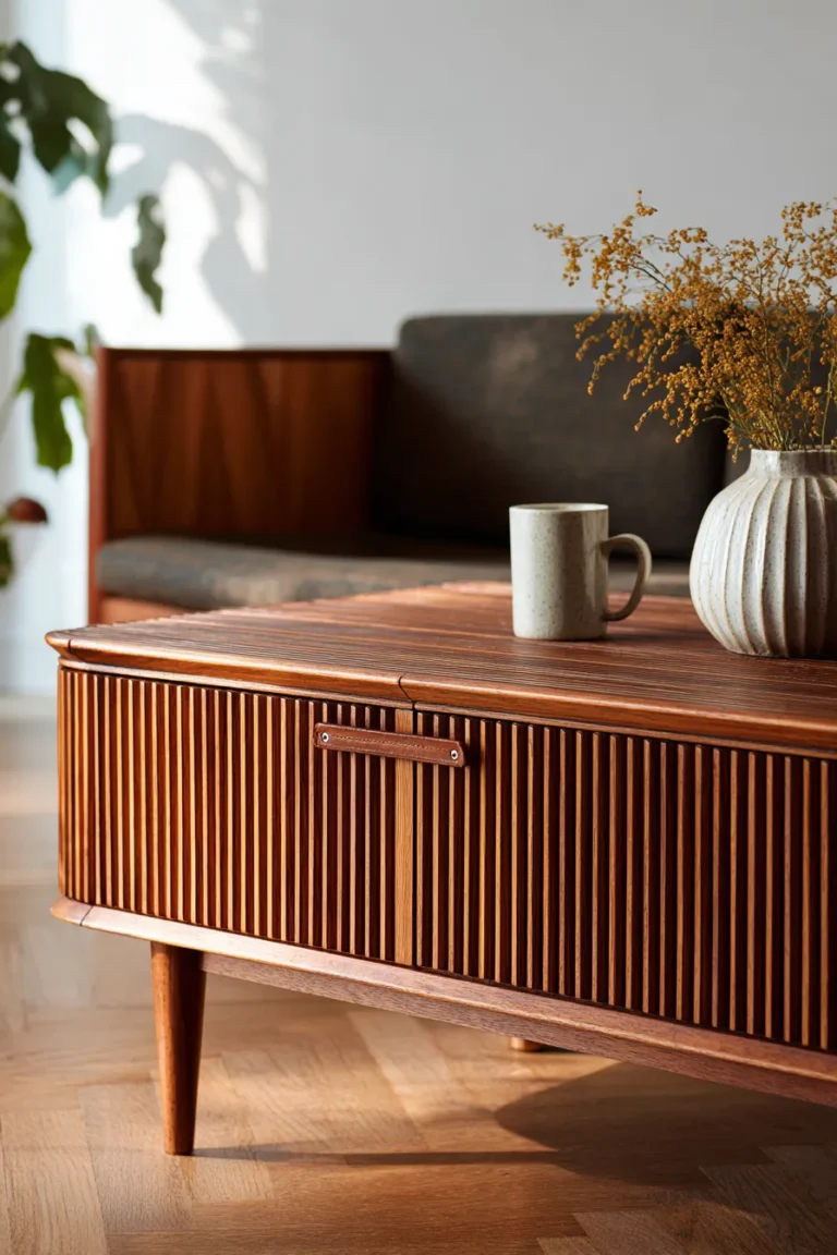
5. The “Leggy” Mid-Century Silhouette

Mid-Century Modern (MCM) design remains a gold standard for small living rooms because of its emphasis on “visual permeability.” The core principle here is the “leggy” silhouette—furniture raised on tapered legs rather than sitting flush on the floor. When the human eye can see the floor continuing underneath the sofa or sideboard, the brain interprets the room’s footprint as larger.10
This layout avoids the blocky, heavy feeling of skirted furniture or overstuffed recliners. It celebrates structure and negative space. The organic curves often found in MCM tables and chairs also help to soften the rigid boxiness of a small rectangular room, promoting better traffic flow and reducing shin-bumping hazards.23
Design Breakdown:
- Tapered Legs: Ensure the sofa, armchair, and media console all stand on exposed legs (at least 6 inches high).24
- Warm Wood Tones: Incorporate teak or walnut woods to bring warmth to the airy layout.25
- Sculptural Accents: Use a Noguchi-style coffee table or an Eames shell chair to add artistic form without visual bulk.26
- Sputnik Lighting: A multi-arm ceiling fixture draws the eye up and spreads light to all corners.10
- Slim Arms: Choose sofas with narrow “track arms” to maximize seating width within a compact frame.25
- Olive & Mustard: Use retro accent colors (olive green, mustard yellow) in cushions or art to add personality.10
Best For: Apartments with beautiful flooring (hardwood or polished concrete) that deserves to be seen.
6. Strategic Mirror Placement

Mirrors are the dynamic “windows” of a windowless wall. This layout centers on the strategic deployment of reflective surfaces to bounce light and duplicate views. Placing a large mirror directly opposite a window is the most effective iteration of this idea; it effectively doubles the natural light and creates a “pass-through” illusion, tricking the eye into thinking the room extends beyond the wall.16
However, the 2025 approach moves beyond simple wall-hanging. We are seeing oversized, floor-leaning mirrors that act as architectural features, or “grid” mirrors that mimic the look of industrial windows. This adds depth and dimension, breaking up solid walls that can feel oppressive in a tight layout.28
Design Breakdown:
- Opposite the Light: Position the primary mirror to catch and reflect the window view.27
- Oversized Leaning Mirror: A tall, floor-standing mirror adds casual drama and reflects the ceiling, enhancing height.16
- Grid Style: Use a window-pane mirror to add architectural interest and “false window” depth.28
- Reflective Decor: Complement mirrors with glass coffee tables or metallic lamp bases to keep light moving.27
- Gallery Integration: Work smaller mirrors into a gallery wall to add “breathing room” among the artwork.
- Avoid Clutter Reflection: Ensure the mirror isn’t reflecting a messy desk or a pile of laundry; curate the view it captures.
Best For: Narrow rooms or basements that suffer from limited natural light.
7. Curated Maximalism

Maximalism in a small space is a high-wire act—done wrong, it’s clutter; done right, it’s a jewelry box. The “Curated Maximalism” layout embraces the “more is more” philosophy but confines it within strict structures. It uses verticality to display collections, drawing the eye upward and keeping the footprint clear. This style creates a deeply personal narrative, wrapping the occupant in layers of texture, history, and color.29
The secret is the “Rule of Three” and vigorous editing. Objects are grouped into vignettes rather than scattered, turning chaos into composition. A floor-to-ceiling gallery wall becomes the focal point, commanding attention and distracting from the room’s small size by overwhelming the eye with beauty rather than emptiness.30
Design Breakdown:
- Floor-to-Ceiling Gallery: Fill one wall completely with art to create a singular, massive visual statement.24
- Jewel Tones: Use deep emeralds, sapphires, or ruby reds in velvet upholstery for richness.27
- Pattern Play: Mix patterns (florals with stripes) but keep them within a cohesive color family to avoid headaches.30
- Vignettes: Group decor items (books, candles, vases) in odd numbers (3 or 5) on trays to contain the “clutter”.22
- Statement Hero: Include one large-scale item (like an oversized lamp or a bold rug) to anchor the smaller trinkets.29
- Textural Layering: Combine glossy ceramics, rough jute, and soft velvet to create sensory depth.22
Best For: Collectors, creatives, and those who find minimalism cold or boring.
8. The L-Shaped Corner Anchor
In a small square or rectangular room, the corners are often underutilized “dead zones.” The L-Shaped Corner Anchor layout capitalizes on this by tucking a sectional sofa deep into the corner. Contrary to the belief that sectionals are too big for small rooms, a single streamlined sectional often creates a cleaner look than a sofa paired with separate armchairs, which can clutter the visual field with too many legs and gaps.4
This layout maximizes seating density while leaving the center of the room open for flow. It defines the “lounge zone” clearly and provides a cozy, wrap-around feel that encourages relaxation. It effectively turns the room’s limitation (a tight corner) into its greatest asset (a deep comfort zone).33
Design Breakdown:
- Tight-Back Sectional: Choose a style with a tight back (no loose cushions) to save 2–3 inches of depth.35
- Corner Placement: Push the sectional into the corner opposite the entry to open up the room’s volume.33
- Rug Unification: Ensure the rug sits under the front legs of the entire L-shape to tie it to the coffee table.4
- Nesting Coffee Tables: Use nesting tables instead of one large block to allow for flexibility and legroom.36
- Wall Sconces: Install sconces above the sectional to provide reading light without taking up floor space with end tables.37
- Light Colors: Keep the sectional fabric light (grey, beige) to prevent it from looking like a dark monolith.3
Best For: Families or households that prioritize lounging and TV watching over formal entertaining.
9. Industrial Chic Softness

Industrial design is perfect for small urban spaces because it celebrates the “bones” of the room—exposed brick, ductwork, or concrete—turning structural necessities into aesthetic assets. However, in a small living room, the harshness of industrial materials (metal, brick, raw wood) needs to be softened to avoid feeling cold or cell-like. This layout balances the raw with the refined.38
The aesthetic is “stripped back” and utilitarian, which naturally reduces clutter. Furniture often features mixed materials, such as black metal frames with reclaimed wood, which tend to have slimmer profiles than traditional wooden furniture. The high contrast of black accents against neutral walls provides a graphic, modern punch that defines the space sharply.40
Design Breakdown:
- Black Metal Accents: Use thin black metal frames for shelving and coffee tables to create crisp lines.39
- Textural Contrast: Soften raw brick or concrete walls with a plush, high-pile Moroccan rug or sheepskin throws.38
- Leather Seating: A distressed cognac leather sofa warms up the cool industrial palette and ages beautifully.39
- Edison Lighting: Use exposed bulb fixtures or metal cage pendants to reinforce the factory aesthetic.42
- Open Shelving: Use open metal-and-wood shelving units to display items without closing off the wall.39
- Greenery: Add large leafy plants to introduce life and softness against the hard edges.10
Best For: Lofts, studio apartments, or renters looking for a cool, edgy vibe that hides wear and tear.
10. “Invisible” Acrylic Accents
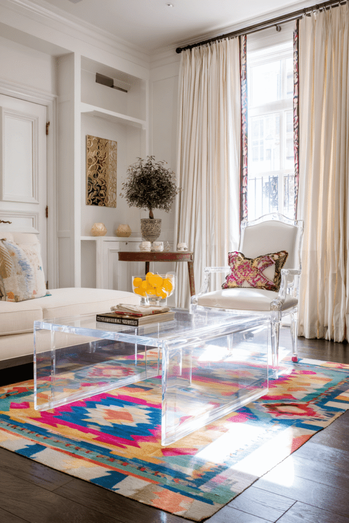
When square footage is at an absolute premium, “ghost” furniture is a secret weapon. This layout utilizes acrylic (Lucite), glass, or polycarbonate furniture that is visually weightless. Because these pieces are transparent, they allow light to pass right through them, and the eye to travel all the way to the floor and walls behind them. A clear acrylic coffee table or side chair fulfills its functional purpose while taking up zero “visual real estate”.43
This creates a sense of airiness and flow that solid furniture cannot match. It allows you to layer furniture (like placing a coffee table in front of a sofa) without the layout feeling heavy or blocked. It adds a touch of modern glam and keeps the focus on your textures and fabrics rather than the bulk of the furniture forms.
Design Breakdown:
- Waterfall Coffee Table: A clear acrylic waterfall table is sleek, safe (no sharp corners), and invisible.16
- Ghost Chairs: Use Louis Ghost style chairs for extra seating that doesn’t clutter the sightline.16
- Glass Tops: If acrylic isn’t your style, opt for metal tables with glass tops to maintain transparency.
- Reflective Quality: The glossy surface of acrylic reflects light, adding a subtle sparkle.
- Layer with Texture: Place invisible tables over a textured rug (jute or patterned wool) so they don’t get lost visually.
- Keep it Clean: This style requires diligence; fingerprints show easily, so it’s less ideal for homes with toddlers.
Best For: Extremely tight spaces or rooms with busy rugs/floors that you want to show off.
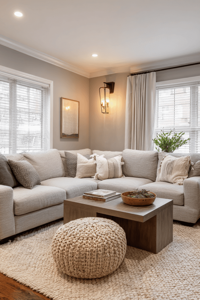
11. The Rug Foundation Strategy
A common mistake in small rooms is using a small rug (“the postage stamp effect”), thinking it scales with the room. In reality, a small rug chops the floor into visually disjointed sections, making the room feel smaller and cluttered. This layout uses an oversized rug—typically 8×10 or larger—to act as the room’s foundation. The rug dictates the size of the “living zone,” and a larger zone feels like a larger room.44
By extending the rug to within 12–18 inches of the walls, you push the visual boundaries outward. It unifies the furniture, anchoring the sofa, coffee table, and chairs onto a single “island,” which feels cohesive and expansive. It also dampens sound, making a small, boxy room feel acoustically warmer.46
Design Breakdown:
- Front Legs On: Ensure at least the front legs of all major seating pieces rest on the rug.45
- 12-Inch Border: Leave a strip of flooring visible around the perimeter to frame the space.49
- Light & Neutral: A light-colored rug will reflect light up from the floor, brightening the whole volume.44
- Subtle Pattern: A large-scale, subtle pattern works better than a tiny, busy pattern which can look chaotic.47
- Texture over Color: Use a jute or wool blend to add interest without overwhelming the color palette.
- Zoning: In an open plan, use the rug to draw a definitive line between the “living room” and the “dining area”.5
Best For: Open concept layouts or rooms with unappealing flooring that needs covering.
12. Lighting Layers: No Overheads

The single central ceiling light (often a flush mount “boob light”) is the enemy of the small living room. It casts a harsh, top-down glare that flattens the room and leaves the corners in shadow, shrinking the perceived space. This layout relies entirely on “layered lighting” situated at varying heights—floor, table, and wall. This creates pools of warm light that draw the eye to different zones, creating depth and mood.50
By illuminating the corners and walls, you visually push the boundaries of the room outward. Wall sconces (even plug-in ones) are particularly valuable as they add light without consuming floor or table space, freeing up surfaces for books or drinks.37
Design Breakdown:
- The Triangle Rule: Place three light sources in a triangular formation around the room to balance illumination.37
- Wall Washing: Use directional floor lamps or sconces to wash light up the walls or onto the ceiling to raise the visual height.51
- Plug-In Sconces: Utilize swing-arm sconces above the sofa for reading light; no electrician required.52
- Dimmer Switches: Essential for controlling the mood and transitioning from “home office” bright to “movie night” cozy.
- Warmth: Stick to 2700K-3000K bulbs for a cozy, inviting glow.5
- Task vs. Ambient: Combine a floor lamp (task) with a table lamp (ambient) for functional versatility.
Best For: Rooms with low ceilings or rentals where you cannot change the hardwired fixtures.
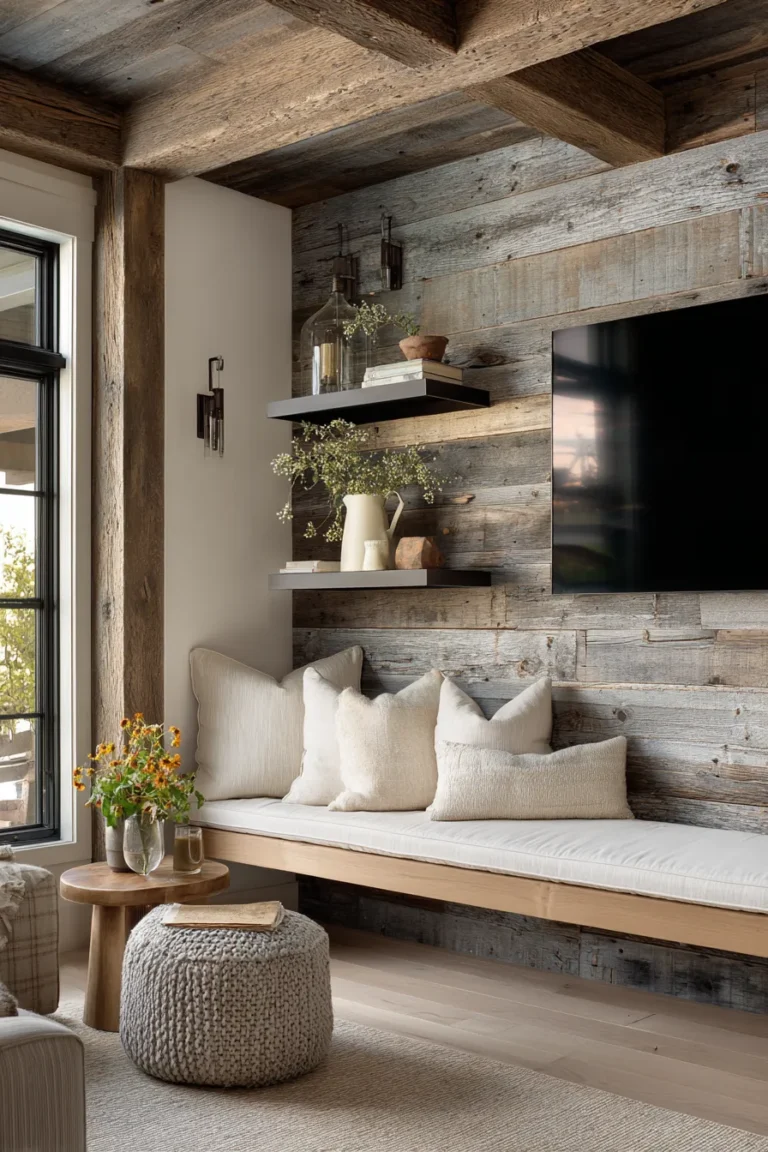
13. Multifunctional “Jewel Box” Zoning
In studio apartments or small homes, the living room often has to double as an office, dining room, or guest room. The “Jewel Box” zoning layout treats these functions as distinct, beautiful vignettes rather than a cluttered mess. It uses furniture to “draw lines” in the room. A console table behind a sofa, an open bookshelf perpendicular to a wall, or a folding screen can act as a soft partition.24
This approach is about “rooms within a room.” By giving every activity a specific “zone,” you prevent the psychology of living in a bedroom or a hallway. The key is to use multifunctional furniture—ottomans with storage, nesting tables, drop-leaf desks—that transforms based on the time of day.5
Design Breakdown:
- The Divider: Use a low bookshelf or console table to separate the lounge from a workspace.24
- Storage Ottomans: Replace the coffee table with a pair of storage ottomans (trays on top for drinks) to hide blankets/tech.44
- Vertical Desk: Use a wall-mounted ladder desk that utilizes vertical height and has a small footprint.36
- Nesting Tables: Pull them apart when guests arrive; stack them when you need floor space for yoga.14
- Hidden Tech: Use cabinets with cane or slat doors to hide routers and consoles while allowing remote signals to pass through.5
- Unified Palette: Keep the color scheme consistent across all zones to prevent visual fragmentation.24
Best For: Studio apartments, remote workers, and busy households requiring high functionality.
Conclusion
The constraints of a small living room are often the catalyst for the most creative design solutions. By abandoning the desire to fit “standard” furniture layouts into a non-standard space, you unlock the potential for a home that feels bespoke and intimate. Whether you embrace the moody depth of color drenching or the airy transparency of acrylics, the goal remains the same: to guide the eye, manipulate light, and create a space that feels expansive not in square footage, but in style and comfort.
FAQs
1. What is the best color for a small living room?
While white and light neutrals are classic for reflecting light and expanding space 54, 2025 trends also favor “Color Drenching” with moody hues like navy, sage, or terracotta. Painting walls, trim, and ceiling the same dark color blurs the room’s edges, creating an infinite, cozy effect.11
2. How do I choose a rug size for a small room?
Always go bigger than you think. A rug that is too small (floating in the center) makes the room look chopped up. Choose an 8×10 or 9×12 rug that allows at least the front legs of your sofa and chairs to sit on it. Leave about 12–18 inches of bare floor around the edges to frame the space.47
3. Can I use large furniture in a small living room?
Yes. One large piece (like a sectional) often makes a room feel larger than many small pieces (like a loveseat + two chairs), which can create “visual clutter.” The key is proportion and profile—choose pieces with clean lines and exposed legs to keep the look airy.1
4. How can I add storage without cluttering the room?
Utilize vertical space and hidden storage. Install floor-to-ceiling shelving to draw the eye up. Use multifunctional furniture like storage ottomans, benches with lids, or sofas with built-in storage compartments. Keep everyday clutter hidden in baskets or closed cabinets.53
5. What is the “Japandi” style mentioned for small spaces?
Japandi is a hybrid of Japanese rustic minimalism and Scandinavian functionality. It is perfect for small spaces because it focuses on decluttering, low-profile furniture (which creates more visual height), and natural textures like wood and bamboo. It creates a calm, Zen-like atmosphere that reduces the stress of a cramped environment.5