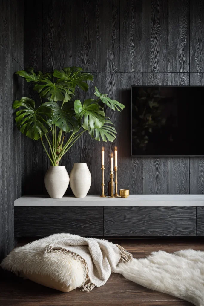
The 2026 TV wall paradigm abandons the ‘feature wall’ mentality in favor of architectural integration—where recessed millwork, concealed mechanical venting, and light reflectance values create a unified spatial plane rather than a competing focal point.
Walk into any luxury interior today and you’ll notice something missing: the overwrought “entertainment center” that dominated the previous decade. The shift reflects a broader cultural exhaustion with visual noise. Designers now prioritize material honesty, acoustic wellness, and what I call “invisible infrastructure”—systems that support modern living without announcing themselves. This approach requires precision in material adjacency, an understanding of how shadow gaps manipulate spatial perception, and the confidence to let negative space do the work.
Why 2026 TV Walls Look Nothing Like 2023
Three forces are reshaping residential media spaces. First, the wellness economy has infiltrated home design—specifically, acoustic transparency ratings now matter as much as thread counts did five years ago. Hard-surface interiors (terrazzo, concrete, marble) require strategic sound absorption, and TV walls present the largest uninterrupted plane to address echo. Second, sustainability mandates are pushing designers toward long-lifecycle materials with authentic patina potential rather than veneers that degrade. Third, asymmetric balance has replaced the symmetrical built-ins that dominated Pinterest boards—a reflection of how we actually use spaces rather than stage them for photos.
Color psychology plays a quiet role here too. Neutrals with high LRV (Light Reflectance Value) between 60-85 bounce ambient light rather than absorb it, which reduces the need for supplemental lighting and creates a perceptual expansion of square footage. This matters exponentially in compact living room designs for small spaces where every reflected lumen counts.
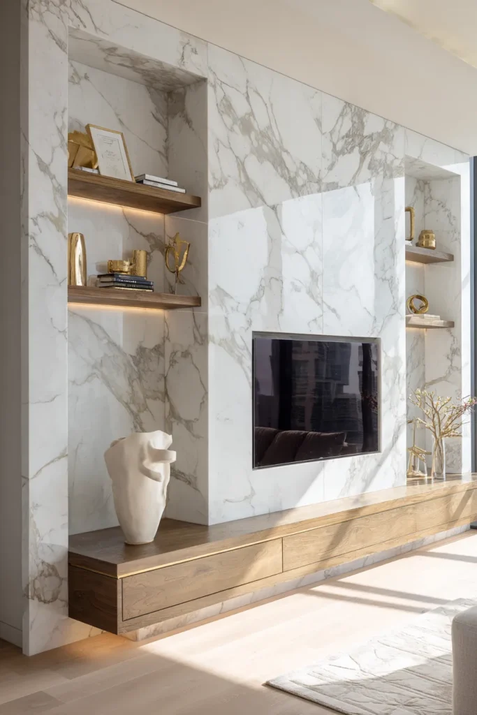
Recessed Travertine Niche with Shadow Gap Perimeter
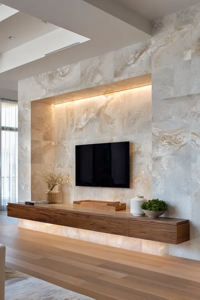
The honed travertine niche treats the TV as a sculptural void rather than an applied element. A 50mm shadow gap around the perimeter—lit with recessed LED strip lights at 3000K—creates the optical illusion that the recess floats independent of the surrounding wall plane. This isn’t about “framing” the television; it’s about erasing the distinction between architecture and equipment.
Design Breakdown:
- Honed travertine slabs in Ivory or Noce finishes (avoiding polished surfaces that create glare)
- 50mm shadow gap perimeter with continuous LED tape (3000K warm white, CRI 95+)
- Depth of 150-200mm to fully recess 65″ displays plus ventilation clearance
- Floating media console in matching travertine or contrasting walnut
- Acoustic considerations: pair with fabric panels on adjacent walls to counteract stone’s reflective properties
Designer’s Secret: Travertine’s natural veining should run horizontally across the niche to create visual width. Vertical veining—which most installers default to—compresses the space optically and fights against the screen’s 16:9 aspect ratio.
Best For: Warm minimalist collectors who want thermal mass (travertine stores and releases heat slowly) and aren’t intimidated by natural stone’s maintenance requirements. Ideal for modern luxury bedrooms that extend living zones.
Warm Minimalist Variation
Pair ivory travertine with unlacquered brass brackets supporting floating shelves. Add a single sculptural ceramic vase in terracotta to bridge the temperature between cool stone and warm metals.
Brutalist Edge Variation
Use Noce travertine with raw steel cantilevered shelves in blackened finish. Replace LED tape with exposed filament bulbs in industrial cages for theatrical shadow play.
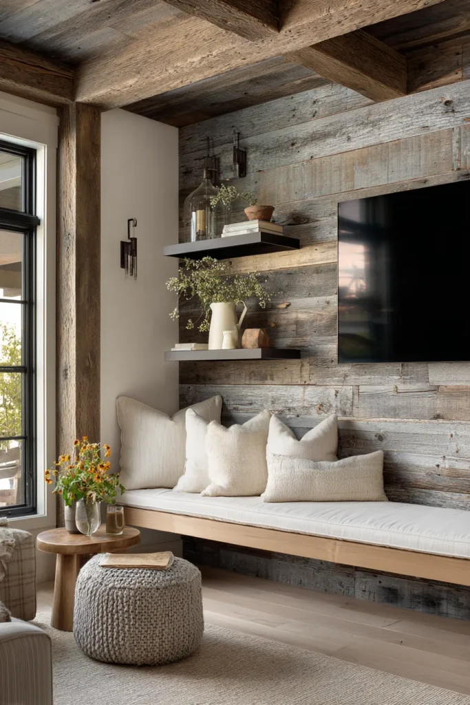
Floor-to-Ceiling Fluted Oak Slat System (18mm Spacing)
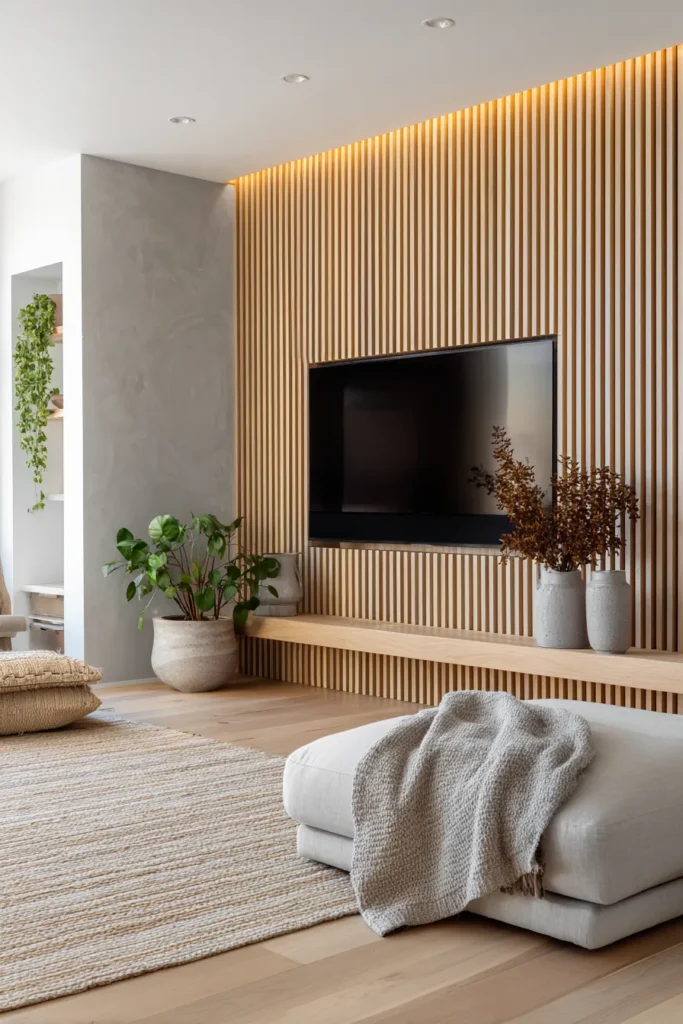
Vertical slat systems have proliferated to the point of cliché, but the 2026 iteration corrects previous mistakes. Slat spacing at precisely 18mm creates acoustic diffusion without becoming a dust trap, while the vertical grain orientation draws the eye upward—critical in spaces with standard 2.7m ceilings. The key is treating slats as a continuous architectural plane rather than a decorative appliqué.
Design Breakdown:
- White oak slat panels with 18mm spacing (avoiding the overly narrow 10mm gaps that read as fussy)
- Extend floor-to-ceiling and wall-to-wall for spatial continuity
- Recessed TV mounting with low-profile plate flush to slat plane
- Smart lighting system behind slats creates ambient backglow
- Pair with jute area rug (minimum 12mm pile height) to absorb mid-frequency sound
Designer’s Secret: Oak slats read as yellow-toned under 2700K lighting and ash-gray under 4000K. If your space has abundant warm wood tones, use 3500K bulbs to neutralize the oak without making it look clinically cold. This is the temperature sweet spot most designers miss.
Best For: Japandi purists and professionals working from home who need acoustic dampening for video calls. The vertical rhythm also benefits small living room layouts by creating perceived height.
Japandi Interpretation
Combine white oak slats with a low-profile walnut console, minimal wall-mounted planters with pothos, and woven linen throw in natural flax.
Art Deco Revival Interpretation
Use darker walnut slats with brass picture lights flanking the TV and a single framed geometric print in gilt frame.
Acoustic Bouclé Fabric Panel Wall with Concealed Mounting
This approach weaponizes textiles as architectural elements. High-NRC (Noise Reduction Coefficient) fabric panels in bouclé weave absorb 0.85+ of sound energy while providing tactile depth that hard surfaces can’t match. The TV mounts behind the fabric on a pull-out articulating arm, invisible when not in use.
Design Breakdown:
- Acoustic fabric panels in ivory or taupe bouclé (minimum 600gsm weight for structural integrity)
- MDF frame system with concealed TV mounting mechanism
- Panel depth of 50mm to accommodate acoustic backing material
- Flank with frosted glass sconces to prevent bouclé from reading as flat
- Velvet cushions in coordinating tones on nearby seating to reinforce textural theme
Designer’s Secret: Bouclé’s looped surface creates micro-shadows that shift throughout the day—but only if lit from an angle. Direct overhead lighting flattens the texture completely. Position sconces at 60° angles from the panel face for optimal depth perception.
Best For: Monochrome maximalists who prioritize acoustics (essential for music listeners or home theaters) and want a sensory experience beyond the visual. Works beautifully in luxury living rooms where multiple textures layer without competing.
Monochrome Luxe Variation
All-ivory palette: ivory bouclé panels, cream linen sofa throw, white oak floors, and a single black bronze objet as punctuation.
Earthy Neutral Variation
Taupe bouclé with terracotta accents, live edge wood bowl, and large fiddle leaf fig in concrete planter.
Blackened Steel Fireplace Surround with Cantilevered Hearth
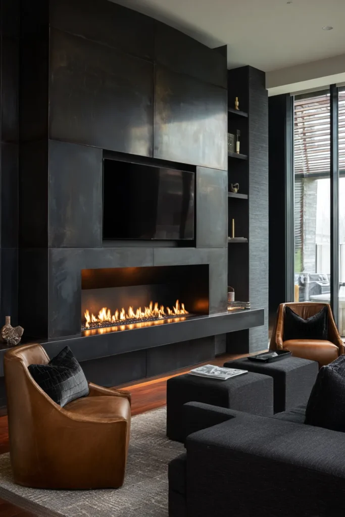
The fireplace-TV pairing has become standard, but most executions fail because they treat the two elements as competitors. The solution is material unity: a blackened steel surround that extends floor-to-ceiling creates a singular monolithic plane. The cantilevered hearth—projecting 400mm—provides visual weight at the base without interrupting the vertical sweep.
Design Breakdown:
- Blackened steel plate (3mm thickness) extending full wall height
- Linear gas fireplace insert (1200mm minimum width for proportional balance)
- Cantilevered steel hearth at 400mm projection
- TV mounted at eye-level when seated (typically 1100-1200mm from floor to center)
- Backlit LED panel behind steel creates subtle halo effect
- Aged bronze handles on adjacent cabinetry echo the steel’s patina
Designer’s Secret: Blackened steel develops a living patina that will mottle over time. This is a feature, not a flaw—but it requires client education. Seal with beeswax annually to control (not eliminate) the aging process and prevent rust blooms in humid climates.
Best For: Industrial refinement enthusiasts and empty-nesters downsizing from traditional homes who want drama without ornamentation. The steel’s thermal mass also complements 70s modern living room aesthetics.
Industrial Refined
Pair with cognac leather accent chairs, charcoal velvet ottoman, and a single oversized art print in charcoal frame.
Mountain Modern
Combine steel with reclaimed Douglas fir beams, stone tile surround, and organic woven wall hanging in neutral tones.
Book-Matched Walnut Veneer with Integrated Media Vents
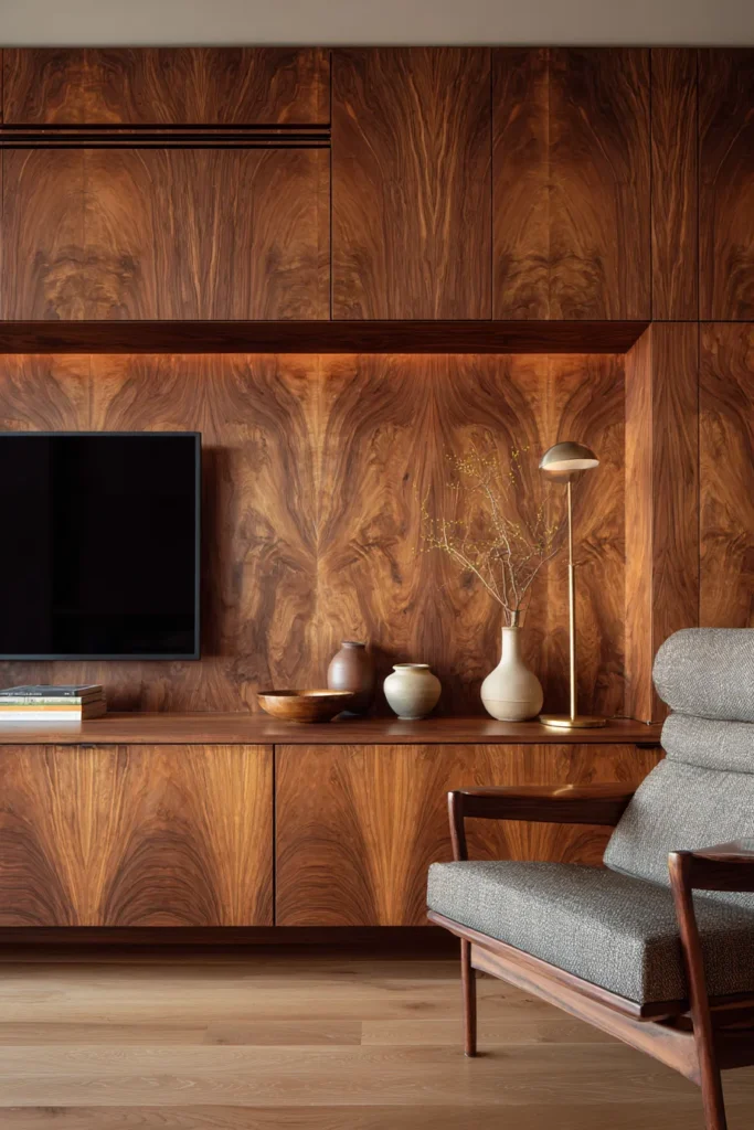
Book-matching—where consecutive veneer sheets are opened like a book to create mirror-image grain patterns—elevates walnut from material to art. The symmetry provides visual anchor points that make asymmetric TV placement feel intentional rather than haphazard. Integrated media vents (concealed within the grain pattern) solve the heat dissipation problem without visible grilles.
Design Breakdown:
- Book-matched walnut veneer sheets (rift-cut for subtle, linear grain)
- Integrated ventilation slots laser-cut to follow grain lines
- Floating media console in matching walnut with push-latch doors
- Minimal asymmetric shelving in same veneer for visual continuity
- Coffee table books on architecture and mid-century design as styling elements
- Perimeter LED strip lighting at 2700K to emphasize walnut’s warmth
Designer’s Secret: Walnut darkens over time with UV exposure—sometimes dramatically. If you’re book-matching, ensure both veneer sheets come from the same log and same position within that log. Even small variations in density will cause uneven aging that destroys the mirror effect within 3-5 years.
Best For: Mid-century purists and collectors who appreciate craftsmanship details that reward extended viewing. This approach also works in dining rooms when you want material continuity between living zones.
Mid-Century Purist
Pair with Eames lounge chair, brass standing lamp, and minimal ceramic vessels in earth tones on floating shelf.
Contemporary Craft
Combine walnut with handwoven textiles, live edge wood accents, and cane webbing details on adjacent cabinetry.
Limewashed Brick Accent with Unlacquered Brass Shelving
Limewash over brick creates a chalky, matte surface that reads as plaster from a distance but reveals texture up close. The unlacquered brass shelving—which will patina from bright gold to warm bronze over 18-24 months—provides the metallic accent without feeling precious or frozen in time.
Design Breakdown:
- Existing or new brick wall treated with limewash paint (not latex paint disguised as limewash—verify mineral-based composition)
- Unlacquered brass brackets supporting floating shelves in white oak or walnut
- TV centered within brick field, mounted on articulating plate
- Decorative mirrors with aged brass frames on adjacent walls to create light bounces
- Woven wall hanging as soft element to counteract brick’s texture
- Consider fabric cable covers in linen to maintain refined aesthetic
Designer’s Secret: Limewash is vapor-permeable, which means it “breathes” and prevents moisture accumulation behind the brick. However, this also means it will wear unevenly in high-traffic areas. Embrace this—the mottled patina is the point. If you want consistency, you want paint, not limewash.
Best For: Mediterranean minimalists and loft dwellers who want to honor existing brick without the orange-red cliché. The combination works particularly well in entryway designs that flow into open living spaces.
Mediterranean Minimal
White limewash over brick, brass shelving, terracotta vessels, and large potted olive tree in concrete planter.
Brooklyn Loft
Gray-toned limewash, blackened steel shelving, vintage framed prints, and industrial glass sconces.
Perforated Metal Screen (40% Open Ratio) for Equipment Concealment
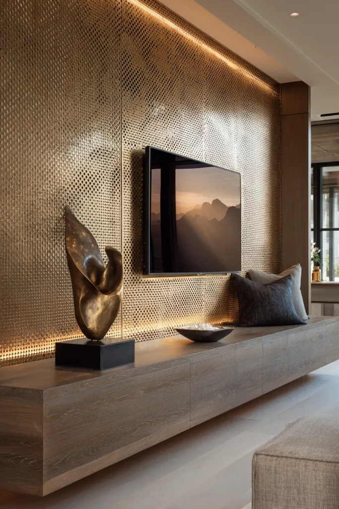
This solution addresses a problem most TV walls ignore: component heat and IR signal requirements. A perforated metal screen at 40% open ratio (meaning 40% of the surface is void space) allows infrared remote signals to pass through while concealing media equipment, cable boxes, and gaming consoles. The screen becomes the design statement, not the equipment behind it.
Design Breakdown:
- Perforated metal mesh panel in brushed brass, blackened steel, or aged bronze
- 40% open ratio for optimal IR transmission and ventilation
- Magnetic or sliding panel system for equipment access
- Credenza with push-latch doors below for additional concealed storage
- LED backlighting behind screen creates dimensional glow
- Area rug in wool or sisal to absorb sound reflection from metal
Designer’s Secret: Test your remote’s IR range through the perforated panel before final installation. Some remotes (particularly older universal remotes) use lower-power IR emitters that struggle with 40% ratios. If you encounter issues, specify 50% open ratio or invest in RF-based (radio frequency) remotes that don’t require line-of-sight.
Best For: Tech-forward minimalists and gamers who need equipment access without visual clutter. This approach is essential in home office designs that double as entertainment zones.
Tech-Forward Aesthetic
Brushed brass mesh, smart lighting system with programmable scenes, minimal walnut console, and abstract bronze sculpture.
Soft Industrial
Blackened steel mesh, linen throw pillows in charcoal, leather seating, and vintage framed photography.
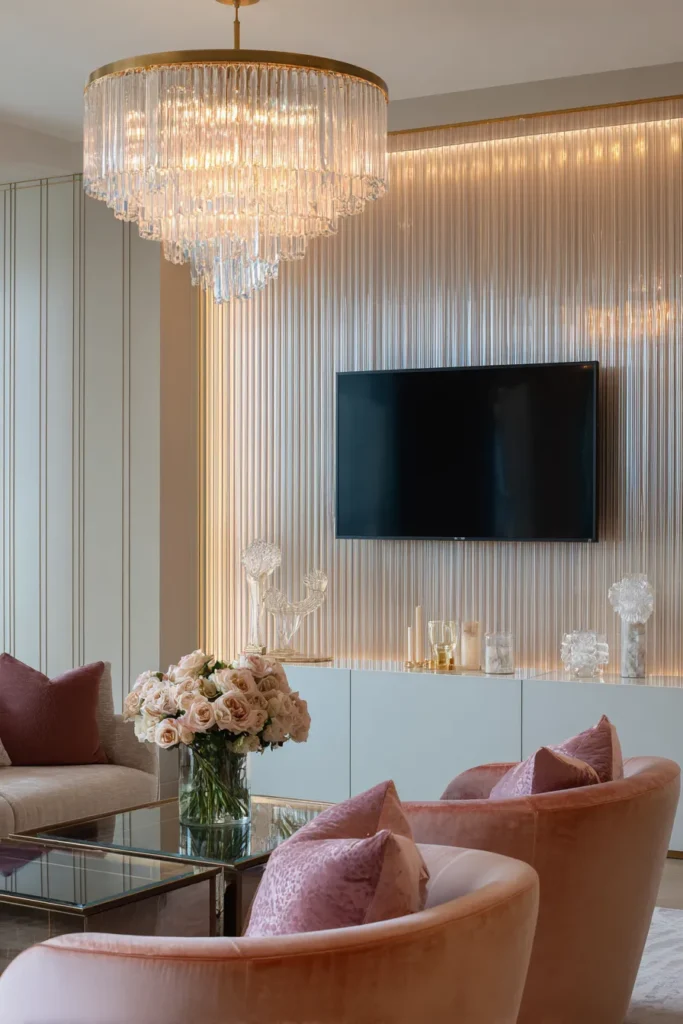
Full-Height Mirror Panels with Antique Finish (Reducing Visual Weight)
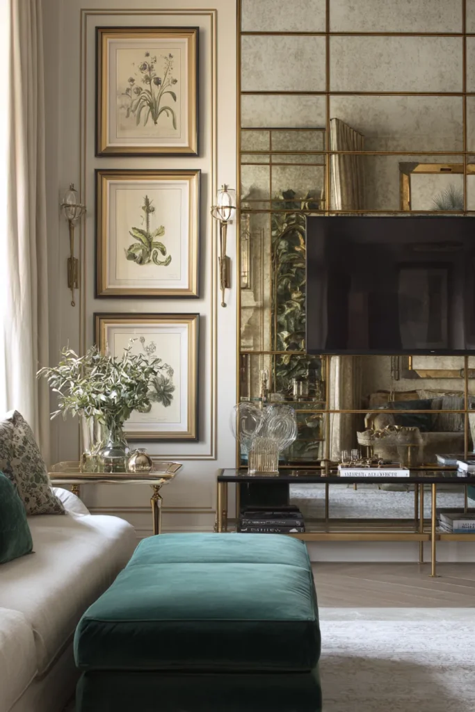
Mirrored TV walls get dismissed as dated, but that’s because most executions use bright, reflective mirror that doubles visual clutter. Antiqued or smoked mirror—with 30-40% reflectivity versus standard mirror’s 90%—creates spatial expansion without the funhouse effect. The TV appears to float in ambiguous depth.
Design Breakdown:
- Antiqued or smoked mirror panels floor-to-ceiling (specify “antique bronze” or “smoke gray” tint)
- Low-profile TV stand in high-gloss black or brass to reflect in mirror
- Minimal surrounding decor—mirror does the work
- Backlit LED panels at 3000K behind mirror perimeter for soft halo
- Decorative brass tray with sculptural objects on console
- Consider vanity desk aesthetics for material continuity if bedroom-adjacent
Designer’s Secret: Antiqued mirror looks gray and dead under cool LED lighting (4000K+). Use exclusively 2700-3000K bulbs to bring out the warm bronze undertones in the mirror’s patina. This single specification makes the difference between “vintage glamour” and “abandoned hotel lobby.”
Best For: Parisian apartment devotees and small-space dwellers who need perceptual square footage expansion. The technique also works beautifully in bathroom vanity designs for material consistency.
Parisian Apartment Style
Antiqued mirror, ornate brass picture lights, velvet ottoman in deep emerald, and vintage framed botanicals.
Small Space Illusionist
Smoked mirror, floating white oak console, minimal ceramic vase with single sculptural branch, and linen curtains to soften edges.
Honed Marble Slab Wall with LED Edge Lighting (3000K)
Marble used to signal opulence, but honed (matte) finishes in 2026 read as restrained luxury. The lack of reflectivity eliminates glare from the TV screen, while the stone’s natural veining provides visual interest without pattern. Edge lighting—a 10mm gap around the marble perimeter with LED tape—makes the slab appear to float.
Design Breakdown:
- Honed marble slabs in Carrara (white with gray veining) or Nero Marquina (black with white veining)
- 10mm shadow gap perimeter with LED strip lighting at 3000K
- Bookmatched slab installation for mirrored veining pattern
- Floating media console in contrasting material (walnut if marble is white, white lacquer if marble is black)
- Brass or bronze hardware as metallic accent
- Air plants in minimalist holders as green punctuation
Designer’s Secret: Marble has “movement” (the direction of veining). Orient the veining horizontally across the TV wall to create visual width, or diagonally for dynamic energy. Avoid vertical veining, which compresses the space and fights against horizontal screen orientation—the same principle as the travertine niche.
Best For: Maximalists who want restraint and collectors who appreciate geological time scales. Marble’s billion-year formation story adds conceptual depth that resonates with thoughtful clients. Also ideal for luxury bathroom spaces extending into bedrooms.
Carrara White Luxe
White marble, brass shelving brackets, walnut floating console, ivory linen throw, and sculptural ceramic vase.
Nero Marquina Drama
Black marble, aged bronze handles, white lacquer console, charcoal velvet cushions, and dramatic oversized art print.
Asymmetric Floating Shelves in Varying Depths (Creating Shadowplay)
Symmetry feels safe, but asymmetric shelving reflects how we actually use spaces—clustering objects we reach for frequently, leaving gaps for visual breathing room. Varying shelf depths from 150mm to 400mm creates dimensional shadows that shift throughout the day, making the wall a dynamic rather than static element.
Design Breakdown:
- Asymmetric modular shelving in white oak, walnut, or matte black
- Depths ranging 150-400mm to create shadow variation
- TV positioned off-center within shelf composition
- Style with coffee table books, ceramic vessels, small plants, and negative space
- Picture light positioned to cast shadows across varied depths
- Decorative objects in varying heights to reinforce asymmetry
Designer’s Secret: Asymmetric arrangements follow the “rule of thirds” grid—divide your wall into nine equal sections and position the TV at one of the four intersection points (not center). This creates tension that reads as intentional rather than accidental. Most failed asymmetric walls simply look off-center because they ignore this underlying structure.
Best For: Gallery collectors and maximalist curators who want the TV to recede into a larger composition. This approach shines in wall art displays where the screen becomes one element among many.
Sculptural Modern
Matte black shelves, museum-quality prints, abstract bronze sculptures, minimal ceramic forms.
Gallery Collector
White oak shelves, mix of framed art and coffee table books, brass bookends, small wall-mounted planters.
Textured Plaster Wall with Integral Color (No Paint)
Integral color plaster—where pigment is mixed into the plaster itself rather than applied as paint—creates depth that painted walls can’t match. As light shifts throughout the day, the surface reveals subtle variations in tone that make the wall feel alive. This is the opposite of the flat, dead quality of most TV accent walls.
Design Breakdown:
- Textured plaster in integral earth pigments (terracotta, ochre, umber)
- Hand-troweled application for organic texture variation
- Limewash or mineral paint for sealing (maintaining vapor permeability)
- Floating walnut console to ground the warmth
- Woven textiles as wall art to reinforce handmade aesthetic
- Terracotta vessels and live edge wood as styling elements
Designer’s Secret: Plaster telegraphs every imperfection in the substrate wall. If you’re working with standard drywall (which is never truly flat), apply a skim coat first or embrace the irregularity as part of the aesthetic. Fighting against the wall’s natural character always looks worse than working with it.
Best For: Italian villa romantics and desert modernists who want tactile surfaces. The warmth counters the coolness of technology beautifully. This aesthetic also translates to earthy bedroom designs.
Italian Villa
Warm ochre plaster, aged brass hardware, terracotta vase with olive branches, linen throw in natural.
Desert Modernism
Pale umber plaster, blackened steel shelving, large cacti in concrete planters, geometric wall art.
Vertical Garden Living Wall with Integrated Irrigation
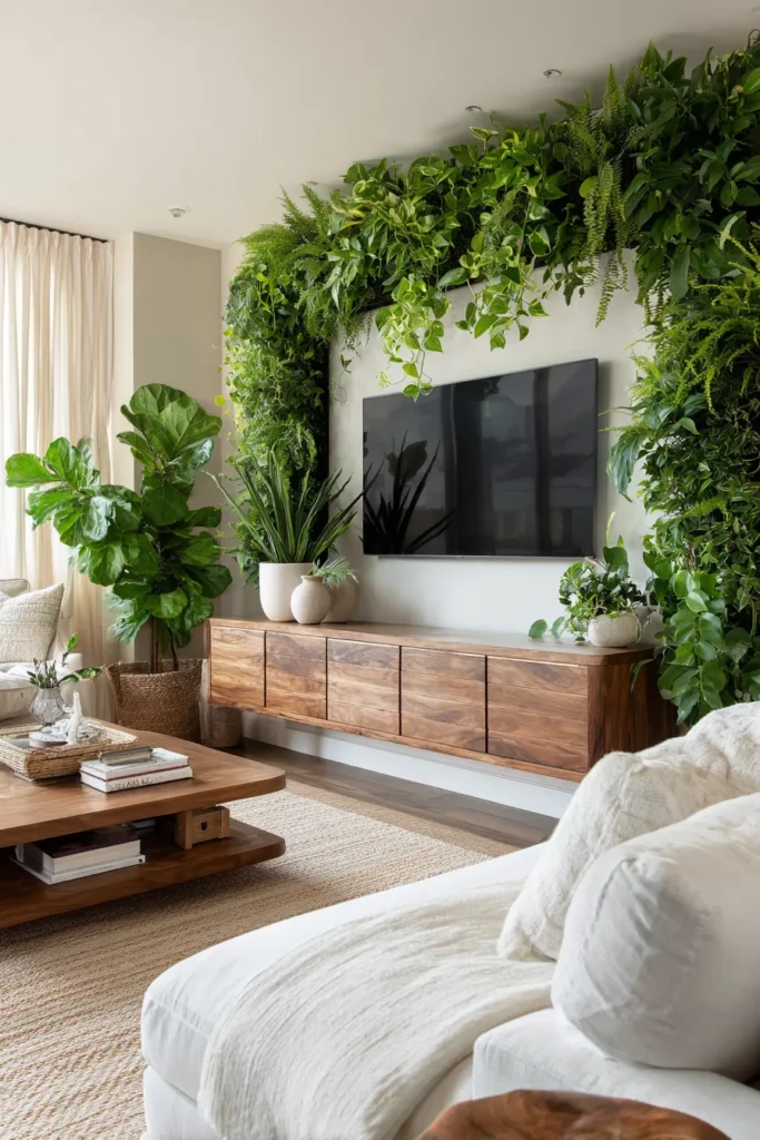
A living wall behind the TV solves multiple problems: biophilic connection (proven to reduce stress), acoustic absorption (plants dampen echo), and air purification. The key is selecting low-light tropical species that thrive in indirect light and installing automated irrigation to eliminate maintenance anxiety.
Design Breakdown:
- Modular living wall system with integrated drip irrigation
- Low-light species: pothos, philodendron, ferns, snake plants
- Wall-mounted planters in matte ceramic or concrete finish
- Large floor plants (monstera, fiddle leaf fig) flanking TV for scale continuity
- Natural fiber area rug to reinforce organic theme
- Warm LED lighting at 2700K to prevent plants from looking sickly
Designer’s Secret: Most living walls fail because designers spec sun-loving plants for interior walls that receive minimal natural light. Stick to proven low-light species and accept that growth will be slower than outdoor plants—this is a feature, not a bug, as it reduces maintenance. Supplement with full-spectrum grow lights if your client wants faster growth.
Best For: Biophilic maximalists and urban dwellers starved for nature. This approach works particularly well in balcony designs that transition to indoor living spaces, creating visual continuity.
Biophilic Maximalism
Dense plant coverage, woven wall hangings, natural wood console, jute rug, layered linen textiles.
Urban Jungle Refined
Minimal plant selection (3-5 species maximum), sleek black planters, white oak console, geometric art.
Charred Wood Shou Sugi Ban Treatment (Yakisugi Technique)
Shou sugi ban—the Japanese practice of charring wood to preserve it—creates a matte black surface with subtle grain texture visible up close. The charring process stabilizes the wood, making it dimensionally stable and insect-resistant. Visually, it provides the drama of black without the flatness of paint.
Design Breakdown:
- Charred wood slat panels (cedar preferred for traditional technique)
- Matte black surface with visible wood grain texture
- Floating console in light oak or white lacquer for contrast
- Brass or aged bronze hardware as warm metallic accent
- Textured linen cushions in cream or natural to soften severity
- Ceramic vessels in matte white for punctuation
Designer’s Secret: Authentic shou sugi ban requires sealing after charring to prevent carbon transfer (black dust rubbing off on everything). Use a clear, matte sealer and test on a sample board first—some sealers add a glossy sheen that destroys the dry, matte quality that makes the technique distinctive.
Best For: Japanese craft enthusiasts and Scandinavian dark aesthetic lovers. The technique bridges multiple design languages, making it versatile for boho bedroom or minimalist spaces alike.
Japanese Craft
Charred cedar, low walnut console, woven cane details, minimal ceramic forms, air plants.
Scandinavian Dark
Charred pine, white lacquer console, sheepskin throw, large monstera, brass candle holders.
Reclaimed Barn Wood with Visible Hardware (Authentic Patina)
Reclaimed barn wood carries decades of weathering—sun bleaching, water staining, nail holes, saw marks. This isn’t distressing applied in a factory; it’s authentic history. The visible hardware (original nails, bolt holes, metal strapping) becomes part of the narrative rather than something to conceal.
Design Breakdown:
- Reclaimed barn wood planks in horizontal installation
- Preserve all original hardware, patina, and imperfections
- Blackened steel or iron brackets for floating shelves
- Aged bronze TV mount to echo original hardware
- Live edge wood bowls and natural fiber textiles for material continuity
- Vintage or industrial lighting to reinforce rustic authenticity
Designer’s Secret: Reclaimed wood often contains hidden metal (nails, staples, wire) that will destroy saw blades. Always use a metal detector before cutting and budget extra for blade replacements. This isn’t a DIY material unless you’re prepared for the learning curve and expense.
Best For: Farmhouse purists and collectors who value provenance over perfection. The aesthetic works in farmhouse dining rooms extending into living spaces for material unity.
Farmhouse Elevated
Light gray-brown barnwood, white oak console, linen cushions in ivory, ceramic pitcher with wildflowers.
Rustic Collector
Dark weathered barnwood, iron shelving, vintage tools as art, leather seating, industrial glass fixtures.
Venetian Terrazzo Composite (Custom Aggregate Mix)
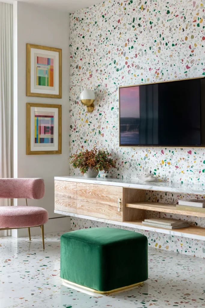
Terrazzo—marble chips suspended in cement or resin—returns in 2026 with custom aggregate mixes that tell specific stories. Specify chips from your region’s geology, or mix in colored glass, brass fragments, or mother-of-pearl for bespoke patterns. The result is a wall that’s genuinely unique rather than catalog-selected.
Design Breakdown:
- Custom terrazzo slabs with specified aggregate mix (work with fabricator on composition)
- Polished or honed finish depending on desired reflectivity
- Brass or bronze details to echo metal aggregate chips
- Floating console in contrasting material (wood if terrazzo is cool-toned)
- Geometric wallpaper on adjacent walls for pattern continuity
- Abstract art picking up aggregate colors
Designer’s Secret: Terrazzo’s visual busyness can overwhelm small TVs. This treatment works best with 65″+ screens that have sufficient visual weight to hold their own against the pattern. For smaller screens, use terrazzo on a partial wall height (bottom two-thirds) with solid color above.
Best For: Postmodern revivalists and collectors who want conversation-starting surfaces. The technique also translates to powder room designs for material consistency.
Postmodern Revival
Multicolor terrazzo with pink and green chips, brass hardware, geometric print, velvet ottoman in emerald.
Coastal Minimal
White terrazzo with shell aggregate, driftwood console, linen in natural, ceramic vessels in seafoam.
Reeded Glass Panels Backlit for Diffused Glow
Reeded (vertically ribbed) glass diffuses light while maintaining translucency—a quality that makes backlit installations particularly magical. The vertical reeding creates subtle shadow lines that shift as you move past the wall, adding kinetic interest to what could be a static plane.
Design Breakdown:
- Reeded glass panels with vertical ribs (6-10mm spacing)
- Backlit LED panels at 3000K creating diffused glow
- Brass or bronze frame around glass panels
- Floating console in high-gloss white or brass to reflect glow
- Velvet or silk cushions in jewel tones for luxe contrast
- Antiqued mirror on adjacent walls to multiply light effect
Designer’s Secret: Reeded glass is directional—the ribs run vertically, and reversing this (horizontal ribs) reads as a mistake rather than a choice. If you want horizontal linear texture, use fluted wood or metal instead. Glass ribs are always vertical in refined installations.
Best For: Art Nouveau devotees and soft glam aesthetics. The diffused light is particularly flattering for skin tones, making it ideal for spaces where people gather and photograph frequently. Consider for vanity room designs extending into bedrooms.
Art Nouveau Nod
Reeded glass in aged brass frame, curved furniture, botanical prints, organic ceramic forms.
Soft Glam
Reeded glass in polished brass, high-gloss white console, blush velvet seating, crystal objets.
Woven Cane Paneling with Walnut Frame (Artisan Craft)
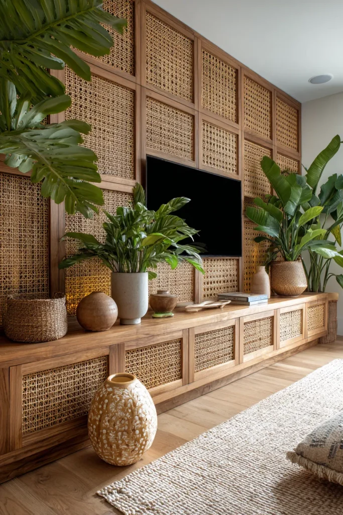
Cane webbing—traditionally found in chair seats—scales to architectural applications beautifully. The woven texture provides visual warmth without pattern, and the material’s translucency allows backlighting effects similar to reeded glass but with organic rather than industrial character.
Design Breakdown:
- Pre-woven cane webbing sheets in natural finish
- Walnut frame system creating geometric grid pattern
- Backlit LED strips at 2700K creating amber glow through cane
- Floating walnut console continuing material theme
- Woven textiles, natural fiber rug, and live plants reinforcing organic aesthetic
- Brass or wood objets as minimal styling
Designer’s Secret: Cane yellows over time with UV exposure—embrace this or spec UV-filtering window treatments. Fighting natural material aging always looks worse than designing with it. The patina enriches rather than degrades if you’re working with quality materials.
Best For: Tropical modern enthusiasts and 70s resurgence devotees. The handcrafted quality appeals to clients who want to support artisan techniques. Works beautifully in reading nook designs creating material continuity.
Tropical Modern
Natural cane, teak console, large palms, rattan accessories, linen in sand tones.
70s Resurgence
Cane with darker walnut frame, cognac leather seating, vintage pottery, macramé wall hanging, brass floor lamp.
Designer’s Warning: Three Fatal Mistakes
Over-Scaling the TV Relative to Wall Proportions A 75″ TV on an 8-foot wall leaves no breathing room—the screen dominates rather than integrates. The ideal ratio is 40-50% screen to wall width. If your TV is larger, expand the wall treatment to adjacent walls to create proper proportion.
Ignoring Acoustic Bounce in Hard-Finish Rooms Stone, metal, and glass reflect sound waves, creating echo that fatigues over time. If you’re using hard materials for your TV wall, you must counterbalance with soft furnishings—upholstered seating, fabric panels, area rugs—within the same space. Acoustic comfort isn’t optional; it’s physiological.
Mixing Incompatible Material Temperatures Without Transition Elements Cool materials (marble, steel, glass) paired directly with warm materials (walnut, brass, terracotta) creates visual discord. You need a neutral bridge—white oak, linen, matte black—to mediate the temperature shift. This is why successful rooms feel coherent even with diverse materials.
Material Pairing Matrix: What Actually Works Together
Stone + Unlacquered Brass Geological timescale meets human timescale. Both materials develop living patinas that deepen with age rather than degrade.
Wood Slats + Acoustic Fabric Visual rhythm meets sound absorption. The slats provide pattern while fabric dampens the sound reflections that wooden surfaces would otherwise create.
Plaster + Raw Steel Soft meets hard. Plaster’s organic texture counterbalances steel’s industrial precision, creating tension that reads as intentional rather than confused.
Marble + Aged Bronze Classical pairing with contemporary restraint. The metals’ warm patina prevents marble’s coolness from feeling sterile.
These seventeen approaches share a common thread: they treat the TV wall as an architectural problem requiring holistic solutions rather than a decorating opportunity for surface application. Material selection, lighting design, acoustic performance, and spatial proportion all factor equally. The result is rooms that support how we actually live—watching, gathering, working, relaxing—without announcing their infrastructure.
The best TV wall is the one you stop noticing as a “TV wall” within a week of installation. When the technology recedes and the room feels complete without calling attention to any single element, you’ve succeeded. That’s the 2026 standard: integration over exhibition, function embedded in beauty, infrastructure made invisible through design precision.
For spaces requiring different solutions, explore our guides on kitchen cabinet colors, living room paint colors, and coffee table styling for comprehensive material and color guidance that complements these TV wall strategies.