The right paint color sets the entire mood of your living room—from calm and collected to bold and dramatic. Whether you’re drawn to soft neutrals that create serenity or deep, moody tones that add character, the perfect shade is waiting to transform your walls into a canvas for your personal style. Each color tells a different story, and finding yours means understanding how light, furniture, and atmosphere work together to create a space that feels genuinely yours.
1. Soft Greige for Timeless Elegance

Greige walks the perfect line between grey and beige, offering a sophisticated neutral that never feels cold or flat. This versatile shade adapts beautifully to changing light throughout the day, appearing warmer in morning sun and more refined as evening approaches. It’s the ultimate chameleon color that works with virtually any design style.
Interior designers favor greige for its ability to ground a space without competing with furnishings or artwork. Unlike stark white or pure grey, greige brings warmth while maintaining the clean, modern aesthetic that contemporary homes crave. It’s particularly stunning when paired with natural wood tones and layered textiles, creating depth without visual weight.
Design Breakdown:
- Choose undertones carefully — some greiges lean pink, others olive; test samples in your actual lighting
- Pair with crisp white trim to define architectural details and add sharpness
- Layer in warm metals like brass or aged gold for elevated contrast
- Balance with varied textures — linen curtains, velvet pillows, woven throws
- Works beautifully with both light and dark wood furniture pieces
- Consider a matte finish for a more sophisticated, velvety appearance
- Anchor with deep charcoal or black accents in artwork or decorative objects
- Complements both cool-toned greys and warm beiges in adjacent rooms
- Allows colorful accent pieces to pop without overwhelming the palette
- Ideal for open-concept spaces where flow between rooms matters
Best For: Modern farmhouse, transitional interiors, or anyone seeking a fail-safe neutral that feels current and collected.
2. Deep Forest Green for Cozy Drama

Rich, enveloping forest green transforms living rooms into intimate retreats that feel both luxurious and grounded. This shade carries the depth of nature indoors, creating walls that seem to wrap around you with warmth and sophistication. The color shifts beautifully throughout the day—nearly black in shadows, jewel-toned in direct light.
Forest green works exceptionally well in rooms with architectural character like exposed beams, brick fireplaces, or detailed molding. The dramatic backdrop makes lighter furniture and metallic accents truly shine, while also supporting a maximalist approach with layered patterns and rich textiles. It’s a bold choice that rewards commitment with serious style impact.
Design Breakdown:
- Enhance with warm brass or gold hardware on furniture and lighting fixtures
- Layer in cream or ivory upholstery to prevent the space from feeling too dark
- Add abundant natural textures — leather, rattan, raw wood, wool
- Use generous lighting with multiple sources including floor lamps and sconces
- Pair with lighter wood floors or neutral area rugs to balance intensity
- Incorporate botanical prints and real plants to reinforce the natural connection
- Consider painting trim in a soft cream rather than stark white for cohesion
- Balance with lighter ceiling paint to maintain airiness and height
- Works beautifully as an accent wall if full-room commitment feels too bold
- Complements jewel tones like burgundy, navy, or burnt orange in accessories
Best For: Traditional homes, cozy reading rooms, or spaces where you want to create an intimate, sophisticated atmosphere.
3. Warm Terracotta for Earthy Comfort

Terracotta brings sun-baked warmth and organic energy to living spaces, evoking Mediterranean afternoons and desert landscapes. This earthy orange-red sits between bold and neutral, offering personality without overwhelming. The color naturally creates a cozy, welcoming atmosphere that makes spaces feel instantly lived-in and loved.
What makes terracotta exceptional is its ability to work across design styles—from bohemian to modern minimalist. The shade has enough depth to stand alone as a statement but pairs beautifully with a wide range of colors. It’s particularly effective in rooms with plenty of natural light, where the color can shift from vibrant to mellow as the sun moves.
Design Breakdown:
- Ground with natural fiber rugs in jute, sisal, or woven wool
- Contrast with crisp white or cream trim for clean definition
- Layer in warm wood tones throughout furniture and accessories
- Add greenery generously — terracotta makes plants absolutely glow
- Incorporate ceramic and clay accessories to reinforce the earthy theme
- Balance with soft linens and cotton textiles in neutral tones
- Use warm lighting with amber bulbs to enhance the color’s glow
- Pair with black or dark brown accents for grounding contrast
- Works beautifully with leather furniture in tan or cognac shades
- Consider a lighter terracotta for smaller spaces to avoid heaviness
Best For: Bohemian interiors, Southwestern styles, or anyone craving warmth and organic character in their space.
4. Classic Navy Blue for Sophisticated Depth

Navy blue delivers timeless elegance with the grounding weight of a true dark color. It reads as refined and intentional, creating living rooms that feel curated and sophisticated. Unlike lighter blues that can feel cool, navy carries warmth in its depth, especially when balanced with the right lighting and furnishings.
This shade has become a designer favorite for its versatility—it functions as a neutral while still providing strong visual interest. Navy creates the perfect backdrop for both traditional and contemporary furnishings, working equally well with brass and chrome, velvet and linen. It’s particularly stunning in rooms with white trim and architectural details that the dark walls can highlight.
Design Breakdown:
- Maximize natural light with sheer curtains or unobstructed windows
- Layer in multiple light sources to prevent the space from feeling cave-like
- Pair with crisp white trim and molding for classic contrast
- Introduce warm metals like brass, gold, or copper for elegant accents
- Balance with cream or ivory upholstery to lighten the overall feel
- Add textural interest through velvet, bouclé, or linen fabrics
- Incorporate mirrors strategically to bounce light and expand the space
- Use lighter wood tones for furniture to create warmth
- Consider navy on just one statement wall if the full room feels too bold
- Pair with blush pink or warm grey accents for sophisticated contrast
Best For: Traditional homes, formal living rooms, or spaces where you want to create refined, timeless sophistication.
5. Creamy Off-White for Airy Brightness

Creamy off-white creates the illusion of space while wrapping rooms in soft, welcoming warmth. Unlike stark white, which can feel sterile and cold, cream-based whites carry subtle undertones that make spaces feel inhabited and inviting. This shade maximizes natural light without the harsh glare of pure white.
The beauty of creamy off-white lies in its flexibility—it serves as the perfect canvas for bold furniture, colorful artwork, or a more neutral, layered approach. The gentle warmth prevents the clinical feeling that cooler whites can create, making living rooms feel like home rather than a showroom. It’s particularly effective in smaller spaces where you want to maximize perceived size.
Design Breakdown:
- Test multiple samples — cream whites vary dramatically between warm honey and cool ivory
- Layer in varied textures to prevent the space from feeling flat or boring
- Add depth with tonal whites in different sheens across trim and walls
- Introduce natural materials like wood, rattan, and linen for organic contrast
- Use colorful accents deliberately — the neutral backdrop makes them pop
- Consider warm undertones if your space has cool northern light
- Pair with light wood floors or neutral area rugs for cohesion
- Add black or charcoal accents for definition and visual weight
- Works beautifully with greenery which stands out against the pale backdrop
- Choose a matte or eggshell finish for a soft, sophisticated appearance
Best For: Small living rooms, spaces with limited natural light, or anyone seeking a bright, flexible backdrop for evolving décor.
6. Dusty Sage for Organic Calm

Dusty sage brings the serenity of nature indoors with its muted, grey-green undertones that feel both calming and current. This sophisticated shade sits in that perfect middle ground—colorful enough to feel intentional, neutral enough to work with countless styles. The color creates an atmosphere of quiet luxury and organic elegance.
What makes dusty sage exceptional is its ability to adapt to different lighting conditions beautifully. In bright light, it reveals its green nature; in softer light, it reads almost as a warm grey. This chameleon quality makes it incredibly versatile, working seamlessly with both warm and cool accent colors while maintaining its peaceful, grounding presence.
Design Breakdown:
- Embrace natural materials — rattan, wicker, raw wood, and linen
- Layer in creamy whites and soft beiges for a cohesive neutral palette
- Add black accents sparingly for modern definition without harshness
- Incorporate botanical elements through prints, fresh plants, or dried arrangements
- Choose warm-toned wood furniture to enhance the organic feel
- Balance with soft grey textiles in pillows and throws
- Use brass or matte gold hardware for subtle warmth
- Consider a flat or matte finish for a more sophisticated, velvety look
- Pair with white or cream trim to maintain airiness
- Works beautifully with terracotta or rust accents for earthy contrast
Best For: Modern organic interiors, Scandinavian-inspired spaces, or anyone seeking calm, nature-connected living rooms.
7. Charcoal Grey for Modern Edge
Charcoal grey delivers bold sophistication with an urban, contemporary edge. This deep neutral creates instant drama while remaining surprisingly versatile—it grounds a space without the commitment of true black. The shade works as a powerful backdrop that makes lighter furnishings, metallic accents, and colorful artwork absolutely pop.
The modern appeal of charcoal lies in its ability to create a gallery-like atmosphere where every design choice feels intentional and curated. It’s particularly effective in spaces with strong architectural lines or minimal furniture, where the dark walls can emphasize form and negative space. When balanced with adequate lighting and warm accents, charcoal creates living rooms that feel both bold and inviting.
Design Breakdown:
- Prioritize lighting — use multiple sources including ambient, task, and accent lights
- Contrast with bright white trim for clean, architectural definition
- Introduce warm wood tones to soften the industrial feel
- Layer in textured neutrals through bouclé, linen, and wool fabrics
- Add metallic accents in brass, copper, or rose gold for warmth
- Use large mirrors to reflect light and prevent the space from feeling closed-in
- Pair with light-colored furniture to create visual balance
- Incorporate colorful artwork that stands out against the dark backdrop
- Consider grey flooring in a lighter shade for tonal cohesion
- Balance with plenty of greenery to bring life into the dramatic space
Best For: Contemporary lofts, modern minimalist interiors, or bold design enthusiasts who embrace drama.
8. Soft Blush for Romantic Warmth

Soft blush pink creates living rooms that feel gentle, romantic, and surprisingly sophisticated. Far from childish or overly feminine, the right blush tone brings warmth with a whisper rather than a shout. This shade works beautifully in spaces with good natural light, where it can shift from peachy to rosy depending on the time of day.
The appeal of blush lies in its unexpected elegance—it challenges traditional neutral palettes while remaining remarkably easy to style. The color pairs beautifully with grey, navy, and deeper jewel tones, offering a soft backdrop that feels current and collected. It’s particularly stunning in rooms with vintage or traditional furnishings, where it adds a fresh, updated sensibility.
Design Breakdown:
- Choose undertones carefully — some blush leans peachy-coral, others dusty-rose
- Pair with warm greys in furniture and textiles for balanced sophistication
- Add brass or gold accents to enhance the warm, luxurious feel
- Layer in cream and ivory textiles to keep the palette soft and cohesive
- Incorporate dark navy or charcoal for grounding contrast
- Use natural wood in medium to dark tones for warmth
- Balance with plenty of white in trim, ceiling, or architectural details
- Add velvet textures which look particularly luxurious against blush walls
- Consider a matte finish for a more modern, sophisticated appearance
- Pair with botanical prints in similar soft tones for gentle pattern play
Best For: Romantic interiors, vintage-inspired spaces, or anyone wanting gentle warmth without traditional beige.
9. Rich Burgundy for Bold Intimacy

Rich burgundy creates living rooms with undeniable personality and intimate warmth. This deep red-purple hybrid brings the richness of wine and the depth of jewel tones, enveloping spaces in luxurious color. It’s a bold choice that rewards confidence with spaces that feel genuinely unique and memorable.
Burgundy works particularly well in rooms designed for evening entertaining or cozy relaxation—the color seems to come alive under warm artificial lighting. The shade pairs beautifully with both traditional and eclectic furnishings, creating a sophisticated backdrop for layered patterns and rich textures. It’s especially effective as an accent wall if you’re hesitant to commit to the color on all four walls.
Design Breakdown:
- Balance with generous cream or ivory upholstery to prevent overwhelming darkness
- Layer in warm metals like antique brass, copper, or bronze
- Use abundant warm lighting with dimmable fixtures for ambiance control
- Pair with rich wood tones in furniture and architectural details
- Add velvet, silk, or satin textures for luxurious depth
- Incorporate botanical patterns in similar warm tones for cohesive layering
- Balance with lighter ceiling paint to maintain room height perception
- Use as an accent wall behind a sofa or fireplace for impact without commitment
- Pair with blush pink or dusty rose accents for sophisticated tonal variation
- Add black accents strategically for modern edge and definition
Best For: Eclectic maximalist spaces, traditional homes with character, or bold personalities craving dramatic intimacy.
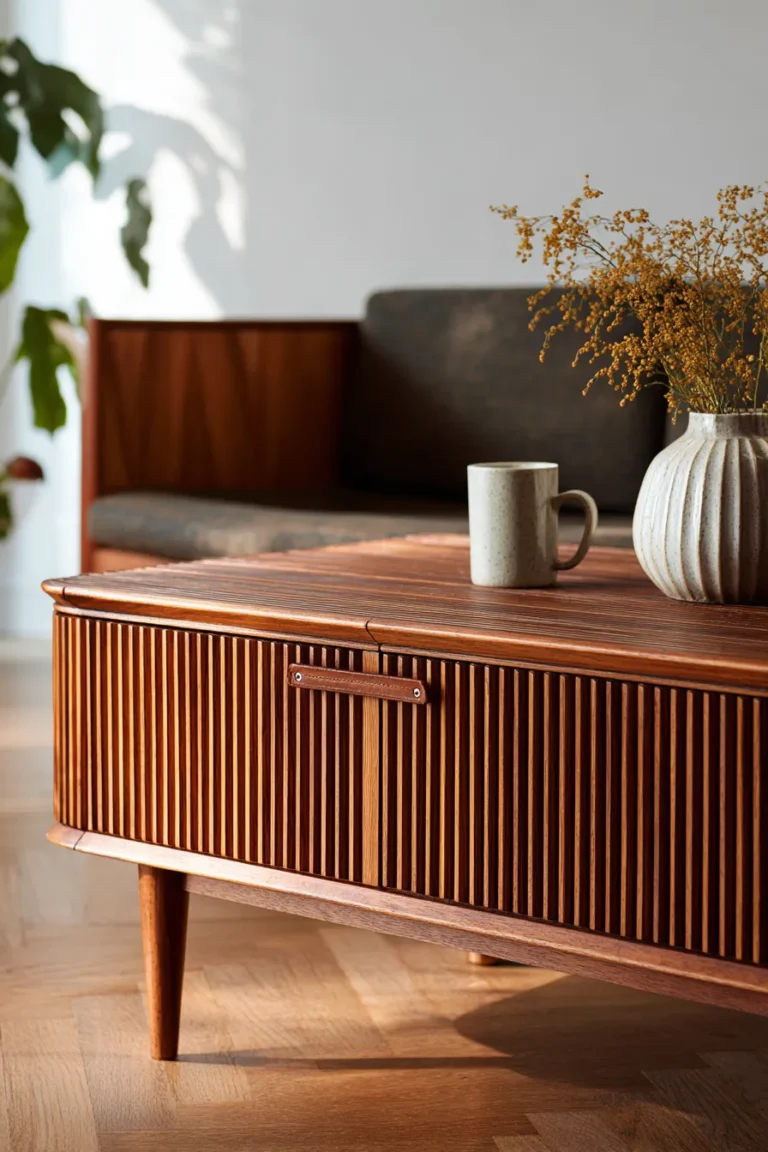
10. Warm Beige for Versatile Neutrality

Warm beige remains one of the most adaptable paint colors, offering a neutral foundation that never feels boring when styled thoughtfully. Unlike cooler greys, beige carries inherent warmth that makes spaces feel immediately inviting. This classic shade serves as the perfect backdrop for both colorful maximalism and pared-down minimalism.
The timeless appeal of warm beige lies in its ability to work with virtually any design style, furniture finish, or accent color. It enhances natural light without the starkness of white, creates flow in open-concept spaces, and provides a cohesive backdrop for layered textures. When chosen with the right undertones, beige feels sophisticated and current rather than dated.
Design Breakdown:
- Test samples extensively — beige can read pink, yellow, or grey depending on lighting
- Layer in varied neutrals in different shades of cream, tan, and taupe
- Add depth with texture through linen, wool, jute, and natural fibers
- Pair with warm wood tones in furniture and flooring for cohesion
- Introduce colorful accents deliberately — beige makes every color pop
- Use black or charcoal accents for definition and visual weight
- Consider different sheens across walls and trim for subtle dimension
- Balance with natural materials like rattan, leather, and stone
- Works beautifully with greenery which stands out against the neutral backdrop
- Pair with brass or warm gold hardware for elevated sophistication
Best For: Transitional interiors, family-friendly spaces, or anyone seeking a timeless neutral that adapts to changing styles.
11. Moody Olive for Refined Sophistication

Moody olive offers depth and character with an earthy, grounded elegance that feels both current and timeless. This sophisticated grey-green sits darker than sage but lighter than forest green, creating living rooms that feel curated and intentional. The color carries an organic quality that brings the outside in while maintaining refined sophistication.
Olive works beautifully in spaces where you want color with substance—it provides personality without overwhelming and pairs exceptionally well with both warm and cool accent tones. The shade creates a cozy atmosphere during the day and transforms into something moodier and more dramatic in evening light, making it particularly effective in multi-functional living spaces.
Design Breakdown:
- Enhance with warm wood furniture in walnut, oak, or teak finishes
- Layer in cream and tan textiles for balanced warmth
- Add brass or antique gold accents throughout lighting and hardware
- Incorporate botanical elements through artwork, prints, or real plants
- Balance with lighter ceiling paint in warm white or cream
- Use natural fiber rugs in jute or sisal to reinforce the organic feel
- Pair with leather furniture in tan or cognac for rich layering
- Add black accents sparingly for modern definition
- Works beautifully with terracotta or rust in accessories and textiles
- Consider varied lighting sources to highlight the color’s depth
Best For: Modern traditional spaces, nature-inspired interiors, or anyone seeking sophisticated color with organic roots.
12. Powder Blue for Serene Lightness

Powder blue creates living rooms that feel airy, peaceful, and gently uplifting. This soft, barely-there blue carries just enough color to feel intentional while maintaining the light-enhancing qualities of near-whites. The shade evokes clear skies and calm waters, bringing a sense of tranquility into everyday spaces.
What makes powder blue particularly effective is its ability to make rooms feel larger and brighter while still providing subtle color interest. Unlike stark white, it offers visual softness that makes spaces feel more livable. The color pairs beautifully with both warm and cool accent tones, working seamlessly in traditional, coastal, and contemporary settings alike.
Design Breakdown:
- Pair with crisp white trim for clean, fresh contrast
- Layer in warm neutrals like beige, tan, or warm grey to prevent coldness
- Add natural wood furniture in light to medium tones
- Incorporate soft textiles in linen, cotton, and wool for warmth
- Use warm metals sparingly — brass or gold adds necessary warmth
- Balance with cream or ivory upholstery rather than stark white
- Add warmth through lighting with warm-toned bulbs and layered sources
- Pair with navy or deeper blue accents for tonal depth
- Works beautifully with botanical prints and greenery
- Consider an eggshell finish for subtle sophistication
Best For: Coastal-inspired spaces, small living rooms needing brightness, or anyone seeking calm, serene atmospheres.
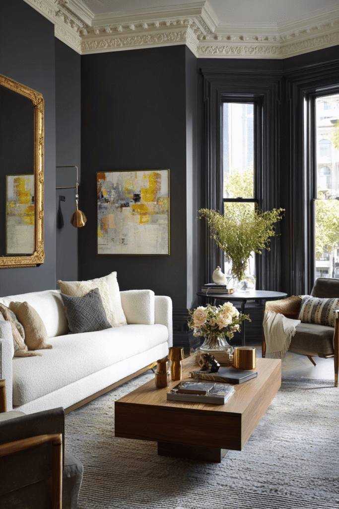
13. Deep Charcoal Black for Statement Drama
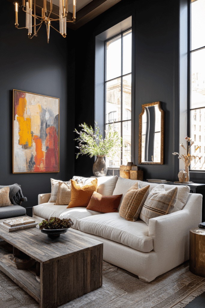
Deep charcoal black makes an undeniably bold statement, creating living rooms with serious visual impact and modern sophistication. This isn’t for the faint of heart—it’s for design enthusiasts who understand that dramatic dark walls can create some of the most striking, memorable spaces. When executed well with proper lighting and balanced furnishings, black walls feel luxurious rather than oppressive.
The power of charcoal black lies in its ability to create a gallery-like atmosphere where every piece of furniture, artwork, and accessory becomes a curated display. The dark backdrop eliminates visual clutter, making spaces feel more intentional and edited. It’s particularly effective in rooms with strong architectural details or abundant natural light that prevents the space from feeling too enclosed.
Design Breakdown:
- Maximize all available natural light — keep windows unobstructed
- Layer multiple light sources including ambient, task, and accent lighting
- Use predominantly light-colored furniture to create essential contrast
- Add warm wood tones to soften the dramatic intensity
- Incorporate metallic accents in brass, gold, or copper for warmth
- Balance with white or cream ceilings to maintain perceived height
- Use large mirrors strategically to reflect light and expand the space
- Add abundant texture through varied fabrics and natural materials
- Pair with colorful artwork that pops dramatically against the dark backdrop
- Consider black as an accent wall if full-room commitment feels too bold
Best For: Modern lofts, bold contemporary spaces, or confident design lovers who embrace high-contrast drama.
14. Golden Mustard for Vibrant Energy
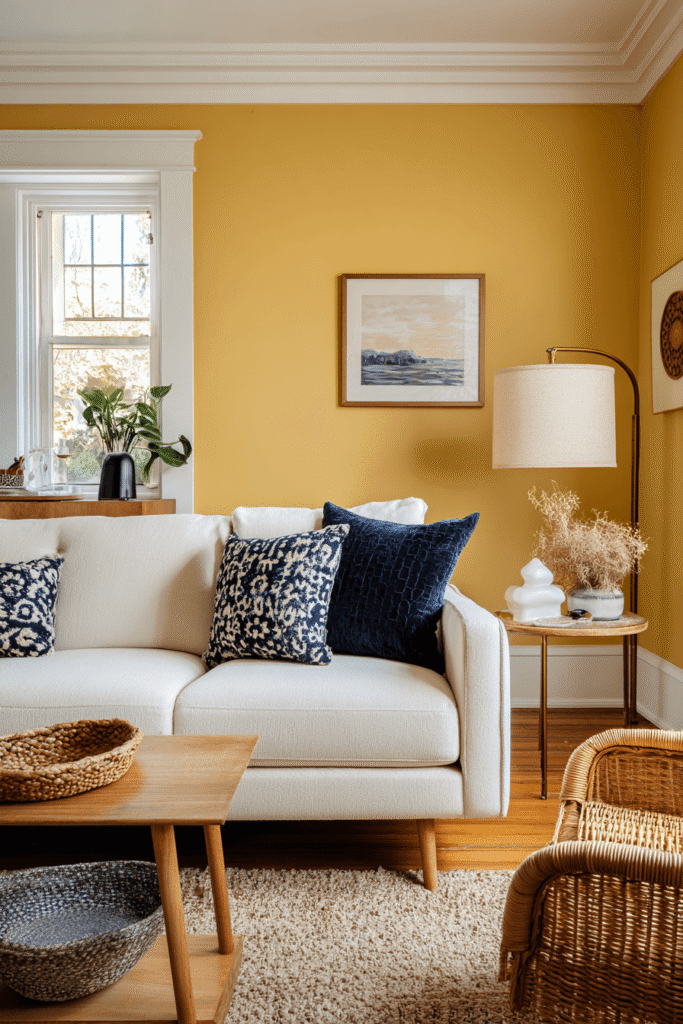
Golden mustard brings cheerful warmth and vintage-inspired personality to living rooms. This rich yellow-gold sits between bold and neutral, offering enough color to energize a space without overwhelming. The shade carries a retro sensibility that works beautifully in eclectic, mid-century modern, or bohemian interiors.
What makes golden mustard particularly appealing is its ability to transform rooms into sunny, welcoming spaces regardless of natural light conditions. The color naturally lifts moods and creates optimistic atmospheres. It pairs surprisingly well with a wide range of colors—from deep navy and forest green to soft blush and warm grey—making it more versatile than it initially appears.
Design Breakdown:
- Ground with neutral furniture in cream, tan, or warm grey
- Add depth with darker accents in navy, forest green, or charcoal
- Layer in natural textures through rattan, wicker, and raw wood
- Balance with plenty of white in trim, ceiling, or architectural details
- Incorporate warm wood tones in medium to dark finishes
- Use as an accent wall if full-room color feels too intense
- Pair with botanical patterns in similar warm tones
- Add black accents strategically for modern grounding
- Works beautifully with vintage or mid-century furniture styles
- Balance with soft textiles in linen and cotton to temper vibrancy
Best For: Eclectic interiors, mid-century modern spaces, or cheerful personalities wanting bold color with vintage charm.
15. Soft Taupe for Understated Luxury

Soft taupe delivers quiet sophistication with its perfect balance between grey and beige, warm and cool. This elevated neutral creates living rooms that feel expensive and collected without trying too hard. The color works as a luxurious backdrop that allows quality furnishings and thoughtful styling to take center stage.
Taupe’s appeal lies in its chameleon-like quality—it adapts to surrounding colors and lighting while maintaining its elegant composure. Unlike cooler greys or warmer beiges, taupe occupies a refined middle ground that pairs beautifully with virtually any accent color. It’s particularly effective in creating cohesive flow in open-concept homes where one color needs to work across multiple spaces.
Design Breakdown:
- Layer in varied neutral tones creating depth through subtle color shifts
- Add luxurious textures like velvet, silk, and cashmere
- Pair with warm metals in aged brass, bronze, or rose gold
- Incorporate natural materials like marble, stone, and quality wood
- Balance with crisp white accents in trim and architectural details
- Use warm lighting to enhance the color’s sophisticated warmth
- Add depth with darker furniture pieces in charcoal or espresso
- Layer in soft greys and creams for tonal sophistication
- Pair with muted jewel tones like sage, dusty blue, or mauve
- Consider a matte or flat finish for maximum luxury appeal
Best For: Sophisticated transitional spaces, luxury interiors, or anyone seeking refined neutrality with subtle warmth.
16. Slate Blue for Tranquil Modernity

Slate blue brings calm sophistication with its grey-blue undertones that feel both modern and timeless. This muted shade creates living rooms with peaceful energy while maintaining enough color interest to feel intentional. The color works beautifully in contemporary spaces where you want serenity without sacrificing style.
What makes slate blue particularly effective is its ability to create a sense of expansiveness—the cool undertones can make rooms feel larger and more open. The color pairs exceptionally well with warm woods, soft neutrals, and metallic accents, creating balanced spaces that feel both relaxing and refined. It’s especially stunning in rooms with abundant natural light where the color’s subtle complexity can truly shine.
Design Breakdown:
- Warm up with natural wood furniture in medium to warm tones
- Layer in cream and warm beige textiles to prevent coldness
- Add brass or warm gold accents for necessary warmth
- Balance with soft white trim for clean definition
- Incorporate warm lighting with amber-toned bulbs
- Pair with navy or deeper blue accents for tonal depth
- Add natural textures through wool, linen, and jute
- Works beautifully with greenery which adds life and warmth
- Use warm grey furnishings rather than cool grey for cohesion
- Consider pairing with blush or terracotta accents for unexpected warmth
Best For: Contemporary homes, tranquil retreats, or anyone seeking modern calm with subtle color sophistication.
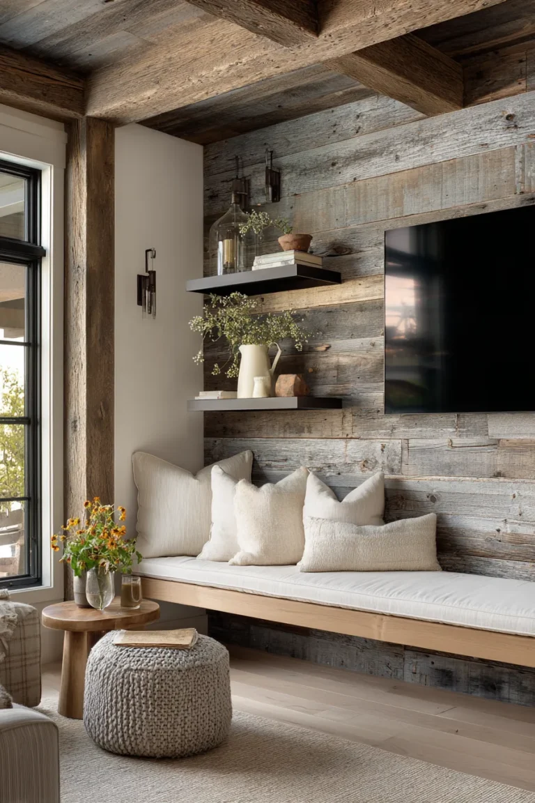
17. Warm Caramel for Inviting Coziness

Warm caramel wraps living rooms in rich, inviting warmth that feels instantly comfortable. This golden-brown shade carries the sweetness of its namesake, creating spaces that feel embracing and lived-in from day one. The color works beautifully across seasons—cozy in winter, warm in summer—making it a year-round winner.
Caramel’s appeal lies in its ability to create depth and warmth without the darkness of chocolate brown or the coolness of traditional tans. The color enhances natural light rather than absorbing it, creating glowing spaces that feel inherently welcoming. It pairs exceptionally well with cream, ivory, and deeper browns, allowing for rich tonal layering that feels sophisticated and intentional.
Design Breakdown:
- Layer in cream and ivory upholstery for tonal warmth and contrast
- Add deeper brown accents in leather, wood, or woven textiles
- Incorporate natural materials liberally—rattan, jute, raw wood
- Balance with white or cream trim to prevent heaviness
- Use warm brass or gold hardware throughout the space
- Pair with warm wood floors in oak or walnut finishes
- Add greenery abundantly which pops beautifully against caramel
- Layer varied textures in similar warm tones for depth
- Incorporate pattern in similar warm color families
- Use warm, ambient lighting to enhance the color’s golden glow
Best For: Cozy traditional spaces, family-friendly living rooms, or anyone craving warmth and inviting comfort in their home.
Conclusion
Choosing the right living room paint color transforms more than just your walls—it sets the emotional tone for your entire home. Whether you’re drawn to the quiet sophistication of soft taupe, the bold drama of charcoal black, or the earthy warmth of terracotta, each color creates its own unique atmosphere. The best choice isn’t about following trends but about understanding how color, light, and your personal style intersect to create spaces that genuinely feel like home.
Remember that paint color never exists in isolation—it interacts with your furniture, lighting, architectural details, and natural light throughout the day. Take time to test samples in your actual space, observe how they shift from morning to evening, and consider how they’ll work with your existing furnishings. The right color will feel right—you’ll know it when you see it in your own light, in your own space, creating the exact mood you’ve been seeking.
FAQs
What are the most popular living room paint colors for 2026?
Warm neutrals like greige and soft taupe continue to dominate, alongside nature-inspired shades like dusty sage, forest green, and warm terracotta. Moody tones like navy blue and charcoal grey are also increasingly popular for those seeking drama and sophistication. The trend overall leans toward colors with depth—shades that create atmosphere rather than simply serving as neutral backdrops.
Should I choose warm or cool tones for my living room?
This depends entirely on your space’s natural light and your desired atmosphere. Rooms with abundant southern or western light can handle cooler tones like slate blue or soft grey without feeling cold. Spaces with limited natural light or northern exposure benefit from warm tones like beige, terracotta, or warm caramel that add inherent warmth. Consider your furniture and flooring undertones too—warm woods pair best with warm paint colors, while cooler greys work with both.
How do I pick a paint color that works with my furniture?
Start by identifying your furniture’s undertones—is your wood warm (golden, honey, reddish) or cool (grey, white-washed, ebony)? Match paint undertones accordingly. For neutral upholstery, you have more flexibility. If your furniture is colorful or patterned, choose paint that either complements (analogous colors) or provides neutral grounding (soft neutrals, warm whites). Test paint samples directly next to your furniture in your actual lighting before committing.
What’s the best neutral paint color for a living room?
Greige, soft taupe, and warm beige consistently top the list for their versatility and timeless appeal. Greige offers sophisticated warmth without reading as overly beige or grey, making it incredibly adaptable. Soft taupe provides understated luxury that works across styles, while warm beige creates inviting comfort. The “best” neutral ultimately depends on your lighting, furniture undertones, and personal preference—always test samples in your specific space.
Can dark paint colors work in small living rooms?
Absolutely—when executed thoughtfully. Dark colors like navy, forest green, or charcoal can actually make small spaces feel more intimate and intentional rather than cramped. The key is maximizing lighting (both natural and artificial), using light-colored furniture and trim for contrast, incorporating mirrors strategically, and ensuring adequate texture to prevent flatness. Dark walls can also blur boundaries in small spaces, creating a cocooning effect that feels sophisticated rather than claustrophobic. Consider starting with one dark accent wall before committing to the full room.