The 2026 shift prioritizes dividers as ‘soft architecture’—semi-permeable vertical planes that manage light reflectance and acoustic zones without sacrificing visual continuity across open-plan spaces.
Gone are the days of clunky, opaque walls that chop up square footage. Today’s spatial solutions function as three-dimensional art installations that filter rather than block, zone rather than isolate. The most sophisticated interiors now treat dividers as transitional thresholds—strategic interventions that control sightlines while preserving the psychological spaciousness that defines contemporary living.
This recalibration stems from post-pandemic work-from-home demands, where homes must accommodate multiple simultaneous functions without compromising aesthetic integrity. Designers are responding with materials that possess inherent porosity: fluted glass that scatters light into soft ribbons, natural fibers that absorb sound frequencies, and oxidized metals that age into living patinas. The result? Rooms that breathe, adapt, and reward closer inspection.
Why Dividers Are Replacing Walls in 2026
Material sustainability drives much of this evolution. FSC-certified hardwoods, upcycled textile panels, and bio-based resins now dominate specification lists as clients demand transparency about embodied carbon. Simultaneously, biophilic design principles push designers toward screening elements that incorporate living plants, raw wood grain, and stone aggregates—materials that register as psychologically restorative rather than industrial.
The color psychology shift toward warm neutrals (think 2200K-2700K lighting compatibility) means dividers must function as three-dimensional canvases that catch and hold amber-toned illumination. Where 2010s minimalism favored stark white and cool grays, today’s palette revolves around ochre, terracotta, charcoal, and sun-bleached linen—hues that create depth through shadow play rather than high contrast.
Acoustic management also factors heavily. Hard-surface rooms (concrete floors, plaster walls, glass expanses) create reverberation times that measure between 1.2-1.8 seconds—far beyond the comfortable 0.4-0.6 second range for residential spaces. Smart dividers now double as sound-dampening infrastructure, using porous materials with NRC (Noise Reduction Coefficient) ratings above 0.65.
1. Fluted Glass Channel Panels
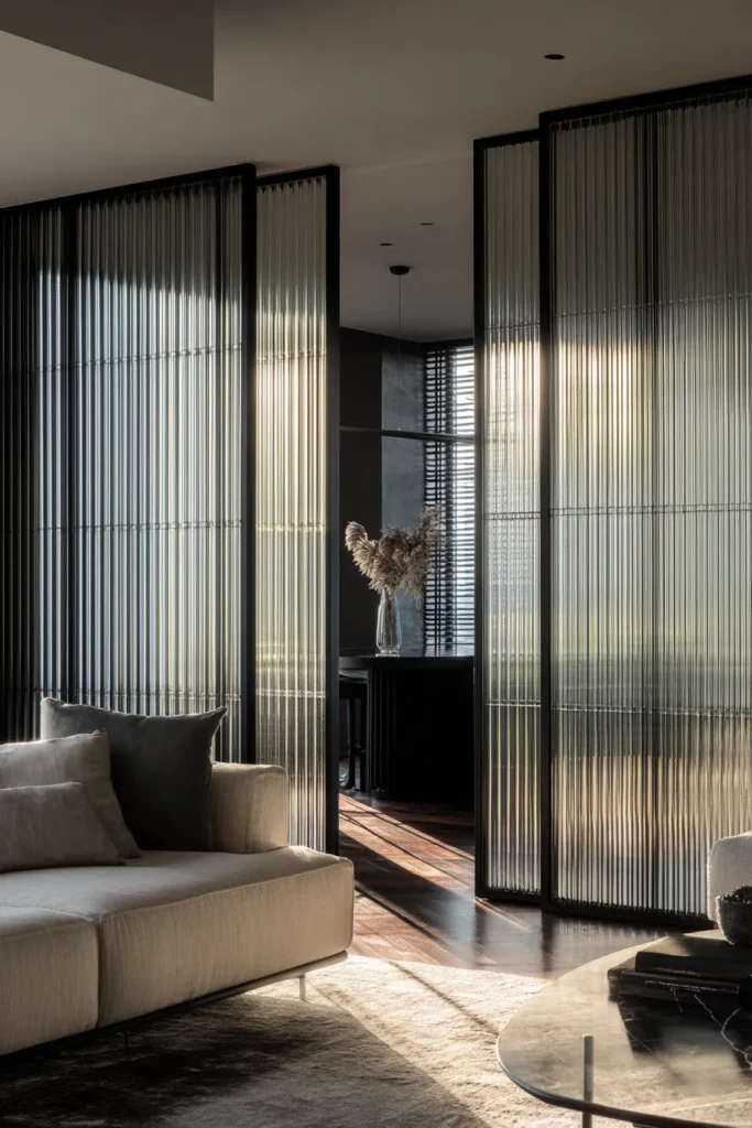
Vertical reeded glass installed in blackened steel frames creates a visual rhythm that breaks sightlines without blocking natural light pathways. The channels—whether 6mm or 12mm pitch—act as light diffusers, scattering direct sun into soft, non-glaring bands that move across adjacent surfaces throughout the day.
Designer’s Secret: Specify glass with 75-80% light transmittance rather than the standard 90%. This subtle reduction prevents the “fish tank effect” where the divider feels invisible, instead creating just enough visual weight to register as an intentional boundary.
Design Breakdown:
- Base material: 10mm tempered fluted glass in bronze or clear finish
- Frame: Powder-coated steel in matte black (RAL 9005) or gunmetal
- Mounting: Floor-to-ceiling tension rods or ceiling-anchored track system
- Spacing: 18-24″ between panels to maintain circulation flow
- Pair with: 2700K LED strip lighting recessed into floor channel for uplight drama
Best For: Open-plan living room designs where you need to separate dining zones without sacrificing borrowed light. Ideal for modernist purists who appreciate industrial materiality.
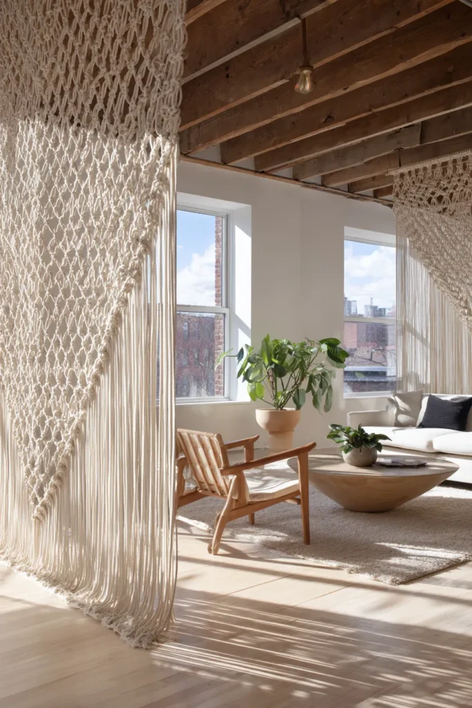
2. Suspended Natural Fiber Rope Curtains
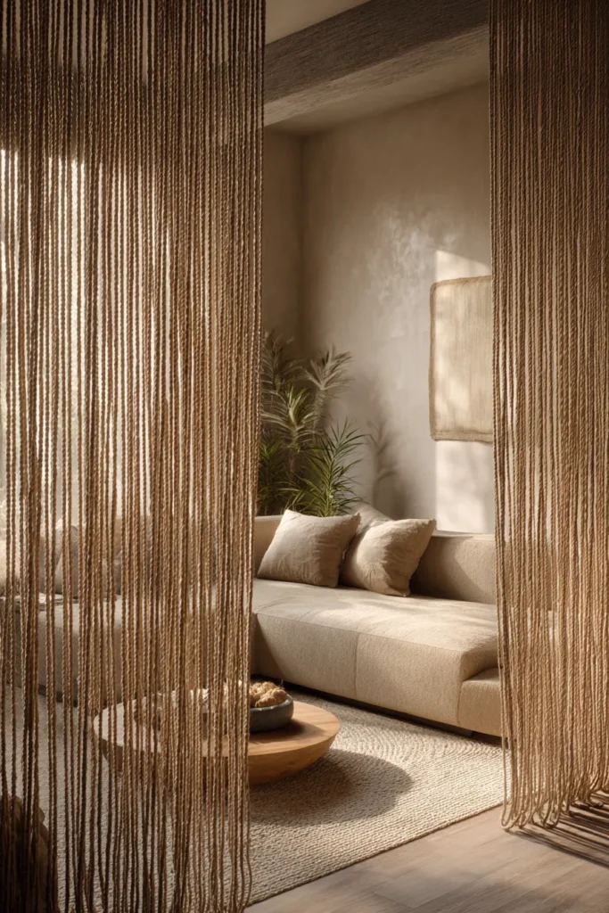
Floor-to-ceiling jute, hemp, or sisal ropes hung at 2-3″ intervals create a kinetic divider that responds to air movement while maintaining a strong vertical gesture. The material choice determines the tactile experience: jute (3mm diameter) feels rustic, hemp (5mm) reads as architectural, while sisal (4mm) offers a bleached, coastal aesthetic.
This approach delivers exceptional acoustic dampening. Natural fibers absorb mid-range frequencies (500-2000Hz)—precisely the vocal range that creates privacy concerns in shared spaces. Unlike solid barriers, rope systems allow air circulation, preventing the stuffiness that plagues enclosed zones.
Designer’s Secret: Install ropes with deliberately uneven tension. When some strands hang taut while others have slight slack, you create visual texture that mimics organic growth patterns. This “controlled imperfection” prevents the divider from reading as sterile or overly geometric.
Design Breakdown:
- Material: Undyed 5mm hemp rope with natural wax finish
- Density: 30-40 strands per linear meter for semi-transparency
- Hardware: Ceiling-mounted stainless steel rail with hidden clamps
- Length: Floor clearance of 1-2″ to prevent fraying
- Lighting integration: Concealed LED tape along top rail creates silhouette effect at night
Best For: Bohemian-leaning interiors and coastal homes. Especially effective in boho bedroom layouts adapted for living zones, where textural layering outweighs formal symmetry.
3. Blackened Steel Frame + Shoji Paper Hybrid
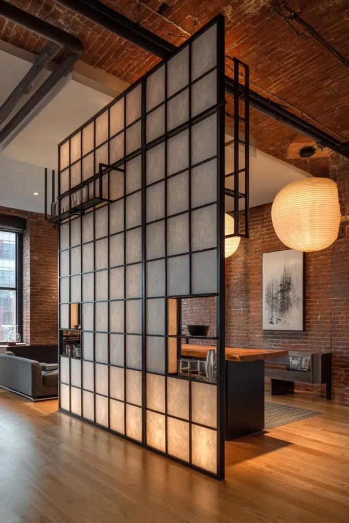
Western steel joinery meets Japanese translucency in this dual-material system. Slender 1.5″ square tube steel creates a grid framework—typically 24″ or 36″ modules—infilled with washi paper or fiberglass-reinforced rice paper panels. The result balances industrial edge with ethereal softness.
The paper’s fibrous structure diffuses light while maintaining privacy, registering as a warm, ambient glow rather than harsh transparency. Unlike solid dividers, shoji systems can incorporate sliding panels that reconfigure spatial relationships based on daily needs.
Designer’s Secret: Source paper with visible fiber inclusions (mulberry bark, abaca strands) rather than uniform sheets. These imperfections create micro-patterns when backlit, transforming the divider into an illuminated textile rather than a flat screen.
Design Breakdown:
- Frame: Welded steel tube (1.5″ × 1.5″) in blackened finish or raw steel with clear matte sealant
- Infill: 3-ply laminated washi paper (85gsm) with 40% light transmittance
- Configuration: Fixed panels with 1-2 sliding sections for flexibility
- Threshold: 4-6″ steel base plate for stability without ceiling anchoring
- Hardware: Concealed European-style soft-close sliding mechanism
Best For: Mid-century modern living room settings where East-meets-West materiality aligns with architectural context. Works beautifully in loft spaces with exposed brick or concrete.
4. Live-Edge Walnut Slat System
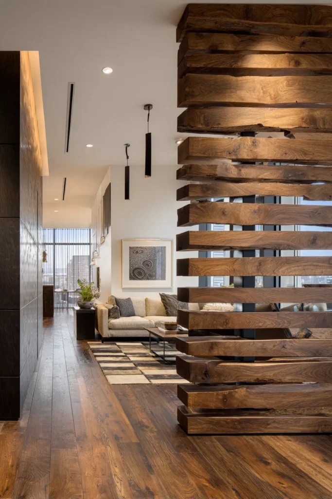
Horizontal or vertical walnut boards—3-4″ wide with preserved bark edges—mounted with 3-6″ gaps create a permeable screen that celebrates raw wood character. Each slat’s unique grain pattern and natural edge irregularities ensure the divider reads as bespoke rather than manufactured.
Walnut’s inherent warmth (its Munsell hue registers around 7.5YR) makes it uniquely compatible with 2700K lighting, creating a cohesive amber-toned environment. The wood’s moderate density (Janka hardness ~1,010 lbf) provides sufficient acoustic absorption without requiring additional treatment.
Designer’s Secret: Alternate slat thickness by 1/4″ increments—some at 1″, others at 1.25″ or 1.5″. This subtle variation creates depth through shadow casting, preventing the flat uniformity of commercial slat walls. When light hits from the side, the thickness gradient becomes apparent.
Design Breakdown:
- Wood: Black walnut or European walnut in natural oil finish (0% sheen)
- Dimensions: 3.5″ wide × varying lengths × 1-1.5″ thick
- Spacing: 4″ gaps for 40% open ratio; 6″ gaps for 50% open ratio
- Mounting: Concealed French cleat system or through-bolted to steel armature
- Finish: Rubio Monocoat in Natural or Smoke tone for enhanced grain definition
Best For: Earthy bedroom aesthetics extended into living areas. Perfect for nature-focused clients who prioritize material authenticity and tactile connection.
5. Modular Acoustic Felt Tiles

Die-cut 100% wool felt tiles (12″ × 12″ or 16″ × 16″) arranged in gradient color patterns create sculptural dividers with exceptional sound-dampening properties. Felt’s NRC rating reaches 0.35-0.55 depending on thickness, making it one of the most effective soft materials for acoustic control.
The modular nature allows for kinetic composition—tiles can be rearranged seasonally or as functional needs shift. By working with multiple felt tones (charcoal, mushroom, rust, sage), you build dimensional color fields that reward prolonged viewing.
Designer’s Secret: Create intentional “color drift” by blending three adjacent tones in irregular patterns rather than strict gradients. This mimics how natural pigments fade—with unexpected pockets of intensity rather than linear progression. The eye registers this as organic rather than engineered.
Design Breakdown:
- Material: 100% merino wool felt in 12mm thickness
- Color palette: 3-5 tones within the same temperature family (warm or cool, never mixed)
- Backing: Aluminum honeycomb panel for rigidity without weight
- Mounting: Cable suspension system or direct wall application with Z-clips
- Configuration: Offset grid (brick pattern) rather than aligned grid for visual interest
Best For: Home office ideas that bleed into living spaces. Exceptional for media rooms where acoustic clarity matters, or reading corners that require sound isolation.
6. Terrazzo Aggregate Freestanding Monoliths

Poured terrazzo panels (6-8″ thick) installed as freestanding sculptural elements create gravity-defying vertical planes. The aggregate composition—marble chips, recycled glass, brass shavings—determines whether the piece reads as contemporary or historically rooted.
Unlike mounted dividers, freestanding monoliths become focal sculptures that happen to define spatial boundaries. Their mass provides psychological weight that anchors open-plan chaos, while their polished surfaces reflect ambient light in fractured, jewellike patterns.
Designer’s Secret: Spec a matte honed finish (60-80 grit) rather than high polish. This subtle texture prevents the terrazzo from reading as commercial flooring repurposed vertically. The low sheen also minimizes glare while allowing the aggregate to remain visually prominent.
Design Breakdown:
- Composition: 70% marble aggregate + 20% recycled glass + 10% brass shavings in white cement matrix
- Dimensions: 8′ height × 3-4′ width × 6″ thickness for structural stability
- Base: Steel plate footing concealed within thickness, no visible support
- Finish: 60-grit hone with penetrating sealer (no topical coating)
- Edges: Hand-chiseled or left raw for artisanal character
Best For: Luxury living room ideas where statement art and functional architecture merge. Ideal for collectors who appreciate material craftsmanship.
7. Arched Cane Webbing Screen

Rattan or cane webbing stretched within steam-bent ash or oak arches creates a divider that references mid-century design language while feeling thoroughly current. The webbing’s open structure (typically 1/4″ open squares) provides 60-70% transparency, making it ideal for maintaining visual connection between zones.
The arch’s curvature softens the divider’s geometry, preventing the rigidity that plagues rectilinear screens. This subtle gesture introduces organic movement into otherwise angular interiors.
Designer’s Secret: Specify a double-layer webbing installation with the second layer rotated 45°. This diamond-over-square pattern creates moiré-like optical effects when viewed from different angles, transforming a static screen into a kinetic visual experience.
Design Breakdown:
- Frame: Steam-bent white oak or ash (2″ × 1″ profile) in natural oil finish
- Webbing: Natural rattan cane in fine (2.5mm) or medium (3mm) gauge
- Configuration: Three-panel hinged screen or single arch with floor anchors
- Arch geometry: Segmental arch (less than 180°) for contemporary proportion
- Finish: Danish oil or hard wax for low-sheen protection
Best For: Transitional interiors that blend traditional craft with contemporary minimalism. Works beautifully in farmhouse living room contexts where authenticity trumps trends.
8. Poured Resin Wave Partition
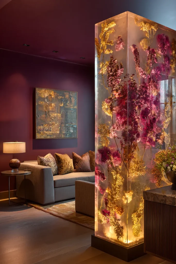
Bio-based epoxy resin cast in 1-2″ thickness with embedded organic materials (dried botanicals, mineral pigments, metallic leafing) creates translucent panels that function as three-dimensional paintings. The resin’s clarity allows light to penetrate while the embedded elements create depth and visual intrigue.
Unlike glass, resin offers sculptural freedom—edges can be hand-shaped, surfaces can incorporate texture, and inclusions can be strategically placed to direct the eye through the composition.
Designer’s Secret: Embed materials in clusters rather than uniform distribution. Create dense pockets of botanical matter that appear to “float” in clear resin fields. This mimics natural sedimentation patterns and prevents the craft-store aesthetic of evenly scattered inclusions.
Design Breakdown:
- Resin: Plant-based epoxy (30% bio-content minimum) with UV inhibitors
- Embedments: Dried lunaria, gold leaf fragments, mineral mica, preserved moss
- Dimensions: 1.5″ thickness for structural integrity without excessive weight
- Edges: Hand-polished to 3000-grit for water-clear finish
- Mounting: Edge-drilled stainless steel rods suspended from ceiling track
Best For: Art-forward interiors where the divider doubles as gallery-worthy sculpture. Particularly effective in living room paint colors featuring deep, saturated walls that provide chromatic contrast to the resin’s translucency.
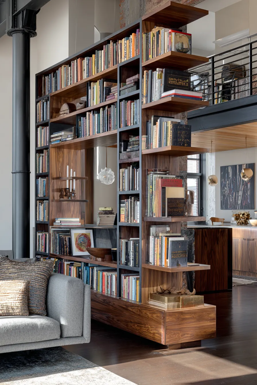
9. Pivoting Bookshelf Wall (Double-Sided Access)

A floor-anchored pivot mechanism supports a full-height bookshelf (10-12′ tall × 4-6′ wide) that rotates 180°, revealing different curated collections to each adjacent space. This kinetic element transforms static storage into an interactive architectural feature.
The pivot’s psychological impact exceeds its functional utility—it suggests that spatial boundaries are negotiable, temporary, and responsive to inhabitants’ needs rather than fixed architectural constraints.
Designer’s Secret: Curate books by spine color on the “public” side facing the primary living area, while organizing functionally (genre, author) on the “private” side facing the work zone. This dual organizational strategy creates a gallery-like display where visible while maintaining personal logic where it matters.
Design Breakdown:
- Structure: Welded steel frame with powder-coated finish, faced with 3/4″ walnut plywood
- Pivot hardware: Commercial-grade floor-bearing pivot (300 lb capacity minimum)
- Shelving: Asymmetric shelf placement—no repeating patterns
- Depth: 10-12″ to accommodate art books and decorative objects
- Counterweight: Concealed steel plate at base opposite pivot point for balanced rotation
Best For: Compact living room layouts in urban apartments where square footage demands multi-functionality. Appeals to bibliophiles who view book collections as design elements.
10. Chain-Link Metal Mesh with Patina
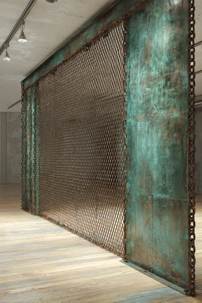
Industrial brass or copper chain-link mesh (1/2″ or 3/4″ opening) left to oxidize naturally creates a divider that evolves over time. The patina development—from bright metallic to muted verdigris or brown oxide—ensures the piece never looks “complete,” instead maturing alongside the space.
The mesh’s transparency maintains sightlines while its metallic materiality provides sufficient visual weight to register as a boundary. Unlike fabric screens, metal mesh possesses inherent structure that requires minimal framing.
Designer’s Secret: Accelerate patina in strategic areas using salt water or vinegar solution, creating high-contrast zones where oxidation appears more advanced. This mimics natural weathering patterns where water runoff concentrates, giving the piece a narrative of age and use.
Design Breakdown:
- Material: Unlacquered brass or copper mesh (16-gauge wire)
- Opening size: 3/4″ for optimal light filtration and transparency
- Frame: Minimal—1″ × 1″ angle iron perimeter only
- Mounting: Ceiling-suspended on aircraft cable with adjustable turnbuckles
- Treatment: Natural oxidation over 6-18 months; optional accelerated patina
Best For: Industrial loft conversions and 70s modern living room revivals where material authenticity and craft-forward detailing define the aesthetic language.
11. Layered Sheer Linen Panels (Triple-Hang System)
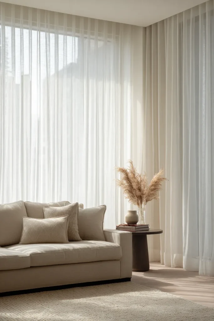
Three overlapping linen panels hung from independent ceiling tracks create adjustable transparency through layering. Each panel differs slightly in opacity—180gsm, 220gsm, and 280gsm—allowing inhabitants to configure privacy levels by sliding layers into or out of alignment.
This system exploits linen’s inherent drape and its ability to filter light into soft, diffused illumination. Unlike synthetic sheers, linen’s slubbed texture creates visual interest even in monochromatic schemes.
Designer’s Secret: Hem each panel to different lengths—the lightest fabric longest (floor-grazing), the heaviest shortest (2-3″ above floor). When panels overlap, this graduated length creates a dimensional cascade rather than a flat curtain wall. The subtle variation registers subconsciously as sophisticated rather than accidental.
Design Breakdown:
- Fabric: 100% European linen in natural, oatmeal, and warm gray
- Weights: 180gsm (sheer), 220gsm (medium), 280gsm (opaque)
- Width: Panels should be 2× finished width for proper fullness
- Hardware: Hospital-grade ceiling track system with silent glide carriers
- Hemming: Raw-edge finish top; weighted hem bottom with concealed lead chain
Best For: Minimalist sanctuaries and minimalist bedroom concepts extended into living areas. Ideal for clients who value materiality over decorative embellishment.
12. Cork Bark Acoustic Wall
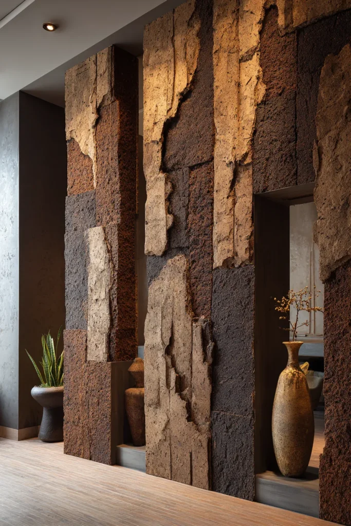
Large-format cork bark panels (24″ × 48″ or larger) installed vertically create a textured divider with exceptional acoustic properties. Cork’s cellular structure (200 million air-filled cells per cubic inch) absorbs sound while providing natural thermal insulation—a rare dual benefit.
The material’s inherent irregularity—no two bark pieces share identical texture or coloration—ensures the divider reads as site-specific rather than mass-produced. Cork’s natural brown tones (ranging from honey to dark chocolate) integrate seamlessly with earth-toned palettes.
Designer’s Secret: Mount cork panels with deliberate gaps (1-2″ spacing) rather than edge-to-edge. This reveals the wall surface behind—painted in a contrasting dark charcoal—creating a graphic pattern where cork “floats” against shadow. The gaps also enhance acoustic performance by creating air cavities.
Design Breakdown:
- Material: Natural cork bark (30-40mm thickness) in untreated finish
- Backing: Plywood substrate with concealed Z-clips for floating appearance
- Configuration: Irregular panel sizes in brick-laid pattern
- Spacing: 1.5″ gaps between panels revealing painted wall behind
- Protective coating: Beeswax-based sealant (maintains natural texture)
Best For: Media wall ideas where acoustic control is critical, or eco-conscious clients prioritizing renewable, low-impact materials.
13. Suspended Macramé Art Installation
Large-scale macramé panels (6-8′ wide) hung from ceiling-mounted dowels create dividers that blur the line between functional partition and fiber art. The knotting technique—square knots, half-hitches, or spiral patterns—determines whether the piece reads as bohemian, contemporary, or traditional.
Unlike woven textiles, macramé’s three-dimensional structure creates depth through shadow play. The cord diameter (typically 4-6mm) and density (tight vs. open knotting) control transparency levels.
Designer’s Secret: Incorporate negative space deliberately. Create large unknotted “windows” within the macramé field where cord framing surrounds empty space. These voids draw the eye through the divider while the knotted sections provide privacy—a controlled tension between concealment and revelation.
Design Breakdown:
- Cord: Natural cotton rope (5mm diameter) in undyed ivory or charcoal-dyed
- Pattern: Geometric knotting with intentional negative space zones
- Dowel: White oak or walnut (2″ diameter) for proportional weight
- Scale: 6-8′ width × 7-9′ drop for full visual impact
- Installation: Ceiling hooks with adjustable-length cord for leveling
Best For: Textile collectors and boho bedroom aesthetics where handcraft and organic forms define spatial character.
14. Smoked Acrylic Floating Panels
Tinted acrylic sheets (typically 1/2″ thick) in bronze, gray, or amber tones create semi-transparent dividers with contemporary sleekness. Unlike glass, acrylic can be edge-lit with LED tape, causing the panel to glow from within—a theatrical effect that transforms the divider at night.
The material’s light weight allows for larger unsupported spans than glass, while its slight flexibility absorbs impact without shattering. Specifying matte finish on one face creates directional transparency—clearer from one side, more private from the other.
Designer’s Secret: Edge-mount panels 3-4″ away from the wall rather than flush-mounting. This air gap creates a shadow line that reads as a dark vertical stripe, adding graphic punch while maintaining the panel’s ethereal quality. The gap also allows for concealed uplighting.
Design Breakdown:
- Material: Cast acrylic (not extruded) in 12mm thickness, bronze or gray tint
- Finish: One face matte (120-grit sanding), one face polished
- Edges: Flame-polished for water-clear appearance
- Mounting: Stainless steel standoffs with 3-4″ wall offset
- Lighting: RGB LED tape concealed in ceiling channel for customizable glow
Best For: Contemporary luxury living room settings where technology integration and atmospheric lighting define the aesthetic. Particularly effective in tech-forward smart homes.
15. Living Plant Wall (Hydroponic Rail System)
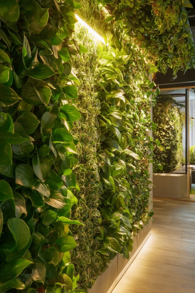
Ceiling-mounted hydroponic rails support modular plant pockets creating a vertical garden divider that provides biophilic benefits alongside spatial definition. The system’s self-watering mechanism eliminates maintenance concerns while ensuring consistent plant health.
Species selection determines character: tropical varieties (pothos, philodendron) create lush density, while succulents (senecio, string of pearls) offer structured geometry. The living element introduces movement through growth, ensuring the divider never appears static.
Designer’s Secret: Mix growth rates deliberately. Combine fast-growing vines that will cascade and soften edges with slow-growing structural plants that maintain the divider’s architectural silhouette. This prevents the “overgrown” look while ensuring the system feels alive rather than preserved.
Design Breakdown:
- System: Modular hydroponic rail with automated drip irrigation
- Plant selection: 60% trailing varieties, 40% upright for balanced composition
- Lighting: Full-spectrum LED grow lights (5000K) on timer
- Substrate: Lightweight expanded clay aggregate or coco coir
- Maintenance: Weekly nutrient refill; monthly pruning
Best For: Wellness-focused interiors and biophilic design mandates. Particularly effective in entryway ideas where the living wall announces the home’s connection to nature immediately upon entry.
Designer’s Warning: Three Fatal Divider Mistakes
1. Over-Anchoring in Rental Spaces
Ceiling-mounted systems that require structural reinforcement create permanent alterations incompatible with rental agreements. Opt for tension-rod systems or freestanding monoliths with sufficient mass for stability without fasteners.
2. Blocking Natural Light Pathways
Even translucent dividers reduce light transmission by 20-40%. Never position dividers perpendicular to your primary window wall—this creates shadowed zones that feel cave-like. Instead, run dividers parallel to windows, using them to filter rather than block light.
3. Ignoring Acoustic Reverberation
Hard materials (glass, metal, resin) reflect sound rather than absorbing it. In rooms with concrete or hardwood floors, combining a reflective divider with hard surfaces creates echo chambers where conversation becomes exhausting. Balance any hard divider with soft furnishings—area rugs, upholstered seating, textile wall hangings—to maintain comfortable acoustics.
Material Specification Quick Reference
Glass Transmittance Values:
- Clear: 90% light transmission
- Bronze: 75-80% transmission
- Gray: 60-70% transmission
- Fluted: 75-85% transmission (higher diffusion)
Fabric Weight Recommendations:
- Sheer screening: 180-220gsm
- Semi-privacy: 250-300gsm
- Full privacy: 320gsm+
- Acoustic performance: 400gsm+ wool felt
Wood Hardness (Janka Scale):
- Walnut: 1,010 lbf (moderate hardness, warm tone)
- White Oak: 1,360 lbf (high durability, neutral tone)
- Ash: 1,320 lbf (prominent grain, contemporary feel)
Acoustic Performance (NRC Ratings):
- Wool felt (12mm): 0.35-0.55
- Cork (40mm): 0.40-0.60
- Natural fiber rope: 0.25-0.40
- Glass/acrylic: 0.05 (minimal absorption)
The most successful dividers share a common trait: they improve their spaces through absence as much as presence. Where walls declare boundaries with certainty, contemporary partitions suggest transitions—liminal zones where one function fades as another emerges. This spatial ambiguity, far from creating confusion, actually enhances how we inhabit rooms. It allows for gradual shifts in mode and mood rather than binary transitions from public to private, work to rest, social to solitary.
Consider how light interacts with your chosen divider across the day’s cycle. Morning sun should filter through in soft bands that announce the day gently. Afternoon glare should be tempered without creating gloom. Evening ambient light should warm the divider’s surface, transforming it into a glowing threshold rather than a dark barrier. This choreography of light and material determines whether your divider feels integrated or imposed.
The physicality matters deeply. Run your hand across the surface—does it invite touch, or does it warn against it? Both responses are valid, but the choice should be intentional. Materials that welcome tactile engagement (woven cane, raw cork, textured linen) create approachable boundaries suitable for family-oriented spaces. Materials that command visual appreciation from a distance (polished terrazzo, delicate shoji paper, floating resin panels) suit more formal environments where preservation matters.
Sound dampening capabilities often surprise clients who focus solely on visual aesthetics. A divider that looks perfect but amplifies noise pollution serves neither privacy nor comfort. Test materials’ acoustic properties by clapping sharply in front of samples—porous materials like felt and cork will absorb the sound’s sharp edge, while hard surfaces will return it fully. In homes with multiple occupants pursuing different activities simultaneously, this acoustic dimension becomes as crucial as the spatial division itself.
Ultimately, the ideal divider respects your space’s existing architecture while introducing a new layer of interpretation. It should feel like it belongs—not through literal matching, but through thoughtful material dialogue. A mid-century home might embrace the steel-and-shoji hybrid’s historical nod while maintaining contemporary proportions. A converted industrial loft could celebrate raw materiality through oxidized metal mesh or live-edge wood. Your space already possesses inherent character; the divider’s role is to articulate that character more clearly, not to compete with it.
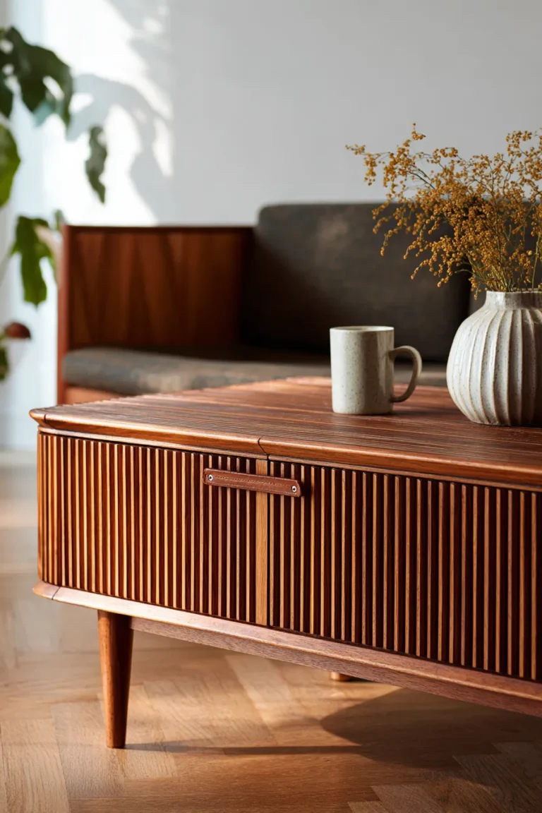
For those seeking additional spatial strategies, explore coffee table decor approaches that complement your newly defined zones, or investigate entryway table decor ideas that extend your divider’s material vocabulary into transitional spaces. When zones work in concert rather than isolation, the entire home achieves the spatial harmony that marks truly considered design.