The 2026 shift in kitchen counter decor abandons sterile minimalism for tactile, tonal layering—where every object carries material weight, artisanal provenance, and contributes to a lived-in narrative rather than showroom perfection.
This transformation mirrors what’s happening across residential interiors: a collective exhale from the cold, clinical aesthetic that dominated the early 2020s. Kitchens, once engineered for maximum efficiency with zero visual friction, now serve as curated galleries where daily rituals intersect with sensory design. The countertop has become a canvas for material storytelling—a place where honed travertine meets unlacquered brass, where hand-thrown ceramics anchor a composition as deliberately as sculpture in a contemporary art space.
The shift stems from multiple cultural forces. Sustainability consciousness demands fewer objects with deeper provenance. The Wabi-Sabi philosophy—celebrating imperfection and transience—has migrated from minimalist bedroom design into functional spaces. Psychologically, we’re craving warmth after years of stark, high-contrast interiors. The result? Counters styled with intention, not decoration. Every vessel, every board, every grouped element earns its place through texture, tone, or tactile presence.
Why Kitchen Counter Styling Evolved in 2026
The design community’s pivot away from “everything hidden” reflects a broader cultural moment. We’ve moved beyond treating kitchens as laboratories. Instead, they’re becoming what designers call “material sanctuaries”—spaces where objects are visible not because they’re decorative, but because they possess inherent beauty through craft and use. This philosophy extends to how we approach kitchen island ideas and even our choices in kitchen cabinets, where open shelving and glass-front doors reveal rather than conceal.
The influence of quiet luxury—that coded term for wealth expressed through understated materials rather than logos—has fundamentally altered counter styling. A $40 mass-produced bowl gets replaced by a $400 hand-thrown vessel that will patina over decades. This isn’t conspicuous consumption; it’s material literacy. Designers now ask: “Does this object have a maker?” and “Will this age with grace?” These questions drive every styling choice.
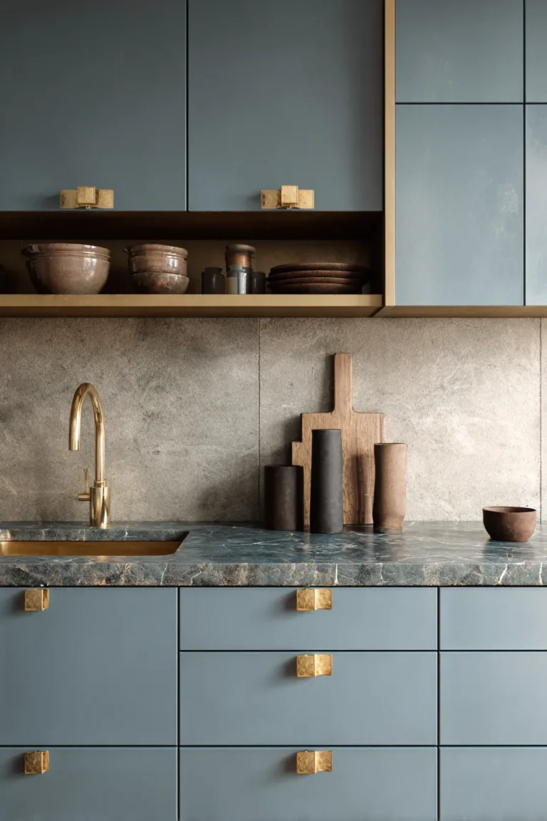
1. Raw-Edge Ceramic Vessel Grouping

Group hand-thrown ceramics in odd-numbered clusters (three or five) along your primary counter span, prioritizing vessels with visible throwing marks and unglazed exteriors. The goal is material friction—rough stoneware against polished quartz creates visual tension that reads as intentional curation rather than accidental placement.
Designer’s Secret: To avoid the “pottery class display” look, ensure your vessel heights follow a 1:1.6:2.5 ratio (the golden proportion). A 4-inch bowl pairs with a 6.4-inch vase and a 10-inch pitcher. This mathematical rhythm registers subconsciously as harmonious.
Design Breakdown:
- Base layer: Honed-finish counter (not polished—reflection competes with ceramic texture)
- Primary vessels: Terracotta or stoneware with 2700K lighting to emphasize earth tones
- Color palette: Clay, putty, raw umber—stay within 3 shades of the same pigment family
- Placement: 18-24 inches from corner edges to maintain visual breath
- Companion element: Single stem (olive branch or dried grass) in tallest vessel
Best For: Collectors drawn to artisanal craft and homeowners comfortable with visible imperfection. Works exceptionally well in kitchens with cozy kitchen design elements where warmth takes precedence over sleekness.
Mediterranean Terracotta
Italian terracotta carries specific light reflectance values (LRV 35-40) that warm under 2700-3000K bulbs. Seek unglazed finishes from Impruneta clay—the iron oxide content creates that signature burnt-sienna depth.
Japanese Stoneware
Bizen-yaki or Shigaraki ceramics feature natural ash glazing from wood-fired kilns. These pieces carry geological memory—each one records the exact kiln position and flame pattern. The irregularity is the luxury.
Scandinavian Clay
Nordic ceramics in slate, granite, and chalk tones offer cooler alternatives. Look for pieces with matte finishes and substantial wall thickness (6-8mm) that feel weighty in hand.
2. Monochromatic Tonal Layering Station

Create a 24-36 inch zone where every object shares the same color family but varies in material, texture, and reflectance value. This technique—called tonal stacking—produces monochromatic depth that photographs as sophisticated restraint.
Designer’s Secret: The magic number is seven materials in one color. A putty-tone station might include: limestone cutting board, raw linen runner, unglazed ceramic crock, bleached wood utensils, honed marble tray, undyed canvas bin, and limestone coasters. Each material catches light differently, creating dimensionality without color variation.
Design Breakdown:
- Foundation: Textured linen runner (raw-edge hem, 160gsm minimum weight)
- Anchor object: Stone or wood piece (highest material mass)
- Mid-height elements: Ceramics and glass in matte finishes
- Vertical accent: Single branch or tall vessel for height variation
- Lighting consideration: 3000-3500K to preserve neutral undertones
Best For: Minimalists who find pure white kitchens too clinical and maximalists who need visual restraint. This approach translates beautifully to small kitchen ideas where color discipline creates spaciousness.
Putty-to-Taupe Gradient
Start with LRV 60 (light putty) at the base and graduate to LRV 30 (deep taupe) at the tallest point. This creates visual weight that grounds the composition.
Clay-to-Rust Progression
Warmer alternative using terracotta, burnt sienna, and oxidized copper tones. Particularly effective in kitchens with oak or walnut cabinetry.
Stone-to-Sage Spectrum
Cool-toned layering from limestone white through celadon to deep sage. Pair with unlacquered brass accents to prevent the palette from reading too cold.
3. Unlacquered Brass Accent Vignette

Introduce three brass objects in different stages of patina—new (bright gold), developing (mottled amber), and aged (dark bronze). This intentional oxidation timeline communicates material sophistication and challenges the expectation of perpetual newness.
Designer’s Secret: Never polish unlacquered brass. The patina is the point. If you’re starting with new pieces, accelerate aging by exposing them to salt air or using a liver of sulfur solution. A piece that’s been touched daily for six months carries more design value than pristine metalwork.
Design Breakdown:
- Base objects: Brass candleholders, utensil crock, or small tray
- Finish specification: Unlacquered (not lacquered or plated)
- Material pairing: Contrast with matte-black elements or honed stone
- Maintenance: Embrace oxidation—wipe with soft cloth only, no polish
- Scale: Keep individual pieces under 8 inches tall to avoid overwhelming counter proportions
Best For: Design-forward homeowners who understand material lifespan as luxury. This vignette style complements modern kitchen ideas that celebrate honest materials over synthetic perfection.
Patinated Vintage Composition
Source brass pieces from the 1960s-80s with naturally developed patina. The aged metal against contemporary counters creates productive temporal tension.
Mixed-Finish Metal Stack
Combine unlacquered brass with brushed stainless and matte black iron. The finish variation within metallic families reads as curatorial expertise.
Brushed-to-Mirror Gradient
Arrange brass objects from matte-brushed finish through satin to mirror-polished. This tactile gradient catches light dynamically throughout the day.
4. Artisanal Breadboard Display Wall

Lean 3-5 cutting boards of varying sizes against the backsplash, creating an accidental-looking vertical gallery. The key is thickness variation: alternate between 1-inch end-grain boards and ⅜-inch serving planks to create depth perception.
Designer’s Secret: The “lean” must be calculated. Boards should rest at 70-75 degrees—steep enough to feel intentional but casual enough to appear unstaged. Use museum putty dots behind the bottom corners to prevent sliding without visible hardware.
Design Breakdown:
- Board selection: Mix wood species (walnut, maple, cherry) for grain variation
- Finish: Food-safe mineral oil only—no glossy polyurethane
- Size range: 8×10 inches (smallest) to 14×20 inches (largest)
- Spacing: 2-3 inches between boards for visual breathing room
- Companion styling: Small brass hook below for hanging utensils
Best For: Kitchens where kitchen sink and prep zones meet aesthetic displays. Homeowners who cook actively and appreciate objects that serve dual purposes.
Live-Edge Walnut Series
Black walnut boards with natural bark edges bring organic irregularity. The Janka hardness (1010) means these boards will patina with knife marks—each scar adds character.
Charred Oak Minimalist
Shou-sugi-ban technique creates carbonized black surfaces with silver grain highlights. Dramatic against white marble or light quartz.
Maple Butcher Block Lean
Traditional end-grain maple in 2-inch thickness provides maximum visual mass. The tight grain pattern reads as neutral texture rather than busy wood figure.
5. Sculptural Stone Fruit Bowl Centerpiece

Position a single substantial stone vessel—12-16 inches in diameter—as your counter anchor. Fill it only one-third full with seasonal fruit (never artificial). The negative space inside the bowl matters as much as the fruit itself.
Designer’s Secret: Stone bowls work because of thermal mass. They stay 5-7 degrees cooler than ambient temperature, which means fruit ripens slower and the stone “reads” as luxurious to touch. This isn’t just visual styling—it’s multisensory design.
Design Breakdown:
- Material: Honed marble, travertine, or soapstone (never polished—reduces glare)
- Weight: Minimum 8 pounds for substantial presence
- Interior finish: Hand-carved marks visible for artisanal provenance
- Fruit strategy: Single fruit type in groups of 3, 5, or 7
- Placement: Dead center of primary counter span or 36 inches from stove
Best For: Kitchens with dining room ideas that flow openly from prep spaces. Those who entertain and need conversation-starting objects that serve practical functions.
Honed Marble Pedestal
Carrara or Calacatta marble with subtle veining. The pedestal base (3-4 inches tall) elevates fruit to eye level when standing at counter.
Travertine Irregular Basin
Unfilled travertine with visible pitting creates textural interest. The organic cavities catch light and shadow like topographical maps.
Soapstone Textured Vessel
Soapstone’s talc content (50-80%) makes it softer and warmer to touch than marble. Darkens naturally with mineral oil application, developing rich charcoal patina.
6. Coffee Bar Micro-Zone Styling

Dedicate 24-30 inches of counter to coffee service, treating it as a boutique café display. This isn’t about appliances—it’s about the vessels, the wood tones, and the ritual objects that surround the brewing process.
Designer’s Secret: Commercial coffee shops use 18-inch minimum spacing between objects. Replicate this professional standard at home. Your French press should never touch your sugar vessel. This breathing room signals curation over clutter.
Design Breakdown:
- Foundation: Walnut or brass tray to define the zone
- Primary elements: Espresso machine or French press, grinder, cups
- Storage: Glass canisters with cork lids (not plastic—static cling visible)
- Accent: Single small plant (pothos or fern) for organic counterpoint
- Lighting: Under-cabinet LEDs at 3000K to showcase coffee-brown tones
Best For: Morning ritual enthusiasts and those drawn to entryway table decor principles of “first impression” styling. The coffee station becomes your kitchen’s welcome moment.
Brass + Wood European Station
Combine unlacquered brass kettle, walnut tray, and white porcelain cups. The 2:1:1 ratio (brass-to-wood-to-ceramic) creates visual balance.
All-Black Modern Service
Matte black everything—from grinder to cups to tray. Break the monochrome with brushed stainless steel accents and a single green plant.
Woven Natural Corner
Rattan tray, bamboo utensils, unglazed ceramic vessels. Every material comes from plant sources, creating cohesive organic warmth.
7. Handcrafted Linen Runner Foundation

Lay a 14-16 inch wide linen runner (not a placemat—too small; not a table runner—too formal) along your primary counter stretch. This textile foundation absorbs visual weight from objects placed on it and introduces crucial material softness into hard-surface kitchens.
Designer’s Secret: The runner must be stone-washed with visible slubs and irregularities. Factory-perfect linen reads as trying too hard. Look for Belgian or French flax with 160-180gsm weight—substantial enough to drape with gravity but not stiff.
Design Breakdown:
- Fabric: 100% linen, pre-washed minimum 3 times for soft hand
- Edge treatment: Raw-edge hem or minimal ½-inch fold (no decorative stitching)
- Color: Undyed natural, earth-pigment dyed (ochre, clay, sage), never bright white
- Length: Two-thirds of your counter span, not full length
- Care: Wash monthly, hang dry, embrace wrinkles as textural feature
Best For: Kitchens where coffee table decor sensibilities meet functional spaces. Those who appreciate textile craft and aren’t afraid of laundering real fabric.
Raw-Edge Flax Natural
Undyed linen in its natural oatmeal tone. The raw edges fray slightly over time—this is desirable aging.
Dyed Earth-Pigment Ochre
Natural dyes from clay, turmeric, or iron oxide. These colors deepen rather than fade with washing, unlike synthetic dyes.
Washed Belgian Linen
European flax processed for maximum softness. The 180gsm weight creates substantial drape that stays in place better than lightweight alternatives.
8. Dual-Height Book Stack Anchor

Stack 3-5 oversized design books (minimum 10×12 inches) to create an 8-12 inch tall anchor at one counter end. This technique borrows from console table ideas and editorial styling to introduce intellectual weight into utilitarian spaces.
Designer’s Secret: The top book must be aspirational—architecture, art, or design monographs that signal your aesthetic allegiance. The spines should be visible and color-coordinated. This isn’t about reading; it’s about material presence and cultural positioning.
Design Breakdown:
- Book selection: Hardcover only, dust jackets removed
- Height sequence: Largest at bottom, graduate to smallest at top
- Color strategy: Neutral spines (black, white, grey, kraft) or single color family
- Top surface: Style with small object (brass compass, ceramic dish, single specimen)
- Protection: Use felt pads under bottom book to prevent counter scratching
Best For: Design professionals working from home and readers who treat books as sculptural objects, similar to how we approach wall art for living room as architectural elements.
Design Monograph Tower
Stack architecture or furniture design books. Titles like “Axel Vervoordt: Portraits of Interiors” or “Tadao Ando: Complete Works” signal design literacy.
Vintage Cookbook Lean
First-edition cookbooks from the 1960s-70s with photographed food. The patina and worn edges communicate generational cooking rather than Instagram styling.
Architecture Folio Display
Large-format photography books (Ansel Adams, Julius Shulman) that measure 14×17 inches. The substantial footprint commands counter presence.
9. Organic Branch + Bud Vase Pairing

Position a single architectural branch (olive, manzanita, or dried protea) in a narrow-neck vase. Height should be 1.5-2x the vase height for proper proportion. This brings living (or lived) material into the kitchen without the maintenance of cut flowers.
Designer’s Secret: The branch should interact with the space above it—reaching toward an upper cabinet or leaning slightly toward a window. This creates spatial dialogue between object and architecture. Dead-vertical branches read as stiff and artificial.
Design Breakdown:
- Vase: Cylinder or bottle shape, 8-12 inches tall, ceramic or glass
- Branch: Foraged or purchased, 15-20 inches long with visible character
- Placement: Corner position or end-of-counter for maximum height clearance
- Material pairing: Place on small stone or wood platform for elevation
- Rotation: Change branch seasonally—olive in spring, manzanita in winter
Best For: Minimalists who need organic elements without fussy maintenance and those exploring boho bedroom aesthetics that translate to functional spaces.
Single-Stem Asymmetry
One dramatic stem (magnolia, eucalyptus) that leans 15-20 degrees off vertical. The asymmetry creates movement.
Foraged Seasonal Arrangement
Branches gathered from local landscapes. Manzanita in fall, cherry blossom in spring, evergreen in winter. This connects kitchen styling to regional ecology.
Dried Element Composition
Preserved protea, pampas, or grasses that last 6-12 months. The papery texture contrasts beautifully against hard counter surfaces.
10. Tiered Marble Tray System

Stack 2-3 circular marble trays in descending sizes (10-inch, 7-inch, 4-inch) to create a wedding-cake service station. Use this for corralling small objects—olive oil bottles, salt cellars, or everyday spices—while maintaining visual sophistication.
Designer’s Secret: The key is material consistency with size variation. All trays must be the same stone but different diameters. This creates a cohesive sculptural moment rather than random plate stacking. The negative space between tiers matters as much as the occupied space.
Design Breakdown:
- Stone selection: Carrara, Calacatta, or Nero Marquina marble
- Finish: Honed (not polished) to reduce fingerprint visibility
- Tier spacing: 1-2 inches between each level using small risers
- Object strategy: Group 3-5 items maximum per tier
- Maintenance: Seal marble with penetrating sealer, reapply annually
Best For: Organizational thinkers who need contained systems and those designing small living room layout strategies where vertical storage maximizes limited surfaces.
Nested Geometric Plates
Circular, hexagonal, and octagonal trays in white marble. The geometric variation within stone consistency creates intellectual intrigue.
Stacked Round Risers
Perfect circles in graduated sizes. The pure geometry reads as contemporary sculpture, particularly effective in modern kitchens.
Mixed-Stone Layer Cake
Combine white Carrara (bottom), grey travertine (middle), black Nero Marquina (top). The ombré stone graduation creates visual weight progression.
Designer’s Warning: Over-Accessorizing Compact Surfaces
The most common counter styling mistake isn’t under-decorating—it’s crowding. Compact kitchens suffer when every square inch carries an object. Calculate your functional-to-styled ratio: 60% of counter space must remain clear for actual food prep. The remaining 40% earns styling. This means a standard 72-inch counter span should have no more than 28-30 inches of styled zones.
Use the “one-third rule” within styled areas. If your coffee station occupies 24 inches of counter, only the outer 8 inches on each side should carry objects. The center 8 inches stays clear for mug placement and daily use. This breathing room prevents the “gift shop display” effect where styled objects compete rather than complement.
When editing, remove items in reverse order of material quality. Keep the hand-thrown ceramic; remove the mass-produced bowl. Keep the brass candleholder; remove the decorative figurine. Material provenance wins over quantity every time.
11. Woven Basket Texture Block

Introduce a single substantial woven basket (10-14 inch diameter, 8-10 inches tall) as a textural counterpoint to hard surfaces. Fill it one-third full with produce that doesn’t require refrigeration—onions, garlic, citrus, or root vegetables.
Designer’s Secret: The basket weave pattern matters. Tight herringbone weaves read as refined; loose, irregular weaves read as casual. For design-forward kitchens, seek rattan or seagrass with visible structural ribs and honest joinery where the handle meets the body.
Design Breakdown:
- Material: Natural rattan, seagrass, or wire (avoid synthetic)
- Construction: Hand-woven with visible irregularities
- Handle: Fixed handles (not removable) for structural integrity
- Interior: Unlined—the weave should be visible from inside
- Companion element: Place on linen runner or wood trivet for elevation
Best For: Organic modernists and those translating patio decorating ideas to interior spaces where natural materials bridge indoor-outdoor living.
Rattan Organic Cluster
Group three baskets in different sizes but same weave pattern. The repetition creates rhythm without monotony.
Seagrass Tonal Stack
Nested baskets in graduated blonde-to-brown tones. The natural color variation within one material family maintains cohesion.
Wire-Frame Industrial Mix
Metal wire baskets with brass or copper finish. The open weave creates see-through texture that doesn’t block sightlines.
12. Functional Decanter + Glassware Vignette

Display 2-4 glass vessels—decanter, carafe, or everyday drinking glasses—as intentional styling rather than hidden storage. The transparency creates visual breath while maintaining utility.
Designer’s Secret: Glass refracts light differently based on wall thickness. Standard 2mm glassware disappears visually; hand-blown 4-6mm glass with irregular bubbles catches light and creates sculptural presence. Seek “imperfect” glass—recycled, seeded, or hand-blown—rather than machine-manufactured clarity.
Design Breakdown:
- Vessel types: Water carafe, wine decanter, everyday tumblers
- Glass quality: Hand-blown or recycled with visible character
- Arrangement: Vary heights dramatically (6-inch tumbler, 12-inch decanter)
- Backdrop: Position against solid backsplash, not windows (reduces glare)
- Contents: Keep decanter empty or fill with water daily for living styling
Best For: Entertaining-focused kitchens and those applying luxury bathroom ideas to kitchen spaces where daily objects deserve spa-like presentation.
Vintage Crystal Bar Cart
Depression-era glass or mid-century crystal with etched patterns. The historical design language elevates everyday hydration.
Modern Borosilicate Service
Laboratory-grade borosilicate glass in geometric shapes. The clinical clarity reads as contemporary restraint.
Colored-Glass Gradient
Amber, smoke, and clear glass arranged by color intensity. The gradient creates visual movement while maintaining material consistency.
13. Minimalist Olive Oil Bottle Display

Line up 3-5 olive oil bottles in graduated heights along a narrow counter strip. This technique transforms functional ingredients into styled moments through repetition and container design.
Designer’s Secret: The bottle shape matters more than the oil inside. Seek Italian ceramica bottles (hand-painted terracotta), amber pharmaceutical glass, or dark green sommelier-style bottles. The consistent material family (all ceramic or all dark glass) with varied heights creates collected sophistication.
Design Breakdown:
- Bottle selection: Artisanal packaging, never clear plastic
- Height range: 6-inch to 12-inch for dramatic variation
- Color palette: Terracotta, amber, dark green—warm earth tones
- Placement: Linear row, not scattered (creates intentional rhythm)
- Functional integration: Front bottles are daily-use; back bottles are display
Best For: Cooks who use high-quality ingredients and those drawn to farmhouse dining room aesthetics where pantry items become decor.
Italian Ceramica Pour Set
Hand-painted terracotta bottles from Umbria or Tuscany. The folk-art decoration connects cooking to cultural heritage.
Amber Glass Medicinal
Apothecary-style glass in amber or cobalt. The pharmaceutical aesthetic reads as serious ingredient curation.
Dark-Glass Sommelier Row
Wine-bottle-shaped olive oil containers in dark green glass. The silhouette consistency creates visual rhythm.
14. Sculptural Candleholder Arrangement
Position 3-5 candleholders in varied heights (from 2-inch votives to 14-inch tapers) along a counter section you don’t use for prep. Candles add vertical drama and introduce flame—a living design element—into the kitchen.
Designer’s Secret: Never light all candles simultaneously; it’s too theatrical. Light only 1-2 during dinner prep to create ambient warmth without overwhelming the space. The holders themselves do the styling work; the flame is an occasional activation.
Design Breakdown:
- Material mix: Brass, iron, ceramic, or stone (avoid glass—too delicate for kitchen)
- Height variation: 6-inch minimum spread between shortest and tallest
- Candle color: Ivory, cream, or natural beeswax (never bright colors)
- Placement: Back corner or section with 24-inch clearance from stove
- Style: Minimalist geometric or organic sculptural forms
Best For: Evening entertainers and those who’ve styled reading corner ideas with ambient lighting as an anchoring element.
Uneven Taper Heights
Single taper holders in brass at staggered heights (4″, 8″, 12″). The rhythmic progression creates visual music.
Pillar Stone Base
Short, substantial stone candleholders (3-4 inches tall) that ground the composition with material mass.
Floating Wax Vessel
Shallow ceramic bowls with floating candles. The horizontal flame spread contrasts with vertical styling elsewhere.
15. Countertop Herb Garden Micro-Station

Cluster 3-5 small potted herbs (4-inch pots maximum) in one dedicated 12-18 inch zone. This living element introduces green without requiring extensive care or creating maintenance anxiety.
Designer’s Secret: Herbs die in decorative pots without drainage. Use terracotta with drainage holes placed on saucers, or ceramic with visible drainage trays. The honesty of functional pots signals you’re actually growing food, not performing kitchen theater.
Design Breakdown:
- Pot material: Unglazed terracotta or matte ceramic with drainage
- Herb selection: Basil, parsley, thyme—high-use, low-maintenance
- Container color: Natural terracotta, white ceramic, or matte black
- Arrangement: Tight cluster, not spaced out (creates intentional “garden moment”)
- Placement: Within 36 inches of window for light access
Best For: Daily cooks and those integrating balcony ideas apartments philosophy where small-space gardening meets functional design.
Terracotta Cluster Trio
Three unglazed terracotta pots in identical size. The repetition with living variation (each herb grows differently) creates dynamic consistency.
Zinc Planter Row
Galvanized metal planters in linear arrangement. The industrial material contrasts beautifully with organic growth.
Wooden Crate Box Garden
Small wooden produce crate (8×10 inches) lined with plastic, holding multiple herb pots. The container-within-container creates casual, farmers-market aesthetic.
16. Textured Cutting Board Lean Series

Similar to the breadboard display but focusing on boards you actually use. Lean 2-3 well-worn cutting boards against the backsplash—the knife marks and stains become the design story.
Designer’s Secret: Don’t hide use patina. A walnut board darkened by years of oil and scarred by knife work carries more design credibility than pristine showpieces. This is Wabi-Sabi applied to kitchen tools—beauty through use and age.
Design Breakdown:
- Board age: Minimum 1 year of active use for visible patina
- Wood species: Dense hardwoods (walnut, cherry, maple) that darken beautifully
- Finish: Mineral oil and beeswax blend, applied monthly
- Size mix: One large prep board (14×18″) plus one small (8×10″)
- Display angle: 75-80 degrees for stable lean
Best For: Serious home cooks and those who appreciate how kids bedroom ideas for boys celebrates lived-in authenticity over showroom perfection.
End-Grain Maple Stack
Butcher-block construction where wood grain runs vertically. The checkerboard pattern and knife-mark resilience make these professional-grade boards.
Olive Wood Irregular Set
European olive wood with wild grain and natural edge. Each board is one-of-a-kind, with dramatic figure and color variation.
Acacia Dark-Grain Collection
Acacia’s contrasting light-to-dark grain creates natural striping. The affordable hardwood looks expensive due to inherent color drama.
17. Artisan Salt Cellar + Spice Display

Arrange 3-6 small vessels (2-4 inch diameter) containing everyday spices or finishing salts. This micro-collection transforms daily seasonings into curated display.
Designer’s Secret: The vessel matters more than the spice. Hand-thrown pinch bowls, vintage glass apothecary jars, or wooden lidded containers signal ingredient reverence. Replace cheap plastic spice bottles with these permanent vessels and refill from bulk sources.
Design Breakdown:
- Vessel material: Ceramic pinch bowls, glass jars with cork, or wood with lids
- Contents: Flaky salt, black pepper, red pepper flakes, everyday spices
- Arrangement: Tight cluster on small tray or directly on counter
- Container style: Uniform material (all ceramic or all glass) for cohesion
- Placement: Within arm’s reach of stove (functional display)
Best For: Ingredient-focused cooks and those who style bathroom vanity ideas with the same contained-collection strategy.
Ceramic Pinch Bowl Collection
5-7 small hand-thrown bowls in neutral tones. The slight size variation from handcraft prevents mechanical uniformity.
Glass Apothecary Jar Row
Vintage or reproduction pharmacy jars with cork stoppers. The clinical aesthetic elevates humble ingredients.
Wood + Cork Vessel Set
Turned wooden containers with cork lids. The warm wood tones integrate beautifully with cutting boards and butcher blocks.
18. Sculptural Fruit Riser Elevation
Instead of fruit bowls, use pedestal stands or footed vessels that elevate produce 3-6 inches above counter level. This architectural move creates visual hierarchy and makes fruit feel like intentional styling rather than forgotten groceries.
Designer’s Secret: Height creates importance. Fruit at counter level disappears visually; fruit elevated on a stand becomes sculptural. Choose pedestals with interesting bases—turned wood, carved stone, or metal filigree—so the bottom half contributes as much design as the fruit itself.
Design Breakdown:
- Pedestal height: 4-6 inches (taller reads as too formal)
- Top surface: Flat or shallow bowl, 10-12 inch diameter
- Base material: Wood, stone, ceramic, or metal
- Fruit strategy: Single type in odd numbers (3 pomegranates, 5 lemons)
- Placement: Central counter position or near kitchen island ideas for symmetrical visual weight
Best For: Formal entertainers and those who apply wall art for bedroom principles of elevated focal points to functional spaces.
Pedestal Tiered Stand
Two or three-tiered cake stand repurposed for fruit. The Victorian silhouette adds unexpected formality to kitchens.
Footed Ceramic Bowl
Simple pedestal bowl in white or terracotta. The clean lines let the fruit become the color story.
Wire-Frame Basket Lift
Industrial wire basket on turned legs. The see-through structure maintains visual lightness while adding height.
19. Negative Space Intentional Clearing

The most sophisticated styling choice: dedicated emptiness. Reserve one 24-36 inch section of counter for absolutely nothing. This “breathing zone” signals design confidence and provides crucial visual rest.
Designer’s Secret: Negative space is never accidental; it’s the highest form of curation. Mark this zone mentally as untouchable. When mail lands there, immediately relocate it. This discipline communicates that your counter styling is intentional architecture, not convenient surface storage.
Design Breakdown:
- Zone width: Minimum 24 inches of unbroken surface
- Surface quality: Highlight your counter material—this empty space showcases the stone or surface itself
- Edge definition: Subtle boundary (where runner ends or where styled objects stop)
- Maintenance: Keep spotlessly clean—any clutter here destroys the intentionality
- Function: Use this space for active prep work, then clear immediately after
Best For: Minimalists, small-space dwellers exploring living room designs small spaces, and anyone who understands that luxury is often measured in what you choose not to display.
60-40 Rule Application
Reserve 60% of total counter length completely clear. Style only 40%. This ratio maintains functional utility while establishing aesthetic presence.
Single-Object Zen Statement
One perfect object (sculptural bowl, single vase) in an otherwise empty span. The isolation creates maximum visual impact.
Corner-Only Concentration
Push all styling to corner zones, leaving the entire central counter stretch empty. This frames styling as bookends rather than continuous decoration.
The transformation from generic to gallery-worthy counter styling hinges on material literacy and restraint. Each object must justify its presence through craft quality, functional beauty, or sculptural contribution. The 2026 aesthetic rejects decoration for decoration’s sake; instead, it demands that styling and utility coexist without conflict.
As you audit your current counter setup, ask: Does this object have a maker? Will it age with grace? Does it contribute texture, tone, or material weight? These questions separate considered curation from accumulated clutter. The goal isn’t perfection—it’s intentionality. Your counters should tell a story about how you live, what you value, and which materials you choose to surround yourself with daily.
Begin with one styling zone. Master the principles there—tonal layering, material friction, negative space—then expand gradually. The most sophisticated kitchens evolve slowly, object by object, as you discover pieces worthy of permanent placement. This is the opposite of instant decoration; it’s patient curation that honors both function and form.