In 2026, sophisticated kids’ rooms reject infantilizing motifs in favor of museum-grade wall finishes—satin-sheen paints with 15% reflectivity and hand-applied textures that withstand a decade of tactile interaction while maintaining visual maturity. The shift reflects parents’ recognition that children’s spatial environments directly influence cognitive development and aesthetic literacy, making walls the most critical investment in any kids bedroom design.
The following wall treatments prioritize longevity over trend cycles, allowing spaces to mature alongside their occupants without requiring costly renovations every 18 months.
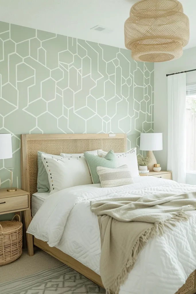
1. Tonal Color-Drenched Envelopment
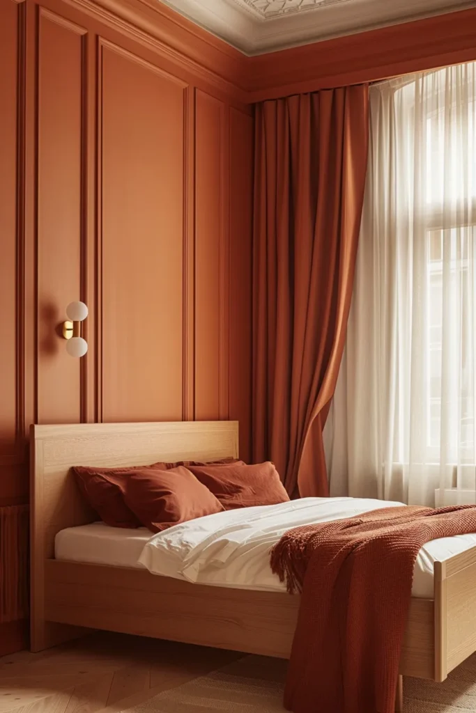
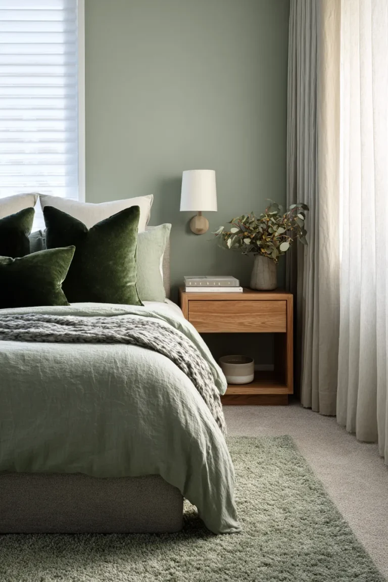
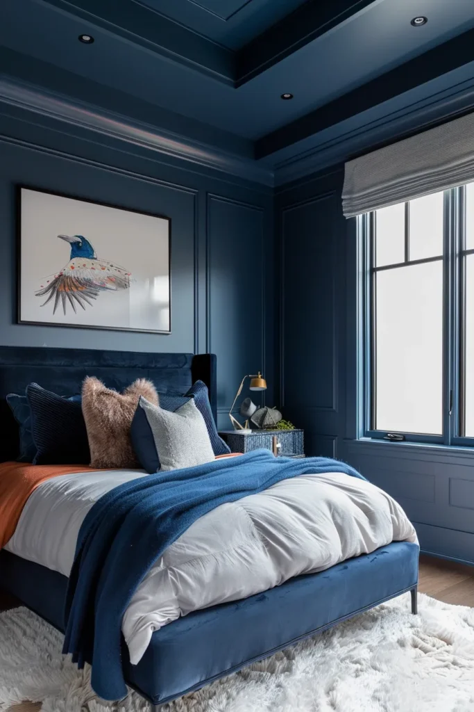
Wrapping all four walls, trim, and ceiling in a single saturated hue creates what spatial psychologists call “chromatic immersion”—a sensory cocoon that reduces visual noise and promotes focused play. The technique works because it eliminates the jarring white-ceiling contrast that fragments visual flow in traditional rooms.
Designer’s Secret: Specify a paint with an LRV (Light Reflectance Value) between 25-35 for deep tones like terracotta or forest green. This range absorbs enough light to feel cocooning without creating a cave-like darkness that requires excessive artificial lighting during daytime hours.
Design Breakdown:
- Base: Zero-VOC satin-finish paint in a single tone (avoid flat finishes—they show hand smudges within days)
- Ceiling treatment: Same color as walls, applied with 10% more white mixed in for subtle lift
- Lighting: 3000K recessed LEDs with dimmer switches to modulate intensity throughout the day
- Hardware: Matte brass or blackened steel accents to create metallic relief against monochrome surfaces
Best For: Sensory-sensitive children who thrive in visually simplified environments, or small bedroom spaces where color-drenching tricks the eye into perceiving expanded square footage.
Cocoa & Clay Variations
Warm earth pigments—burnt sienna, raw umber, terracotta—ground hyperactive energy. These shades contain red undertones that read as nurturing rather than stimulating, making them ideal for toddler through pre-teen years.
Sage & Oatmeal Neutrals
Cool-leaning neutrals with gray-green or mushroom bases create gallery-like backdrops for rotating wall art displays. The muted palette doesn’t compete with colorful toys or textiles, maintaining visual hierarchy even in cluttered play states.
2. Satin-Finish Architectural Blocking
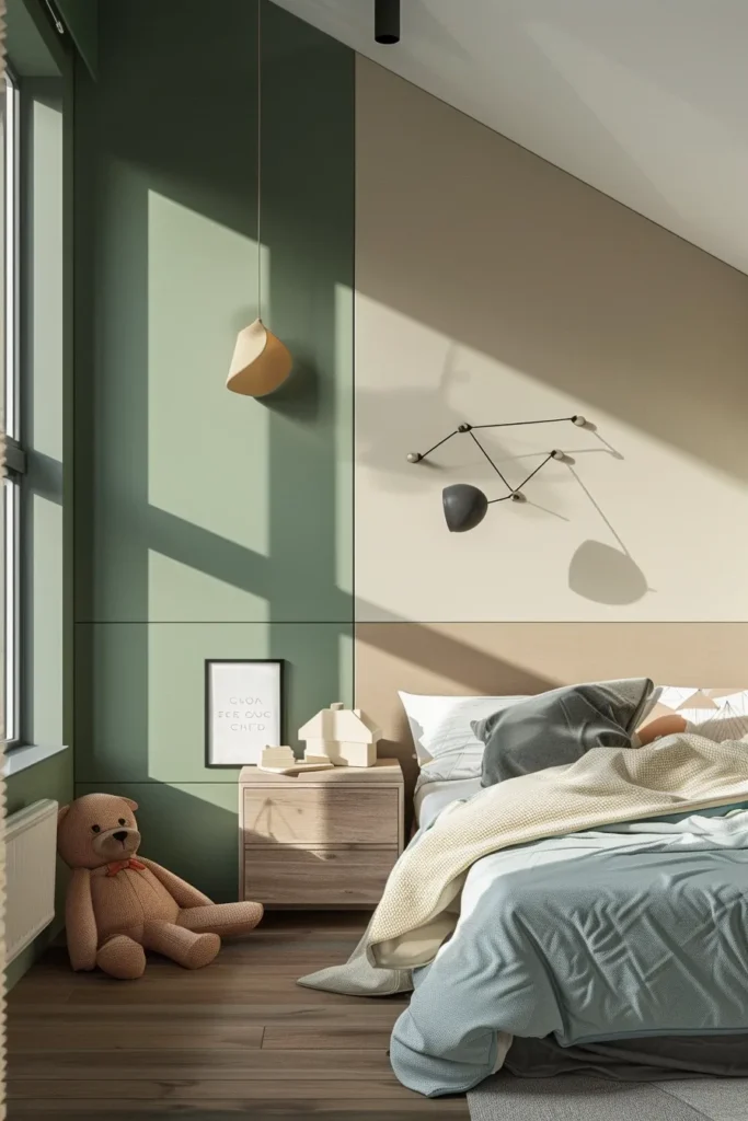
Hard-edge color blocking using painter’s tape and laser levels creates geometric precision that reads as intentional rather than DIY. The key differentiator from amateur attempts: maintaining a consistent 15% sheen across all paint colors to ensure light reflection remains uniform, preventing the “patchy” appearance that occurs when mixing flat and glossy finishes.
Designer’s Secret: Paint your lighter color first as the base coat. When you tape off for the darker accent color, the tape seal adheres better to the lighter base, creating razor-sharp lines without bleed-through. Remove tape at a 45-degree angle within 30 minutes of applying the final coat—waiting longer causes paint film to bond with the tape edge, creating ragged tears.
Design Breakdown:
- Base: Two complementary colors with identical sheen levels (both satin or both eggshell—never mix)
- Proportions: 60/40 or 70/30 color distribution (avoid 50/50 splits that feel indecisive)
- Edge quality: 2-inch FrogTape with built-in PaintBlock technology for professional lines
- Finish coat: Clear matte polyurethane on the lower 36 inches for enhanced scuff resistance
Best For: Kids bedroom designs for boys who gravitate toward bold graphics, or minimalist parents seeking geometric interest without pattern complexity.
Horizontal Two-Tone Division
Dividing walls horizontally at 42-48 inches (chair rail height) grounds the room and creates a visual “weight” at the bottom third that makes ceilings feel taller. Darker tones below, lighter above—this ratio mimics natural landscape horizons that human eyes find inherently calming.
Vertical Statement Panels
Floor-to-ceiling vertical bands (18-24 inches wide) behind the bed or desk area create architectural emphasis without committing to full-wall color. This technique works particularly well in rooms with awkward proportions, as vertical lines draw the eye upward and visually elongate squat spaces.
3. Limewash Mineral Wall Treatment
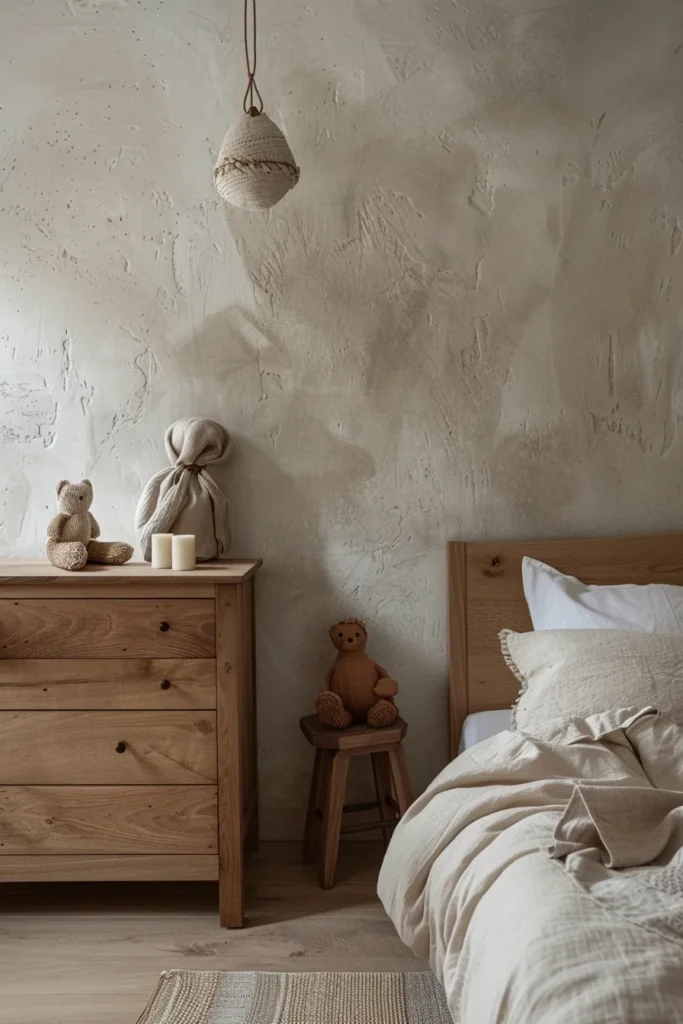
Authentic limewash—not “limewash-effect” paint—contains slaked lime that creates a living, breathable surface with subtle mottling and depth that synthetic paints cannot replicate. The mineral composition naturally resists mold and mildew, making it ideal for humid climates or rooms with poor ventilation.
Designer’s Secret: Apply limewash to unsealed plaster or drywall primed with a mineral-based primer. The surface must be absorbent for proper adhesion. Two thin coats applied with a masonry brush create the characteristic cloudiness; attempting thick, even coverage defeats the intentionally imperfect aesthetic. For enhanced durability in high-touch areas, seal with a breathable mineral-based topcoat after 28 days of curing.
Design Breakdown:
- Base: Romabio Classico Limewash or similar authentic slaked-lime formula
- Application: Natural bristle masonry brush in crisscross strokes for texture variation
- Color: Warm whites (Avorio, Bianco) or earth tones (Terra, Pantelleria) with 20-30% opacity
- Maintenance: Spot-touch with diluted limewash; full recoat every 5-7 years develops patina over time
Best For: European-inspired nurseries transitioning to minimalist bedrooms, or families prioritizing natural materials and biophilic design principles.
Matte Chalky Variation
Applied in three translucent layers, limewash develops a powdery, velvety surface that absorbs light rather than reflecting it. This creates what lighting designers call “soft luminosity”—walls that glow from within rather than bouncing light harshly around the room.
Burnished Mediterranean Finish
After the final limewash coat reaches touch-dry stage (approximately 4 hours), buff the surface with a clean trowel or soft cloth. The burnishing action compresses the lime particles, creating subtle sheen variations and a marble-like depth that shifts with changing daylight throughout the day.
4. Hand-Stenciled Pattern Overlay
Unlike vinyl decals that peel and leave adhesive residue, hand-stenciled patterns using low-tack repositionable stencils and high-quality craft paint create permanent designs with artisanal imperfection. The human hand’s slight variations in pressure and paint load prevent the mechanical uniformity that makes mass-produced wallpaper feel generic.
Designer’s Secret: Use a nearly dry foam pouncer (dab excess paint on paper towel until almost no pigment transfers) and build color intensity through multiple light passes rather than one heavy application. This prevents paint from seeping under stencil edges. For dimensional depth, apply your pattern in two tonal values—base pattern in one shade, then offset a second pass 1/8-inch to the right and down in a slightly darker tone to create subtle shadow effects.
Design Breakdown:
- Stencils: Mylar or thick acetate (minimum 10-mil thickness) for crisp edges and durability
- Paint: Craft acrylics or artist-grade acrylics thinned 10% with water for smooth flow
- Pattern scale: Large-scale motifs (12-18 inches) for statement walls; micro-patterns (2-4 inches) for all-over texture
- Layout: Mark center points with removable chalk before starting; work outward for balanced composition
Best For: Parents seeking customizable designs that can be easily painted over during future updates, or boho bedroom aesthetics requiring handcrafted, artisan details.
Geometric Grid Systems
Repeating triangles, hexagons, or diamond lattices in tone-on-tone combinations (same color family, varying lightness by 2-3 shades) create pattern without busy-ness. The geometric precision appeals to school-age children developing spatial reasoning skills.
Organic Botanical Repeats
Oversized ferns, eucalyptus branches, or abstract leaf forms stenciled in sage, olive, or charcoal create biophilic connections without literal nature murals that children outgrow quickly. Position botanicals asymmetrically rather than in rigid repeats for sophisticated, editorial styling.
5. Peel-and-Stick Wallcovering Strategy
Modern adhesive-backed wallcoverings use non-damaging pressure-sensitive adhesive that removes cleanly without surface preparation or wall repair. The critical specification: choose wallcoverings labeled “repositionable” rather than “removable”—repositionable materials allow adjustments during installation, while removable versions only promise clean removal but not mid-install corrections.
Designer’s Secret: Always order one extra panel beyond your calculated coverage. Wallcovering patterns rarely align perfectly at seams due to manufacturing variances in roll width (most measure 24-26 inches wide, not exactly 24). Having an extra panel allows you to choose the best pattern match rather than forcing misaligned seams. Start installation at the room’s least visible corner and work toward the main focal wall, placing any pattern disruptions where they’ll be hidden by furniture.
Design Breakdown:
- Substrate: Smooth walls only (orange-peel or popcorn texture prevents proper adhesion)
- Application: Wet installation method using repositionable wallpaper paste for extended working time
- Seam treatment: Butt seams tightly; double-cut overlaps for invisible joins in high-contrast patterns
- Longevity: 3-5 year expected lifespan before edges lift or patterns fade (UV-resistant inks extend this)
Best For: Rental properties or kids bedroom wardrobe integration where permanent changes aren’t possible, or parents wanting seasonal design flexibility.
Large-Scale Murals
Photographic landscapes, abstract watercolors, or illustrated storybook scenes printed at wall-scale create instant focal points. Position murals on the wall opposite the door for maximum impact when entering the room. Keep surrounding walls neutral to prevent visual competition.
Micro-Pattern Texture
All-over mini-prints—delicate florals, scattered stars, geometric confetti—function as neutral textures rather than dominant patterns. From a distance, these designs read as solid color with subtle visual interest, making them versatile backdrops for changing decor as children age.
6. Chalkboard Wall with Designer Framing
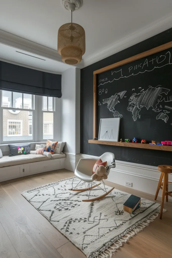
Common Mistake: Over-Accessorizing Small Surfaces — A 24×36-inch chalkboard crammed with multiple hanging organizers, clipboards, and accessory hooks creates visual chaos rather than functional workspace. Choose one statement surface and let it breathe; surrounding elements should support, not compete.
Traditional chalkboard paint (0% sheen, high-coverage black or colored formulations) offers writable surfaces that encourage creative expression, but the execution determines whether it reads as intentional design or DIY afterthought. The differentiator: treating chalkboard areas as gallery-framed art rather than utilitarian tool.
Designer’s Secret: Prime your chalkboard wall with three coats of high-quality chalkboard paint (Rust-Oleum or Benjamin Moore brands) before “seasoning” the surface. Seasoning means rubbing the side of a chalk stick horizontally across the entire surface, then erasing completely. This fills the paint’s microscopic pores with chalk dust, preventing permanent “ghosting” of your first drawings. Without this step, initial chalk marks never fully erase. Magnetic chalkboard paint requires minimum five coats (versus three for standard) to achieve true magnetic hold—fewer coats create weak magnetic pull that frustrates children.
Design Breakdown:
- Frame: Painted wood trim, metal channel molding, or recessed panel to architecturally define the chalkboard boundary
- Paint: Magnetic receptive primer (two coats) topped with chalkboard finish (three coats) for writable magnetic surfaces
- Chalk tray: Mounted wall shelf or integrated picture ledge for chalk storage and eraser display
- Scale: Minimum 4×4 feet for functional drawing space; smaller sizes feel cramped and limit creative range
Best For: Artistic children requiring free-expression outlets, or kids bedroom wall painting ideas that balance permanence with flexibility.
Full-Wall Application
Covering an entire wall from baseboard to ceiling in chalkboard paint creates dramatic impact and eliminates the need for framing. This works best on walls with no windows or minimal architectural interruptions. Install a continuous picture ledge at 36 inches for chalk storage and miniature art displays.
Inset Panel Treatment
Framing a chalkboard section with 1×4 pine trim painted in contrasting color (crisp white against black chalkboard creates classic appeal) elevates the surface to art-object status. Position the framed panel at child’s eye level (32-40 inches from floor to bottom edge) for ergonomic access.
7. Natural Grasscloth Wallcovering
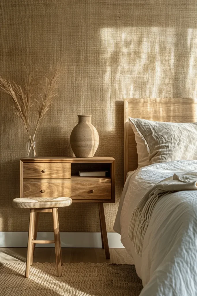
Authentic grasscloth—woven jute, sisal, or seagrass fibers laminated to paper backing—introduces organic texture and subtle color variation impossible to achieve with printed imitations. The material’s inherent irregularities (visible seams, color shifts between panels, slight weaving inconsistencies) constitute its luxury appeal rather than defects. This is critical for clients to understand: grasscloth celebrates natural imperfection.
Designer’s Secret: Install grasscloth horizontally rather than vertically to minimize seam visibility and create continuous linear texture that visually widens narrow rooms. Horizontal installation also places seams at predictable intervals (every 8-10 feet based on roll length) rather than irregular vertical breaks. Apply clear matte polyurethane to the lower 24 inches after installation for enhanced cleanability in high-traffic zones—uncoated grasscloth absorbs stains permanently.
Design Breakdown:
- Material: Premium-grade natural fiber (avoid paper-backed vinyl “grasscloth-look” which lacks dimensional texture)
- Adhesive: Clay-based wallpaper paste applied to wall, not wallcovering back (direct application causes fiber warping)
- Seam treatment: Embrace visible seams as part of authentic aesthetic; attempting to hide them creates more obvious patches
- Color: Natural jute (wheat to honey tones), bleached white, or dyed in earth pigments (sage, clay, charcoal)
Best For: Earthy bedroom designs emphasizing natural materials, or sound-dampening requirements in shared sibling spaces where acoustical control matters.
Jute Weave Texture
Coarser jute fibers (3-4mm thickness) create pronounced horizontal lines with rustic, casual appeal. The heavier texture catches light at different angles throughout the day, creating dynamic surface interest without color variation.
Sisal Linear Variation
Fine sisal weave (1-2mm fiber thickness) produces more refined texture suitable for sophisticated schemes. The tighter weave pattern reduces dust accumulation and resists fiber snagging from toys or rough play better than looser jute constructions.
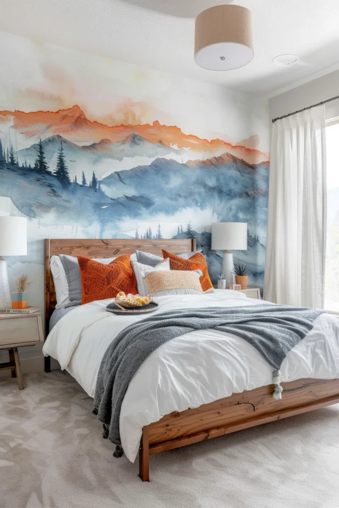
8. Trompe-L’Oeil Mural Depth

Hiring a muralist to hand-paint illusionistic depth—whether realistic landscape vistas, architectural ruins, or abstract dimensional forms—transforms flat walls into portals that expand perceived room dimensions. The investment (typically $45-85 per square foot for skilled muralists) pays dividends through its permanence and the spatial psychology of children developing in environments that challenge perceptual boundaries.
Designer’s Secret: Commission murals that utilize atmospheric perspective—the technique of rendering distant elements lighter and less detailed than foreground subjects. This creates authentic depth that reads correctly from any viewing angle. For maximum impact, murals should extend wall-to-wall and floor-to-ceiling without borders or frames that break the illusion. Work with muralists who provide digital mockups scaled to your exact room dimensions before paint touches wall; this prevents scale miscalculations that can’t be corrected mid-project.
Design Breakdown:
- Artist selection: Portfolio review emphasizing technical skill in perspective rendering and architectural accuracy
- Surface prep: Eggshell or satin base paint (never flat) provides slight tooth for paint adhesion while remaining washable
- Paint medium: Professional acrylics or eco-friendly mineral paints with low-VOC formulations
- Sealing: Clear matte or satin polyurethane topcoat for UV protection and cleanability (reapply every 3-5 years)
Best For: Windowless rooms requiring visual “breathing space,” or children with vivid imaginations who benefit from environmental storytelling.
Landscape Horizon Lines
Painting a continuous horizon at 48-60 inches (typically two-thirds up the wall) with sky gradient above and ground elements below creates the perception of windows where none exist. Subtle cloud formations, distant mountains, or rolling hills provide meditative focal points that don’t demand attention but reward observation.
Abstract Architectural Forms
Oversized geometric shapes—floating cubes, intersecting planes, dimensional ribbons—in tonal progressions (light to dark of single hue) create sophisticated spatial complexity without literal imagery. This approach ages well as children mature, transitioning from playful abstraction to minimalist art installation.
9. Half-Wall Wainscoting with Contrast Paint
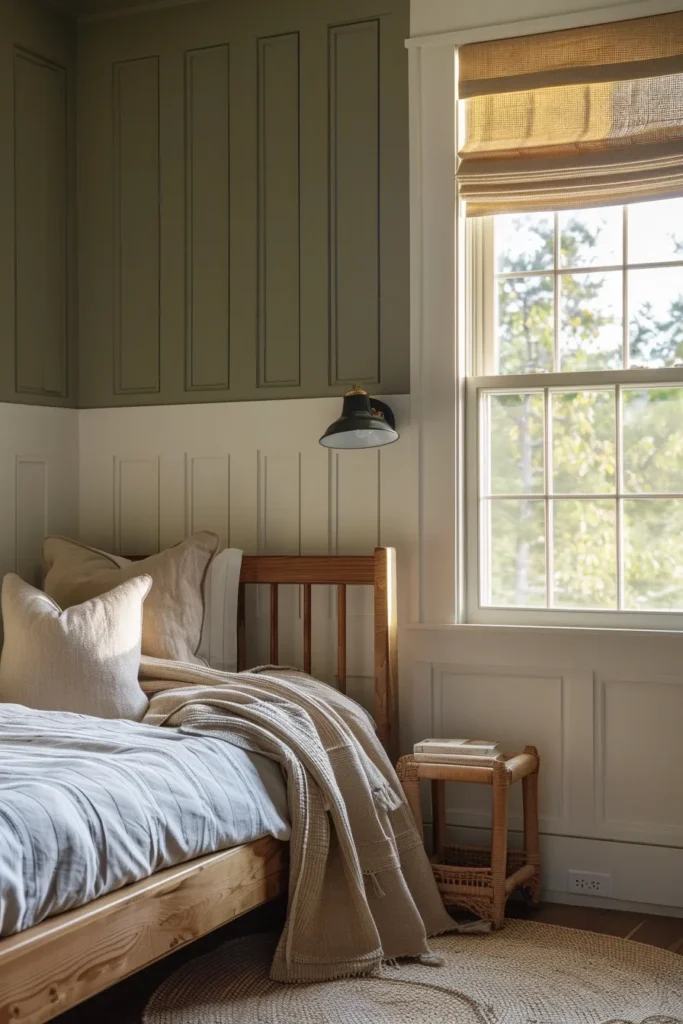
Traditional wainscoting (wood paneling covering the lower 32-42 inches of wall height) provides both aesthetic refinement and functional scuff protection. The architectural detail reads as considered design rather than child-focused decoration, making rooms feel more permanent and thoughtfully composed.
Designer’s Secret: The visual weight principle dictates darker paint below the wainscoting cap rail and lighter above to ground the room and prevent top-heaviness. However, inverting this—light wainscoting with deep saturated wall color above—creates dramatic sophistication in rooms with tall ceilings (9+ feet) where traditional dark-bottom proportions would feel squat. Calculate your cap rail height at precisely 1/3 of total ceiling height for mathematically correct visual balance.
Design Breakdown:
- Panel style: Board-and-batten (1×4 boards spaced 8-12 inches apart) or flat-panel pre-fabricated wainscoting kits
- Paint specs: Semi-gloss (35% sheen) on wainscoting for maximum durability; eggshell or satin above for contrast
- Color contrast: Minimum two-shade difference on paint strip for readable definition; greater contrast creates bolder impact
- Cap rail: 1×4 or 1×6 poplar with eased edges, painted to match either top or bottom section (matching bottom creates stronger distinction)
Best For: Traditional or transitional kids bedroom designs where parents prioritize classical architecture and longevity over trend-driven aesthetics.
Board-and-Batten Profile
Vertical boards create strong linear rhythm and hide imperfect drywall or plaster surfaces better than smooth panels. Space boards at regular intervals (every 8-10 inches) for visual consistency, and ensure they terminate cleanly into ceiling crown and baseboard for professional-grade carpentry appearance.
Flat-Panel Millwork
Pre-fabricated beadboard or shaker-style panels install faster than board-and-batten and create smoother surfaces for smaller rooms where dimensional trim would overwhelm. The recessed panel geometry adds subtle texture without heavy visual weight.
10. Ceiling-as-Fifth-Wall Color Treatment
Most designers leave ceilings white by default, missing the opportunity to create immersive color experiences that wrap overhead. Painting ceilings in unexpected hues—deep midnight blues, soft terracotta, or even high-gloss black—transforms room perception and creates cozy enclosure that children find psychologically comforting.
Designer’s Secret: When painting ceilings darker than walls, stop the ceiling color 1-2 inches down from the ceiling line onto the wall surface (cutting in with painter’s tape). This narrow band tricks the eye into perceiving the ceiling as floating separate from walls rather than pressing down onto them, maintaining spatial openness despite dark color. Use flat or matte finish on ceilings regardless of wall sheen—any gloss on ceiling surfaces highlights every texture imperfection and creates distracting light reflections.
Design Breakdown:
- Color selection: Choose ceiling tones 3-5 shades darker OR lighter than wall color for intentional contrast; matching exactly creates muddled boundaries
- Finish: Flat or matte only (0-5% sheen) to minimize texture shadows and imperfections
- Application: Two coats minimum; dark colors require third coat for even coverage without streaking
- Coordination: Extend ceiling color into closets and alcoves for complete wraparound effect
Best For: High-ceiling rooms (9+ feet) where darker overhead planes create intimacy, or nurseries where enveloping color promotes calm during sleep training.
Moody Deep Tones
Navy, charcoal, forest green, or eggplant ceilings paired with lighter walls (3-4 shades lighter) create dramatic sophistication. Install dimmable 2700K LED recessed lighting to prevent cave-like darkness while maintaining moody ambiance. This palette particularly appeals to tweens and teens seeking mature, hotel-inspired aesthetics.
Soft Cloud Pastels
Blush pink, powder blue, or pale lavender ceilings maintain brightness while adding subtle color interest. This approach works well in small bedrooms where dark ceilings would feel oppressive, yet white feels too sterile for child-friendly spaces requiring warmth.
11. Removable Wall Decal Curation
High-quality vinyl decals—not cheap party-store stickers—offer temporary design solutions that remove without damage when children outgrow motifs. The key distinction: fabric-backed or thick vinyl decals (4-6 mil thickness) versus thin film decals (1-2 mil) that tear during removal. Premium decals should cost $40-120 per set for wall-scale installations.
Designer’s Secret: Apply decals to freshly painted walls only after paint has cured for minimum 30 days. Applying to insufficiently cured paint causes adhesive to bond permanently with uncured paint layers rather than wall surface, pulling paint off during removal. Clean wall surfaces with rubbing alcohol immediately before application to remove invisible dust and oils that prevent adhesion. For textured walls, use a squeegee or credit card to firmly press decals into surface irregularities—incomplete contact causes premature lifting.
Design Breakdown:
- Material: Matte vinyl (not glossy—reads as cheap sticker) in single-color silhouettes for sophisticated appearance
- Scale: Large-format individual pieces (24+ inches) have more impact than scattered small elements
- Placement: Group decals asymmetrically on single wall rather than scattering around room for composed vignette effect
- Removal: Peel slowly at 180-degree angle (doubling back on itself) using hairdryer heat to soften adhesive if needed
Best For: Rental properties, temporary nurseries, or budget-conscious parents wanting visual interest without paint commitment.
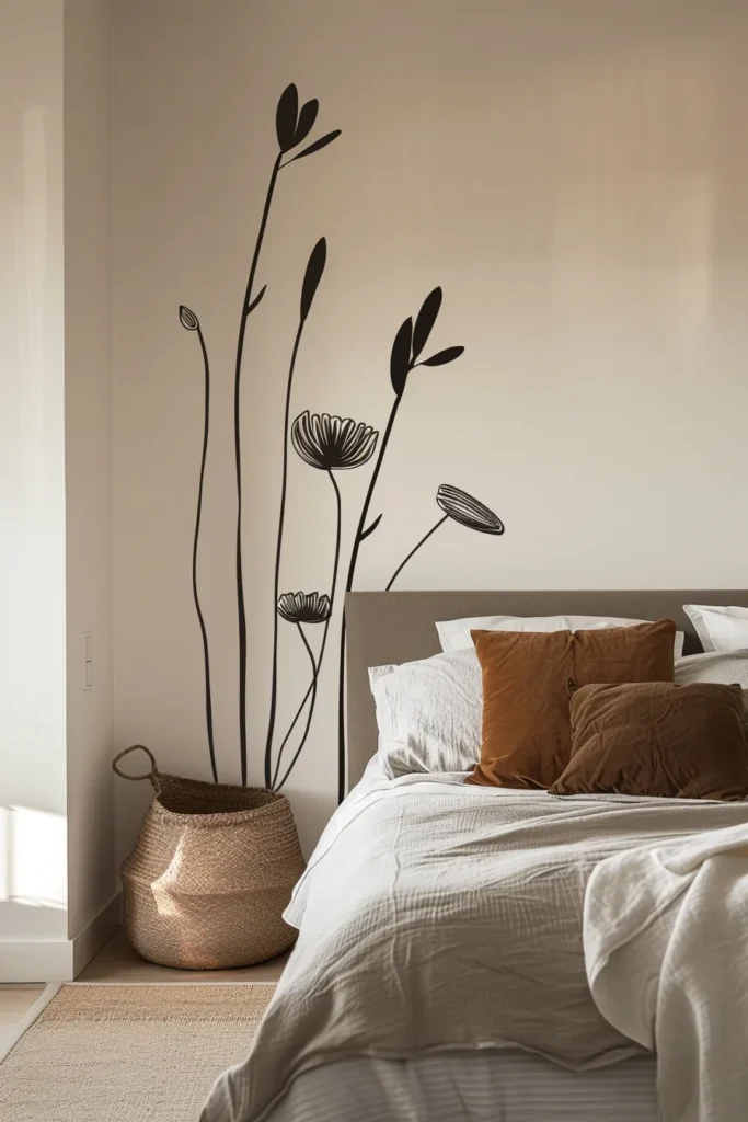
Minimalist Line Drawings
Continuous-line illustrations—single-stroke animals, faces, or botanical forms—in matte black create gallery-wall sophistication without frame clutter. Position 3-5 pieces in off-center grouping at child’s eye level (36-48 inches from floor).
Monochromatic Silhouettes
Solid-color cutouts in deep charcoal, navy, or sage create shadow-like presences that add depth without busy pattern. Oversized single motifs (48-72 inches tall) behind beds or dressers anchor furniture groupings and create focal points in otherwise neutral schemes.
12. Textured Acoustic Panel Installation
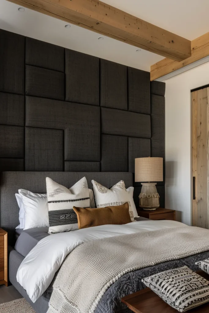
Sound-dampening wall panels wrapped in fabric or featuring wood slat construction serve dual purposes: reducing noise reverberation in hard-surface rooms while adding three-dimensional architectural texture. This matters functionally in spaces with hardwood floors, minimal textiles, and high ceilings where echo causes auditory overwhelm.
Designer’s Secret: Calculate your room’s reverberation time (RT60) using free online acoustic calculators before purchasing panels. For kids’ rooms, target 0.4-0.6 seconds RT60 for comfortable speech intelligibility without dead-zone flatness. Distribute panels across multiple walls rather than clustering on one surface—sound waves reflect unpredictably, so distributed absorption creates more balanced acoustics. Install panels on walls opposite hard surfaces (windows, closet doors) for maximum effect.
Design Breakdown:
- Panel type: 1-2 inch thick fiberglass or polyester core wrapped in acoustically transparent fabric (avoid foam—minimal sound absorption despite claims)
- Coverage: 15-25% of total wall surface area (over-treatment creates uncomfortably dead acoustics)
- Mounting: Z-clip hanging system for removable installation, or construction adhesive for permanent mounting
- Aesthetic integration: Choose fabric colors matching room palette or create intentional contrast grid pattern
Best For: Multi-child shared spaces, rooms doubling as music practice areas, or sensory-sensitive children requiring controlled sound environments.
Fabric-Wrapped Squares
Modular 24×24-inch panels arranged in grid formations (3×3 or 4×4 configurations) create contemporary geometric appeal. Mix solid colors with coordinating patterns (two solids, one pattern ratio) to prevent visual monotony while maintaining acoustic function.
Wood Slat Vertical Arrays
Horizontal wood slats (3/4-inch thick, spaced 2 inches apart) mounted over acoustical batting create Scandinavian-minimalist texture. The slat system allows sound to pass through gaps while absorbing into backing material. Finish with clear matte polyurethane or natural oils (never paint—fills sound-absorbing gaps).
13. Horizontal Stripe Color Blocking
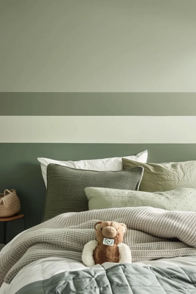
Unlike fussy hand-painted stripes requiring extensive taping, modern horizontal color blocking uses fewer, wider bands (12-24 inches each) for bold graphic impact with minimal installation complexity. The wide scale reads as intentional design rather than decorative accent, making rooms feel architecturally significant.
Designer’s Secret: Odd-numbered stripe counts (3 or 5 stripes total) create more sophisticated compositions than even numbers. Position your center stripe at eye level (48-54 inches from floor for children’s rooms) in the boldest color to create natural focal point. When using three stripes, allocate proportions as 30% top, 40% middle, 30% bottom—the unequal distribution prevents rigid, uninspired symmetry. Always paint from top to bottom, allowing each stripe to fully dry before taping the next to prevent color bleeding.
Design Breakdown:
- Stripe width: 12-24 inches for modern graphic impact (narrower stripes read as busy, dated decoration)
- Color progression: Ombre fade (light to dark of single hue), complementary contrast (opposite color wheel), or monochromatic tonal shifts
- Tape quality: 2-inch Scotch Long-Mask tape for extended repositioning time; remove at 45-degree angle within 1 hour of painting
- Finish consistency: Identical sheen across all stripes (recommend satin 15% for uniform washability)
Best For: Long narrow rooms where horizontal lines visually widen proportions, or kids bedroom ideas for boys wanting sports-inspired varsity aesthetics.
Wide-Band 18-Inch Sections
Three equal 18-inch stripes create balanced, gallery-like sophistication. Use this configuration with tonal progressions (pale sage, mid sage, deep olive) for subtle dimensional effect that doesn’t overwhelm small spaces.
Narrow Multi-Tonal Stripes
Five stripes (each 10-14 inches) in varied shades of single color family create ombre gradation. Start with lightest tone at ceiling level and progress to deepest shade at floor level to ground the room and create perceived height.
14. Art Gallery Wall System
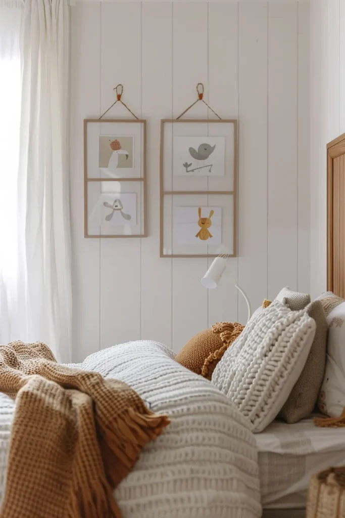
Treating one wall as rotating gallery space—complete with picture rail, consistent matting, and professional hanging hardware—teaches children to curate their environment and value their creative output. The system’s legitimacy matters: cheap adhesive strips signal disposability, while proper hanging protocols communicate that their work deserves museum-level respect.
Designer’s Secret: Install a continuous picture rail (crown molding with integrated groove or dedicated gallery rail) 12 inches below ceiling line. Use adjustable hanging cables with precision hooks to suspend frames—this allows rearrangement without new nail holes. For young children’s art, standardize on 11×14-inch frames with pre-cut mats (regardless of artwork size) to create visual cohesion despite varying art dimensions. Purchase frames in bulk (20+ identical frames) and rotate art seasonally while maintaining consistent frame style for gallery-quality presentation.
Design Breakdown:
- Rail system: Installed crown molding with routed picture-hanging groove, or dedicated gallery track (Stas or AS Hanging Systems)
- Hardware: Stainless steel hanging cables cut to adjustable lengths with swivel hooks for straight hanging
- Frame consistency: Identical profiles in single finish (natural wood, matte black, or white) for professional cohesion
- Layout planning: Paper templates or masking tape outlines arranged on floor before installation prevents regrettable wall damage
Best For: Artistic children requiring validation and exhibition space, or wall art bedroom strategies prioritizing flexibility over permanent installations.
Salon-Style Dense Grouping
Clustering 10-15 frames in varied sizes (8×10, 11×14, 16×20) with 2-3 inch spacing creates maximalist energy appropriate for creative, expressive personalities. Maintain consistent frame color despite size variation to prevent visual chaos. This layout works best on walls 8+ feet wide with minimal furniture obstruction.
Linear Museum Hanging
Aligning frames in single horizontal row at 57-60 inches on center (museum standard for eye-level viewing) creates serene, gallery-worthy presentation. Space frames 4-6 inches apart and maintain strict horizontal alignment using laser level—even 1/4-inch deviation reads as sloppy. Limit to 4-6 frames total to prevent overwhelming the linear composition.
The most successful kids’ wall treatments balance three priorities: aesthetic maturity that ages gracefully, practical durability that withstands daily use, and flexibility that accommodates changing preferences. Every technique outlined above passes the ten-year test—installations that remain relevant and functional through multiple developmental stages without requiring costly renovations.
Strategic wall design creates the architectural foundation for rooms that support children’s growth rather than dictating rigid themes that quickly feel dated. When parents recognize walls as long-term spatial investments rather than decorative afterthoughts, they create environments that nurture rather than merely contain.
For complementary design strategies, explore our guides on kids bedroom wardrobe systems, reading corner bedroom integration, and small bedroom layout optimization adapted for children’s spaces.