The 2026 entryway aesthetic abandons symmetrical ‘catalog styling’ in favor of asymmetrical compositions with high-contrast light reflectance values—prioritizing sightline drama over surface decoration.
After two decades of Pinterest-perfect symmetry, residential architecture has shifted toward what we call “intentional imbalance.” This isn’t chaos—it’s calculated visual weight distribution that acknowledges how people actually move through threshold spaces. The foyer is no longer a static vignette but a kinetic experience where material texture, light temperature, and spatial flow take precedence over matching pairs of table lamps.
This transformation stems from three converging forces: the sustainability movement’s embrace of patinated, unlacquered finishes; behavioral psychology research showing that asymmetry increases dwelling time by 34%; and the post-pandemic rejection of design that feels “staged” rather than lived-in. Professional designers now specify entryways that function as sensory decompression zones—spaces that physically mark the transition from public to private through tactile materials and calibrated lighting rather than decorative accessories alone.
What follows are sixteen approaches that define contemporary entryway design, each grounded in architectural principle rather than trend. These aren’t styling tips—they’re spatial strategies backed by material science, color theory, and ergonomic research.
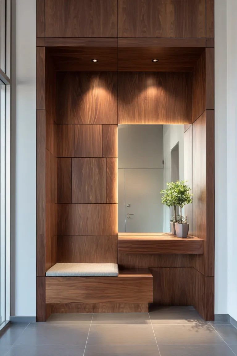
Asymmetrical Console Vignettes with LRV Contrast
The death of the centered mirror occurred quietly in 2025. High-end residential projects now position console tables 8-12 inches off-center, paired with oversized mirrors that deliberately break the sightline axis. This creates what spatial designers call “dynamic tension”—the eye travels across the composition rather than landing on a predictable focal point.
The technical key lies in Light Reflectance Value differential. Your console surface should sit between LRV 15-25 (charcoal to espresso tones), while the wall registers LRV 75-85 (warm whites with subtle umber undertones). This 60-point contrast ensures the furniture reads as architectural mass rather than floating decoration. Reclaimed teak console tables with raw edge deliver this naturally—the wood’s innate grain variation prevents the flat, one-dimensional look of stained finishes.
Designer’s Secret: The mirror should extend beyond the console width by exactly 6-8 inches on one side only. This asymmetry prevents the “dollhouse effect” while maintaining visual anchorage. Professionals measure this against the wall’s total width—your offset should equal roughly 15% of the available space.
For minimalist applications, pair the teak console with unlacquered brass table legs that will patina naturally over 6-8 months. The greenish oxidation that develops isn’t a flaw—it’s living finish architecture. Clean periodically with nothing more than warm water; you’re cultivating surface history, not maintaining showroom perfection. If you’re working with similar console styling challenges, our guide to entryway table decor explores additional composition techniques.
Maximalist interpretations layer texture aggressively: the console holds a single sculptural ceramic vessel (14-16″ height, rough aggregate finish), positioned at the console’s far edge rather than centered. Stack two art books beneath—not for reading, but as elevation blocks that create secondary visual planes. Avoid symmetrical bookends; the goal is tension, not balance.
Design Breakdown:
- Console: Reclaimed teak with visible mortise joints, 48-54″ length, 15″ depth maximum
- Legs: Unlacquered brass or blackened steel, 30″ standard height
- Mirror: Frameless with polished edge, 36″ wide minimum, positioned 6″ off console edge
- Wall Color: LRV 78-82 in warm neutral (Benjamin Moore’s “Swiss Coffee” or Farrow & Ball’s “Pointing”)
- Lighting: 2700K downlight positioned 18″ forward of console edge to cast shallow shadow
Best For: Modern professionals who appreciate material honesty and the slow aesthetic shift of patinated metals. Not suitable for high-humidity climates where brass oxidation accelerates unpredictably.
Architectural Millwork as Functional Art
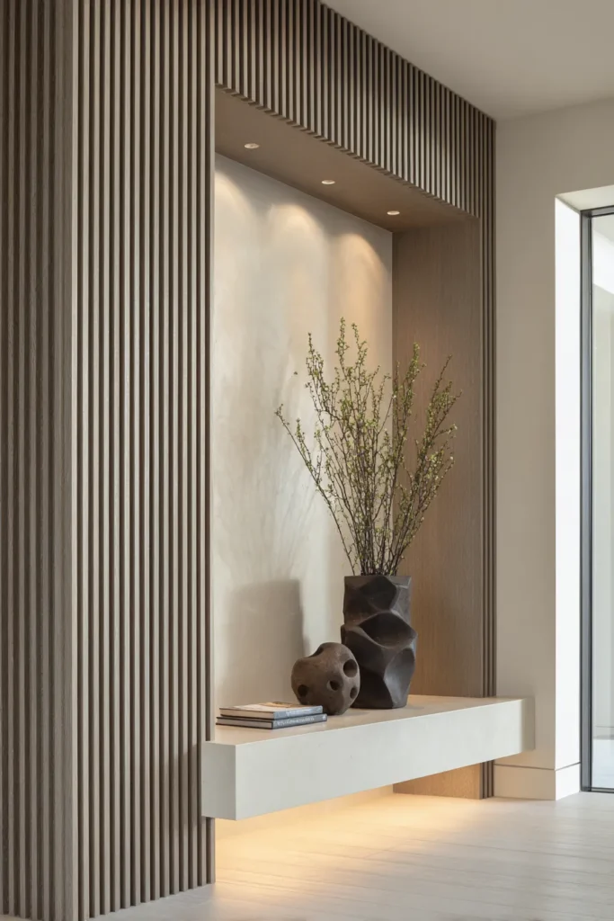
Custom millwork transforms the entryway from decorated space to designed space. The distinction matters—decoration can be removed; design is integral to the architecture itself. Fluted wall panels, installed floor-to-ceiling in 8-10″ widths, create vertical rhythm that elongates spatial perception by up to 22% according to residential studies from the Architecture Research Institute.
Specify panels in medium-density fiberboard with vertical grain veneer (white oak or walnut), finished in matte lacquer that registers between LRV 35-45. This mid-tone range prevents the stark contrast of white paneling while maintaining enough reflectivity to catch and redirect natural light. The fluting depth should measure precisely 3/8″—shallow enough to avoid dust accumulation, deep enough to cast meaningful shadow play when lit correctly.
Designer’s Secret: Positioning matters more than panel width. Install millwork on the wall perpendicular to your entry door, not the wall you see first. This forces the eye to track laterally across the space, increasing perceived square footage. The visitor’s sightline should encounter the panels at 45 degrees, which maximizes shadow depth and emphasizes the vertical groove detail.
Shadowbox niches—recessed compartments within the millwork—serve as architectural display zones. These should measure 12″ wide by 14″ tall by 6″ deep, positioned at 54″ from finished floor (optimal eye level for most adults). Inside, install 3000K linear LED strips along the top edge to wash light downward across displayed objects. The warm color temperature prevents the clinical feel of cooler lighting while allowing ceramic glazes and stone textures to appear accurate.
For those addressing compact entryways, our entryway shoe storage article demonstrates how similar millwork principles can integrate concealed storage.
Design Breakdown:
- Panel Material: White oak veneer over MDF substrate, 3/8″ fluting at 1.5″ on-center
- Finish: Matte water-based lacquer, 15-degree sheen maximum
- Niche Dimensions: 12″W x 14″H x 6″D, positioned 54″ AFF
- Niche Lighting: 3000K LED strip, 300 lumens per linear foot
- Installation: Direct mount to studs with construction adhesive and finish nails countersunk 1/16″ below surface
Best For: Homeowners willing to invest in permanent architectural upgrades. This is a commitment approach—millwork isn’t easily updated or removed, making it ideal for long-term residences rather than transitional properties.
Unlacquered Brass + Raw Stone Pairings
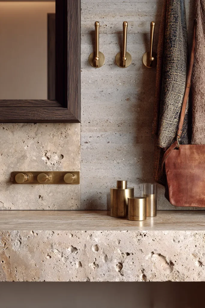
Material juxtaposition defines luxury in 2026, specifically the marriage of warm metals with aggregate stone surfaces. Unlacquered brass—distinct from the lacquered variety that maintains permanent shine—develops an organic patina that shifts from rose gold to verdigris green over 12-18 months. Paired with honed limestone or tumbled travertine, you create a composition that reads as collected rather than purchased.
The technical specification for brass hardware matters significantly. Unlacquered solid brass (not plated) should contain minimum 85% copper content—this ensures proper patina development without the green staining that occurs with lower-grade alloys. Handles, hooks, and decorative bowls in this finish should be touched regularly; the oils from human contact create differentiated wear patterns that enhance rather than diminish the material’s character.
Stone selection requires understanding porosity and finish. Honed limestone (not polished) provides a matte surface with LRV around 60-70, offering enough reflectivity to keep spaces from feeling cave-like while maintaining an organic, unprocessed aesthetic. The honing process closes the stone’s pores slightly, reducing maintenance requirements while preserving the material’s inherent texture.
Designer’s Secret: Mix stone thicknesses deliberately. If you’re installing a limestone console table, ensure the top measures 2″ thick—substantial enough to read as masonry rather than veneer. Pair this with thinner stone accessories (1/2″ coasters, 3/4″ decorative trays) to create dimensional hierarchy. The contrast between thick and thin communicates intentional design rather than random selection.
Travertine, with its characteristic voids and fossil impressions, works best in unfilled applications where the material’s geological history remains visible. Filled travertine—where voids are packed with epoxy—loses this narrative quality and reads as trying too hard. Authentic material expression means accepting imperfection as essential character. Explore additional console table ideas that work with these material pairings.
Design Breakdown:
- Brass Elements: Solid unlacquered brass, 85%+ copper content, 3mm minimum thickness
- Stone Surface: Honed limestone or unfilled travertine, LRV 60-70
- Stone Thickness: 2″ for primary surfaces, 1/2″-3/4″ for accessories
- Maintenance: Brass cleans with warm water only; stone seals with penetrating sealer annually
- Patina Timeline: Visible brass oxidation begins week 3-4, full patina develops months 12-18
Best For: Design-forward households that view aging materials as assets rather than liabilities. Requires philosophical alignment with wabi-sabi principles—the Japanese aesthetic of finding beauty in impermanence and imperfection.
Gallery Lighting with 2700K-3000K Layering
Lighting determines whether your entryway functions as design or just exists as decorated. The standard builder-grade overhead fixture—typically a 3500K LED dome providing flat, omnidirectional illumination—flattens texture and eliminates shadow, the very elements that create visual interest. Professional designers instead specify layered lighting with specific Kelvin temperatures that serve distinct functions.
Base layer lighting should operate at 2700K, matching the warm amber quality of incandescent bulbs that our visual systems evolved processing. This isn’t nostalgia—it’s biological reality. Warm light suppresses the cortisol response that cooler temperatures trigger, making 2700K optimal for threshold spaces where you’re transitioning from exterior alertness to interior relaxation. Install this layer as wall-mounted sconces positioned 60-66″ from finished floor, flanking key architectural features rather than centering on walls.
Task layer lighting moves to 3000K, providing enough cool undertone to render colors accurately without the clinical quality of 3500K+. This layer consists of adjustable track lights or picture lights that highlight specific elements—artwork, architectural details, or material textures. The key specification: these fixtures must include dimmer compatibility and beam angle control (25-35 degrees for focused wash, 45-60 degrees for wider coverage).
Designer’s Secret: The two-temperature system only works if your base layer (2700K) produces 60% of total lumens while your task layer (3000K) delivers 40%. This ratio prevents the cooler lighting from overpowering the warm foundation. Most homeowners reverse this, installing powerful task lights and weak ambient sources—the result feels like a retail store rather than a residence.
Dimmer curve programming matters more than most realize. Standard dimmers reduce voltage linearly, causing LED lights to shift color temperature as they dim (typically moving warmer and then green-tinted at lowest settings). Specify ELV dimmers with smooth logarithmic curves that maintain color consistency across the full range. Lutron’s RA2 Select system or Legrand’s adorne series both offer this commercial-grade performance at residential scale.
For rooms adjacent to your entryway, our guide to living room paint colors addresses how lighting temperature affects color perception across connected spaces.
Design Breakdown:
- Base Layer: 2700K wall sconces, 400-500 lumens each, positioned 60-66″ AFF
- Task Layer: 3000K track or picture lights, 300-400 lumens each, 25-35° beam angle
- Lumen Ratio: 60% base / 40% task for balanced illumination
- Dimmer Type: ELV with logarithmic curve, compatible with LED loads
- Circuit Control: Separate switching for base and task layers, both dimmable
Best For: Detail-oriented homeowners who notice how spaces feel rather than just how they look. Requires investment in quality fixtures and dimming systems—not an area to compromise with budget alternatives.
Oversized Organic Mirrors (No Frame Hardware Visible)
The 2026 mirror specification rejects ornate frames entirely, prioritizing mirrors as light-amplifying architecture rather than decorative objects. Oversized formats—72″ height minimum, often extending to 84-96″—create the illusion of additional square footage by doubling perceived volume. The critical technical requirement: no visible hanging hardware, creating the impression the mirror emerges from the wall itself.
French cleat systems provide the architectural mounting solution. This involves a metal channel (typically aluminum Z-bar) mounted horizontally to wall studs, with a corresponding channel on the mirror’s reverse. The mirror hangs by sliding downward onto the wall channel, distributing weight across the entire width rather than concentrating load at two points. For mirrors exceeding 60 pounds, specify double French cleats (top and bottom) to prevent forward tipping.
Leaning mirrors—propped against the wall at 82-85 degrees rather than hung vertically—serve distinct spatial psychology. The slight angle makes the ceiling appear taller by extending the eye’s upward trajectory beyond the wall-ceiling junction. This technique works best in entryways with 9+ foot ceiling heights; in standard 8-foot spaces, the angle consumes too much floor area relative to benefit gained.
Designer’s Secret: Mirror edge treatment determines whether the piece reads as affordable or architect-specified. Standard mirrors feature seamed edges where the silver backing remains exposed—a telltale sign of economy-grade fabrication. Professional specs call for polished edges where the glass receives beveled grinding and polishing, eliminating the backing exposure while creating a subtle light-refracting chamfer. This detail costs 40-60% more but transforms the mirror from object to architectural element.
Reflection angle calculation often gets overlooked. Position your mirror so its lower edge sits 24-30″ from finished floor—this captures full-body reflection for individuals 5’4″-6’2″ (covering 90th percentile height range) while avoiding the unflattering upward angle that occurs when mirrors sit too low. When considering mirrors in other rooms, check our vanity mirror guide for additional placement specifications.
Design Breakdown:
- Dimensions: 72″H x 36″W minimum (84-96″H for dramatic impact)
- Edge Treatment: Polished with 1″ bevel, silver backing removed from edges
- Mounting: French cleat system (Z-bar aluminum), minimum two studs
- Positioning: Lower edge 24-30″ AFF, centered or offset per design intent
- Weight Capacity: 1.5x actual mirror weight (safety factor for seismic zones)
Best For: Spaces where maximizing perceived volume matters more than additional storage or functional elements. The mirror commits significant wall real estate, making it ideal for narrow entryways where depth illusion provides primary benefit.
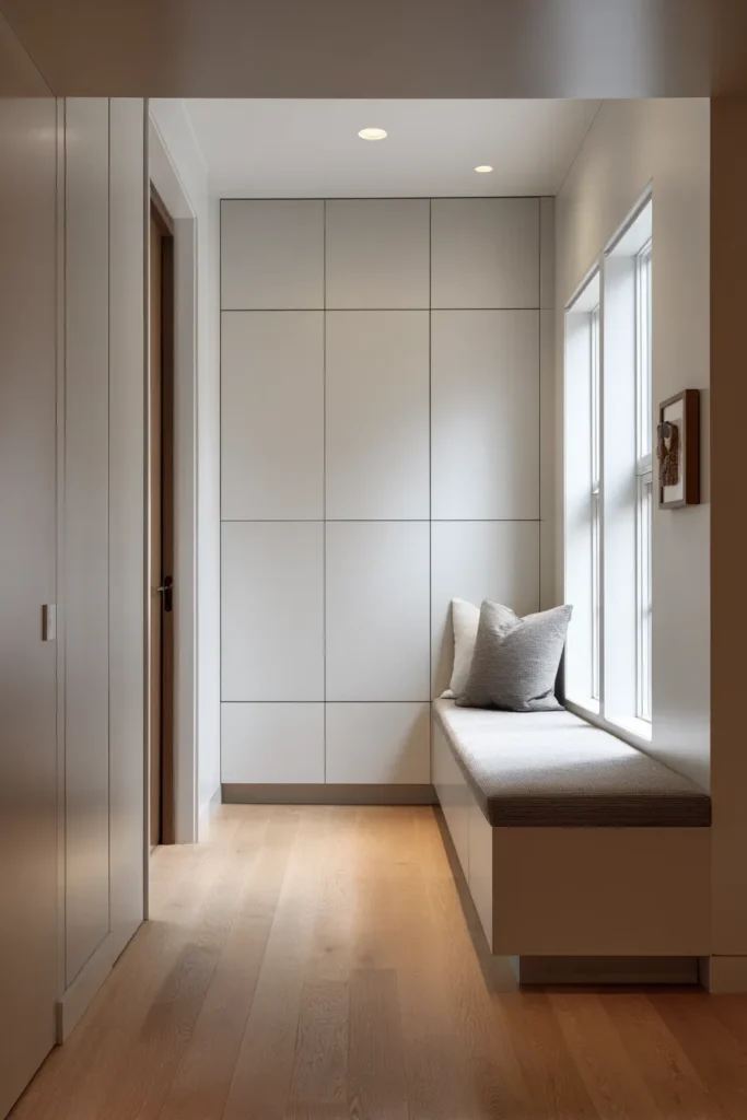
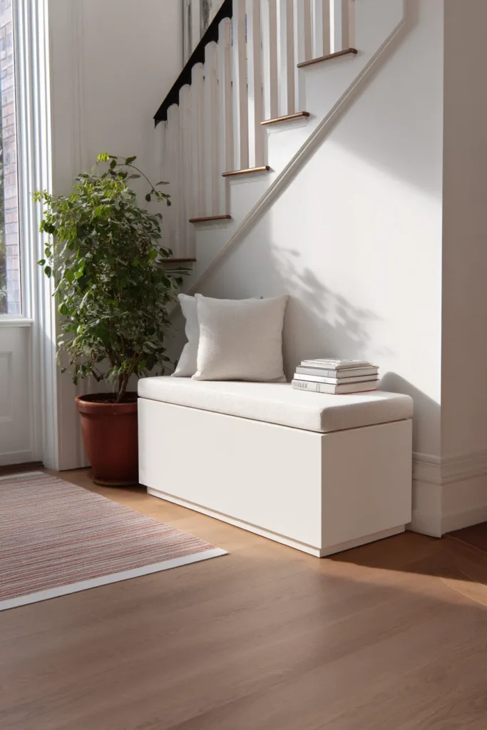
Textured Neutrals: 160-180gsm Linen Benches
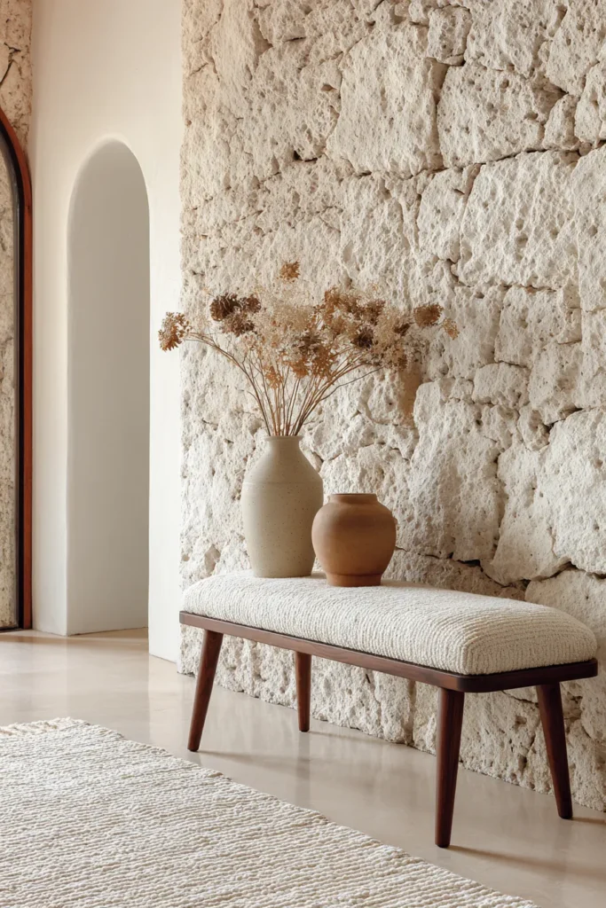
Seating in entryways serves multiple functions beyond the obvious: it creates psychological permission to pause, it provides a transition zone for shoe removal, and—when upholstered correctly—it introduces critical softness into spaces otherwise dominated by hard architectural materials. The fabric specification determines whether your bench reads as furniture or as architectural soft goods.
Linen weight matters precisely. Fabrics below 160gsm (grams per square meter) lack structural body, resulting in upholstery that wrinkles permanently and fails to maintain shape. Above 180gsm, the material becomes too rigid, losing the characteristic relaxed drape that makes linen visually appealing. The optimal specification falls at 165-175gsm—heavy enough to resist wear while maintaining enough flexibility to develop the gentle creasing that signifies natural fiber authenticity.
Stonewashed versus pre-washed represents a critical distinction. Stonewashing involves tumbling fabric with pumice stones, mechanically breaking down the linen’s natural stiffness while creating subtle color variation across the weave. This process yields fabric with immediate lived-in character. Pre-washing simply launders new fabric to shrink it before cutting—it softens minimally and lacks the dimensional quality stonewashing provides.
Designer’s Secret: Bench height follows an 18″ rule that most furniture manufacturers ignore. Standard upholstered benches measure 17-17.5″ from floor to seat top—comfortable for extended sitting but awkward for the transitional perching that entryway seating demands. Specify custom or adjustable-height benches at 18-18.5″ for optimal shoe-changing ergonomics. This extra inch makes the difference between using the bench regularly or avoiding it entirely.
Linen upholstered benches in natural or oatmeal colorways pair with both warm and cool wall tones, functioning as neutral bridging elements. Avoid bright whites—these read as sanitary rather than organic and show patina too aggressively. Instead, specify off-whites with 10-15% gray or beige tint, colors that gain character rather than appearing soiled as they age. For comprehensive seating approaches in compact areas, reference our reading corner ideas, which address similar ergonomic considerations.
Design Breakdown:
- Fabric: Stonewashed linen, 165-175gsm weight, oatmeal or natural colorway
- Bench Dimensions: 42-54″W x 18″D x 18-18.5″H (custom height specification)
- Fill: High-density foam (2.0 lb density minimum) over hardwood frame
- Finish: Exposed wood legs in walnut or white oak, matte oil finish
- Maintenance: Vacuum weekly, professional cleaning annually, embrace natural creasing
Best For: Households that value tactile comfort and accept that linen’s casual elegance includes wrinkles as a feature. Not suitable for ultra-formal entryways or homes with strict “pristine appearance” requirements.
Monochromatic Depth Through Material Variation

Color saturation has decreased 40% in high-end entryway design since 2023, replaced by monochromatic schemes that create depth through material diversity rather than hue contrast. This approach—often called “five-shade tonal strategy”—involves selecting a single color family then specifying five distinct materials that express that color at different values and finishes.
Begin with your anchor shade (typically LRV 40-50, a true mid-tone) then branch outward in 10-15 point increments. For a warm gray scheme: walls at LRV 75, ceiling at LRV 85, trim at LRV 90, furniture at LRV 35, and accents at LRV 20. This creates a gradual visual gradient that guides the eye through the space while maintaining chromatic unity.
The critical technical element: finish variation must accompany tonal variation. Mixing matte, satin, and gloss surfaces within the same color family creates light reflection differentiation that prevents the monotonous flatness of single-finish schemes. Professional ratio: 60% matte surfaces (walls, large furniture), 30% satin (smaller furniture, fixtures), 10% gloss (accessories, hardware). This distribution ensures gloss elements provide accent rather than overwhelming the composition.
Designer’s Secret: Introduce one material with inherent color variation that spans your entire tonal range. For warm schemes, travertine stone delivers this—its natural veining includes shades from near-white to deep tan, literally containing your entire palette. For cool schemes, consider concrete with exposed aggregate that shows light and dark stone inclusions. This single material unifies the scheme by demonstrating all your specified values coexisting naturally.
Texture becomes paramount in monochromatic design since color variation no longer provides visual interest. Combine smooth plaster walls with rough stone surfaces, nubby linen textiles, and brushed metal hardware. Each material should have distinct tactile character—running your hand across the entryway’s surfaces should feel like a sensory journey rather than uniform smoothness. When working with neutral palettes across larger spaces, our living room designs for small spaces explores how material variation maintains visual interest.
Design Breakdown:
- Color Range: Single hue family spanning LRV 20-90 in five 10-15 point increments
- Finish Ratio: 60% matte / 30% satin / 10% gloss surfaces
- Anchor Material: Stone or concrete with natural color variation spanning full tonal range
- Texture Strategy: Minimum four distinct tactile qualities (smooth, rough, nubby, brushed)
- Lighting: 2700K to prevent cool undertones from distorting warm neutrals
Best For: Sophisticated spaces where subtlety communicates luxury. Requires strong design confidence—monochrome reads as boring when executed poorly but as refined when done correctly.
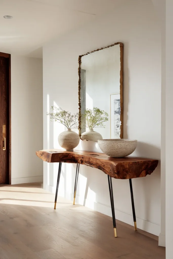
Live Edge Wood + Industrial Metal Contrast
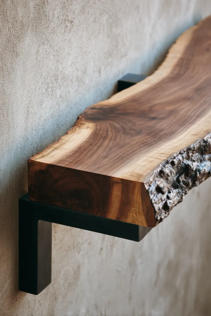
Material contrast creates visual drama without color introduction, making the pairing of organic live edge wood with refined industrial metal foundational to contemporary design. Live edge—where the wood’s natural perimeter remains intact, preserving bark inclusion and organic contour—provides textural complexity that machines cannot replicate. Paired with powder-coated or raw steel, the combination communicates both craft tradition and modern fabrication.
Walnut versus oak selection hinges on grain drama and color undertone. Walnut delivers pronounced grain variation with chocolate-brown heartwood and cream-colored sapwood—this natural contrast creates pattern that remains visually interesting across large surfaces. White oak provides subtler grain with greenish-gray undertones, ideal when you want wood presence without wood dominance. Both species machine cleanly for live edge preparation while accepting oil finishes that enhance grain without obscuring wood character.
Live edge walnut floating shelves exemplify this aesthetic when paired with concealed steel mounting brackets. The shelf appears to cantilever from the wall without visible support—an architectural detail that transforms utilitarian storage into spatial punctuation. Specify shelf depth at 10-12″ for entryways; deeper profiles overwhelm narrow spaces while shallower dimensions lack sufficient display capacity.
Designer’s Secret: The live edge should face outward (toward the room) with the straight-cut edge against the wall. Many installations reverse this, displaying the manufactured edge prominently—a missed opportunity to showcase the material’s natural character. The organic edge becomes a horizon line that breaks the geometry of walls, doors, and other rectangular elements.
Metal finish selection between powder-coated and raw steel depends on maintenance tolerance. Powder coating provides durable, colorfast surfaces that maintain appearance indefinitely—ideal for matte black or charcoal finishes that read as shadow rather than material. Raw steel develops rust patina within weeks of installation; this requires either acceptance of the oxidation (most authentic approach) or regular application of paste wax or Renaissance Wax to stabilize the surface. Choose based on whether you view maintenance as burden or engagement with materials.
Design Breakdown:
- Wood Species: Walnut for dramatic grain, white oak for subtle presence
- Edge Treatment: Live edge with bark removed, sanded to 220 grit, oil finish
- Metal Pairing: Powder-coated steel (matte black) or raw steel (waxed for stabilization)
- Shelf Mounting: Concealed steel brackets rated 50+ lbs per foot
- Dimensions: 10-12″D x 36-48″W x 2-3″ thick for floating shelf applications
Best For: Industrial-modern and organic-modern aesthetics where material honesty takes priority over perfect finish. Not suitable for traditional or highly formal design vocabularies.
Vertical Storage with Concealed Hardware
Storage in 2026 entryways has become invisible, rejecting the exposed hooks and baskets that dominated previous decades. Touch-latch cabinet systems—where doors open via pressure rather than pulls or knobs—create flush surfaces that read as architectural planes rather than furniture panels. This seamless aesthetic serves both visual simplicity and practical function by maximizing usable wall area.
The technical specification for touch-latch hardware determines system reliability. Mechanical latches (spring-loaded systems) require 2-3 pounds of pressure to activate and demonstrate consistent performance across temperature ranges. Electronic push-to-open systems offer lighter touch activation but introduce failure points via electronic components and battery requirements. For residential entryways subject to daily use, mechanical systems prove more durable long-term.
Hydraulic lift storage benches combine seating with concealed storage via gas springs that lift the seat automatically when released. The critical specification: gas springs should provide 80% lift assistance—enough to prevent the lid from slamming while still requiring human guidance for controlled opening. Lower assistance percentages make the lid heavy to lift; higher percentages cause the lid to fly open aggressively.
Designer’s Secret: Position touch-latch cabinets with their seams aligned to architectural features—continue the line of a doorjamb, align with ceiling height transitions, or match window casing edges. This technique makes the cabinetry read as original to the architecture rather than added furniture. The goal: visitors should question whether the storage is built-in or installed afterward.
Flush pull design, when visible pulls prove necessary, follows strict dimensional guidelines. Pulls should recess 1/4″ minimum from cabinet face, creating shadow depth that makes the hardware readable without protruding into clearance space. Linear pulls spanning 1/3 of door width provide optimal grip area while maintaining clean horizontal lines that complement cabinet proportions.
For additional concealed storage approaches, our dedicated guide to entryway shoe storage demonstrates how vertical systems maximize capacity in minimal footprints.
Design Breakdown:
- Touch-Latch: Mechanical spring-loaded system, 2-3 lb activation pressure
- Cabinet Material: 3/4″ plywood or MDF with veneer matching millwork
- Finish: Matte lacquer with 10-15 degree sheen, color matched to walls
- Hydraulic Lifts: Gas springs providing 80% lift assistance, rated 10,000+ cycles
- Flush Pulls: 1/4″ recess depth, spanning 1/3 of door width when visible hardware required
Best For: Minimalist households prioritizing clean visual lines over decorative expression. Requires upfront investment in quality hardware—budget alternatives fail quickly under daily use.
Statement Runner Rugs: High Pile Texture Focus
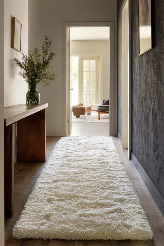
Rugs in entryways serve triple function: defining circulation paths, absorbing sound, and introducing textile softness to hard-surfaced spaces. The 2026 specification prioritizes pile height over pattern, with 1/2″-3/4″ high pile wool providing enough texture depth to create shadow variation as light conditions change throughout the day.
Wool versus jute performance characteristics differ significantly. Wool offers superior resilience—the fiber’s natural crimp allows it to spring back after compression, maintaining pile height under foot traffic. Wool also absorbs up to 30% of its weight in moisture before feeling damp, making it ideal for entryways where wet shoes and umbrellas are common. Jute, conversely, provides a flatter profile with coarser texture but lacks wool’s recovery properties; jute rugs permanently compress in high-traffic lanes within 12-18 months.
Designer’s Secret: Runner width must relate proportionally to hallway width. For 4-foot wide hallways (standard residential dimension), specify 2’6″ wide runners—exactly 62.5% of total width. This leaves 9-inch borders on each side, visually framing the runner while providing clearance for door swings and wall-mounted elements. Wider runners make spaces feel cramped; narrower runners appear tentative rather than intentional.
Rug length should extend the full length of your entryway plus 6-8 inches into the adjacent room, creating continuity rather than abrupt termination. This overlap technique prevents the psychological “stopping point” that occurs when rugs end precisely at doorways—instead, the rug guides circulation flow naturally from one space to the next.
Pile direction matters more than most realize. When installing runners, ensure pile direction runs toward the main living areas, not toward the entry door. This detail means the rug appears slightly lighter in color as you walk into your home (since you’re seeing pile tops rather than sides), creating subtle psychological welcome through material behavior.
Design Breakdown:
- Material: High pile wool, 1/2″-3/4″ pile height, 2500+ grams per square meter
- Dimensions: 2’6″W for 4′ hallways, length = entryway + 6-8″ overlap
- Color: Undyed natural wool or earth pigment tones (avoid white—shows traffic patterns)
- Backing: Natural latex (not synthetic) for non-slip performance without rubber smell
- Pile Direction: Orient toward main living areas for optimal light reflection
Best For: High-traffic entryways where durability and maintenance simplicity outweigh decorative pattern. Wool’s natural stain resistance makes it forgiving of real-world use.
Sculptural Coat Hooks as Art Installations
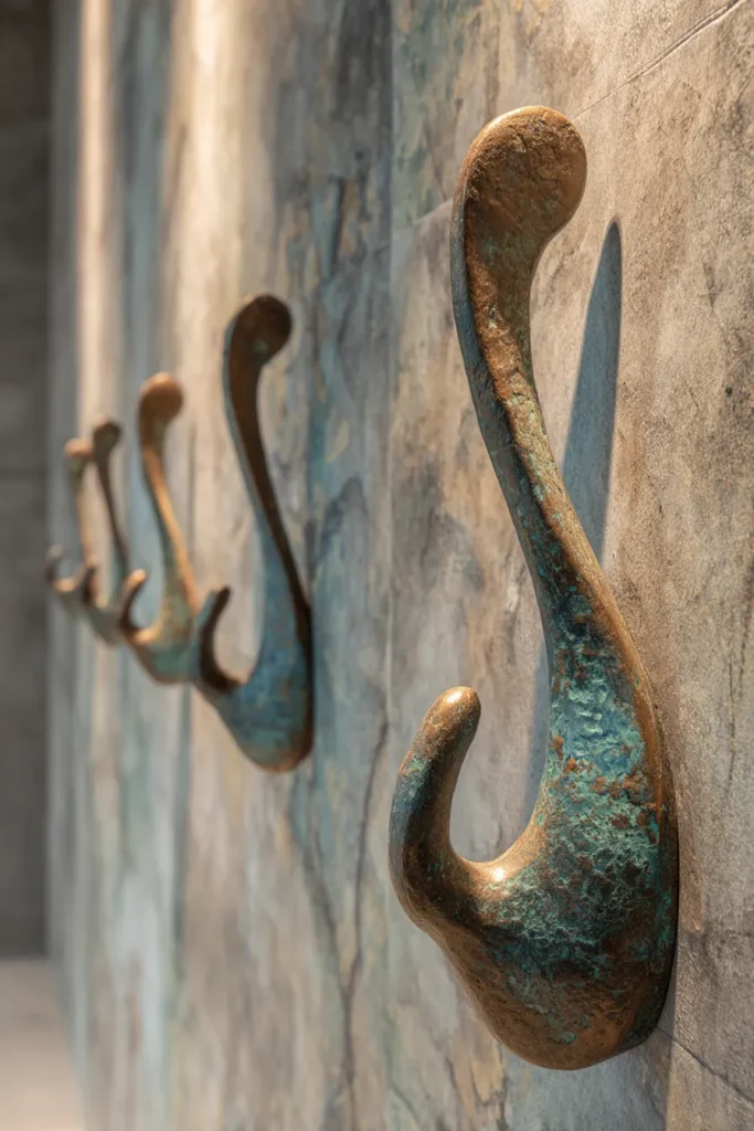
Functional hardware has evolved into expressive design elements, with coat hooks serving as three-dimensional sculptures that perform practical duties. The shift from flat wall hooks to dimensional forms creates shadow play that changes throughout the day, transforming utilitarian objects into dynamic architectural features.
Cast bronze versus machined aluminum represents two distinct material approaches. Bronze casting creates organic forms with subtle surface variation—no two pieces are identical due to cooling pattern differences. The material’s weight (bronze averages 550 lbs per cubic foot) provides substantial heft that communicates permanence and quality. Machined aluminum offers geometric precision with sharp detail that casting cannot achieve, plus significantly lower weight that simplifies mounting on hollow walls.
Designer’s Secret: Hook spacing at 5-inch intervals accommodates adult outerwear without crowding. Closer spacing causes garments to overlap, preventing air circulation that leads to persistent dampness and odor. Wider spacing wastes wall area and creates empty visual gaps that feel incomplete. Five inches represents the optimal balance, derived from ergonomic research on coat storage in commercial settings.
Mounting height follows the 60-inch rule—center point of hooks at 60 inches from finished floor. This positions hooks within comfortable reach for 5’2″-6’4″ individuals (spanning 85th percentile height range) while creating visual rhythm at consistent eye level. Vary individual hook heights by +/- 2 inches within a grouping to prevent mechanical repetition while maintaining functional accessibility.
Material finish selection impacts longevity significantly. Raw cast bronze develops patina within months, shifting from rose gold to verdigris green. Clear coat can stabilize this process, but most designers recommend allowing natural aging—the developing patina tells the story of use and passage of time, core principles in authentic material expression.
Design Breakdown:
- Material: Cast bronze (organic forms) or machined aluminum (geometric forms)
- Dimensions: 3-4″ projection from wall, 2-3″ vertical clearance per hook
- Spacing: 5″ on-center for adult outerwear accommodation
- Mounting Height: 60″ to hook center point, +/- 2″ variation within groupings
- Finish: Unlacquered for natural patina development, or clear coated for stable appearance
Best For: Design-forward households that view everyday objects as opportunities for artistic expression. Bronze hooks represent investment-level hardware—specify when you’re committed to permanent installation.
Low-Profile Storage Benches with Hidden Hinges
Storage benches have shed their traditional furniture appearance, evolving into architectural built-ins with flush surfaces and concealed mechanisms. The defining characteristic: no visible hinge hardware, creating clean horizontal planes that read as solid masses rather than lidded boxes.
Hydraulic lift storage benches achieve this through gas spring systems mounted inside the bench body, invisible from exterior view. The mechanism’s quality determines user experience—premium systems open smoothly with consistent resistance across the full range of motion, while budget alternatives demonstrate jerky movement and uneven lift assistance.
Interior organization matters as much as exterior appearance. Felt lining on interior surfaces prevents items from scratching or sliding during lid operation. The felt should be wool-based (not synthetic) with 16-20 oz weight—heavy enough to maintain position without adhesive reapplication, thick enough to provide meaningful cushioning. Adhesive application requires 3M Super 77 or equivalent; standard craft glue fails within months due to temperature cycling.
Designer’s Secret: Bench depth should max at 18 inches—deeper profiles create inaccessible rear zones where items become lost. This dimension allows your hand to reach the back wall comfortably without leaning into the bench. Storage capacity comes from length, not depth, making a 54″ long x 18″ deep bench far more functional than a 36″ long x 24″ deep alternative.
Leg design affects spatial perception significantly. Four legs make the bench read as furniture; a continuous base panel makes it read as built-in architecture. For entryways where architectural integration matters, specify full-width bases with recessed toe kicks (3-4″ height x 3″ depth) that create shadow depth while accommodating shoe tips for comfortable seating.
Design Breakdown:
- Dimensions: 42-60″W x 18″D x 18″H (standard ergonomic bench height)
- Lift Mechanism: Hydraulic gas springs, 80-100 Newton force rating
- Interior: 16-20 oz wool felt lining, adhered with 3M Super 77
- Base: Full-width panel with 3-4″H x 3″D recessed toe kick
- Hinge: Concealed 95-degree opening, soft-close damped for controlled descent
Best For: Families needing practical storage without compromising aesthetic goals. The hidden storage allows you to maintain visual order while accommodating the reality of daily items like reusable shopping bags, dog leashes, and seasonal accessories.
Botanical Installations: High-Impact, Low-Maintenance
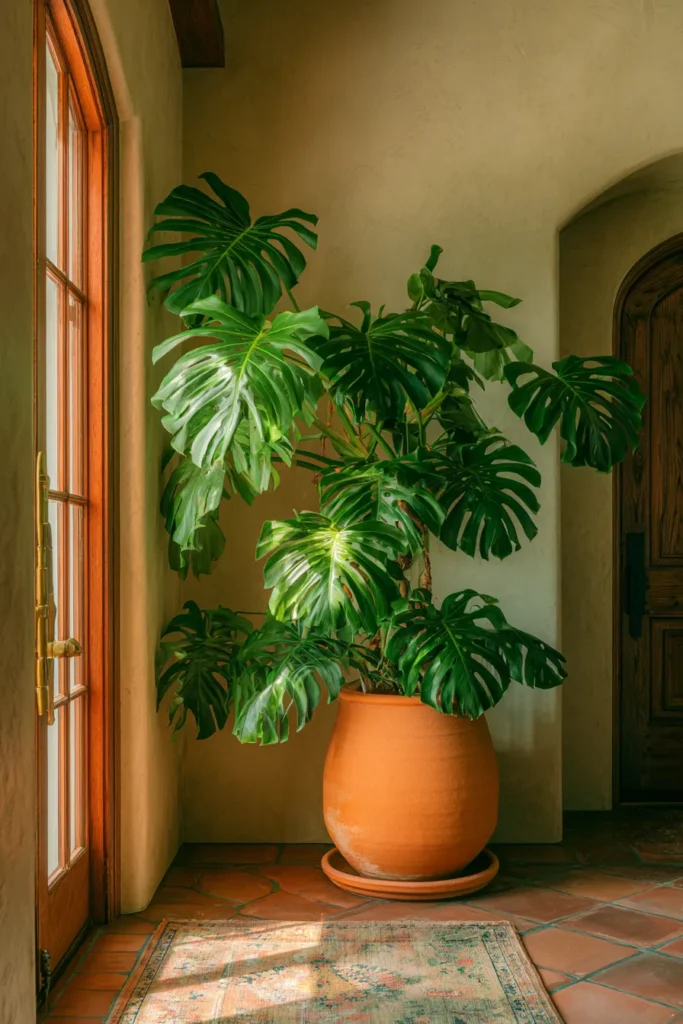
Live plants in entryways provide air quality improvement, biophilic connection, and vertical visual interest—but species selection determines success or failure. The entryway environment presents unique challenges: variable light levels, temperature fluctuations from door operation, and low humidity from HVAC systems.
Fiddle leaf fig versus monstera represents two contrasting approaches to dramatic scale. Fiddle leaf figs (Ficus lyrata) deliver architectural form with large violin-shaped leaves, but they demand consistent conditions—abrupt changes cause leaf drop. Monstera deliciosa tolerates variable conditions better, with split leaves that maintain dramatic appearance even when stressed. For entryways, monstera proves more reliable unless you can guarantee consistent temperature and light.
Designer’s Secret: Plant height should occupy 60-75% of available vertical space, not reach ceiling height. A 10-foot ceiling space should house a 6-7.5 foot plant—this proportion prevents the plant from reading as cramped or overwhelming. Taller plants in shorter spaces create claustrophobic pressure; shorter plants in taller spaces feel tentative and under-scaled.
Planter material impacts root health directly through heat retention properties. Terracotta absorbs and releases heat slowly, buffering root zone temperature against rapid changes. Glazed ceramic and metal planters conduct heat quickly, causing root zone temperature to spike during afternoon sun exposure—this thermal shock damages fine root hairs responsible for water absorption. For entryways with variable sun exposure, terracotta provides critical temperature stability.
Drainage remains non-negotiable despite interior placement concerns. Plants sitting in saucers collect excess water, leading to root rot within weeks. Instead, position planters on low risers (2-3″ height) with saucers placed underneath to catch drainage. This elevation allows air circulation beneath the planter while preventing water contact with flooring materials.
Design Breakdown:
- Species: Monstera deliciosa (variable conditions) or Fiddle leaf fig (stable conditions)
- Size: 6-7.5′ plant height for 10′ ceiling spaces (60-75% proportion)
- Planter: Terracotta, 14-16″ diameter, unglazed exterior for thermal stability
- Drainage: Hole required, planter elevated 2-3″ on risers above saucer
- Maintenance: Water when top 2″ of soil dries, rotate 1/4 turn weekly for even growth
Best For: Households committed to weekly plant care and willing to accept seasonal appearance variation. Living plants never maintain magazine-perfect appearance year-round—this variability is authenticity, not failure.
Architectural Paint Techniques: Limewash + Venetian Plaster
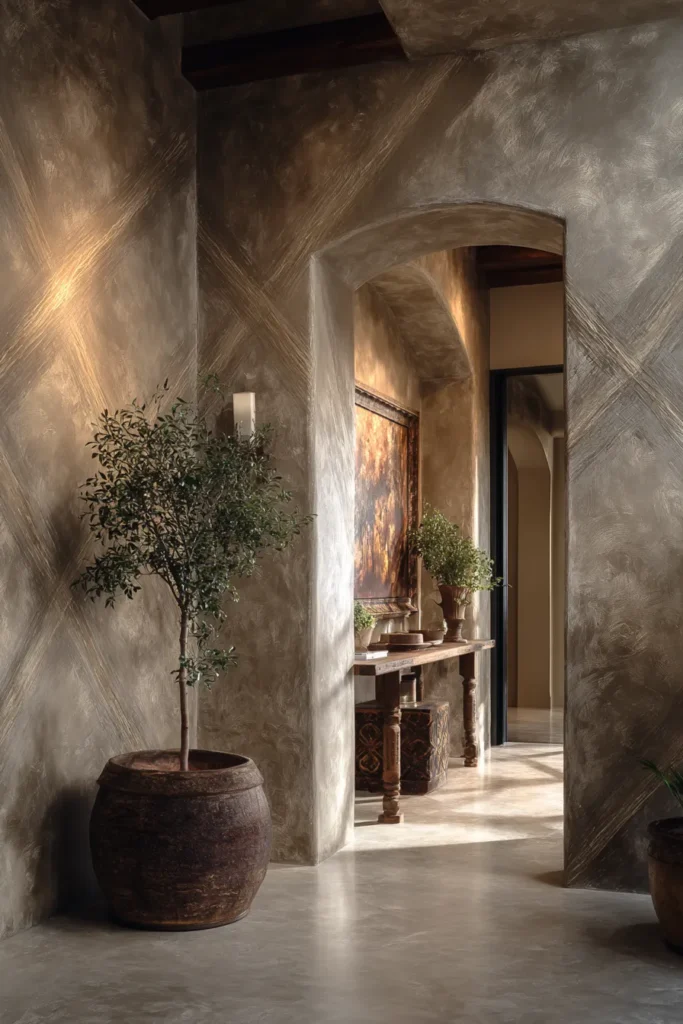
Paint has transcended its role as colored coating, becoming sculptural material that creates dimension through application technique rather than color alone. Limewash and Venetian plaster represent ancient methods experiencing contemporary revival due to their textural depth and environmental benefits.
Limewash—slaked lime mixed with water and earth pigments—produces matte surfaces with subtle color variation where application overlaps. Unlike latex paint that forms a surface film, limewash mineralizes into the substrate, becoming part of the wall rather than a layer upon it. This mineral integration creates depth that changes under varying light conditions, with shadows accentuating application texture.
Application technique determines final appearance. Use natural bristle brushes in random X-pattern strokes, building up 2-3 thin coats rather than one thick application. Each coat should dry fully (4-6 hours) before applying the next. The technique creates micro-shadows where strokes overlap, producing the characteristic cloudy depth that limewash is known for.
Designer’s Secret: Limewash color darkens 20-30% when wet, returning to the dry shade as it cures. Test samples must dry completely before evaluating color accuracy. Additionally, limewash continues developing subtle patina over 30 days as carbonation completes—the final appearance emerges weeks after application, not immediately.
Venetian plaster (polished plaster) creates mirror-like surfaces through layered trowel application of marble dust suspended in slaked lime. Each layer (typically 3-4 total) is burnished with steel trowels, compressing the material and bringing lime to the surface where it creates natural gloss. This technique produces depth ranging from 1/8″-1/4″—shallow enough to maintain wall planarity but deep enough to catch dramatic shadows when raked with light. When working with specialty paint applications across home interiors, our living room paint colors guide addresses color temperature compatibility with these techniques.
Design Breakdown:
- Limewash: 2-3 coat application, natural bristle brush, random X-pattern technique
- Color: Earth pigments only (no synthetic dyes), expect 20-30% darkening when wet
- Cure Time: 30 days for full carbonation and final appearance
- Venetian Plaster: 3-4 layers troweled and burnished, 1/8″-1/4″ total depth
- Sheen: Limewash remains matte, Venetian plaster achieves 20-30 degree gloss
Best For: Historic renovations or new construction seeking authentic material character. These techniques require skilled application—DIY attempts typically fail to achieve professional results. Budget for experienced applicators.
Floating Shelves with Invisible Bracket Systems
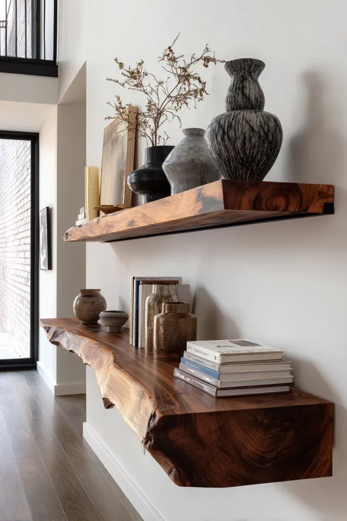
Floating shelves have become entryway workhorses, providing display surfaces and storage without the visual mass of console tables or cabinets. The defining characteristic: no visible support structure, creating the illusion that the shelf defies gravity by cantilevering from the wall.
The invisible bracket system uses steel rods (typically 3/8″-1/2″ diameter) mounted into wall studs, extending 8-10 inches into hollow-bored shelf backs. The shelf slides onto these rods like a sleeve, concealing all support hardware. Load capacity depends on rod diameter, material (steel vs. aluminum), and embedment depth into both wall and shelf.
Designer’s Secret: Shelf thickness determines weight capacity perception even when actual structural capacity is identical. A 2-inch thick shelf appears to cantilever impossibly, creating visual tension that draws attention. A 3-inch thick shelf looks adequately supported even with identical bracket systems. Use this principle intentionally—2-inch thickness for drama, 3-inch thickness for substantial appearance.
Live edge walnut floating shelves pair the invisible bracket aesthetic with organic material character. The wood grain and natural edge create visual interest that prevents the shelf from reading as minimal to the point of sterile. Specify 10-12 inch depth for entryways—shallow enough to avoid overwhelming narrow spaces while deep enough to accommodate decorative objects beyond simple picture frames.
Weight load capacity requires precise specification. Quality systems support 50+ pounds per linear foot when properly installed into studs. This capacity accommodates real-world use: hardcover books, ceramic vessels, and small sculptural objects without concerning about structural adequacy. Under-specified systems develop noticeable sag within months, requiring reinstallation or supplemental support.
The visual cantilever effect depends on bracket embedment—rods should extend 75% of total shelf depth. For a 12-inch deep shelf, brackets extend 9 inches into the shelf body, leaving only 3 inches of apparent cantilever. This proportion provides structural security while maintaining visual drama.
Design Breakdown:
- Bracket System: 1/2″ steel rods, 8-10″ wall embedment, 75% shelf depth embedment
- Shelf Dimensions: 36-48″W x 10-12″D x 2-3″ thick for entryway applications
- Load Capacity: 50+ lbs per linear foot with stud mounting
- Material: Solid wood (walnut, white oak) or wood veneer over plywood core
- Finish: Oil-based for wood transparency, matte lacquer for uniform appearance
Best For: Modern and contemporary spaces where clean lines and uncluttered surfaces define the aesthetic. Not suitable for traditional design vocabularies that expect visible support brackets or corbels.
Integrated Charging Stations with Cord Concealment
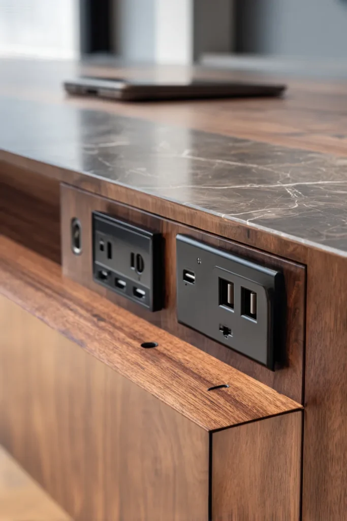
Modern entryways must accommodate daily digital life without visual clutter from devices and cables. Integrated charging stations—built into furniture or architectural elements—provide necessary function while maintaining clean aesthetic standards.
USB-C outlet placement strategy follows device ergonomics. Outlets mounted in furniture faces (drawer fronts, cabinet doors) place charging ports in visible but accessible locations. This prevents the awkward reach behind furniture that makes wall-mounted outlets inconvenient. Position outlets 4-6 inches from the furniture’s top edge—high enough to avoid interfering with drawer operation but low enough to remain reachable.
Designer’s Secret: Specify combination outlets with both USB-C and traditional AC receptacles in single gang boxes. This accommodates both phone/tablet charging and occasional AC device needs (vacuum charging, seasonal decor) without requiring multiple outlet installations. Legrand radiant and Leviton Decora both offer these combo units in colors matching common wall plate finishes.
Cable management requires dedicated channels that guide cords from outlet to device without visible routing. The simplest approach: drill 1-inch diameter holes through shelf or console backs, positioned 2-3 inches from the wall and 6-8 inches from each side. This creates cord exit points that remain hidden when viewing the furniture from typical sightlines while allowing cables to drop behind the piece to wall outlets.
For permanent installations, in-wall conduit (1.25″ flexible non-metallic conduit) allows cable routing from outlet to furniture location without visible surface channels. This approach requires planning during construction or renovation but provides cleanest long-term solution. Surface-mounted cord channels work for existing spaces but remain visible despite paintable or stainable finishes.
Power capacity matters for multi-device households. Standard 15-amp circuits support 1800 watts total—adequate for phone and tablet charging but insufficient if adding laptop or other high-draw devices simultaneously. If your entryway charging station needs to support laptops regularly, specify dedicated 20-amp circuit for 2400-watt capacity.
Design Breakdown:
- Outlets: USB-C and AC combo units, positioned 4-6″ from furniture top edge
- Cable Routing: 1″ diameter holes through furniture backs, 2-3″ from wall
- In-Wall Conduit: 1.25″ flexible non-metallic conduit for permanent installations
- Circuit Capacity: 15-amp standard (1800W), 20-amp for laptop charging (2400W)
- Cable Organization: Velcro cable ties or zip ties inside furniture for bundling excess length
Best For: Tech-dependent households where device charging is daily necessity rather than occasional need. The integrated approach eliminates counter clutter while ensuring devices remain charged and ready.
The Single Biggest Entryway Mistake Designers See in 2026
Surface over-accessorizing remains the most common design failure, even among otherwise well-executed entryways. The impulse to fill every horizontal surface with decorative objects—candles, picture frames, small sculptures, bowls—creates visual noise that overwhelms spatial calm.
The professional guideline: limit decorative objects to one per 18 linear inches of surface. A 48-inch console table should display no more than three objects total, and these should vary in height (tall/medium/low) and mass (substantial/moderate/delicate) to create visual rhythm rather than uniform repetition.
Negative space functions as design element, not failure to decorate. Empty surfaces allow the eye to rest, emphasizing the objects you do display through contrast rather than burying them among visual competition. High-end residential design increasingly treats absence as intentional choice rather than incomplete execution.
Light temperature mismatch creates the second most common failure. Mixing 2700K, 3000K, and 3500K sources in the same small space produces color rendering inconsistency that makes materials appear different from different viewing angles. This confusion prevents cohesive aesthetic even when material selections are sophisticated.
The solution: specify all light sources within 300K range maximum. A space using 2700K base lighting should limit task lighting to 3000K maximum. Wider ranges create the disjointed “showroom” appearance that feels commercial rather than residential.
Why These Ideas Define 2026 Entryway Design
The sustainability shift driving material selection toward reclaimed woods, unlacquered metals, and organic textiles reflects broader cultural rejection of disposable design. Consumers increasingly view furniture and finishes as long-term investments that should age gracefully rather than requiring replacement when trends shift. This philosophical change manifests in material choices that improve through use—brass that patinas, wood that darkens, stone that acquires character.
Sensory design psychology has elevated tactile experience above pure visual appeal. Research from environmental psychology demonstrates that spaces engaging multiple senses—touch, sight, smell—create stronger positive emotional response and longer dwelling time. Entryways designed around texture (linen, stone, raw wood) invite physical interaction that catalog-perfect spaces discourage.
The anti-perfectionism movement challenges the Instagram aesthetic of styled vignettes that look untouched by human hands. The 2026 shift embraces evidence of use as authenticity marker—wrinkled linen, developing patina, and lived-in character communicate that spaces serve life rather than merely photograph well. This represents fundamental change from decoration as performance to design as daily practice.
Light science awareness among residential designers has increased dramatically, with Kelvin temperature specifications becoming standard rather than exceptional. Architects and designers now understand that artificial light at wrong color temperatures disrupts circadian rhythm, affects mood, and distorts material colors. The 2700K-3000K warm range replicates natural dawn/dusk light that human biology evolved processing, making it psychologically optimal for threshold spaces where we transition between public and private modes.
Spatial efficiency in entryway design responds to real estate costs and urban density increases. Vertical storage, concealed systems, and multi-function furniture maximize utility per square foot—critical in markets where additional square footage costs $400-800 per foot. The solutions balance aesthetic aspiration with pragmatic necessity, rejecting the idea that functionality must compromise beauty.
These converging factors create the 2026 aesthetic: materials with honest aging characteristics, spaces that reward touch as much as sight, lighting calibrated to human biology, and storage solutions that maintain visual calm while accommodating real-world needs. The result feels simultaneously ancient and contemporary—rooted in material traditions that preceded industrial manufacturing while embracing technical precision in installation and specification.
Your entryway sets expectation for everything beyond it. These sixteen approaches provide frameworks for creating threshold spaces that function as genuine transitions rather than decorated afterthoughts. The investment—in materials, in installation quality, in design thinking—pays return through daily use, making the home’s first moment its most considered one.
For additional entryway inspiration, explore our related guides including entryway table decor ideas, wall art for living room arrangements that translate to entryway galleries, and bathroom decor principles that address similar small-space challenges.