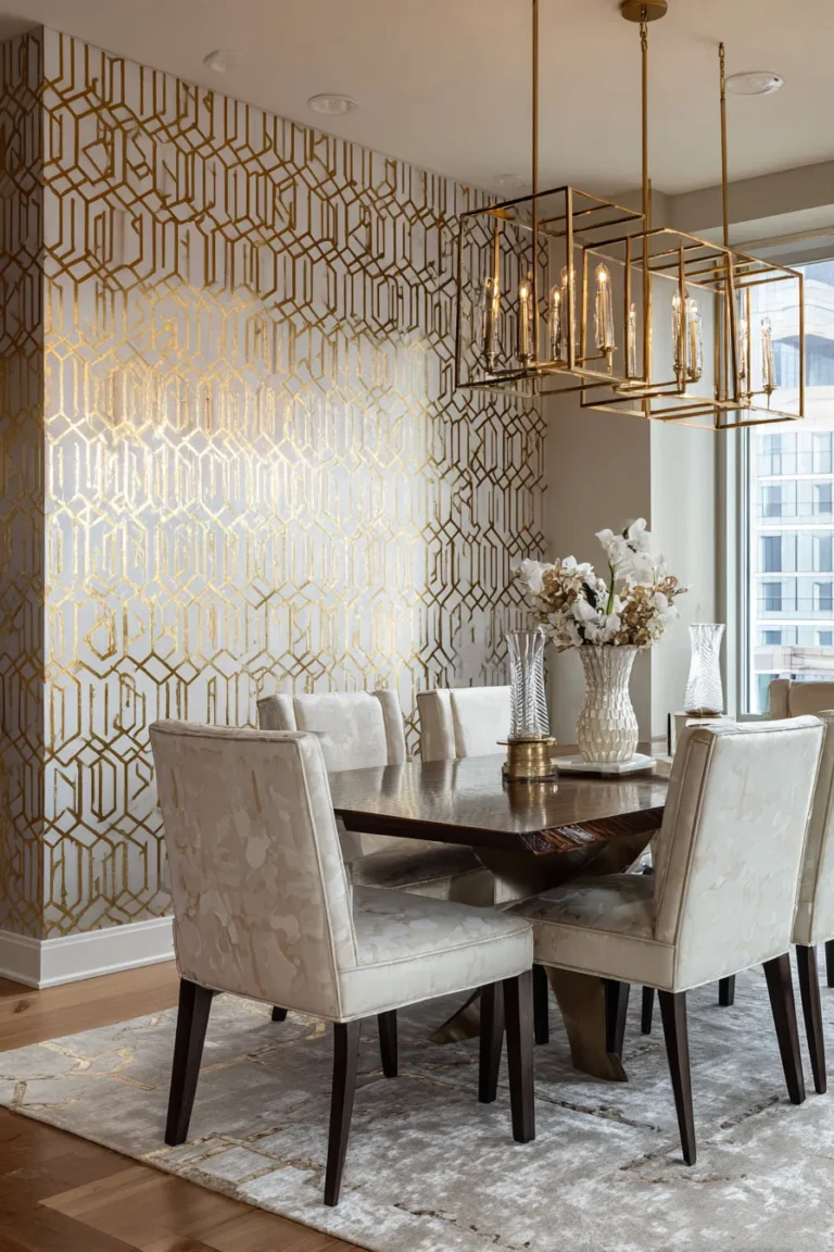
The 2026 dining table centerpiece has abandoned symmetrical florals for asymmetric material layering—prioritizing tactile contrast (rough travertine against polished brass) and negative space over visual density. This shift reflects a broader movement in residential design: the table is no longer just a functional surface but a spatial anchor that dictates the room’s entire emotional temperature.
As an interior architect who’s specified dining spaces for clients ranging from Tribeca lofts to Malibu coastal estates, I’ve watched centerpiece design evolve from ornamental afterthought to strategic design element. The difference between a well-composed centerpiece and a haphazard arrangement lies in understanding material weight, light reflectance values, and the physics of visual proportion. What follows are sixteen techniques that professional designers use to create centerpieces that feel intentional, not staged.
Why Material Contrast Replaced Floral Symmetry
The design world has moved past the “matching set” mentality. In 2026, sophistication is measured by how successfully you juxtapose opposing textures—the porous surface of travertine against the mirror-like finish of unlacquered brass, for instance. This isn’t arbitrary. Our brains process tactile variety as visual richness, which explains why a single rough-hewn ceramic vessel can command more attention than five identical glass vases.
Sustainability has accelerated this shift. Permanent object-based centerpieces replace the weekly floral purchase, reducing both cost and environmental impact. Designers are specifying pieces that migrate seasonally between dining tables, console surfaces, and bedroom nightstands—a circular design approach that maximizes value per square inch of storage.
Color temperature plays an unexpected role here. Under 2700K warm LED bulbs, brass develops a honeyed patina that reads as luxurious. The same piece under 4000K cool light appears clinical, almost institutional. This is why I always specify light sources before selecting metallic finishes—the material’s visual performance is entirely light-dependent.
The Golden Ratio for Dining Table Centerpieces
The 12-inch maximum height rule isn’t decorative folklore; it’s based on human sightline mathematics. When seated, the average person’s eye level rests at approximately 42-48 inches from the floor. A centerpiece exceeding 12 inches creates a visual barrier that fragments conversation flow—guests literally cannot make eye contact without leaning sideways.
For length coverage, I use the one-third rule: the centerpiece should occupy roughly one-third of the table’s total length. On a 72-inch rectangular table, this translates to a 24-inch linear composition. Anything longer feels dominating; anything shorter reads as timid.
Odd-number clustering (3, 5, 7 objects) creates visual stability through asymmetry. This principle, borrowed from Japanese ikebana, generates focal points that guide the eye in a natural scanning pattern rather than forcing it into rigid left-right symmetry.
Light Temperature and Material Selection
Here’s what most DIY guides won’t tell you: the color temperature of your dining room lighting fundamentally alters how materials appear. A matte stonewashed ceramic vase that looks sublime under warm 2700K candlelight can appear muddy and lifeless under cooler 3500K bulbs.
Natural daylight (approximately 5000-6500K) reveals true material colors but can make warm metals like brass and copper appear jaundiced. This is why I recommend testing centerpiece compositions at the time of day you’ll actually be using the space. A breakfast table bathed in morning light requires different material choices than a dinner table illuminated primarily by candles.
The reflectance index matters too. High-gloss finishes bounce light aggressively, which can create unwanted glare across polished tabletops. Matte and satin finishes absorb light, making them ideal for intimate dinner settings where you want soft, diffused ambient glow rather than bright reflections.
Unlacquered Brass Candlestick Gradation
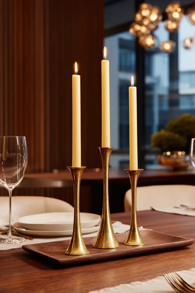
The power of unlacquered brass candlesticks lies in their temporal quality—they develop natural patina over time, creating a living finish that changes with use. Arrange three candlesticks in graduated heights (8″, 10″, 12″) to create a stepped silhouette that draws the eye upward without blocking sightlines.
Designer’s Secret: Most people arrange candlesticks in ascending order from left to right, which creates a predictable ramp. Instead, place the tallest candlestick slightly off-center, flanked by the two shorter pieces. This asymmetric triangle feels more intentional and less catalog-styled.
Design Breakdown:
- Base: Three unlacquered brass candlesticks in varying diameters (1.25″, 1.5″, 1.75″)
- Candles: Unscented ivory or sand-colored tapers (avoid white, which reads too stark against brass)
- Placement: Position on a 14″ x 6″ walnut or marble tray to contain wax drips
- Lighting context: Pair with 2700K overhead pendant for cohesive warm glow
Best For: Formal dining rooms with traditional or transitional aesthetics; professionals who entertain frequently and want a centerpiece that requires zero maintenance between uses.
Variation: Everyday Minimal Styling
For daily use, remove two candlesticks and leave only the tallest piece with a single unlit taper. The negative space this creates feels deliberate rather than incomplete.
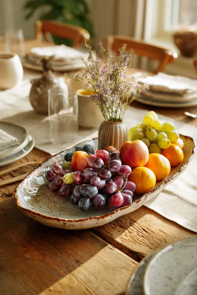
Travertine Bowl with Seasonal Elements
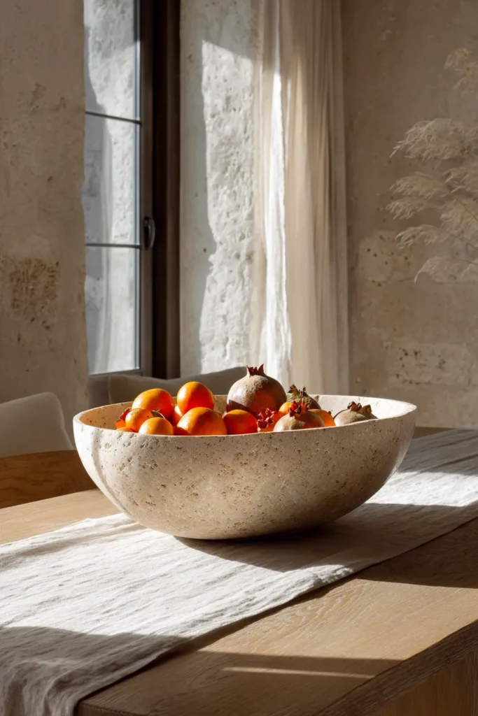
Travertine bowls offer the rare combination of sculptural heft and organic warmth. Their porous surface catches light unevenly, creating subtle shadow play that shifts throughout the day. Fill with seasonal elements—pomegranates and persimmons in autumn, Meyer lemons and kumquats in spring—for a centerpiece that’s both decorative and edible.
Designer’s Secret: The bowl itself should be the statement piece; the contents are secondary. Choose a vessel with pronounced mineral veining or fossilized inclusions that tell a geological story. Overfilling obscures these details—leave at least 2 inches of interior rim visible.
Design Breakdown:
- Vessel: 12-14″ diameter travertine bowl in cream or taupe (avoid pure white, which looks sterile)
- Fill: 5-7 pieces of monochromatic fruit (odd numbers create visual stability)
- Accent: Tuck preserved eucalyptus sprigs between fruits for textural contrast
- Surface: Place on raw linen runner to absorb condensation from fresh fruit
Best For: Homes with organic modern or Mediterranean aesthetics; anyone seeking a functional centerpiece that guests can actually eat from during meals.
Seasonal Rotation Strategy
Winter: Fill with unshelled walnuts and dried artichokes. Spring: Nest speckled eggs (real or ceramic) in sheet moss. Summer: Display smooth river stones. Autumn: Arrange miniature pumpkins and dried maize.
Asymmetric Ceramic Vase Clustering
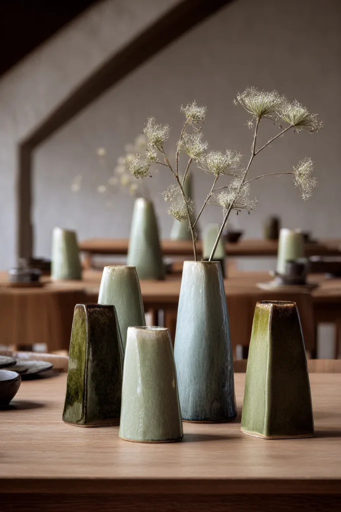
The hand-glazed ceramic vase cluster works because it violates traditional symmetry while maintaining visual balance. Select three to five vases in varying heights (6″, 9″, 11″) with distinct glaze finishes—matte, satin, and crackle—to create textural conversation.
Designer’s Secret: Arrange vases in a triangular footprint rather than a straight line. Position the tallest vase at the rear right, medium height front left, and shortest rear left. This creates depth perception and prevents the “bowling pin” lineup that screams amateur hour.
Design Breakdown:
- Vessels: 3-5 ceramic vases in related but non-matching glazes (think celadon, sage, and moss green)
- Contents: Single stems only—one vase might hold a dried lunaria pod, another a fresh olive branch
- Spacing: Maintain 3-4 inches between each vessel to preserve individual silhouettes
- Background: Position against a neutral wall color (BM Revere Pewter or similar) to prevent visual competition
Best For: Minimalist spaces where restraint is the primary design language; collectors who want to showcase artisan pottery without creating a cluttered vignette.
Glaze Finish Mixing Formula
Combine one high-gloss piece (reflects maximum light) with two matte pieces (absorbs light) for balanced luminosity. The ratio prevents the composition from feeling either too flat or overly reflective.
Sculptural Driftwood Branch Statement
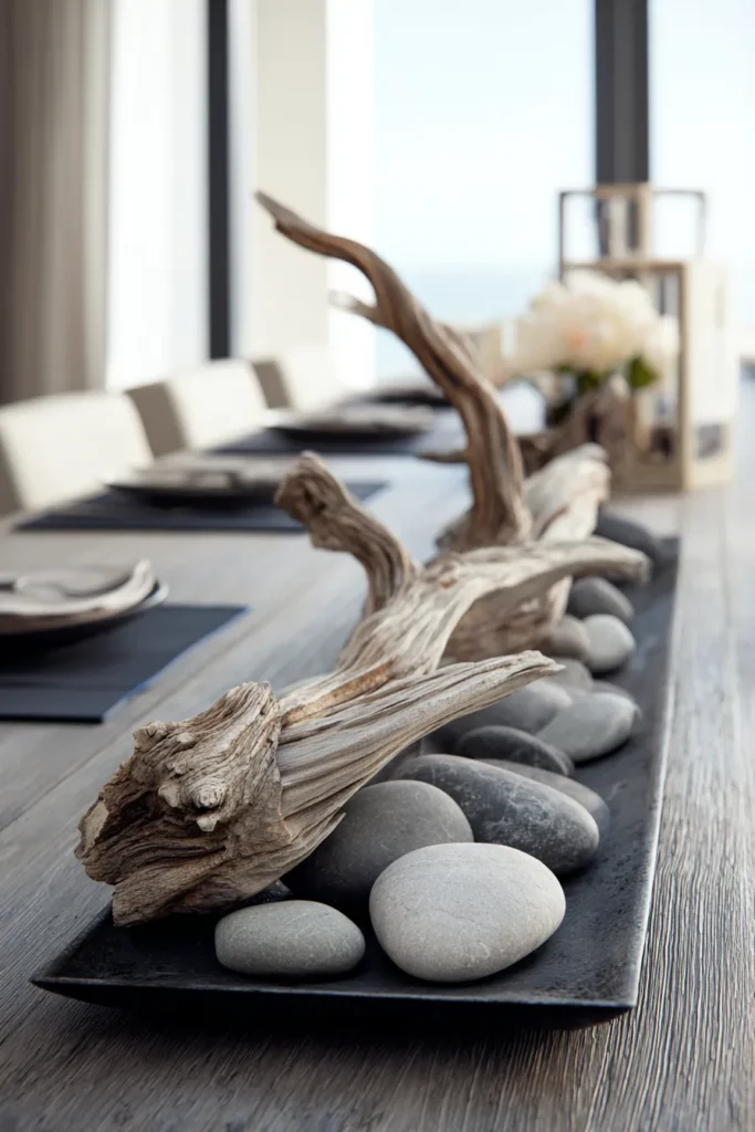
A single piece of architectural driftwood can anchor an entire table composition. Look for branches with pronounced curves or multiple directional forks—these create visual movement that static objects cannot achieve. The key is selecting wood with a bleached, weathered surface that reads as intentional sculpture rather than yard debris.
Designer’s Secret: Most people place branches upright in tall vases, which creates a vertical explosion that overwhelms the table. Instead, position the branch horizontally across a low rectangular tray (3-4″ height maximum). This horizontal orientation respects the table’s linear plane while still providing sculptural interest.
Design Breakdown:
- Branch: 18-24″ weathered driftwood with visible grain and natural curves
- Support: Low-profile ceramic or concrete tray in charcoal or terracotta
- Anchor: Use museum putty to secure the branch so it doesn’t roll
- Companion objects: Add 2-3 smooth river stones at the base for compositional weight
Best For: Coastal contemporary or Japanese-inspired interiors; homeowners who prefer organic materials to manufactured objects and want a zero-maintenance centerpiece.
Layered Variation
For more complex compositions, nestle the driftwood into a bed of preserved reindeer moss, then add a single ceramic vessel containing one dramatic stem (protea or king protea work beautifully).
Dried Pampas Grass in Frosted Amber Glass
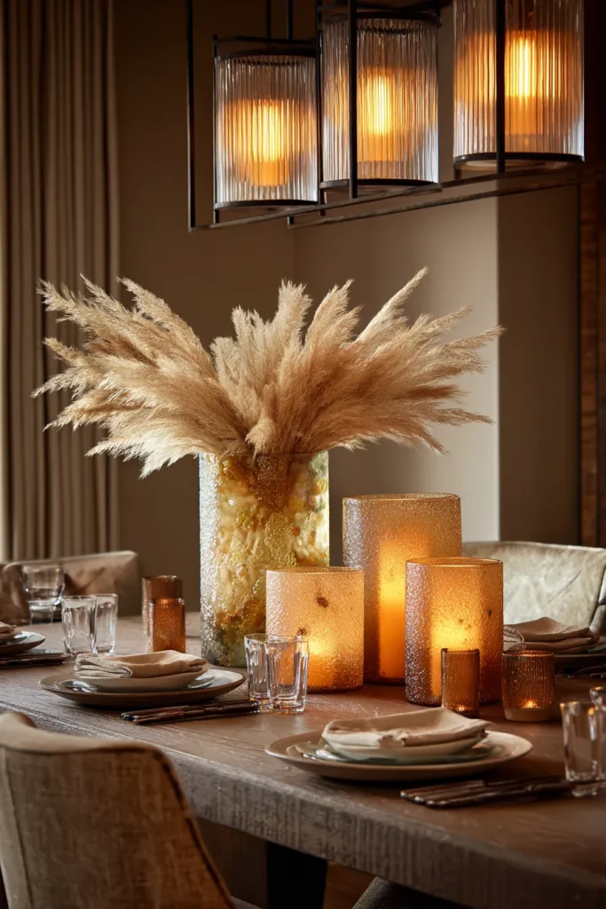
Dried pampas grass has transcended its boho origins to become a legitimate architectural element when styled correctly. The trick is restraint—three to five plumes maximum in a frosted glass hurricane vase create refined impact, while overstuffed arrangements read as Pinterest cliché.
Designer’s Secret: Trim pampas plumes to staggered heights before arranging. Cut the tallest stem at 18″, medium at 14″, shortest at 10″. This creates an organic gradient that mimics how grasses grow in nature, rather than the uniform “hedge” effect that comes from leaving them untrimmed.
Design Breakdown:
- Vessel: Frosted amber glass hurricane, 8-10″ diameter with 10-12″ height
- Plumes: 3-5 natural pampas in ivory or wheat tones (avoid dyed colors)
- Placement: Position slightly off-center on the table’s length for asymmetric sophistication
- Lighting: Under 2700K warm light, the amber glass casts honeyed shadows across the table
Best For: Transitional and contemporary spaces that blend natural elements with refined finishes; anyone seeking a permanent centerpiece that requires zero water or maintenance.
Linear Arrangement for Rectangular Tables
For tables longer than 72″, use two identical hurricane vases positioned at one-third and two-thirds points along the table’s length. This creates rhythmic repetition without rigid symmetry.
Rechargeable Ceramic Table Lamp Pairing
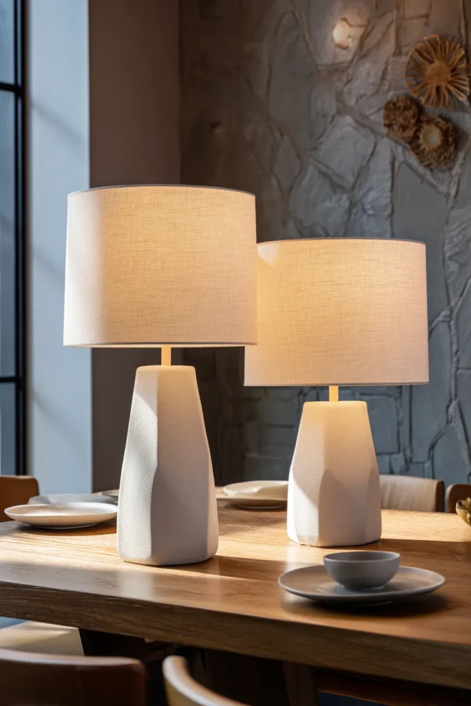
Rechargeable table lamps have revolutionized centerpiece design by eliminating cords while providing functional task lighting. Position two lamps with ceramic or marble bases at opposite ends of the table’s centerline, creating ambient pools of light that frame the dining experience.
Designer’s Secret: Most people match lamp heights exactly, which creates institutional symmetry. Instead, select two lamps from the same collection but in different heights (one 12″, one 9″). This subtle variation signals curation rather than catalog ordering.
Design Breakdown:
- Lamps: Two cordless LED lamps with ceramic bases in matte white or terracotta
- Light temperature: Specify 2700K warm white for flattering skin tones
- Dimming capability: Essential—you’ll want 100% brightness for task work, 30% for dinner ambiance
- Shade material: Linen or rice paper for soft light diffusion (avoid harsh translucent plastic)
Best For: Multi-functional dining spaces that serve as workspaces during the day; homes with limited overhead lighting where supplemental task light is necessary.
Single Focal Lamp Alternative
For smaller tables (48″ or less), one centered lamp provides sufficient ambient light. Choose a sculptural base—a turned ceramic form or natural stone—that functions as art object when unlit.
Hand-Glazed Porcelain Serving Platter as Base
An oversized porcelain platter functions as both centerpiece foundation and serving vessel—the ultimate form-follows-function approach. Select a piece with an organic edge or hand-formed rim that suggests artisan production rather than mass manufacturing.
Designer’s Secret: Layer objects on the platter using the “rule of thirds” spatial division. Position the tallest object (a small vase or candle) at the rear one-third point, a medium object (fruit cluster) at the front one-third, and leave the center third relatively empty. This negative space prevents the composition from feeling cluttered.
Design Breakdown:
- Platter: 16-18″ porcelain serving piece in natural white or speckled glaze
- Layered objects: One small bud vase with single stem, 3-5 seasonal fruits, 2-3 decorative objects
- Surface protection: Place cork or felt pads underneath to prevent table scratching
- Styling philosophy: Curated abundance, not maximalist chaos
Best For: Casual entertaining styles where the centerpiece doubles as serving ware; homes where every object must earn its keep through multi-functionality.
Fruit Display Composition
Arrange fruit in a color-gradient sequence: pale lemons on one end, transitioning through oranges, to deep pomegranates on the opposite end. This ombré effect creates visual flow across the platter’s length.
Woven Rattan Tray with Curated Objects
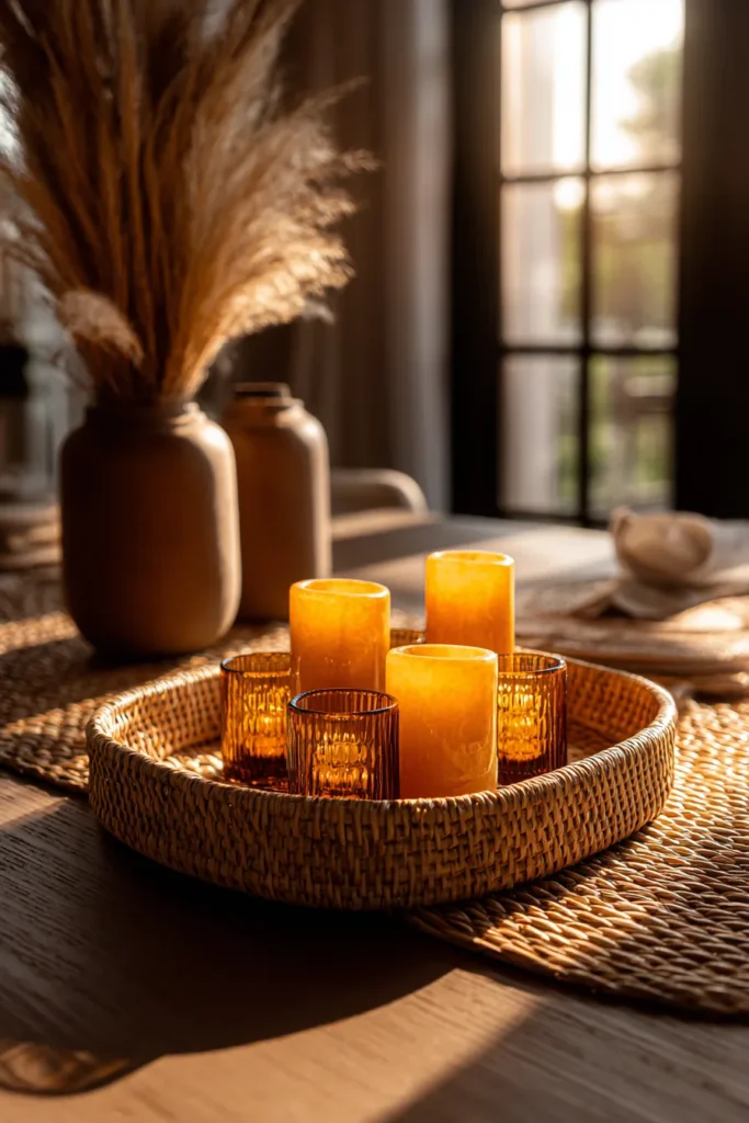
A low-profile rattan tray brings organic texture to modern tables without the heavy visual weight of solid wood. Its woven structure creates subtle shadow patterns under directional lighting, adding dimensional interest to otherwise flat surfaces.
Designer’s Secret: The tray’s edge height should never exceed 2 inches. Taller sides create a “shadowbox” effect that makes objects appear trapped rather than displayed. A shallow lip (1-1.5″) is sufficient to contain items while maintaining visual openness.
Design Breakdown:
- Tray: Natural rattan in honey or weathered grey finish, 20-24″ length
- Candlelight configuration: 5-7 votive candles in amber glass holders, arranged in loose cluster
- Object vignette: Alternative to candles—small sculptural objects, decorative boxes, vintage finds
- Base layer: Consider placing a linen napkin or fabric square underneath the tray for color accent
Best For: Relaxed contemporary interiors with global influences; anyone who wants the flexibility to completely change the centerpiece look by simply swapping tray contents.
Seasonal Content Rotation
Spring: Fill with smooth white stones and a single orchid stem. Summer: Display seashells and coral fragments. Autumn: Arrange acorns and dried leaves. Winter: Cluster pinecones and evergreen sprigs.
Oversized Pillar Candle Trio
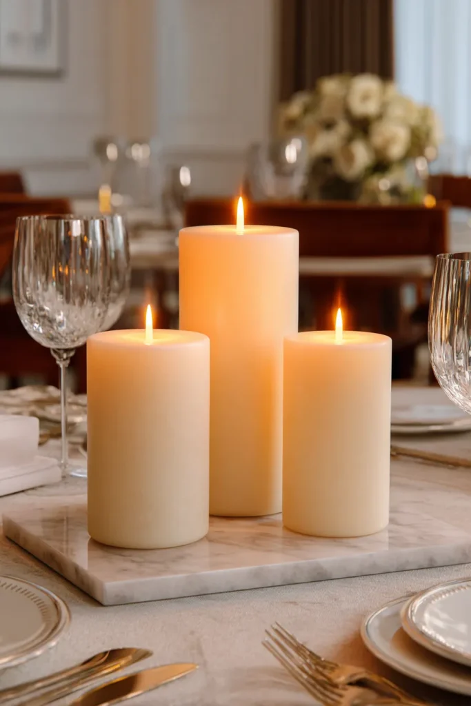
Three substantial pillar candles in staggered heights create dramatic vertical interest without the fragility of taper candles. The key is scale—these should be 3-4 inch diameter pillars that command presence, not timid votives that disappear on a large table.
Designer’s Secret: Position candles in an isosceles triangle formation rather than a straight line. Place two candles 16″ apart as the triangle’s base, with the third candle 12″ forward from the centerpoint between them. This three-dimensional arrangement looks intentional from any seat at the table.
Design Breakdown:
- Candles: Three unscented pillars in graduated heights (4″, 6″, 8″) and matching diameter (3.5″)
- Color selection: Ivory, sand, or concrete grey (pure white feels too stark against warm wood tables)
- Burn strategy: Light only the tallest candle for everyday use to preserve the others
- Base surface: Position on stone or marble tiles to catch wax drips and protect the table
Best For: Romantic dinner settings; homes with traditional or transitional design that embrace candlelight’s timeless appeal.
Height Variation for Drama
For special occasions, substitute with 10″, 12″, and 14″ heights. The increased vertical drama creates a more formal, ceremonial atmosphere.
Live Succulent Garden in Low Ceramic Planter
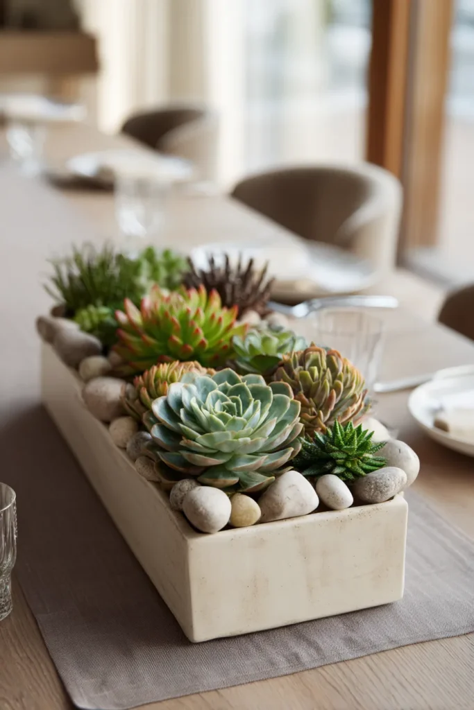
A succulent arrangement in a shallow ceramic planter provides the benefits of living plants without the maintenance demands of flowers. Choose architectural varieties—echeveria, haworthia, or sempervivum—whose geometric rosette forms create natural sculptural interest.
Designer’s Secret: Plant in odd-numbered clusters (3, 5, or 7 plants) but vary the species to create textural diversity. One common mistake is planting identical succulents, which creates a monotonous “crop field” appearance rather than a curated garden.
Design Breakdown:
- Planter: Shallow rectangular ceramic vessel, 12-16″ length × 4-6″ width × 3″ depth
- Soil: Well-draining cactus mix topped with decorative pebbles or crushed granite
- Plant selection: Mix rosette-forming varieties with trailing types (string of pearls) for dimension
- Maintenance: Water bi-weekly; rotate 90° monthly to ensure even light exposure
Best For: Low-maintenance households; modern minimalist spaces where living plants add organic softness to hard-edged architecture.
Single Species Repetition
For a more minimalist approach, plant seven identical echeveria in graduated sizes, arranging them from largest to smallest in a linear row. This repetition creates rhythmic pattern rather than chaotic variety.
Abstract Biomorphic Ceramic Sculpture
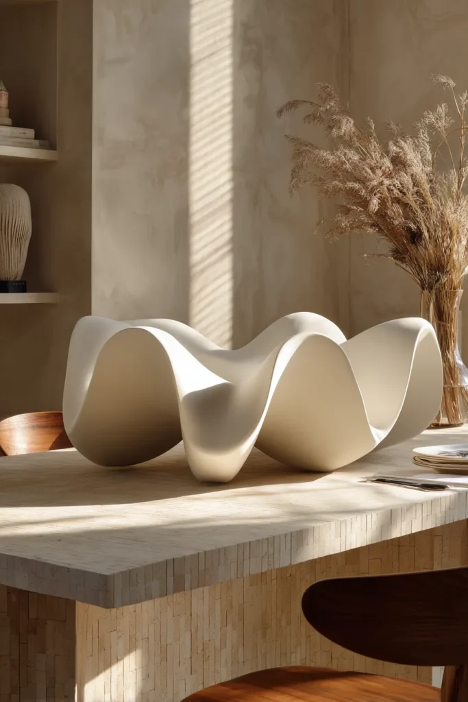
A single abstract ceramic sculpture can anchor the entire table’s visual narrative. Select pieces with biomorphic curves—forms that suggest organic growth rather than geometric precision—to create a focal point that invites closer examination.
Designer’s Secret: The sculpture should occupy negative space rather than fill it. Position the piece slightly off-center and leave at least 18 inches of clear table surface on all sides. This breathing room allows the sculpture to function as art object rather than mere decoration.
Design Breakdown:
- Sculpture: Abstract ceramic form, 8-12″ height, in matte white, terracotta, or charcoal
- Surface finish: Matte or satin (avoid high gloss, which can appear cheap in sculptural forms)
- Positioning: Place on 12″ square travertine tile to create a subtle pedestal effect
- Companion elements: Resist the urge to add anything—the sculpture should stand alone
Best For: Art-forward interiors; collectors who view their dining table as a gallery surface for rotating sculptural works.
Paired with Negative Space Elements
If the solo sculpture feels too sparse, add a single low vessel with one dramatic branch positioned 24″ away at the opposite end of the table. The two objects create visual dialogue without competition.
Stone Decorative Orb Collection
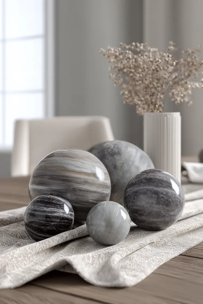
Decorative orbs in materials like polished marble, rough granite, or smooth resin create textural interest through pure form. Cluster 5-7 orbs in varying sizes (2″, 3″, 4″ diameters) in a loose, organic arrangement that suggests natural rock formations.
Designer’s Secret: Mix surface finishes within the same color family. Combine polished and honed orbs in shades of grey—some glossy, some matte—to create tonal variation that reads as sophisticated rather than matchy-matchy.
Design Breakdown:
- Orbs: 5-7 spheres in mixed materials (marble, granite, resin, wood)
- Color palette: Monochromatic earth tones (charcoal, taupe, sand, cream)
- Arrangement: Tight cluster in table center, or dispersed along a narrow rectangular tray
- Seasonal adaptation: Swap orbs for seasonal elements (replace with ornaments in December, painted eggs in April)
Best For: Minimalist interiors where subtle textural variation creates interest without color; anyone seeking a permanent centerpiece that requires zero maintenance.
Dispersed Organic Placement
Rather than clustering, space orbs at irregular intervals across the table’s length—one every 12-14 inches. This creates a rhythmic punctuation that guides the eye along the table’s axis.
Geometric Crystal Votive Holder Set

Faceted crystal votives catch and refract light, creating prismatic sparkle that elevates the table’s entire atmosphere. Arrange 7-9 votives in a linear progression down the table’s center, spacing them 8-10 inches apart to create a luminous runway effect.
Designer’s Secret: Mix candle heights within identical votive holders. Use both tea lights (1″ height) and standard votives (1.5″ height) to create subtle flame variation that prevents the “birthday cake” uniformity of perfectly matched candles.
Design Breakdown:
- Holders: 7-9 geometric crystal votives in clear or smoky grey
- Candles: Unscented tea lights in white or ivory (scented candles compete with food aromas)
- Linear spacing: 8-10″ intervals along a linen runner for contained arrangement
- Light temperature: The crystal’s prismatic effect is most dramatic under 2700K warm lighting
Best For: Formal dinner parties; glamorous interiors that embrace reflective surfaces and light play as primary design elements.
Scattered Ambient Glow
For a more casual approach, cluster 3-5 votives in an asymmetric grouping at the table’s center, leaving the ends clear for serving platters or wine bottles.
Faux Bonsai Tree with River Stones
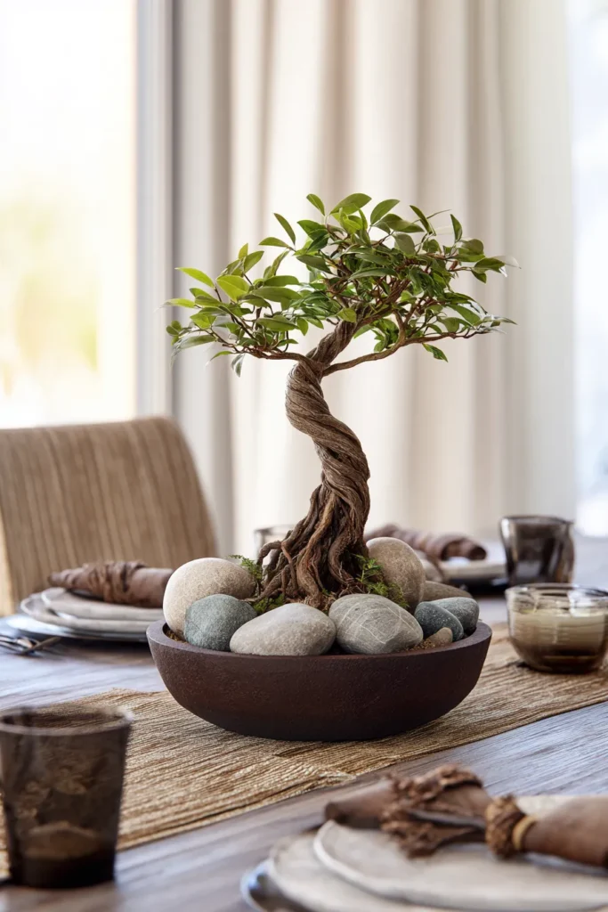
A realistic faux bonsai offers the sculptural beauty of a living tree without the horticultural expertise required to maintain one. Select specimens with visible trunk character—twisted bark, exposed roots, or pronounced branching structure.
Designer’s Secret: The bonsai should sit in a shallow ceramic dish (3″ depth maximum) rather than a traditional deep pot. This low profile maintains the centerpiece’s sightline-friendly proportions while referencing authentic bonsai aesthetics.
Design Breakdown:
- Tree: Faux bonsai, 10-12″ overall height including pot
- Pot: Shallow rectangular ceramic in unglazed terracotta or matte charcoal
- Base layer: Top soil with smooth river stones or crushed granite for realistic ground cover
- Positioning: Slightly off-center placement creates more interest than dead-center symmetry
Best For: Zen-minimalist interiors; anyone who appreciates the aesthetic of bonsai without the commitment to weekly pruning and watering schedules.
Off-Center Asymmetric Balance
Position the bonsai at the table’s one-third point rather than center. Balance the composition by placing a low travertine bowl with river stones at the opposite end.
Brass Decorative Bowl with Natural Elements
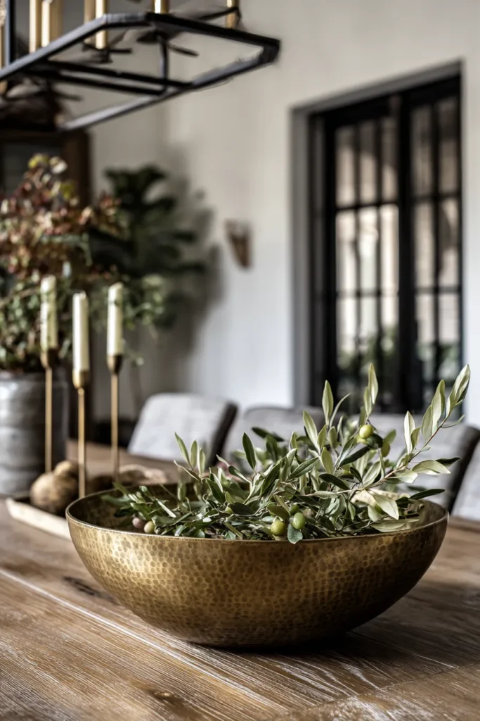
An unlacquered brass bowl functions as both sculptural object and functional vessel. Its hammered or smooth surface develops natural patina over time, creating a living finish that deepens with age. Fill with seasonal foliage, decorative objects, or leave empty to showcase the bowl’s form.
Designer’s Secret: Choose a bowl with interior depth (4-5 inches minimum) but a wide diameter (10-12 inches). This proportion creates visual presence without the “soup tureen” appearance that comes from overly deep vessels.
Design Breakdown:
- Bowl: Unlacquered brass, 10-12″ diameter with hammered or smooth finish
- Seasonal foliage: Autumn—olive branches; Winter—eucalyptus; Spring—flowering quince; Summer—wild grasses
- Permanent objects: Alternative to foliage—fill with smooth stones, decorative balls, or vintage marbles
- Patina maintenance: Embrace natural tarnishing or polish monthly with lemon juice and salt
Best For: Homes with warm metal accents throughout; anyone who appreciates materials that age gracefully and develop character over time.
Empty Bowl as Sculpture
Display the bowl completely empty, allowing its material and form to function as the sole focal point. This radical minimalism works best in spaces with strong architectural bones that don’t require decorative distraction.
Layered Material Vignette (Mixed Media)
The most sophisticated centerpieces combine multiple elements in carefully balanced compositions. Layer a rattan tray with a ceramic sculpture, a small brass bowl containing stones, and a single hand-glazed vase with one dramatic stem.
Designer’s Secret: Follow the “texture triangle” rule—combine one rough texture (rattan), one smooth texture (ceramic), and one reflective texture (brass). This three-part harmony creates visual interest without sensory chaos.
Design Breakdown:
- Base layer: Natural rattan tray, 20-24″ length
- Primary object: Abstract ceramic sculpture, 8-10″ height, positioned rear-left
- Secondary object: Small brass bowl, 4-6″ diameter, filled with river stones, positioned front-right
- Accent element: Narrow ceramic bud vase with single protea or banksia stem, front-center
- Color palette: Neutral earth tones (sand, terracotta, brass, natural fiber)
Best For: Eclectic contemporary interiors; confident stylists who understand how to balance multiple elements without creating visual clutter.
Monochromatic Depth Strategy
Rather than mixing colors, use varying shades of a single hue family. A composition of ivory ceramic, cream rattan, champagne brass, and sand-colored stones creates tonal depth while maintaining monochromatic restraint.
Designer’s Warning: Common Centerpiece Mistakes
Over-Accessorizing Small Surfaces
The mathematical sweet spot for centerpiece coverage is 25-30% of the table’s total surface area. On a 72″ × 40″ table (2,880 square inches), your centerpiece should occupy approximately 720-860 square inches. Exceeding this ratio creates visual congestion that makes the table feel smaller and guests feel cramped.
I’ve seen clients cover 60-70% of their table surface with layered runners, oversized bowls, and multiple vignettes—a composition that might photograph well but fails in daily function. Remember: a dining table’s primary purpose is dining. The centerpiece should enhance, not obstruct.
Ignoring Light Temperature Compatibility
The single most common technical error is selecting materials without considering the room’s dominant light source. Brass and copper require warm (2700-3000K) lighting to achieve their honeyed, luxurious appearance. Under cool (4000K+) lighting, these same metals read as brassy and cheap.
Similarly, white ceramics can appear dingy under warm incandescent bulbs but look crisp under cooler LED lighting. Before investing in any centerpiece materials, test samples under your actual dining room lighting at the time of day you’ll be using the space.
Matching Too Perfectly
Interior design showrooms style tables with perfectly matched candlesticks, identical vases, and symmetrical placement because they’re selling products, not creating homes. Real sophistication comes from curated imperfection—the candlestick set where one piece is slightly taller, the vase cluster where glazes are related but not identical.
When everything matches exactly, the composition reads as “newly purchased” rather than “thoughtfully collected over time.” This is what I call “hotel lobby syndrome”—spaces that look professionally staged but feel emotionally cold.
Material Finish Glossary for Centerpiece Selection
Unlacquered brass: Raw brass without protective coating; develops natural patina over months through oxidation. Requires occasional polishing to maintain bright finish, or can be left to develop aged character.
Stonewashed ceramic: Clay fired at high temperature, then tumbled or treated to create matte, slightly rough surface texture. Absorbs light rather than reflecting it.
Travertine: Porous sedimentary stone formed by mineral deposits in hot springs. Characterized by natural pitting and fossil inclusions. Color ranges from cream to rust.
Frosted glass: Clear glass treated with acid etching or sandblasting to create translucent matte surface. Diffuses light rather than transmitting it cleanly.
Patinated metal: Bronze, copper, or brass that has developed surface oxidation (verde gris, rust, or dark brown) through natural aging or chemical treatment.
Seasonal Rotation Strategy
Spring/Summer Palette (March-August)
During warmer months, shift toward cooler tones and lighter materials. Replace heavy brass with frosted glass. Swap dense ceramic for lightweight porcelain. The table should feel optically lighter even if the actual centerpiece weight remains constant.
Increase negative space—allow more bare table surface to show. Summer dining benefits from visual airiness; a sparse composition feels intentional rather than incomplete.
Material recommendations: White ceramics, clear glass, natural linen, pale stone, bleached wood, fresh greenery in whites and greens.
Autumn/Winter Palette (September-February)
As daylight decreases, embrace warmer metallics and denser textures. This is brass season—the metal’s honeyed warmth feels appropriate against shorter days and longer evenings spent indoors.
Layer depth through material stacking. Where summer centerpieces might feature a single element, winter compositions can support 3-5 layered objects without feeling heavy.
Material recommendations: Unlacquered brass, dark ceramics (charcoal, terracotta), amber glass, rich wood tones, dried botanicals in rust and brown tones.
Frequently Asked Questions
What is the ideal centerpiece height for conversation flow?
The maximum height should be 12 inches measured from the table surface to the centerpiece’s highest point. This measurement ensures that seated guests (whose eye level rests at approximately 42-48 inches from floor) can make eye contact across the table without leaning or craning. For formal dinners where conversation is paramount, consider an even more conservative 8-10 inch maximum.
How do you balance a centerpiece on a rectangular versus round table?
Rectangular tables benefit from linear compositions—elements arranged along the table’s length create natural visual flow. Use the one-third rule: centerpieces should occupy approximately one-third of the table’s total length.
Round tables require radial thinking. Position elements in concentric circles radiating from a central focal point, or create an asymmetric cluster positioned slightly off-center. Avoid perfect center placement on round tables; it creates static symmetry that feels institutional.
Which materials pair best with unlacquered brass?
Brass achieves maximum sophistication when paired with materials that contrast its reflective surface. Ideal companions include porous travertine (rough versus smooth), matte ceramics (light-absorbing versus light-reflecting), and natural linen (organic versus refined).
Avoid pairing brass with other high-shine metals like polished silver or chrome—the competing reflections create visual chaos. Similarly, skip pairing with glossy ceramics; the dual reflectivity feels aggressive rather than refined.
How do you prevent a minimalist centerpiece from looking empty?
Minimalism requires precision, not sparseness. A successful minimal centerpiece relies on three elements: exceptional material quality, perfect proportion, and strategic placement.
Choose one statement piece with inherent visual interest—sculptural form, pronounced texture, or compelling patina. Position it slightly off-center rather than dead-center (which reads as forgotten rather than intentional). Ensure the object occupies approximately 10-15% of the table’s surface area; any less feels incidental.
What’s the rule for mixing metals in dining table styling?
Limit yourself to two metal finishes maximum. More than two creates a “junk drawer” aesthetic that undermines sophistication.
If using brass candlesticks, avoid introducing bronze sculptures or copper bowls in the same composition. However, you can successfully mix metal temperatures—warm brass paired with cool iron or steel creates intentional contrast rather than accidental chaos.
The key is repetition: if you introduce a metal finish, repeat it at least once elsewhere in the composition to signal intentionality.
Internal Resources
For more dining room design guidance, explore our comprehensive guides:
- Dining Room Ideas
- Dining Room Wall Decor
- Dining Room Chandelier
- Farmhouse Dining Room
- Coffee Table Decor (similar styling principles apply)
- Entryway Decor (for surface styling techniques)
The centerpiece is the table’s emotional signature—it establishes whether the space feels formal or casual, lived-in or staged, intentional or accidental. By understanding material properties, light physics, and spatial proportion, you can create compositions that function as both practical table anchors and sculptural focal points. The sixteen approaches detailed here provide frameworks, not formulas. Adapt them to your specific table dimensions, lighting conditions, and aesthetic preferences, always prioritizing negative space over decorative density.