The 2026 shift in coffee table styling prioritizes spatial breathing room over surface coverage—expect empty quadrants, asymmetrical groupings, and a 60/40 negative space ratio that contradicts traditional décor advice. After two decades of “more is more” maximalism, luxury interiors now embrace what Tokyo-based architects call ma—the intentional void that gives objects room to breathe and the eye space to rest.
1. The Edited Quadrant Method

Stop centering everything. The most sophisticated coffee tables in 2026 intentionally leave 40-60% of the surface empty, creating visual tension through strategic placement rather than symmetrical filling.
Designer’s Secret:
Divide your table into four imaginary quadrants. Style only two opposite corners (diagonal placement), leaving the other two completely bare. This creates what interior architects call “active negative space”—the empty areas become part of the composition rather than leftover gaps. This technique works especially well in small living room layouts where every surface counts.
Design Breakdown:
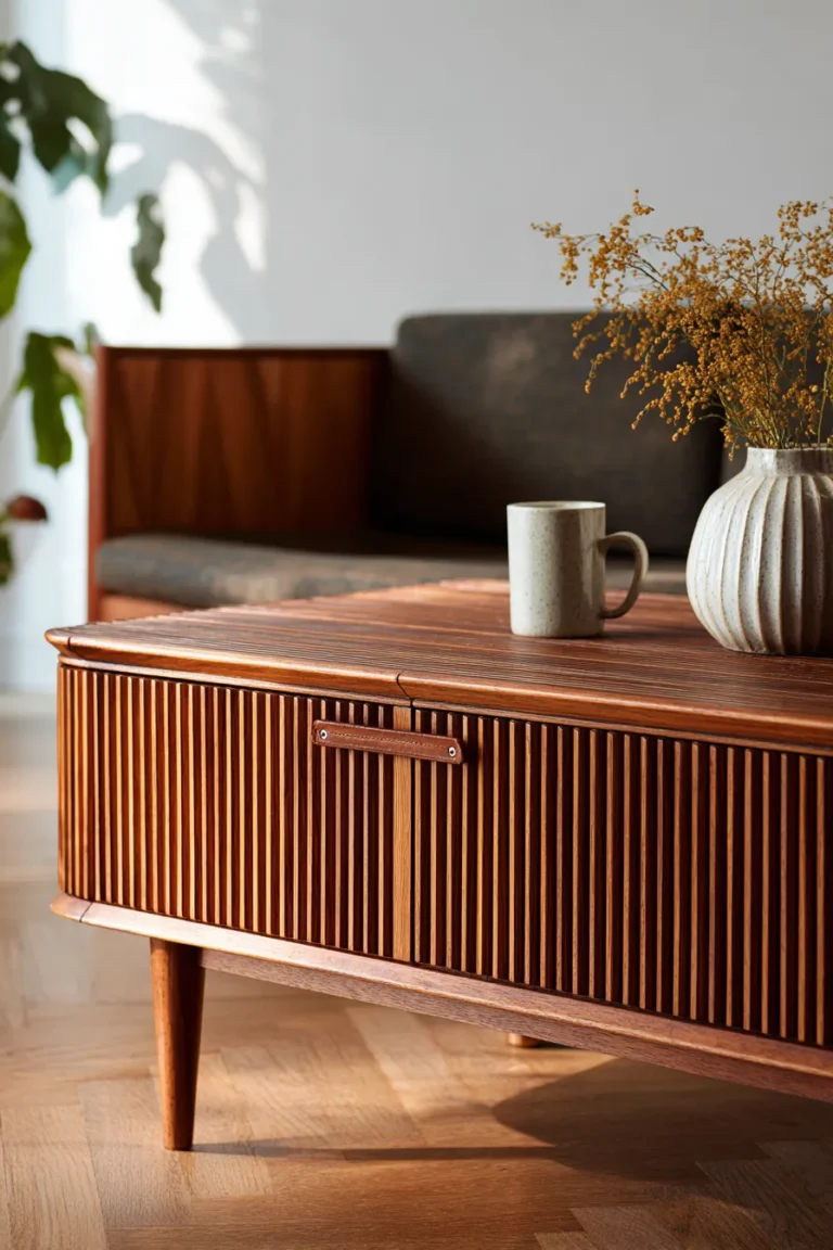
- Base Surface: unlacquered brass tray (18″ diameter) in natural patina—avoid polished finishes that read as “new”
- Primary Object: hand-thrown ceramic vessel (6-8″ height) in matte chalk or raw terracotta
- Secondary Element: hardcover art monograph (not stacked—single book, spine out)
- Lighting Consideration: Place under 2700K LED bulbs to warm the metal tones and soften ceramic texture
Best For:
Modernists who appreciate gallery-like restraint and high-traffic homes where functional surface area matters more than decorative density.
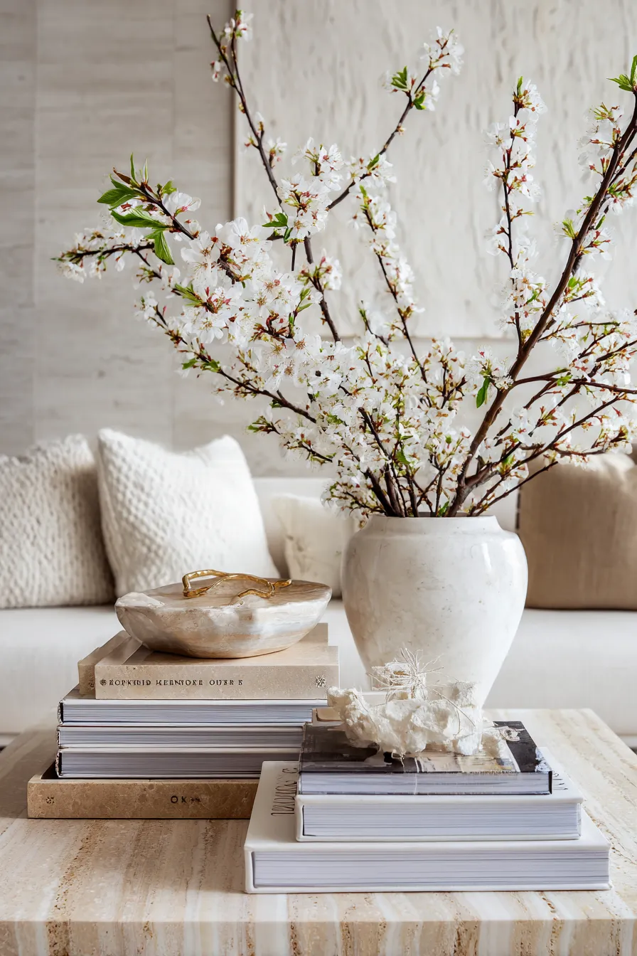
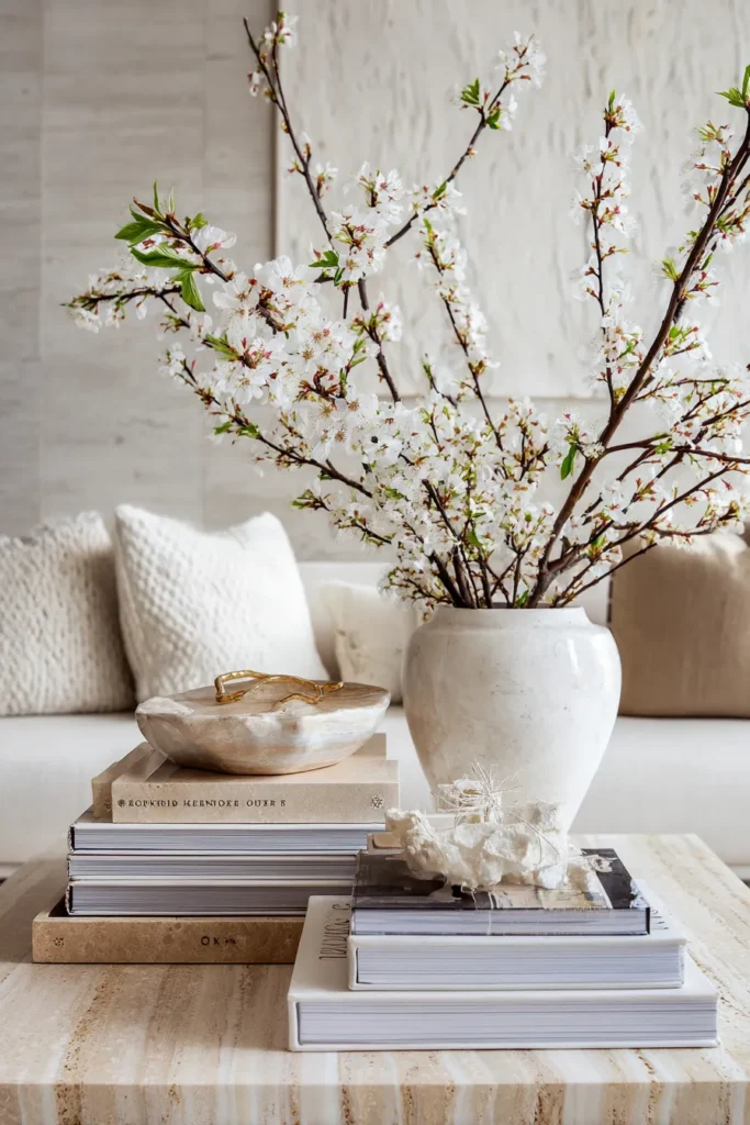
2. Sculptural Book Architecture

Books function as pedestals, not filler. In 2026, coffee table books are selected for dimensional structure—thickness, binding texture, and spine color—rather than content alone.
Designer’s Secret:
Create height variation by mixing horizontal stacks (2-3 books maximum) with a single vertical book leaned at 70-75 degrees against the stack. The angled plane introduces dynamic geometry that flat stacks lack. Never exceed three horizontal layers or the composition reads as “lazy storage” rather than intentional design. For more curated book display inspiration, explore our guide on wall art arrangements.
Design Breakdown:
- Horizontal Base: oversized art book (12×16″) in neutral linen binding
- Mid-Layer: medium format design book (9×11″) with contrasting spine color
- Vertical Accent: slim photography book (8×10″) leaned at angle
- Topper Object: natural agate bookend or brass sphere (3-4″ diameter)
Best For:
Intellectually curious homeowners and creatives who want their reading habits visible but not performative.
3. Material Contrast Layering
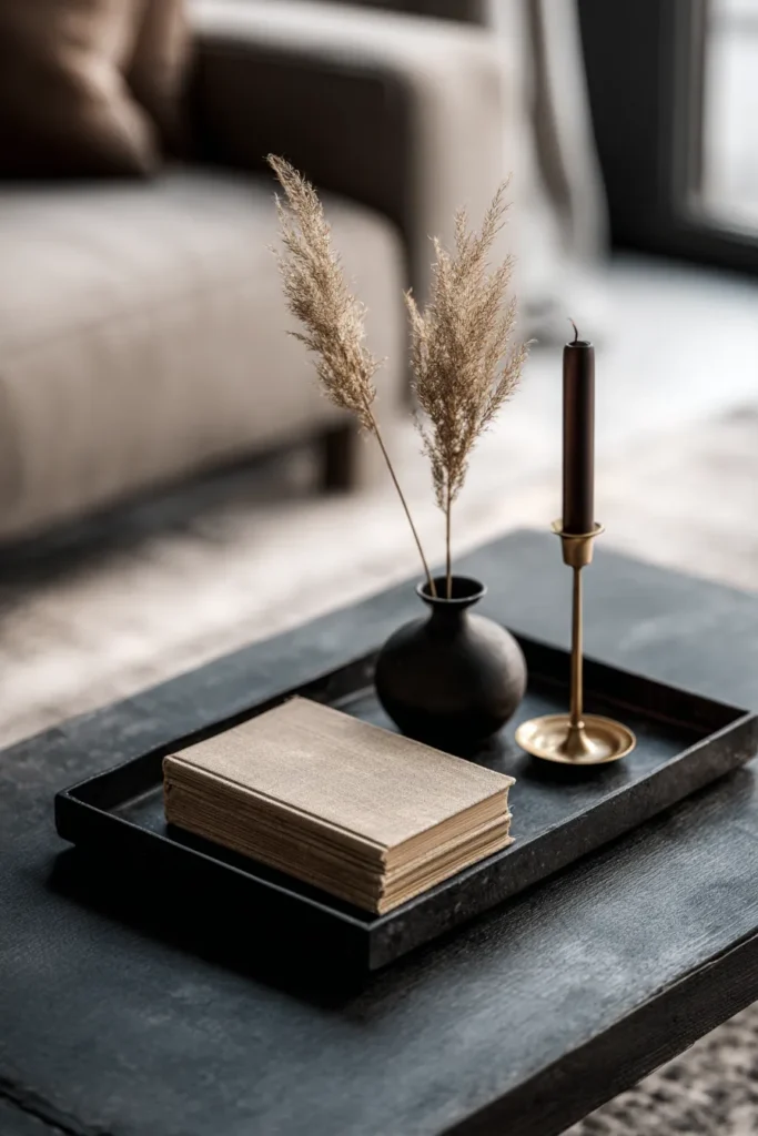
The most visually interesting coffee tables exploit material opposition—not just different textures, but different thermal properties, reflectance values, and tactile temperatures.
Designer’s Secret:
Pair materials with opposing “visual weight”: a heavy, cold element (marble, stone, dark metal) must be balanced by a light, warm element (blonde wood, linen, paper). This isn’t about literal weight—it’s about how the eye perceives density. A black honed marble tray needs a bleached wood bead garland or bone china bowl to avoid visual heaviness.
Design Breakdown:
- Cold/Heavy: blackened steel tray (rectangular, 14×8″) or honed marble catchall
- Warm/Light: raw linen-bound journal or light ash wood box
- Transitional: antique brass candlestick (single, 8″ height)
- Softener: dried pampas grass (18-20″) in minimal vessel
Best For:
Design professionals and collectors who understand that contrast creates visual vibration—the slight discomfort that makes a space memorable. This approach complements luxury living room designs.
4. Low-Profile Botanical Integration
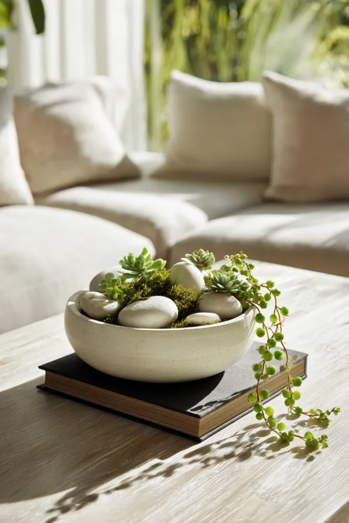
Forget towering floral arrangements. 2026’s botanical trend emphasizes horizontal growth—succulents, moss landscapes, and low-bowl arrangements that enhance rather than obstruct sightlines across the table.
Designer’s Secret:
Choose plants based on “growth gesture”—spreading vs. upright. For coffee tables, select trailing string of pearls, flat lithops (living stones), or air plant clusters that occupy horizontal space without creating vertical barriers. Mount them in shallow ceramic planter (maximum 3″ depth) to maintain the low profile.
Design Breakdown:
- Container: unglazed stoneware bowl (10-12″ diameter, 2-3″ deep)
- Primary Plant: string of pearls or string of hearts (trailing habit)
- Base Medium: sheet moss or decorative sand (light taupe)
- Accent: river rocks (smooth, palm-sized, 2-3 pieces)
Best For:
Biophilic design enthusiasts and those with low natural light (succulents tolerate neglect better than cut flowers).
5. Tray Composition Theory

Trays aren’t organizational tools—they’re compositional frames that define boundaries within the larger surface. Think of them as mini galleries. This layering approach is essential for coffee table decor that feels intentional rather than cluttered.
Designer’s Secret:
Use monochromatic trays (tray color should match table finish within two shades) to create invisible “rooms” on your table. A natural rattan tray on a light wood table disappears, making objects appear to float. Conversely, a matte black metal tray on a dark table creates a recessed “gallery” effect.
Design Breakdown:
- Primary Tray: round rattan tray (16-18″ diameter) or rectangular shagreen tray (14×10″)
- Grouped Items (3-5 only):
- soy wax candle in concrete vessel (3″ diameter)
- linen coaster stack (set of 4)
- brass matchbox holder
- glass vial with single stem
Best For:
Households with children or pets (corrals small objects safely) and those who restyle frequently (easy to swap out entire tray).
6. Asymmetrical Triangulation

The “designer’s triangle” is the invisible geometry connecting three objects of varying heights. This creates dynamic movement that symmetrical arrangements lack.
Designer’s Secret:
Map three points in a scalene triangle (all sides different lengths), then place objects at each vertex with heights in a 1:2:3 ratio. Example: 4″ candle, 8″ vase, 12″ sculptural object. The eye travels naturally through this progression, creating narrative flow rather than static display. Apply this same principle to entryway table decor for cohesive home styling.
Design Breakdown:
- Point A (Low): alabaster paperweight or smooth stone (3-4″)
- Point B (Medium): turned wood candlestick or ceramic bud vase (7-9″)
- Point C (Tall): glass cylinder vase with dried branches (11-13″)
- Grounding Element: linen table runner (partial placement) to anchor the triangle
Best For:
Overthinkers who love systems and visual perfectionists who notice when things feel “off” but can’t explain why.
7. Textural Density Play

Surface variety matters more than color variety. A monochromatic table with five different textures will always look richer than a colorful table with uniform smooth finishes.
Designer’s Secret:
Pair maximum texture contrast in adjacent items: rough cast iron candleholder next to polished marble sphere, or nubby handwoven basket beside glossy ceramic bowl. The tactile invitation makes people want to touch the display—this is the sign of successful styling.
Design Breakdown:
- Rough: raw edge wood slab (8×10″ serving board) or unfinished concrete planter
- Smooth: polished nickel tray or glazed porcelain vessel
- Soft: cashmere throw (draped corner only) or felted wool balls
- Porous: volcanic rock bookend or unglazed terracotta dish
Best For:
Sensory seekers and those who want their home to feel collected over time rather than purchased in one shopping trip.
8. Lighting Layer Strategy
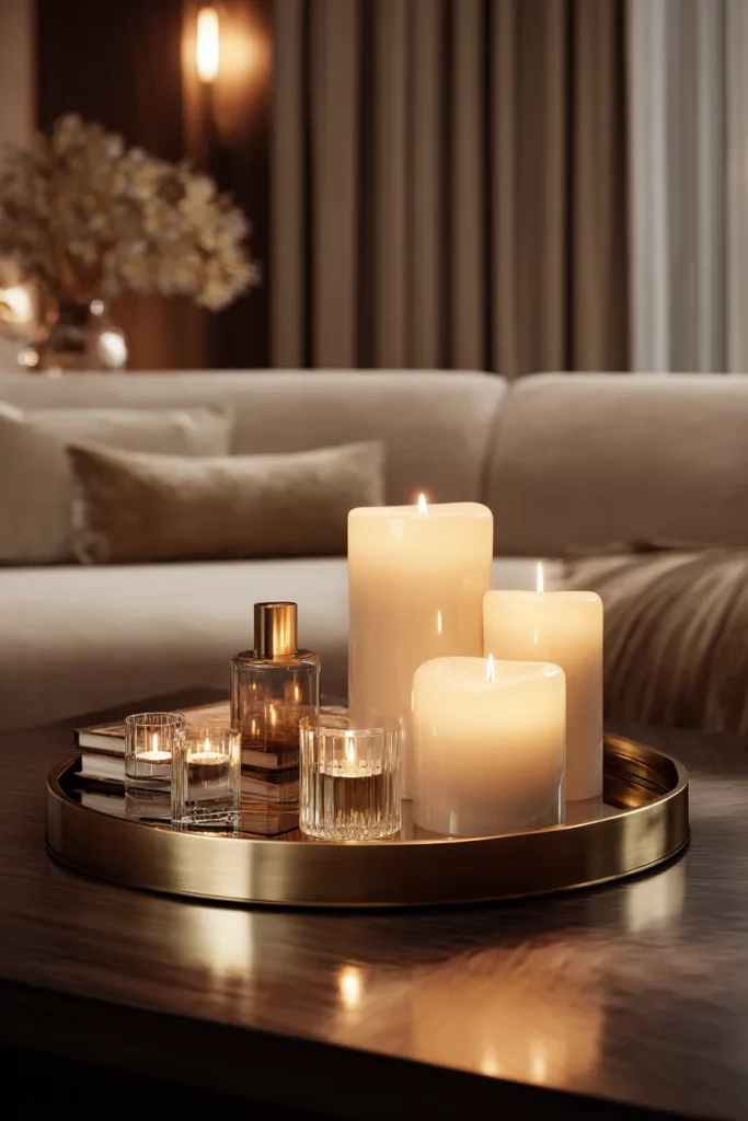
Coffee table lighting isn’t about brightness—it’s about introducing a secondary light source at low eye level to create intimacy and warmth in the 2700-3000K range.
Designer’s Secret:
Never use cool-white bulbs (4000K+) in living spaces—they flatten skin tones and make warm-toned materials (wood, leather, brass) appear sickly yellow. For coffee tables, use 2700K Edison-style LED candles or rechargeable cordless lamp (adjustable 2200-2700K) to mimic firelight’s amber glow. This lighting philosophy extends to dining room design as well.
Design Breakdown:
- Primary Light: rechargeable table lamp (brushed brass or matte black, 10-12″ height)
- Accent Light: battery-operated flameless candles (realistic flicker, set of 3)
- Reflective Element: antique brass mirror tray to multiply light output
- Bulb Specification: Always 2700K maximum for warm ambiance
Best For:
Evening entertainers and those who want their living room to transition from day space to intimate gathering zone after sunset.
9. Collected Object Curation
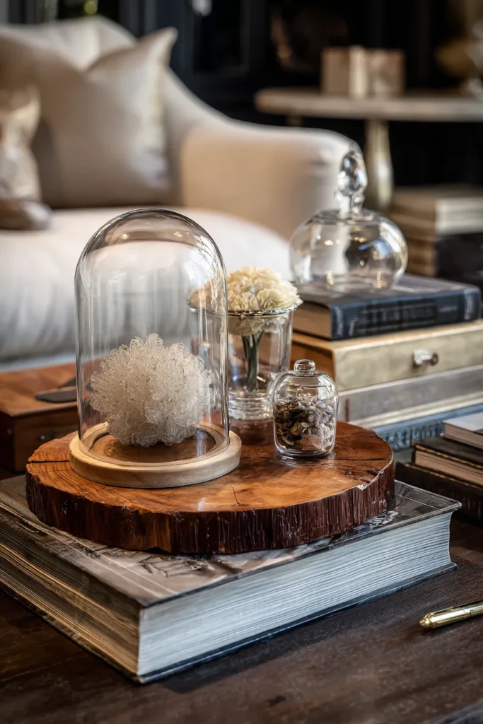
Display your travels and passions without creating a souvenir shop. The 2026 approach treats personal objects like museum pieces—isolated, explained through placement, and rotated seasonally.
Designer’s Secret:
Limit display to 1-2 personal objects at a time, elevated on pedestals or within vitrines. A small glass cloche (6-8″ height) transforms a beach stone into a specimen. A natural wood pedestal (3-4″ height) makes a vintage find feel gallery-worthy. Rotation is key—swap monthly to keep the display dynamic.
Design Breakdown:
- Display Vessel: glass dome cloche with wood base or acrylic display box
- Pedestal: raw edge wood round (4-6″ diameter)
- Label Option: brass card holder with handwritten note (optional but adds curatorial legitimacy)
- Lighting: small LED picture light if object has detail worth highlighting
Best For:
Global nomads and sentimental collectors who want to honor special objects without overwhelming their space.
10. Seasonal Rotation Framework
Professional stylists don’t redecorate rooms—they rotate 4-5 key objects quarterly while maintaining base layers. This creates freshness without requiring full table resets.
Designer’s Secret:
Establish permanent “anchor” objects (large tray, primary book stack, structural bowl) that never move. Then create a “swap kit” for each season: spring = cherry blossom branches in white vase, summer = coral specimen and linen runner, fall = dried hydrangea and leather-bound book, winter = evergreen bundle and white candles. Store off-season items in labeled cotton storage bins.
Design Breakdown:
- Permanent Anchor 1: large travertine tray (20″ round or 18×12″ rectangle)
- Permanent Anchor 2: coffee table book set (2-3 neutral spines)
- Seasonal Swap 1: Botanical element (dried flower bundles or seasonal branches rotated)
- Seasonal Swap 2: Textile accent (linen napkin or small woven mat in seasonal color)
Best For:
Organized maximalists who love change but hate full redesigns, and those who want holiday decor without plastic bins of themed accessories.
11. Functional-First Styling for Small Coffee Tables

The most successful coffee tables balance beauty with utility. Hide remotes, coasters, and charging cables within the composition itself using dual-purpose objects. This is especially critical for small coffee table designs where every inch matters.
Designer’s Secret:
Use decorative boxes with lift-off lids (not hinged—they look cleaner when open) to store remotes, charging cables, and eyeglasses. Choose boxes in natural materials (leather box, lacquered wood box, or woven rattan box) that match your aesthetic. Stack wide-format hardcover books to hide wireless charging pads underneath.
Design Breakdown:
- Hidden Storage: leather storage box with lid (8x6x4″)
- Coaster Solution: marble coaster set or slate coaster set in holder (not scattered loose)
- Cable Management: wireless charging pad (neutral color) hidden under book stack
- Multi-Use Tray: large handled tray for easy clearing when using table surface
Best For:
Practical aesthetes who refuse to choose between beauty and function, and households where the coffee table sees daily use.
12. Personal Archive Display

Frame small, meaningful objects—vintage stamps, pressed flowers, heirloom jewelry—behind glass to create intimate table art that invites close examination.
Designer’s Secret:
Use floating frame boxes (6×6″ or 8×8″ shadow boxes) with museum-grade acid-free backing to display fragile items. Lean frames at 15-degree angles against book stacks rather than standing them upright—this prevents the “propped photo” look and creates intentional design geometry.
Design Breakdown:
- Framing: brass shadow box frame or black metal shadow box frame (8×8″)
- Backing: linen insert or velvet insert in neutral tone
- Display Stand: small brass easel (6-8″ height) or lean against books
- Grouping Option: Gallery wall of 3-4 small frames on table surface (not wall)
Best For:
Sentimental minimalists who want to display family history without traditional photo albums, and those seeking conversation starters that reveal personal narrative.
Designer’s Warning: The Over-Grouping Trap
Common Mistake: Filling your coffee table with seven or more objects creates visual noise, not richness.
Professional stylists follow the “Rule of Uneven Numbers”—three, five, or seven objects maximum, with strong preference for three. Why? The human eye processes odd-numbered groupings faster and finds them more aesthetically satisfying than even numbers. But here’s the nuance: five small objects create the same visual weight as seven, so default to three substantial objects rather than multiple small trinkets.
The Fix:
Audit your current coffee table. Remove everything. Reintroduce only three objects using the triangulation method (see #6). Live with this for 48 hours. Only then decide if you need to add a fourth or fifth element. Most people discover they don’t.
Material Investment Guide
Not all coffee table objects are created equal. Invest in these foundational pieces that elevate any styling approach:
High-Value Investments:
- handmade ceramic vessel from independent potter ($80-150) — appreciates with patina
- vintage brass candlesticks ($60-120) — never looks dated
- oversized art book from independent publisher ($50-90) — conversation catalyst
- natural stone tray (marble, travertine, or slate) ($70-140) — timeless base layer
Budget-Friendly Foundations:
- dried pampas grass, dried lunaria, or dried protea ($15-30) — last 6-12 months
- linen napkins or cotton napkins as runners ($20-40 for set) — textile warmth without commitment
- smooth river stones or geodes ($10-25) — free form, organic interest
- thrifted hardcover books ($5-15 each) — instant height and color
Styling Across Different Room Aesthetics
The principles above adapt beautifully to various design styles:
For Minimalist Bedrooms:
Apply the same “edited quadrant” approach to bedroom vanity ideas and nightstands for cohesive minimalism throughout.
For Boho Spaces:
Embrace the textural density play with macrame plant hangers, woven baskets, and natural fiber rugs that complement your boho bedroom aesthetic.
For Modern Farmhouse:
Combine the material contrast layering (metal + wood) with vintage finds perfect for farmhouse dining room style.
For Small Apartments:
The functional-first approach is essential for balcony styling and patio decorating where dual-purpose pieces maximize limited space.
The 2026 Styling Mindset
Coffee table styling has evolved from “filling space” to “creating breathing room.” The best-styled tables in luxury homes right now share three characteristics:
- Intentional emptiness — 40-60% of surface remains clear
- Material contrast — minimum three different textures visible
- Personal curation — at least one object with provenance or meaning
Stop shopping for coffee table decor as a category. Instead, collect objects slowly—from travels, galleries, antique markets—that earn their place through beauty, function, or memory. A coffee table styled over months will always feel more authentic than one styled in an afternoon with cart-to-home delivery.
Consider extending this curation philosophy to reading corner design and entryway shoe storage for a collected-over-time aesthetic throughout your home.
The question isn’t “What should I put on my coffee table?” but rather “What deserves to be seen every day?”
Final Note: Your coffee table reflects your editing skills, not your shopping skills. Resist the urge to fill space. Trust the pause. Let objects speak without shouting over each other.