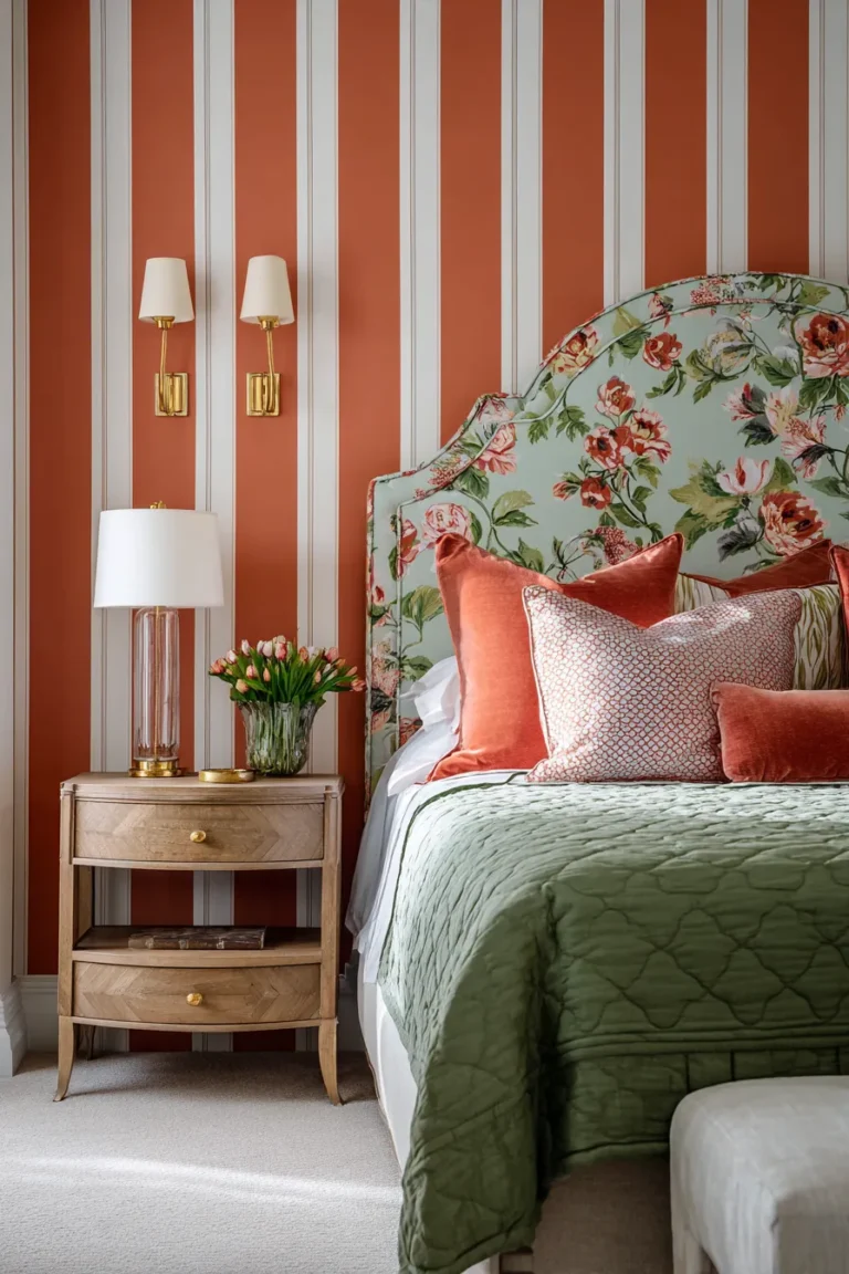
The 2026 boho bedroom abandons maximalist clutter for ‘curated imperfection’—a material-first approach where every textile weight, finish patina, and light temperature is intentionally mismatched to create sophisticated visual tension.
What distinguished this year’s bohemian interiors from their predecessors isn’t the presence of global textiles or artisan craft, but rather the precision with which designers are now calibrating material density, light reflectance values, and spatial breathing room. The aesthetic has matured from “more is more” into something closer to material intelligence—where a single 400gsm wool throw carries more design authority than five lightweight cotton blankets ever could. This shift parallels broader bedroom design evolution, where intentionality trumps accumulation.
This shift responds to three converging forces: sustainability mandates pushing clients toward investment-grade textiles, wellness research proving that chromatic harmony affects sleep architecture, and a post-minimalist fatigue that craves warmth without chaos. The result is a bohemian language that speaks in material dialects rather than decorative accents—particularly relevant for primary bedroom suites where material quality directly impacts daily well-being.
Textile-Led Boho Bedroom Concepts
1. Raw-Edge Organic Linen Layering

The definitive 2026 bed builds tactile weight through fabric density gradients rather than pattern mixing. Start with a base-layer duvet in 180gsm stonewashed linen—the specific weight matters because lighter linens (120–140gsm) lack the drape necessary to create sculptural folds, while heavier iterations above 220gsm read as winter bedding year-round.
Designer’s Secret: To avoid the sterile “all-white hotel” effect, your secondary textile layer must be precisely two shades darker than your base. This creates enough tonal contrast for natural shadows to register depth without introducing obvious color blocking. Measure this using paint chip samples in LRV increments—aim for a 5–8 point difference.
Design Breakdown:
- Base: Belgian or French flax linen in ‘Sand’ (LRV 68) or ‘Warm Gray’ (LRV 61)
- Accent throw: 220gsm waffle weave in ‘Mushroom’ (LRV 55) with raw-edge hem
- Pillowcases: 160gsm linen with mother-of-pearl buttons, not ties
- Bed frame: Oiled walnut or matte-black steel with visible welding marks
- Ambient lighting: 2700K warm LED strips behind headboard for fabric texture emphasis
Best For: Minimalist bohemians and tactile-sensitive sleepers who need visual calm but crave material richness. This approach particularly suits minimalist bedroom enthusiasts seeking warmth without clutter.
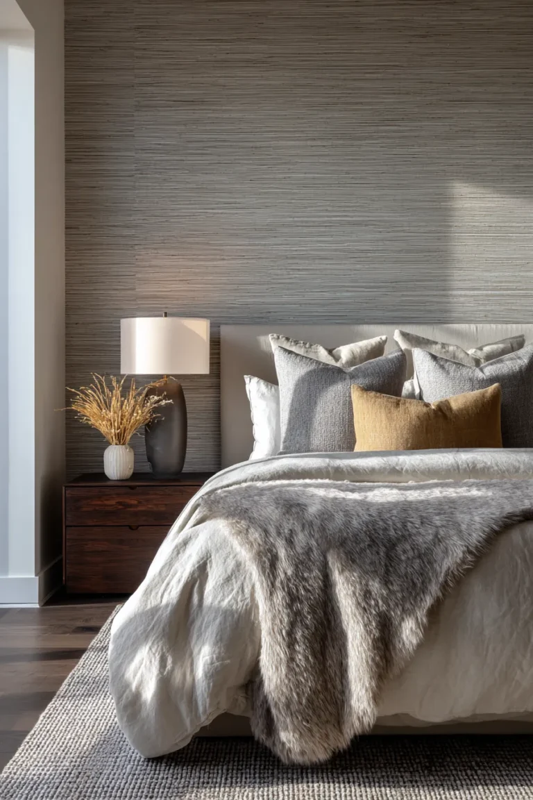
2. Mixed-Weave Neutrals with Shadow Architecture
This approach treats your bed as a study in surface variation rather than color composition. The technique requires three distinct weave structures in the same color family: a flat percale base (smooth), a textured dobby weave middle layer (dimensional), and a slubbed linen top layer (irregular). Light hits each surface differently throughout the day, creating what interior architects call “passive animation.”
Designer’s Secret: Install your bedside lighting at mattress height rather than traditional nightstand height. When light sources sit 18–22 inches above the floor, they rake across textured fabrics at acute angles, amplifying weave variations by 40–60% compared to overhead lighting.
Design Breakdown:
- Base: 400-thread-count organic percale in ‘Ecru’
- Middle: Portuguese cotton dobby weave duvet with self-stripe
- Top: Belgian linen throw with 12mm slub irregularities
- Nightstands: Travertine or limestone with natural pitting
- Task lighting: Adjustable brass gooseneck sconces with 2800K bulbs
For spaces requiring dual functionality, stone surfaces also work beautifully as vanity desk foundations when paired with appropriate seating.
Best For: Photography enthusiasts and anyone working from a bedroom space who needs the room to photograph well in natural light.
3. Indigo-Dyed Handwoven Textiles

Natural indigo develops patina differently than synthetic versions—a critical distinction that separates authentic boho from costume boho. True plant-based indigo (from Indigofera tinctoria) oxidizes with UV exposure and body oils, creating subtle color variations that synthetic indigo blue cannot replicate. This living finish means your bedding will develop unique fade patterns within 18–24 months.
Designer’s Secret: Pair deep indigo (LRV 8–12) with a warm-toned wood floor, never cool grays. Indigo’s blue-black depth needs the orange undertones in oak, teak, or walnut to prevent the room from reading as cold nautical rather than earthy bohemian. The complementary color relationship does the tonal balancing automatically.
Design Breakdown:
- Base: Japanese katazome-dyed cotton futon cover in traditional motifs
- Accent: Mudcloth throw in natural ecru as brightness contrast
- Pillows: Hand-blocked indigo on heavyweight linen (240gsm)
- Flooring: Wide-plank white oak with natural oil finish (never gray stain)
- Decorative: Brass or copper vessels to echo warm metal undertones
Best For: Collectors of artisan textiles and renters seeking impactful color without permanent wall treatments. This palette also complements earth-toned bedroom schemes focused on grounding color psychology.
4. Heavyweight Wool Bouclé Accent Walls

Upholstered wall panels aren’t new, but specifying them in 600–800gsm bouclé wool transforms them from decorative gesture into functional acoustic architecture. A 10-foot wall clad in heavyweight bouclé can reduce ambient noise by 35–40% while adding the textural depth of a three-dimensional installation.
Designer’s Secret: Stop the upholstery 18 inches from the ceiling rather than running it full-height. This creates a “breathing line” that prevents the room from feeling padded-cell enclosed while maintaining the acoustic benefits. The gap also prevents dust accumulation that plagues full-wall upholstery.
Design Breakdown:
- Material: Undyed wool bouclé in natural cream or charcoal (800gsm minimum)
- Installation: Fabric-wrapped panels over 1-inch acoustic batting
- Height: Floor to 6’10” on 8-foot ceilings, leaving upper wall in matte paint
- Bed placement: Headboard directly against bouclé wall for integrated look
- Complementary: Jute or sisal area rug to double-down on textural layering
Best For: Urban dwellers in high-rise buildings and light sleepers who need noise mitigation without acoustic foam aesthetics.
5. Gauze Canopy Layers with Thermal Drape

The canopy bed returns in 2026, but engineered for temperature regulation rather than romance. Layer 60gsm cotton voile (summer-weight) with 180gsm linen panels (winter-weight) on separate tracks. This creates a micro-climate management system—open gauze for air circulation in warm months, closed linen for heat retention in cold months.
Designer’s Secret: Hang your gauze panels 14–16 inches lower than your linen drapes. When both are closed, the gauze acts as a diffusion layer that softens the heavier linen’s visual weight, preventing the cave-like enclosure feeling. The layered termination points also create more dynamic movement when windows are open.
Design Breakdown:
- Summer layer: Organic cotton gauze in ‘Natural White’ (60–80gsm)
- Winter layer: Stonewashed linen in ‘Warm Gray’ (180–200gsm)
- Hardware: Ceiling-mounted track system with independent operation
- Bed frame: Low-profile platform in weathered oak or blackened steel
- Lighting: Pendant lights inside canopy at 2200K for evening ambiance
Best For: Sleepers sensitive to temperature fluctuations and anyone in four-season climates needing adaptive bedroom environments.
Material Contrast & Patina-Forward Designs
6. Unlacquered Brass with Oxidized Copper

Living finishes—metals that develop patina through atmospheric exposure—define luxury bohemian interiors in 2026. Unlacquered brass ages from bright gold to mottled amber-brown, while oxidized copper shifts from salmon-pink to verdigris green. The key is mixing both metals in a single room to create a patina timeline, where newer brass reads as “accent” against elder copper’s “base tone.”
Designer’s Secret: Accelerate brass patina in specific areas using a vinegar-salt solution applied with cotton swabs. This lets you “art direct” the aging process, creating concentrated darkening around hardware edges and high-touch zones while leaving recessed areas bright—mimicking decades of authentic use in just 48 hours.
Design Breakdown:
- Bed frame: Unlacquered brass tubing with visible joining techniques
- Lighting: Oxidized copper pendant lights or wall sconces
- Hardware: Brass drawer pulls on nightstands, pre-darkened in priority areas
- Mirrors: Brass-framed with deliberately uneven patina distribution
- Accessories: Copper vessels and brass candlesticks in varying patina stages
Best For: Design purists who appreciate Wabi-sabi imperfection and anyone renovating historic homes seeking material continuity.
7. Reclaimed Teak with Lime-Washed Oak

Pairing a dense tropical hardwood (teak at 55 lbs/ft³) with a lighter temperate wood (white oak at 47 lbs/ft³) creates visual weight distribution that grounds a room without heaviness. The technique requires treating the lighter wood with lime wash or whitewash—this raises its apparent lightness while the teak’s natural oil darkens with age, increasing the contrast over time.
Designer’s Secret: Position your darkest wood (reclaimed teak) as the bed frame and your lightest wood (lime-washed oak) as flooring. This inverts the expected dark-floor-light-furniture formula, making the bed read as a sculptural anchor rather than furniture floating on a surface. The psychological effect mimics sleeping on solid ground.
Design Breakdown:
- Bed: Reclaimed Indonesian teak with hand-adzed texture and natural silver patina
- Flooring: Wide-plank white oak with Swedish lime wash finish (matte, non-yellowing)
- Nightstands: Same reclaimed teak as bed for material continuity
- Contrast: White-washed rattan or cane accent chairs
- Treatment: Natural oils on teak (never polyurethane), water-based sealer on oak
Best For: Scandinavian-boho hybrid aesthetics and spaces needing visual grounding without dark color palettes.
8. Travertine Nightstands with Matte-Black Steel

Stone and metal pairings work when you match their thermal properties intentionally. Travertine (a porous limestone) feels warm to touch despite being stone due to its cellular structure and low thermal conductivity. Pairing it with matte-black steel creates temperature contrast—the stone reads as organic warmth, the steel as industrial cool—without visual temperature confusion.
Designer’s Secret: Specify unfilled travertine rather than filled and polished versions. The natural pitting and voids create micro-shadows that change throughout the day as light angles shift, giving static stone the visual behavior of a living material. Filled travertine loses this dimension entirely.
Design Breakdown:
- Nightstands: Unfilled travertine blocks (12″×12″×24″) with visible fossil inclusions
- Bed frame: Welded matte-black steel with 2-inch square tubing
- Lamps: Blackened steel with adjustable arms for task reading
- Flooring: Concrete or terrazzo to support stone’s mineral language
- Softening: Sheepskin or cowhide rug for necessary warmth
Best For: Modern bohemians and anyone in warm climates needing materials that stay cool to touch.
9. Weathered Terracotta Floor Tiles

Unsealed terracotta develops surface patina through micro-absorption of oils, water, and atmospheric particles—essentially aging like leather rather than remaining static like porcelain. This living surface requires maintenance (annual wax sealing), but the reward is a floor that becomes more beautiful with traffic patterns and time, recording the room’s use history.
Designer’s Secret: Install terracotta in a traditional Spanish “paso” pattern (12″×12″ tiles rotated 45 degrees) rather than standard grid layout. The diagonal orientation makes rectangular bedrooms feel more square and creates movement that prevents the floor from reading as an orange expanse. It also hides grout line irregularities better than straight-laid patterns.
Design Breakdown:
- Tiles: Handmade terracotta from Oaxaca or Andalusia (thickness 1.25″–1.5″ for thermal mass)
- Sealer: Natural beeswax and linseed oil (reapply every 12–18 months)
- Grout: Lime-based in ‘Natural’ to match tile body color
- Underfloor: Radiant heating highly recommended for barefoot comfort
- Rugs: Minimal—one small bedside jute rug maximum to showcase tile
Best For: Warm-climate homes and anyone seeking flooring that improves with age rather than deteriorates.
Lighting Architecture for Boho Spaces
10. Layered Kelvin Zones (2200K–3000K)

Professional lighting design recognizes that color temperature affects not just ambiance but also how materials read visually. A 2700K light source emphasizes warm undertones in wood and textiles, while 3000K begins introducing cool clarity. Layering both in separate circuits lets you shift the room’s entire material palette throughout the day.
Designer’s Secret: Use 2200K (ultra-warm amber) for accent lighting only—aimed at textured walls or upward toward ceilings. This extremely warm light looks artificial when used as general illumination but creates magic when used directionally to graze surfaces, making rough plaster or brick look candlelit.
Design Breakdown:
- Ambient: 2700K recessed LED downlights on dimmer (general illumination)
- Task: 3000K adjustable reading sconces at headboard (functional clarity)
- Accent: 2200K LED tape behind floating headboard or under bed frame (material emphasis)
- Control: Three separate dimmer circuits for independent zone management
- Hardware: Warm brass or aged bronze switch plates, never brushed nickel
Best For: Anyone spending significant time reading in bed and design professionals who understand lighting as material modifier.
11. Paper Lantern Diffusion with Edison Filaments

Japanese paper lanterns—true chōchin made from washi paper and bamboo—diffuse light through variable density fibers, creating soft gradients that LED panels can’t replicate. When fitted with visible-filament Edison bulbs (2200K–2400K), they produce what lighting designers call “animate glow”—light that appears to move as air currents subtly shift the paper.
Designer’s Secret: Hang lanterns in odd-number clusters (3 or 5) at staggered heights—never in symmetrical pairs. Position the lowest lantern at 60 inches above the floor and the highest at 84 inches, with 8–12 inch vertical spacing between. This creates overlapping diffusion pools that eliminate dark corners without uniform brightness.
Design Breakdown:
- Lanterns: Authentic Japanese washi paper in 18″–24″ diameter (avoid synthetic substitutes)
- Bulbs: 40W-equivalent Edison filament LED at 2200K (visible spiral filament essential)
- Suspension: Fabric-wrapped electrical cord in dark brown or charcoal
- Placement: Corner grouping or bedside clusters, never centered overhead
- Dimming: Critical—lanterns should be dimmable to 10% for night-light function
Best For: Renters needing impactful lighting without hardwiring and anyone seeking Japanese-Scandinavian boho hybrids.
12. Sculptural Brass Sconces with Dimming Control

Wall-mounted sconces provide task light without claiming nightstand real estate—critical in smaller bedrooms. But specification matters: look for sconces with adjustable arms (minimum 180-degree rotation) and high CRI ratings (90+) to ensure fabric colors remain accurate in evening hours. Low-CRI lighting makes even expensive textiles look muddy and flat.
Designer’s Secret: Mount sconces 48–52 inches above the floor when measured to the bulb center—not the fixture’s top. This positions light at seated eye level for reading while directing most illumination downward onto bedding, where texture benefits from angled light. Standard electrician mounting at 60+ inches causes glare and shadows your book.
Design Breakdown:
- Fixtures: Unlacquered brass with articulating arms and exposed bulb design
- Bulbs: 2700K LED with CRI 95+ (necessary for accurate textile color rendering)
- Mounting: 48–52 inches to bulb center, positioned 18–24 inches from headboard edges
- Control: Dimmer switches rated for LED load (standard dimmers cause flicker)
- Shades: None—exposed Edison or globe bulbs are structural to the aesthetic
Best For: Readers, small-space dwellers, and anyone who treats bedside lighting as sculptural elements.
Spatial Balance & Asymmetric Composition
13. Low-Profile Platform Bed with Vertical Textiles

Dropping your mattress height from standard 24–26 inches to 14–16 inches above the floor fundamentally changes a room’s spatial perception. Lower beds increase the visible ceiling height and create what architects call “datum shift”—your eye level while seated moves down, making wall-mounted elements appear taller and more dramatic.
Designer’s Secret: Compensate for the low bed by extending vertical textiles (curtains, tapestries, or fabric panels) from ceiling to floor without breaks. This uninterrupted vertical line counterbalances the lowered horizontal bed plane, preventing the room from feeling squat. Never hem curtains 2–3 inches above the floor—this breaks the vertical gesture exactly where it matters most.
Design Breakdown:
- Bed: Japanese-style platform in 8″–10″ height with integrated tatami or linen mat
- Mattress: Low-profile (8″) for total bed height of 16–18 inches
- Curtains: Floor-to-ceiling linen in neutral tones with 2-inch puddling at floor
- Headboard: Wall-mounted textile panel extending 60+ inches above mattress
- Rugs: Layered low-pile kilims to build up floor plane slightly
Best For: Small bedrooms needing vertical volume and anyone embracing Japanese or Korean design principles. The spatial strategies here also apply to compact sleeping spaces where vertical emphasis is critical.
14. Off-Center Focal Walls with Floating Shelves

Symmetry feels formal; asymmetry feels collected. Instead of centering your bed on a wall, position it 18–24 inches off-center and build a floating shelf vignette on the resulting blank wall space. This breaks the expected mirror-image nightstand setup and creates purposeful negative space that lets individual pieces breathe.
Designer’s Secret: Follow the “rule of optical thirds” rather than mathematical thirds. Divide your wall into three zones visually—place your bed to occupy roughly two-thirds of the wall, leaving one-third for your shelf composition. This creates enough imbalance to feel intentional without tipping into chaos. Mathematical 1/3–2/3 divisions often feel too extreme.
Design Breakdown:
- Bed placement: 18–24 inches off wall center, toward the shorter remaining distance
- Shelves: 2–4 floating shelves in reclaimed wood or blackened steel (asymmetric lengths)
- Shelf styling: Books, ceramics, and collected objects with varied heights—consider bedroom wall art that reinforces your material palette
- Nightstands: One substantial piece on the longer bedside, minimal or none on shorter side
- Lighting: Single oversized pendant or wall sconce on the shelf-side wall
Best For: Collectors, asymmetric thinkers, and anyone renovating bedrooms with off-center windows or doors. This layout also maximizes floor space for integrated wardrobe solutions along adjacent walls.
15. Sunken Seating Nook with Built-In Cushions

If you’re renovating with access to floor structure, a sunken seating area (8–12 inches below main floor) creates zone delineation more effectively than any rug or furniture arrangement. This architectural gesture transforms a corner into a dedicated reading sanctuary or meditation space without walls or doors—pure spatial definition through level change.
Designer’s Secret: Line the sunken zone with the same flooring as the raised areas rather than switching materials. The level change itself provides enough differentiation; adding a material transition makes the drop feel like a mistake or failed detail rather than an intentional design move. Continuous material emphasizes the volumetric carving.
Design Breakdown:
- Depth: 10–12 inches below main floor level (shallower feels unintentional)
- Cushions: Built-in bench with 6-inch-thick foam base in 180gsm linen slipcovers
- Access: Two 18-inch-wide steps in same material as floor
- Lighting: Low-voltage LED strip under step nosing for night navigation
- Textiles: Floor cushions and sheepskin throws for softness variation
Best For: Renovation projects, loft bedrooms with high ceilings, and anyone needing defined spaces within open-plan sleeping areas.
Biophilic Integration & Air Quality
16. Living Moss Wall with Humidity Control

Preserved moss panels require zero maintenance but offer zero air quality benefits. Living moss walls, however, function as passive humidifiers and air filters—absorbing VOCs and releasing clean moisture. The trade-off is monthly misting and attention to ambient humidity (ideally 50–70%), which makes them viable only in bedrooms with proper environmental control.
Designer’s Secret: Install your living moss panel opposite your bed rather than behind it. Moss releases humidity at night when temperatures drop—positioning it across from where you sleep distributes that moisture throughout the room rather than concentrating it at your head. This prevents the clammy feeling that ruins many poorly-planned moss wall installations.
Design Breakdown:
- Installation: Modular panels of sheet moss, cushion moss, and fern moss (avoid single-species)
- Size: 4’×6′ minimum for meaningful humidity impact in 12’×14′ bedroom
- Backing: Moisture-barrier backing with built-in irrigation mat
- Maintenance: Weekly misting with distilled water, quarterly diluted fertilizer
- Humidity: Monitor with hygrometer, maintain 55–65% for moss health
Best For: Green thumbs, dry-climate residents, and anyone committed to maintenance routines.
17. Oversized Terracotta Planters with Structural Plants

“Structural plants” refers to specimens with architectural form—think mature fiddle-leaf figs, bird of paradise, or large snake plants—versus trailing or flowering varieties. In boho bedrooms, these function as vertical elements that occupy floor space without requiring furniture, creating natural room dividers and air purification nodes.
Designer’s Secret: Choose root-bound plants intentionally rather than avoiding them. A root-bound fiddle-leaf fig or rubber tree grows slower and requires less frequent watering—often just once every 10–14 days versus weekly for actively-growing specimens. For low-maintenance bedroom plants, buy mature specimens and keep them slightly pot-bound to slow growth and reduce care needs.
Design Breakdown:
- Containers: Unglazed terracotta in 18″–24″ diameter (terra cotta breathes, preventing overwatering)
- Plants: Fiddle-leaf fig, bird of paradise, large snake plants, or mature rubber trees
- Placement: Floor-standing in corners or flanking doorways (never on nightstands)
- Soil: Cactus/succulent mix for bedrooms (fast-draining prevents fungus gnats)
- Saucers: Oversized terracotta saucers to catch drainage without plastic trays
Best For: Busy professionals needing low-maintenance biophilic design and anyone in dry climates requiring natural humidification.
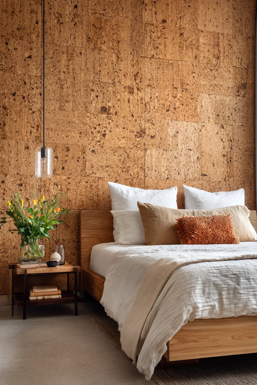
18. Natural Cork Headboard with Acoustic Benefits

Cork panels absorb sound frequencies between 500–2000 Hz—the exact range of human speech and urban noise pollution. A floor-to-ceiling cork headboard wall functions as acoustic treatment while providing a warm, textured backdrop that ages beautifully as natural cork darkens over time from UV exposure.
Designer’s Secret: Specify thick cork panels (1.5″–2″ minimum) and leave them completely unsealed. Thin cork tiles (0.25″) or sealed cork loses 60–70% of its acoustic absorption. The air pockets within thick, unsealed cork are what trap sound waves—any surface sealer fills those pockets and destroys the functional benefit while keeping only the aesthetic.
Design Breakdown:
- Material: Natural cork panels in 1.5–2-inch thickness (not cork tiles or veneer)
- Installation: Direct-mounted to wall with low-VOC adhesive, no sealer or topcoat
- Coverage: Full wall behind bed, floor to ceiling for maximum acoustic benefit
- Color: Natural cork honey tone (darkens to amber over 2–3 years with UV)
- Pairing: White oak or light wood bed frame to echo cork’s warm tones
Best For: Light sleepers, urban apartments with street noise, and anyone seeking natural materials with measurable functional benefits.
Designer’s Warning: The Scale Hierarchy Trap
Over-layering textiles without respecting density hierarchy creates visual mud, not bohemian richness. The amateur mistake is combining seven different fabric weights in one space—gauze curtains, medium-weight linen bedding, heavy wool throws, lightweight cotton pillows, and so on—hoping the variety creates depth.
The professional approach limits to three distinct textile densities: light (60–100gsm), medium (150–200gsm), and heavy (300gsm+). Within each weight category, you can vary weave structures, but jumping between too many density levels creates competition rather than conversation. Your eye can’t find resting places when every surface demands different focal attention.
Apply the same principle to material categories: limit to three primary materials per bedroom. Typical successful combinations include wood + textile + metal, or stone + textile + leather. Adding glass, ceramic, paper, and rope to that mix doesn’t create “curated”—it creates craft fair. This restraint principle applies equally to living room compositions and other residential spaces where material editing defines sophistication.
The contemporary bohemian bedroom succeeds through material restraint, not accumulation. Each textile weight, each patina stage, each light temperature is a deliberate choice in a larger material narrative. The 18 approaches detailed here share a common methodology: they prioritize how materials behave—how linen drapes, how brass ages, how light grazes texture—over how many objects occupy a room.
This represents a fundamental shift from bohemian-as-collected-chaos to bohemian-as-material-intelligence. The rooms that will define this aesthetic in 2026 and beyond won’t be the ones with the most globally-sourced objects, but rather the ones where every surface, every finish, every fiber demonstrates a designer’s understanding of physical properties, light behavior, and spatial composition. The question isn’t what to add, but what each addition contributes to the room’s sensory architecture.