The 2026 bathroom aesthetic abandons sterile minimalism for what interior architects call “tactile quietude”—spaces where patinated unlacquered brass fixtures, hand-slubbed Zellige tile, and 2700K warm-spectrum lighting create sensory depth without visual noise.
This shift isn’t about adding more objects. It’s about material intelligence: choosing finishes that develop character, surfaces that absorb rather than reflect harshness, and lighting that mimics the 1800K flicker of candlelight without the fire hazard. Where last decade’s bathrooms chased the clinical precision of luxury hotels, 2026 embraces what design psychologists call “wabi-sabi modernism”—the beauty of imperfect, impermanent, and incomplete.
Why This Moment Demands a New Bathroom Vocabulary
Three concurrent forces are reshaping high-end bathroom design. First, sustainability mandates have made longevity the ultimate luxury metric—unlacquered metals that age for decades now outrank chrome’s need for replacement every 7-10 years. Second, neuroscience research confirms what designers have intuited: bathrooms lit at 2700K reduce cortisol by 18% compared to 4000K+ “daylight” bulbs, making color temperature a wellness specification, not just an aesthetic choice. Third, the collapse of fast-fashion interiors has created demand for artisanal irregularity—Zellige tile’s uneven glaze and limewash plaster’s mineral depth signal authenticity in an era of mass-produced sameness.
The result? Bathrooms that feel like decompression chambers rather than showrooms.
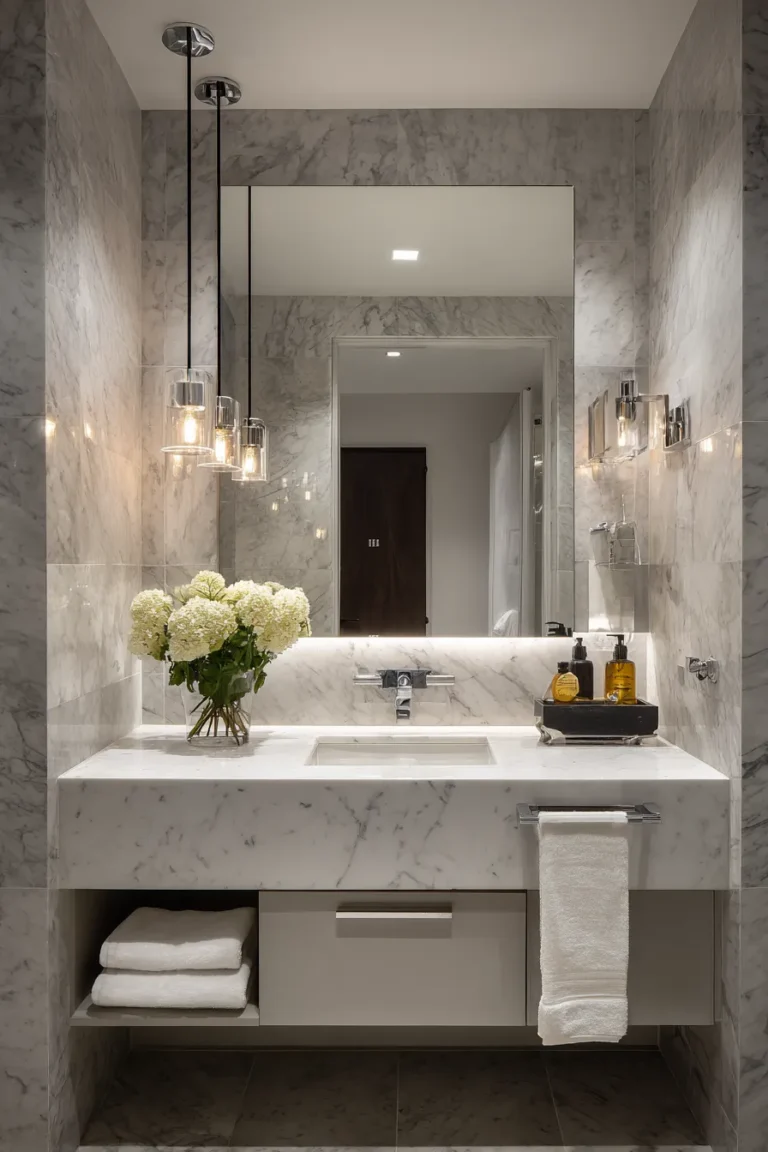
1. Unlacquered Brass Hardware with Intentional Patina

Living finish metals—unlacquered brass, bronze, and copper—develop a unique oxidation pattern based on your water’s pH, hand oils, and humidity levels. This isn’t tarnish to polish away; it’s the point. Within six months, touchpoints like faucet handles darken to a rich tobacco hue while water-splashed areas remain lighter, creating a topographical map of daily use.
Designer’s Secret: To accelerate patina in a controlled way, mist fixtures lightly with white vinegar every two weeks for the first three months. This creates deeper contrast zones faster than natural aging alone, giving you the “heirloom” look by month four instead of year two.
Design Breakdown:
- Faucets: Waterworks Easton collection in unlacquered brass or Newport Brass raw finish
- Towel bars: Wall-mounted with visible mounting hardware (concealed mounts fight the aesthetic)
- Lighting: Pair with aged brass sconces at 2700K to create temperature continuity
- Maintenance: Never use polish—wipe with damp microfiber only to preserve patina integrity
Best For: Design-forward homeowners who understand that perfection is less interesting than evolution. Not suitable for those who panic at the first sign of “aging.”
2. Handcrafted Zellige Tile Envelopes

Moroccan Zellige tile—each piece hand-cut and glazed—creates light refraction impossible with machine-made ceramics. The irregular glaze pools thicker in some areas, creating micro-variations that catch 2700K lighting like hammered metal. Install them with hairline grout joints (1/16″ maximum) or groutless for a liquid, continuous surface that reads as wall covering rather than tile grid.
Designer’s Secret: Specify tiles in a single color but from three different production batches. Artisans’ glaze recipes shift slightly between firings, giving you tonal variation within your “monochrome” palette—this prevents the flat, lifeless look of perfectly matched tile.
Design Breakdown:
- Dimensions: 2″x6″ for vertical rhythm or 4″x4″ for dense mosaic effect
- Color strategy: Choose Blanc (off-white) or Gris (warm gray) for light multiplication
- Installation: Cement-based thinset with minimal grout to showcase edge irregularity
- Coverage: Full wet wall (shower surround) or strategic accent wall behind vanity
Best For: Bathrooms with controlled natural light where glaze imperfections become the decorative element. Avoid in harsh overhead-lit spaces that expose rather than celebrate irregularity.
3. Microcement Wall Cladding (Seamless Continuity)

Microcement—a 2-3mm polymer-modified cement finish—eliminates grout lines entirely, creating a continuous skin that flows from wall to ceiling to floor without visual interruption. The material’s slight trowel texture catches light at oblique angles while remaining completely waterproof when sealed properly. Apply over existing tile for a renovation that bypasses demolition.
Designer’s Secret: Request a “medium trowel” finish rather than smooth. The micro-texture hides water spots and soap residue far better than polished plaster, maintaining the “just cleaned” look for days instead of hours.
Design Breakdown:
- Base coat: Two layers at 1mm each for structural integrity
- Finish coat: Single layer hand-troweled in cross-hatch pattern
- Sealer: Matte polyurethane in two coats (never gloss—it reads cheap)
- Color: Custom-tinted warm grays (add raw umber pigment to avoid cool undertones)
Best For: Minimalists who want texture without pattern, and renovators avoiding tile demolition dust. Requires skilled applicator—this isn’t DIY territory.
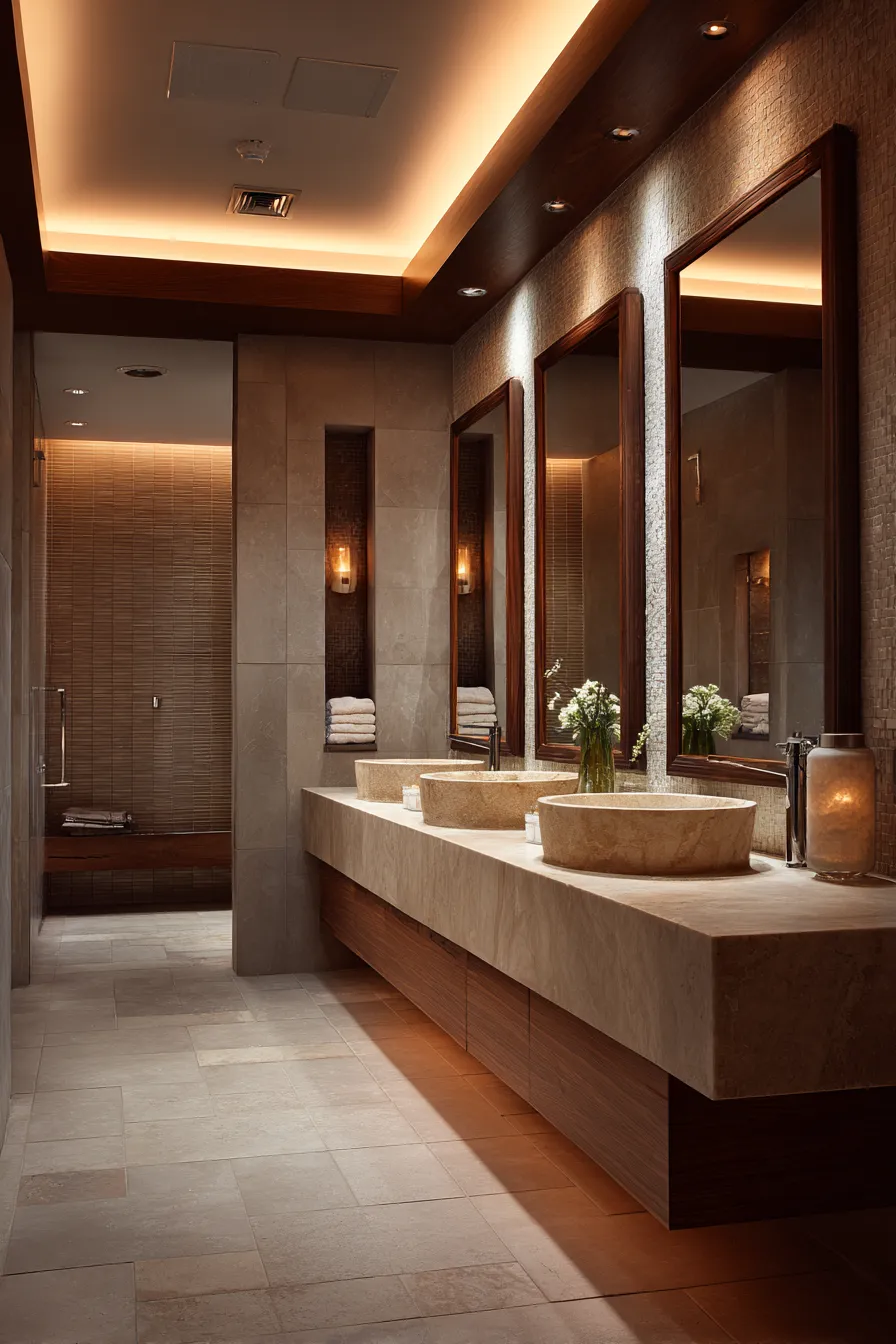
4. 2700K Warm Spectrum Layered Lighting

Color temperature isn’t decorative preference—it’s physiological engineering. Bathrooms need three zones: 3000K task lighting at the mirror (accurate for makeup/shaving), 2700K ambient lighting overhead (cortisol reduction), and 2200K accent lighting in niches (creates depth). All bulbs must hit CRI 90+ to render skin tones without the green cast of cheap LEDs.
Designer’s Secret: Install your mirror lighting 6″ higher than standard electrician placement. This casts light downward onto the face rather than straight into it, eliminating the horror-movie shadows under eyes and nose that ruin expensive skincare routines.
Design Breakdown:
- Mirror lighting: 3000K LED strips with frosted diffuser, CRI 95
- Ceiling ambient: 2700K recessed cans on dimmer, spaced 4′ apart
- Accent: 2200K picture lights above artwork or in shower niche
- Dimming: Lutron or Legrand systems (cheap dimmers create LED flicker)
Best For: Anyone who’s ever looked worse in their bathroom mirror than in natural light. This fixes that.
5. Honed Limestone or Travertine Slab Wrapping

Book-matched natural stone—where adjacent slabs are mirror images—creates vein continuity across walls like opened pages of a geology textbook. Honed (matte) finishes diffuse light rather than reflecting it, making 12″x24″ slabs feel architectural rather than decorative. The limestone’s fossilized texture adds micro-interest that polished marble lacks.
Designer’s Secret: Specify “cross-cut” travertine rather than “vein-cut.” Cross-cutting reveals the stone’s circular growth rings (like tree rings), creating more visual movement than the parallel striations of vein-cut. It’s the difference between static wallpaper and living geology.
Design Breakdown:
- Slab size: 24″x48″ or larger to minimize seams (16″x24″ reads residential-grade)
- Finish: Honed at 400-grit (matte but not porous)
- Sealing: Penetrating sealer, reapplied annually (not topical coating)
- Veining: Book-matched pairs on primary wall, random elsewhere for cost control
Best For: Spaces with architectural bones to honor—wasted in builder-grade bathrooms. Budget for professional installation; stone lippage (uneven edges) destroys the effect.
6. Aged Bronze Faucet Suites (Pre-Oxidized Finish)

Unlike unlacquered brass that ages in real-time, aged bronze arrives pre-oxidized with a chocolate-to-charcoal gradient, then stays stable. The finish combines dark depth with dimensional high-spots where “wear” is simulated. Pair with warm neutrals (greige, taupe) to enhance the bronze’s amber undertones; against cool grays, it reads muddy rather than rich.
Designer’s Secret: Aged bronze only works if it’s the dominant metal—mixing it with chrome or brushed nickel makes it look accidental rather than intentional. Commit fully: faucets, shower fixtures, towel hardware, even toilet paper holder. Partial commitment reads indecisive.
Design Breakdown:
- Suite coordination: All fixtures from same manufacturer/finish code (slight variations between brands clash)
- Showerhead: 8″ rain head in matching finish (undersized heads look orphaned)
- Temperature: Pairs with 2700K-2800K lighting only (3000K+ makes it look rusty)
- Grout color: Charcoal or espresso to harmonize with dark metal tones
Best For: Traditional-leaning modernists who want warmth without brass’s reflectivity. Not for Scandinavian minimalism—the finish has too much personality.
7. Limewashed Plaster Ceiling Treatment
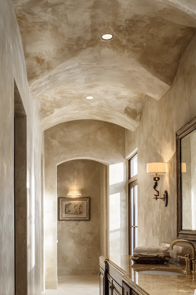
Mineral-pigmented limewash creates depth impossible with flat paint. The calcium hydroxide in limewash undergoes carbonation over weeks, developing a mottled patina as moisture interacts with pigment. Apply in uneven cross-hatched strokes—perfection is the enemy here. The result reads like aged European stucco rather than fresh drywall.
Designer’s Secret: Add 10% marble dust to your limewash mix. This creates micro-reflectivity that catches light without gloss, making low ceilings feel taller through subtle luminosity. Standard limewash can look flat and chalky without this additive.
Design Breakdown:
- Base coat: Primer specifically for alkaline coatings (standard primer causes peeling)
- Application: Natural bristle brush in crisscross strokes, leaving texture visible
- Color: Warm white (add raw sienna pigment) or soft gray (add lamp black)
- Humidity: Actually improves in bathroom moisture—limewash is hygroscopic and breathes
Best For: Ceilings in bathrooms with architectural detail (coffers, beams) to highlight. Wasted on 8′ flat ceilings without dimension.
8. Sculptural Freestanding Tub as Anchor Element

A freestanding tub isn’t furniture—it’s spatial punctuation. Stone resin composite tubs (crushed marble bound with resin) weigh 300-400 lbs empty, creating gravitational presence that acrylic tubs (80 lbs) lack. Position it asymmetrically rather than centered; perfect symmetry feels staged rather than inhabited. Leave 36″ minimum clearance on all sides—any less and it reads cramped rather than intentional.
Designer’s Secret: Ignore the “window-adjacent” tub Instagram trope unless you genuinely want neighbors watching you bathe. Instead, position the tub perpendicular to the window so bathers face the view while maintaining privacy. Function over Instagram.
Design Breakdown:
- Material: Stone resin with matte finish (glossy acrylic reads cheap)
- Dimensions: 67″L minimum for adult comfort (anything shorter is decorative)
- Filler: Floor-mounted tub filler in aged bronze or unlacquered brass
- Surround: Travertine or limestone within 12″ of tub edge for water tolerance
Best For: Bathrooms 120+ sq ft where a tub won’t dominate. In smaller spaces, built-in alcove tubs are more honest.
9. Fluted or Ribbed Natural Stone Detailing

Vertical grooves carved into limestone or marble create shadow-play that changes throughout the day as light angles shift. Machine-cut fluting (CNC) is too perfect—specify hand-carved or waterjet-cut for slight irregularities that read artisanal. Install on a single accent wall or column, never all four walls (that’s maximalist chaos, not layered sophistication).
Designer’s Secret: Fluting depth matters critically. Grooves under 8mm deep disappear at typical bathroom lighting distances; over 15mm and they collect soap scum in shower applications. The sweet spot is 10-12mm: enough shadow drama without maintenance nightmares.
Design Breakdown:
- Application: Shower accent wall (behind freestanding tub) or vanity backsplash
- Groove spacing: 1.5″ center-to-center for dense rhythm, 3″ for relaxed
- Stone type: Limestone for matte texture, marble for subtle luminosity
- Lighting: Graze with 2700K picture light from top or bottom to maximize shadow
Best For: Bathrooms with natural light that changes angle throughout the day. Wasted under static overhead lighting.
10. Floor-to-Ceiling Frameless Glass (Wet Room Aesthetic)

True frameless glass—no header track, no metal channels—requires 1/2″ tempered glass minimum and precise millwork. The absence of frames makes the shower dissolve visually into the bathroom rather than boxing it off. Specify StarCast coating (not generic “water repellent”) for true water sheeting—droplets run down in sheets rather than beading, drastically reducing cleaning frequency.
Designer’s Secret: Install the glass 1/4″ shy of the ceiling rather than full-height. This invisible gap allows steam to escape without fogging the mirror, while maintaining the visual illusion of floor-to-ceiling continuity. Full-height installations trap steam and require exhaust fans that disrupt the spa-like quiet.
Design Breakdown:
- Glass thickness: 1/2″ minimum (3/8″ flexes and feels cheap)
- Hardware: Polished stainless or aged bronze hinges (chrome is over)
- Threshold: Zero-barrier with linear drain (no curbs to break visual flow)
- Coating: StarCast or EnduroShield at factory application
Best For: Wet rooms or large walk-in showers (60″+ wide) where enclosure isn’t necessary. Not suitable for tub/shower combos.
11. Organic Textiles in High-Performance Weaves

Stonewashed linen bath mats (160-180gsm weight) provide absorbency with texture that machine-made cotton lacks. The slubbed, irregular weave catches light variably, preventing the flat uniformity of terry cloth. Pre-washed linen arrives soft immediately rather than requiring 10+ washes to break in, and the wrinkled texture is the aesthetic—never iron bathroom linens.
Designer’s Secret: Layer two bath mats rather than buying thick shag rugs. A thin jute mat (for texture and water tolerance) topped with a linen mat (for softness) creates dimensional interest while ensuring the linen never sits in standing water, which causes mildew in organic fibers.
Design Breakdown:
- Primary mat: Stonewashed linen in natural, sand, or charcoal (27″x45″)
- Underlayer: Natural jute or sisal (30″x48″) for water drainage
- Towels: Waffle weave linen or bamboo terry (not Egyptian cotton—it’s too heavy when wet)
- Color strategy: Tone-on-tone neutrals (avoid stark white, it shows every water spot)
Best For: Bathrooms with controlled humidity (exhaust fans) to prevent mildew. Not suitable for windowless or poorly ventilated spaces.
12. Biophilic Niche Installations (Preserved Moss Walls)

Preserved reindeer moss—chemically stabilized to remain soft without water—brings biophilic texture without maintenance. Install in a 12″x24″ recessed niche with 2200K accent lighting from above; the low color temperature enhances the moss’s natural green-gray tones. This isn’t living greenery; it’s botanical taxidermy that delivers nature’s stress-reduction benefits without the upkeep.
Designer’s Secret: Mix three moss textures in a single niche: reindeer moss (cloud-like), sheet moss (flat and velvety), and mood moss (dimensional clumps). Monochromatic moss looks craft-store amateur; layered textures read intentionally designed.
Design Breakdown:
- Niche depth: 4″ minimum for dimensional layering (2″ reads flat)
- Backing: Painted matte black to create depth illusion
- Lighting: 2200K LED strip at top edge, directed downward
- Humidity: Actually benefits from bathroom moisture (keeps moss supple)
Best For: Modern bathrooms that need organic softness without the commitment of living plants. Avoid in rentals—installation is permanent.
Designer’s Warning: The Multi-Metal Mistake
Mixing metal finishes only works when there’s clear hierarchy: one dominant finish (70% of fixtures), one accent finish (30%), and absolutely no third options. The Instagram trend of “aged brass faucets with chrome lighting and brushed nickel towel bars” creates visual noise that undermines the material intelligence this entire aesthetic depends on. If you’re going to layer metals, ensure they share either temperature (warm metals together) or sheen (all matte or all polished). Never mix warm matte with cool polished—that’s not eclecticism, it’s confusion.
The shift toward tactile quietude isn’t about spending more—it’s about specifying smarter. A single unlacquered brass faucet that develops patina for 20 years holds more design value than replacing chrome fixtures every decade. Zellige tile’s handcrafted irregularity costs the same per square foot as machine-made subway tile, yet delivers exponentially more visual interest. The 2026 bathroom recognizes that true luxury isn’t perfection—it’s materiality that improves with age, surfaces that reward touch, and lighting that makes inhabitants feel better, not just look better.
This is architecture as wellness infrastructure, where every finish specification is a micro-decision about how a space will feel in five years, not just how it photographs tomorrow. The bathrooms that endure aren’t the most Instagrammable—they’re the ones where unlacquered brass tells the story of daily rituals, where limewash plaster ages like fine wine, and where 2700K lighting makes 6 AM feel like golden hour. That’s not decoration. That’s design literacy.